基于数据挖掘的共享单车骑行数据分析与预测
温馨提示:文末有 CSDN 平台官方提供的博主 QQ 名片
1. 项目背景
共享单车系统在大城市越来越流行,通过提供价格合理的自行车租赁,让人们可以享受在城市里骑自行车的乐趣,而无需为自己购买自行车。本项目利用 Nice Ride MN 在双子城(明尼苏达州明尼阿波利斯市/圣保罗市)提供的历史数据。我们将通过查看不同站点的自行车需求、每个站点的自行车流量、季节性和天气对骑行模式的影响,以及会员和非会员之间骑行模式的差异,来探索共享单车骑行数据。
2. 功能组成
基于数据挖掘的共享单车骑行数据分析与预测系统的主要功能包括:
3. 数据读取与预处理
stations = pd.read_csv('data/Nice_Ride_2017_Station_Locations.csv')trips = pd.read_csv('data/Nice_ride_trip_history_2017_season.csv')Stations 和 trips 基本信息:
stations.info()trips.info()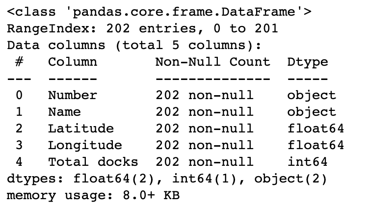
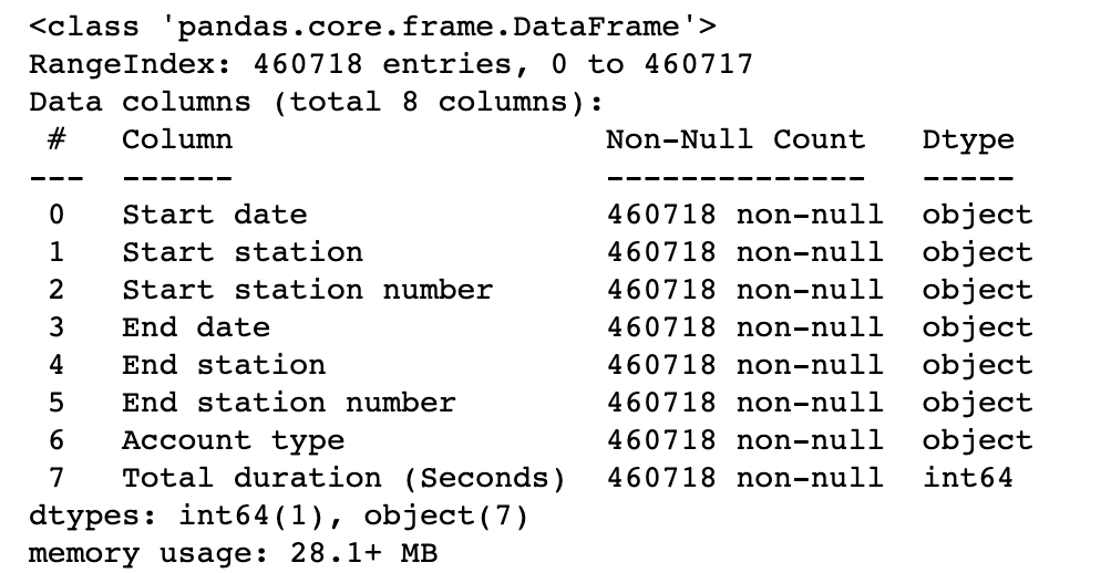
stations 和 trips 数据集看起来非常干净——没有丢失值,纬度、经度和加载的码头数量与预期一致。
转换时间字段的数据格式:
# Convert start and end times to datetimefor col in ['End date', 'Start date']: trips[col] = pd.to_datetime(trips[col], format='%m/%d/%Y %H:%M')4. 数据探索式可视化分析
4.1 车站位置 Station Locations 的分析
# On hover, show Station nametooltips = [("Station", stations['Name'])]# Plot the stationsp, _ = MapPoints(stations.Latitude, stations.Longitude, title="Nice Ride Station Locations", tooltips=tooltips, height=fig_height, width=fig_width)show(p)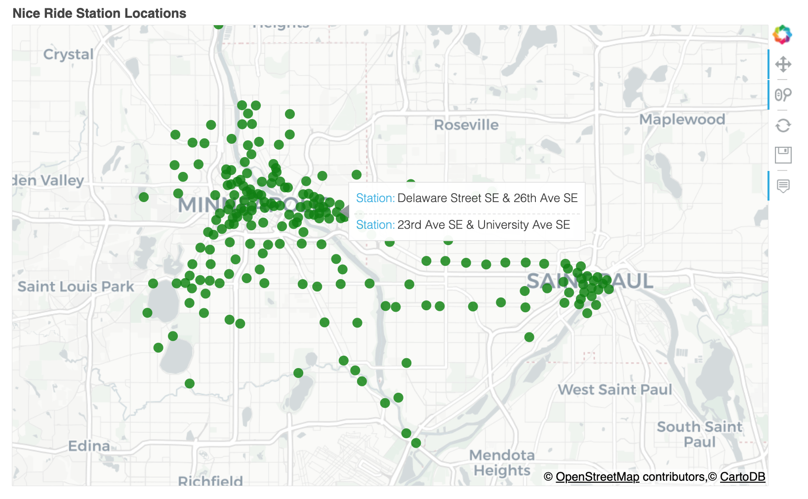
可以看出,大多数车站都分散在明尼阿波利斯周围,但圣保罗市中心也有一个集群,以及沿大学大道和格兰德大道的几个车站,它们连接明尼阿波利斯和圣保罗。
4.2 每个车站的自行车停靠站数量
# Plot histogram of # docks at each station plt.figure(figsize=(16, 5))plt.hist(stations['Total docks'],)plt.ylabel('Number of Stations')plt.xlabel('Number of Docks')plt.title('Number of Docks Distribution')plt.show()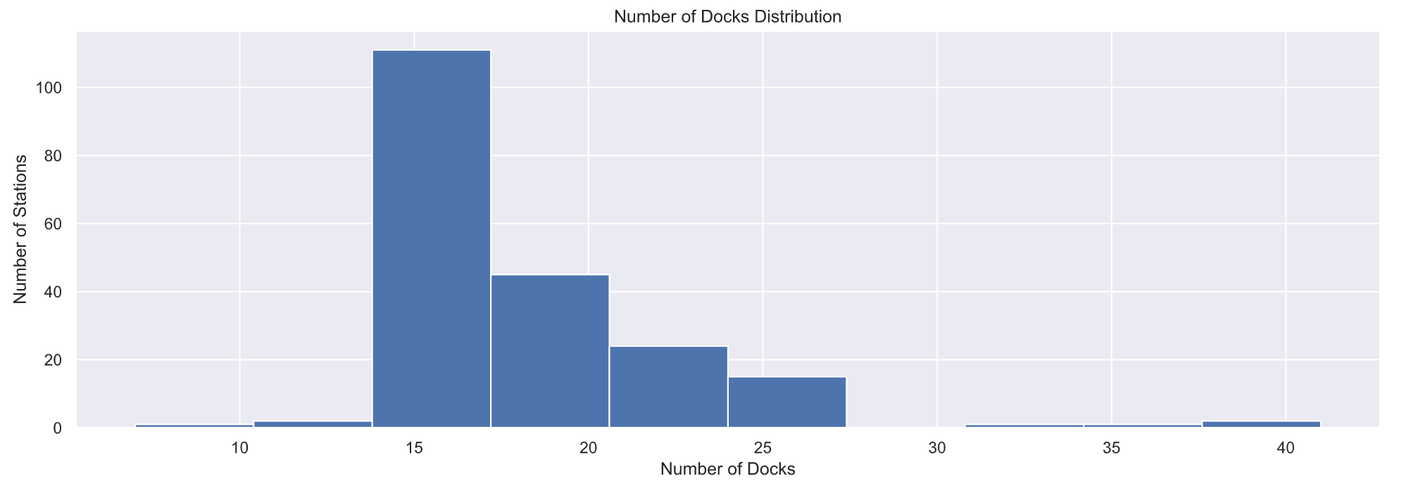 可以看出,每个车站大部分停靠15辆共享单车。
# 显示车站名称和停靠自行车数量tooltips = [("Station", stations['Name']), ("Docks", stations['Total docks'])]# Plot the stationsp, _ = MapPoints(stations.Latitude, stations.Longitude, tooltips=tooltips, color=stations['Total docks'], size=4*np.sqrt(stations['Total docks']/np.pi), title="Number of Docks at each Station", height=fig_height, width=fig_width)show(p)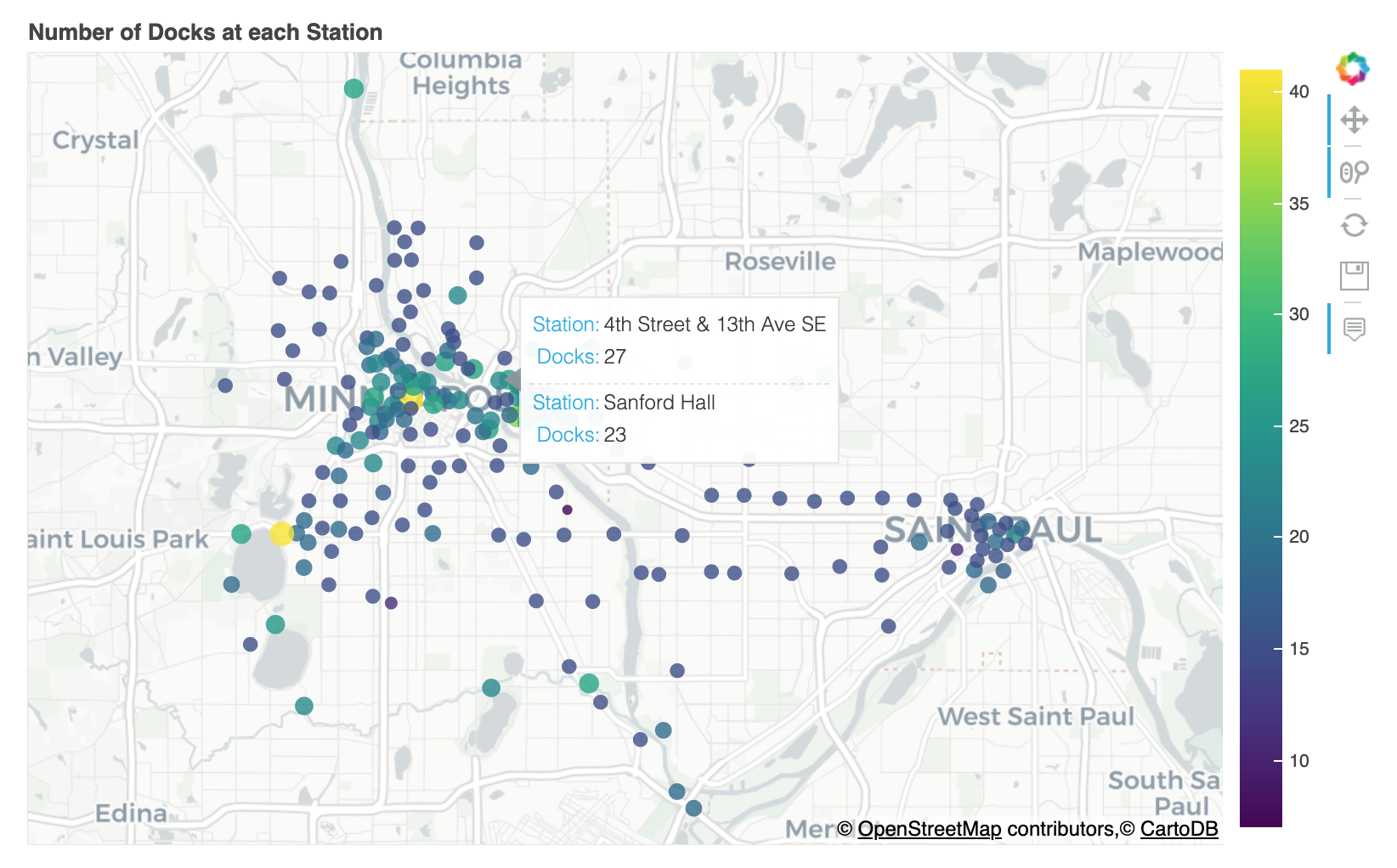 4.3 车站需求分析 Station Demand
demand_df = pd.DataFrame({'Outbound trips': trips.groupby('Start station').size(), 'Inbound trips': trips.groupby('End station').size() })demand_df['Name'] = demand_df.indexsdf = stations.merge(demand_df, on='Name')plt.figure(figsize=(16, 5))plt.hist(sdf['Outbound trips'], bins=20)plt.ylabel('Number of Stations')plt.xlabel('Number of outbound rentals')plt.title('Outbound trip distribution')plt.show()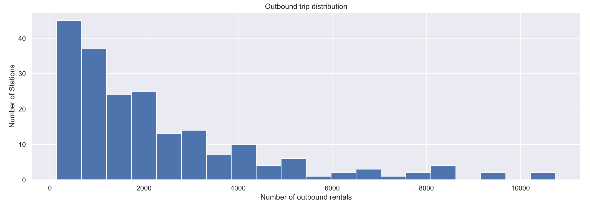
# Plot num trips started from each station plt.figure(figsize=(16, 5))plt.hist(sdf['Inbound trips'], bins=20)plt.ylabel('Number of Stations')plt.xlabel('Number of inbound rentals')plt.title('Inbound trip distribution')plt.show()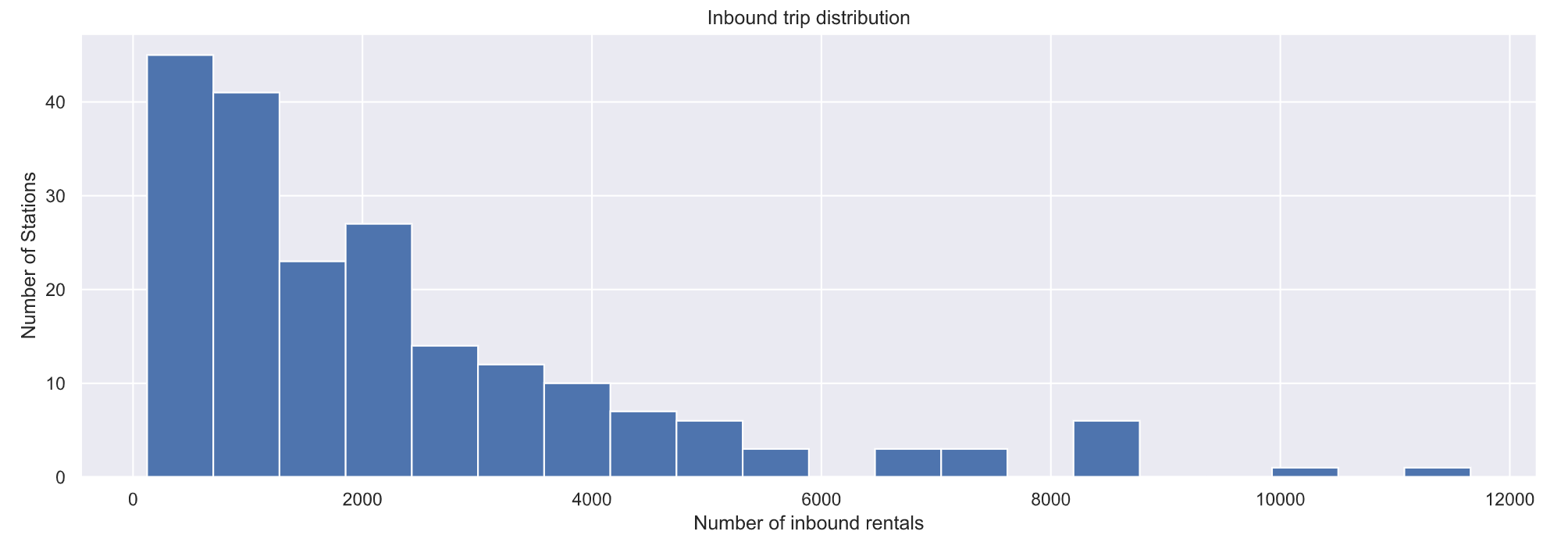 可以看出,Nice Ride MN 必须将自行车从有多余自行车的车站重新分配到没有足够自行车的车站。在该站结束的骑乘次数比在该站开始的骑乘次数多的车站最终会有额外的自行车,而 Nice Ride MN 将不得不将这些额外的自行车重新分配给更空的车站!分析哪些车站的终点车次比起点车次多。
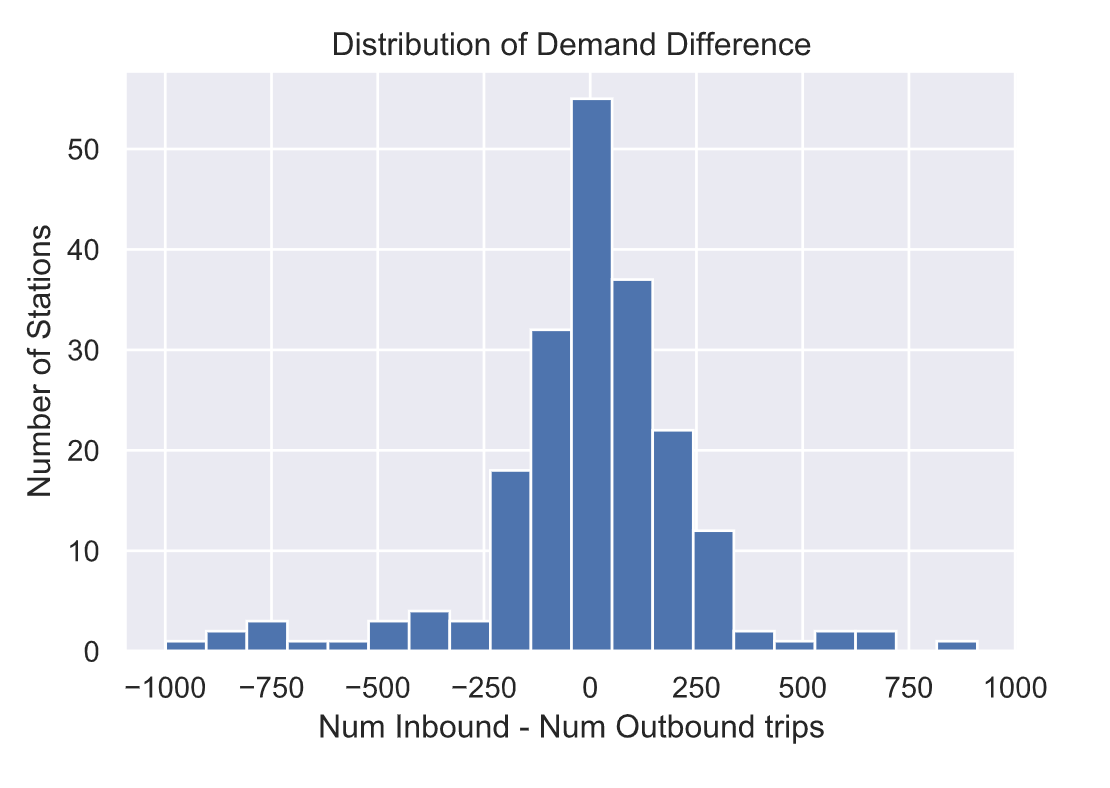
大多数车站的终点车次和起点车次差不多。然而,肯定有几个站是不平衡的!也就是说,有些车站的入站乘车次数多于出站乘车次数,反之亦然。
我们可以把这些分布绘制在地图上,看看哪些是不平衡的站。我们将使用Bokeh在三个单独的选项卡中绘制出出境旅行次数、入境旅行次数和需求差异。圆圈的颜色和区域表示相应选项卡中的vaue(出境旅行次数、入境旅行次数或差异)。对于“差异”,圆圈的大小表示“绝对”差异(因此我们可以看到哪些站点最不平衡,颜色告诉我们它们在哪个方向不平衡)。单击绘图顶部的每个选项卡,查看出站行程、入站行程的数量或两者之间的差异。
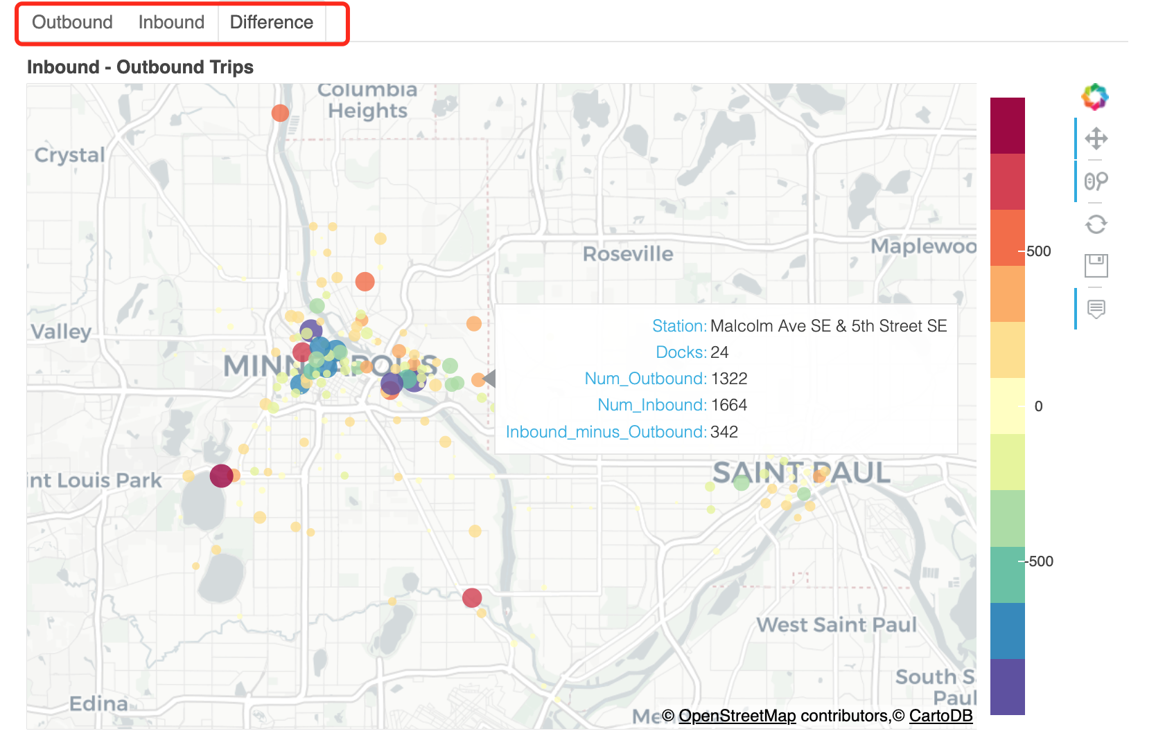
有些车站结束行程的人数远远多于开始行程的人数(例如,位于圣诺克斯湖大道Lake St & Knox Ave、Bde Maka Ska东北角的车站,或Minnehaha Park车站)。还有一些车站,开始旅行的人比结束旅行的人多得多(例如,明尼苏达大学校园的科夫曼联合车站和威利大厅车站)。但大多数车站的入站和出站数量差不多。
还可以看出,更多的车从明尼阿波利斯市中心或密歇根大学校园出发,离开市中心。请注意,明尼阿波利斯市中心聚集了许多大型蓝色圆圈(出站次数较多的车站),但大多数大型红色圆圈(出站次数较多的车站)远离市中心,往往是“目的地”和公园(如明尼哈公园、Bde Maka Ska、洛根公园和北密西西比区域公园))
4.4 需求差异性分析
理想情况下,“Nice Ride”希望在进站和出站车次差异较大的车站有更多的码头。这是因为,如果在一个特定的车站开始的骑乘次数多于在该车站结束的骑乘次数,那么随着时间的推移,该车站的自行车数量将会减少。所以,车站需要有足够的码头来容纳足够的自行车,这样车站在一天结束时就不会空无一人了!另一方面,如果在一个车站结束的车程比在那里开始的车程多,那么该车站的所有码头都会挤满,人们将无法在那里结束他们的车程!因此,这些车站必须有足够的码头来吸收一天中的交通量。
sdf['abs_diff'] = sdf['demand_diff'].abs()sdf['Docks'] = sdf['Total docks']/sdf['Total docks'].sum()sdf['DemandDiff'] = sdf['abs_diff']/sdf['abs_diff'].sum()sdf['demand_dir'] = sdf['Name']sdf.loc[sdf['demand_diff']0, 'demand_dir'] = 'More Incoming'sdf.loc[sdf['demand_diff']==0, 'demand_dir'] = 'Balanced'tidied = ( sdf[['Name', 'Docks', 'DemandDiff']].set_index('Name').stack().reset_index().rename(columns={'level_1': 'Distribution', 0: 'Proportion'}))plt.figure(figsize=(4.5, 35))station_list = sdf.sort_values('DemandDiff', ascending=False)['Name'].tolist()sns.barplot(y='Name', x='Proportion', hue='Distribution', data=tidied, order=station_list)plt.title('Proportion Docks vs Demand Difference')locs, labels = plt.yticks()plt.yticks(locs, tuple([s[:15] for s in station_list]))plt.show()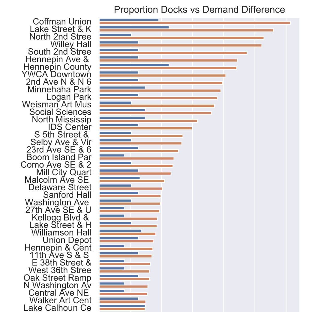
每个车站的码头数量与总体需求差异之间并没有很好的匹配。需求的差异可能会随着时间的推移而变化。例如,一些车站可能在早上有更多的出站行程,在晚上有更多的入站行程,反之亦然。
4.5 需求随时间变化的差异
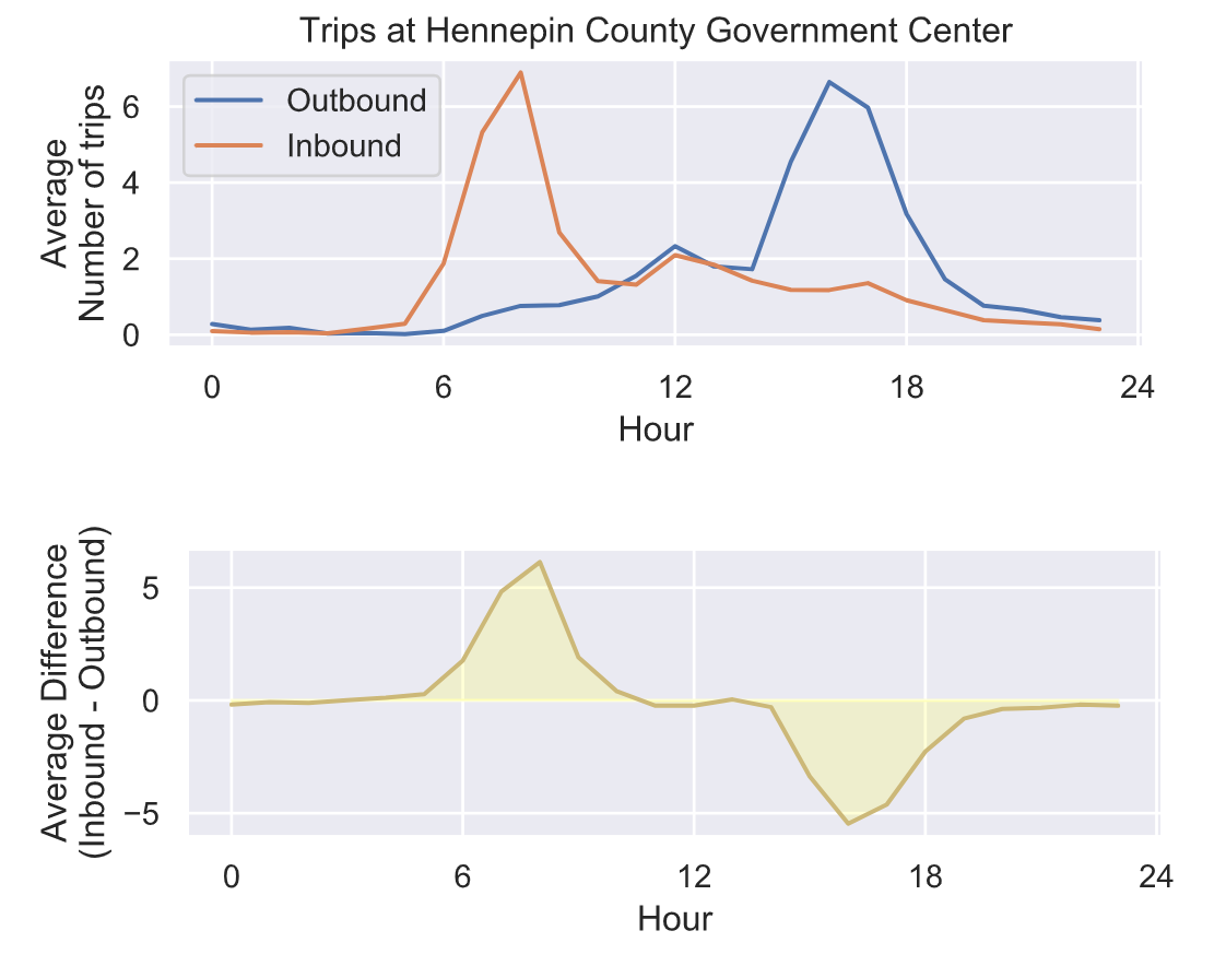
驶入和驶出车站之间的平衡并不是一成不变的——它会随着时间而变化!在早上8点左右,有更多的人在车站结束他们的租车,可能是通勤上班的人。但在一天结束时,大约下午5点,人们通常会从该车站开始租车,可能是为了上下班回家。
4.6 需求的累积差异分析
# 计算需求的累积差异cdiff = trips_hp['Difference'].apply(np.cumsum, axis=1)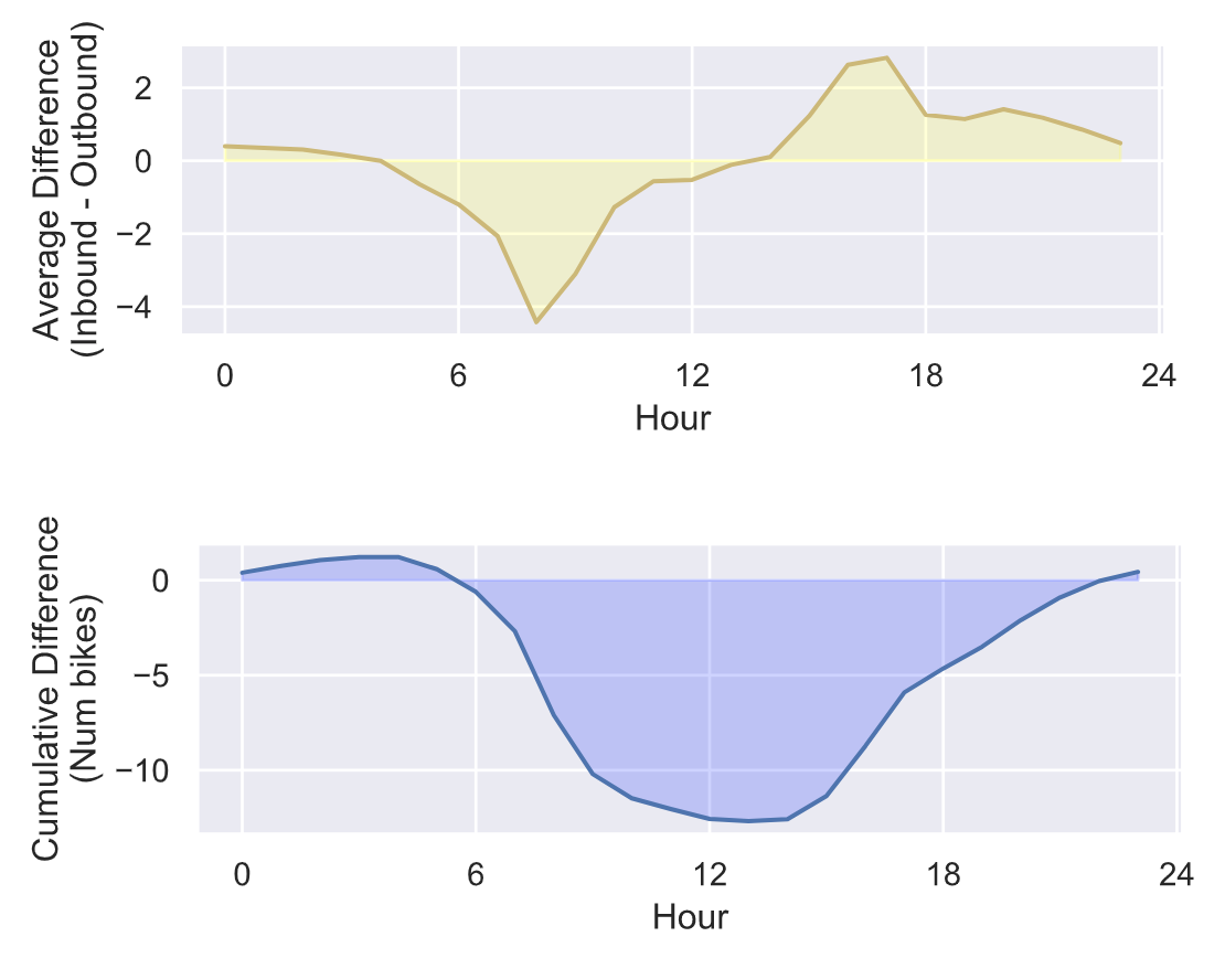
从累积的需求差异来看,很明显早上有很多自行车被从这个车站带走,晚上又被带回来。所以,如果尼斯骑行不把自行车重新分配给这个车站,在上午9点到下午4点之间,这里的自行车会比晚上少很多。
4.7 单车从停靠点的流转情况分析
乘站的位置、每个车站的码头数量、每个车站的需求以及需求随时间的变化。然而,自行车是如何从每个车站流向另一个车站的?也就是说,旅行的分布是什么样的?每个车站最常见和最不常见的目的地是什么?
# 计算从每个车站到另一个车站的行程数flow = ( trips.groupby(['Start station', 'End station'])['Start date'] .count().to_frame().reset_index() .rename(columns={"Start date": "Trips"}) .pivot(index='Start station', columns='End station') .fillna(value=0))# Plot trips to and from each stationsns.set_style("dark")plt.figure(figsize=(10, 8))plt.imshow(np.log10(flow.values+0.1), aspect='auto', interpolation="nearest")plt.set_cmap('plasma')cbar = plt.colorbar(ticks=[-1,0,1,2,3])cbar.set_label('Number of trips')cbar.ax.set_yticklabels(['0','1','10','100','1000'])plt.ylabel('Station Number FROM')plt.xlabel('Station Number TO')plt.title('Number of trips to and from each station')plt.show()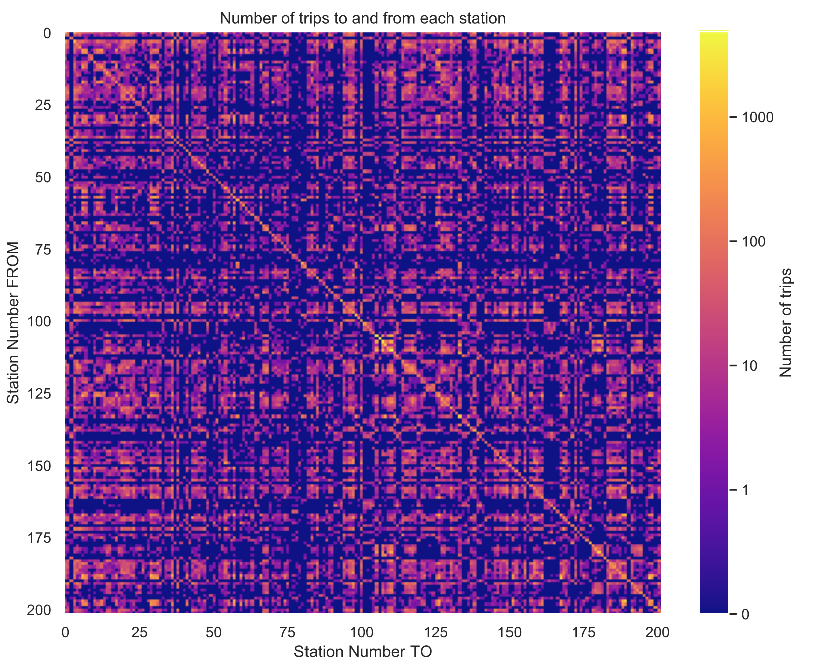
# 最终停靠在出发时候的同一车站的数量sns.set()plt.figure()plt.bar([0, 1], [np.trace(flow.values), flow.values.sum()-np.trace(flow.values)], tick_label=['Same as start', 'Other'])plt.xlabel('End station')plt.ylabel('Number of trips')plt.title('Number of trips which end\n'+ 'at same station they started from')plt.show()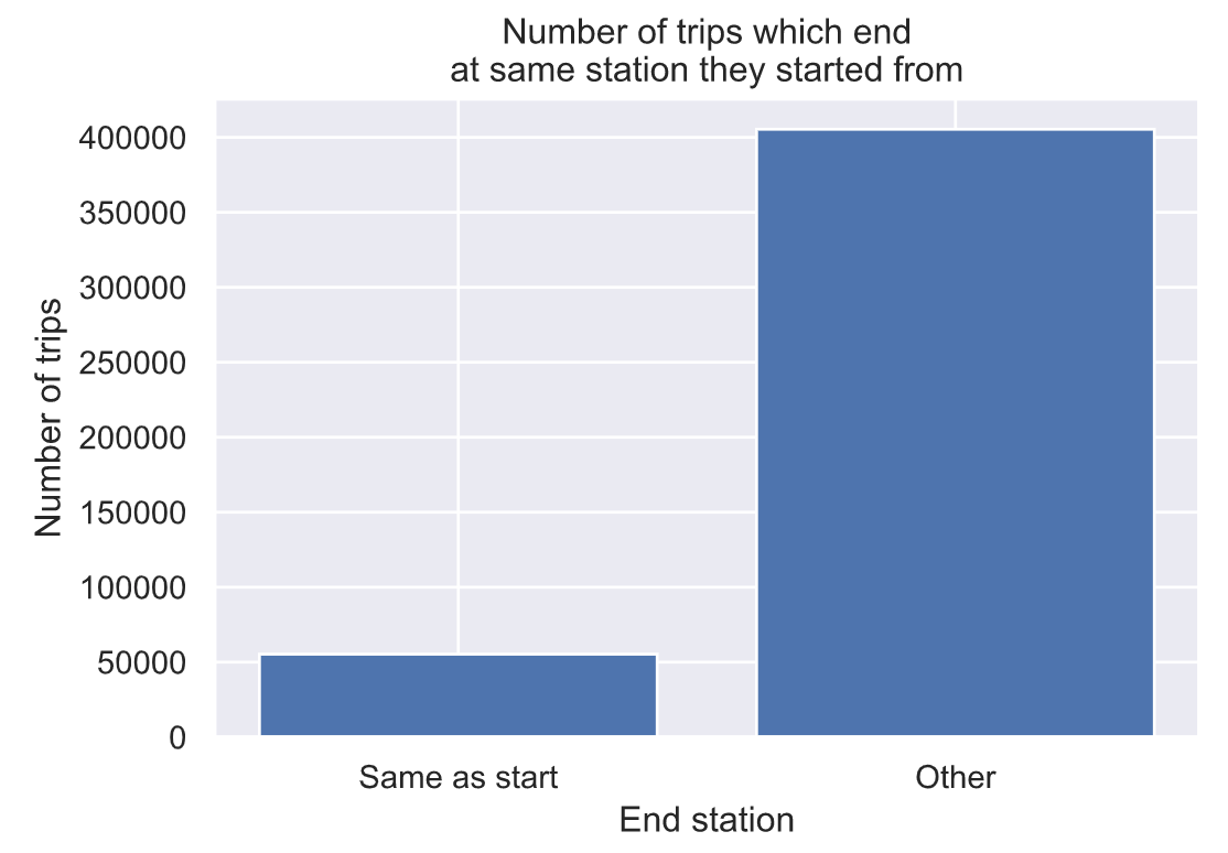
可以看出,大多数旅行实际上不会回到他们出发的车站。
4.8 骑行时长分析
# 超过24小时的,可能为异常情况Ntd = np.count_nonzero(trips['Total duration (Seconds)']>(24*60*60))print("Number of trips longer than 24 hours: %d ( %0.2g %% )" % (Ntd, 100*Ntd/float(len(trips))))# 骑行时长不超过1小时的Ntd = np.count_nonzero(trips['Total duration (Seconds)']<(24*60))print("Number of trips shorter than 1 hour: %d ( %0.2g %% )" % (Ntd, 100*Ntd/float(len(trips))))# Plot histogram of ride durationsplt.figure()sns.distplot(trips.loc[trips['Total duration (Seconds)']<(4*60*60), 'Total duration (Seconds)']/3600)plt.xlabel('Ride duration (hrs)')plt.ylabel('Number of Trips')plt.title('Ride durations')plt.show()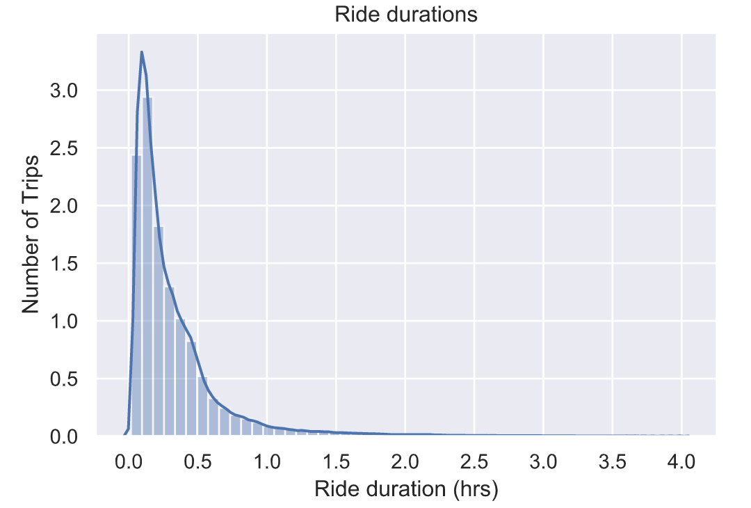
4.9 每个月骑行时长分布情况
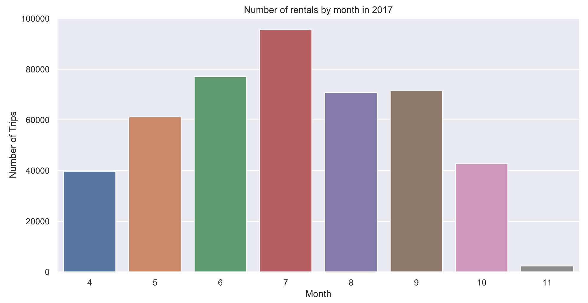
最受欢迎的单车骑行月份是7月,尽管在非黄金月份仍有很多单车骑行,但4月和10月的数量几乎是7月的一半。
4.9 一年中每天骑行分布情况
trips.groupby(trips['Start date'].dt.dayofyear)['Start date'].count().plot()plt.xlabel('Day of the year')plt.ylabel('Number of rentals')plt.title('Number of rentals by day of the year in 2017')holidays = [("Mother's day", 134), ("Memorial day", 149), ("4th of July", 185), ("Labor day", 247), ("Oct 27", 300)]for name, day in holidays: plt.plot([day,day], [0,6000],'k--', linewidth=0.2) plt.text(day, 6000, name, fontsize=8,rotation=90, ha='right', va='top')plt.show()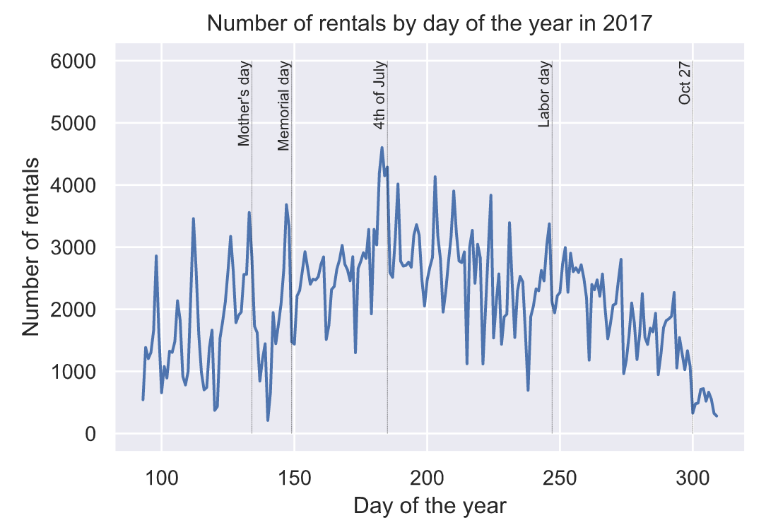
4.10 每周骑行分布情况
plt.figure()sns.countplot(trips['Start date'].dt.weekday)plt.xlabel('Day')plt.ylabel('Number of Trips')plt.title('Number of rentals by day of the week in 2017')plt.xticks(np.arange(7), ['M', 'T', 'W', 'Th', 'F', 'Sa', 'Su'])plt.show()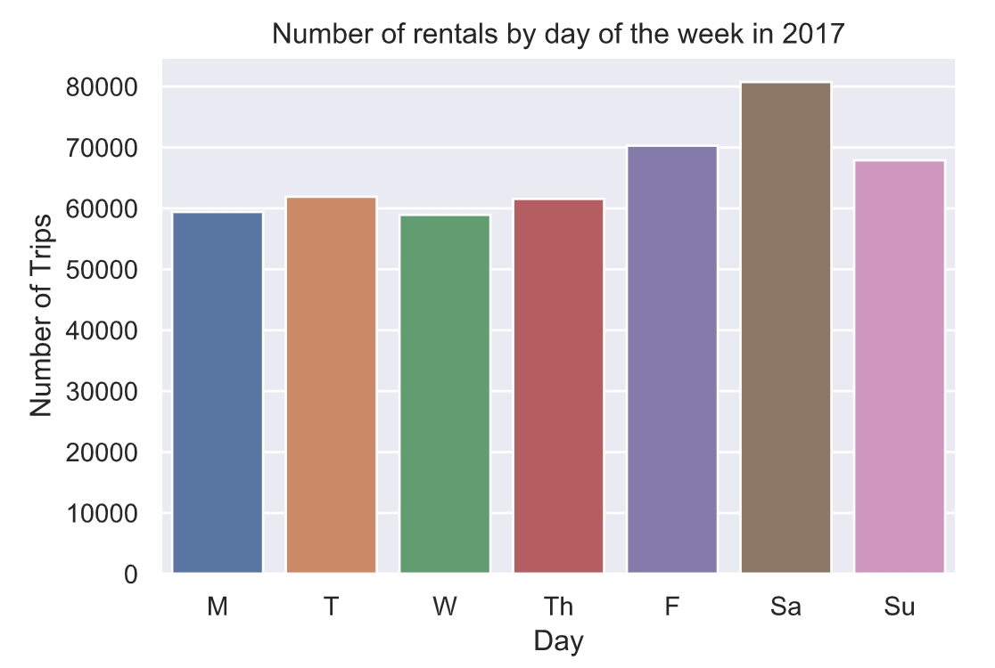
4.11 天气因素影响骑行情况
weather = pd.read_csv('data/WeatherDailyMinneapolis2017.csv')weather['DATE'] = pd.to_datetime(weather['DATE'], format='%Y-%m-%d')# Plot daily min + max temperatureplt.plot(weather.DATE.dt.dayofyear, weather.TMAX, 'C2')plt.plot(weather.DATE.dt.dayofyear, weather.TMIN, 'C1')plt.legend(['Max', 'Min'])plt.xlabel('Day of year')plt.ylabel('Temperature (degrees F)')plt.title('Daily temperatures in Minneapolis for 2017')plt.show()
气温与单车骑行数量分布情况:
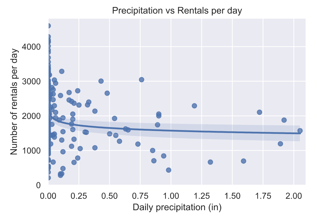
降水量与骑行次数分布情况:
降水量与骑行时长的分布情况:
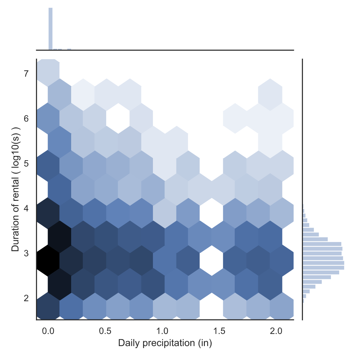
降水量和骑行持续时间之间可能存在一定的负相关。这在比较有雨和无雨的骑行时间时更为明显。
4.12 会员用户分析
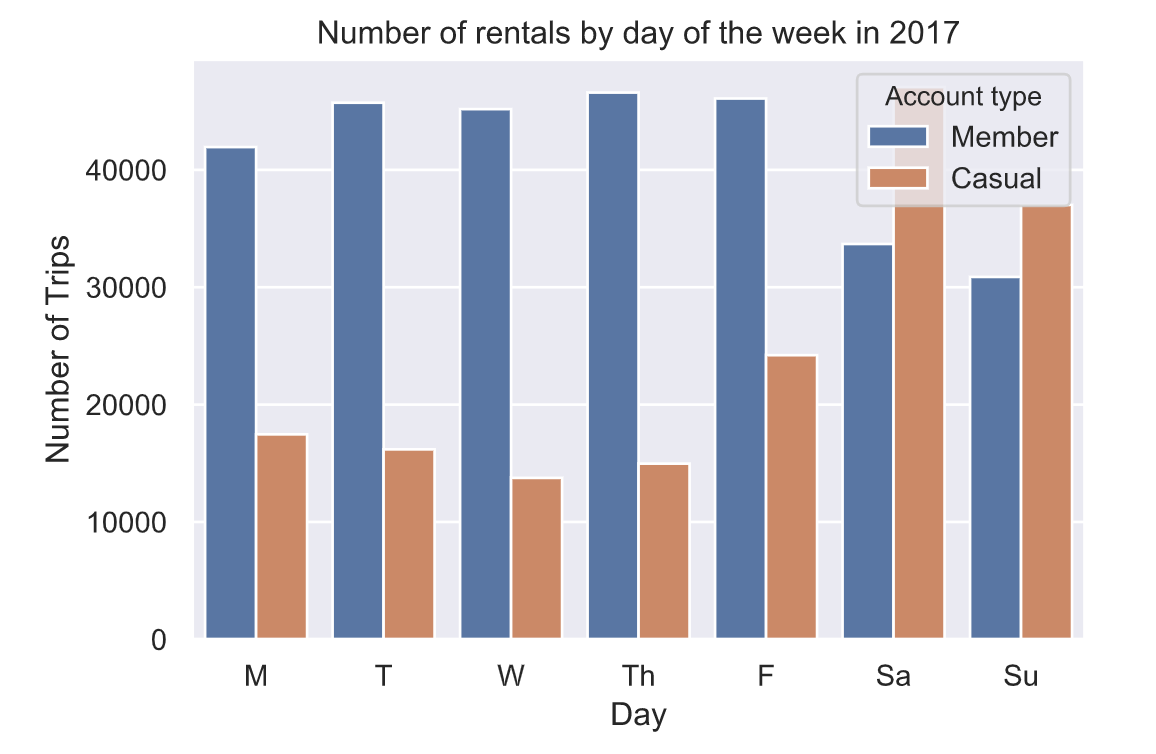
会员与非会员用户每日骑行次数差异性分析:
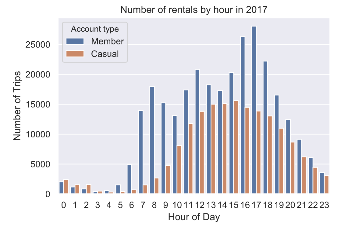
会员与非会员用户每小时骑行次数差异性分析:
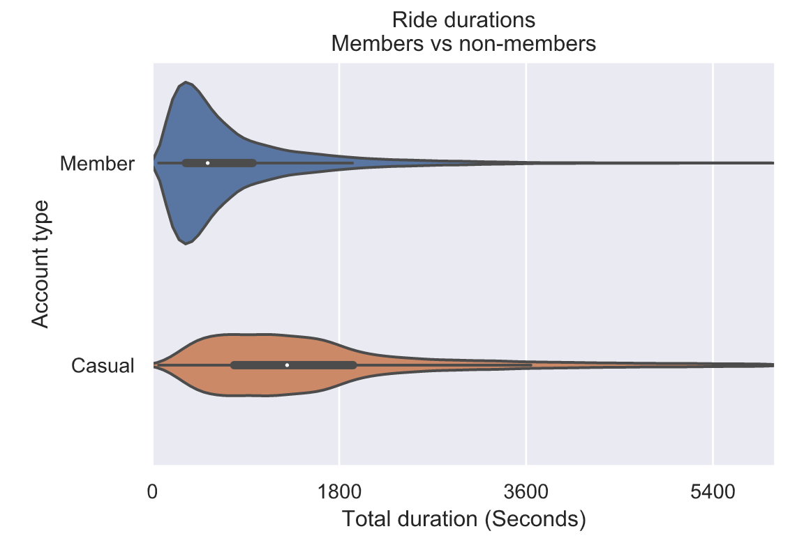
会员与非会员用户骑行时长差异性分析:
5. 基于天气数据和历史骑行数据预测每日骑行数据
建立一个模型来预测每天的乘车次数,包括季节、天气和其他因素,利用二阶多项式来模拟季节效应:
![]()
然而,季节将与温度高度相关!这意味着,如果我们试着将两者都放在同一个模型中,温度对乘坐次数的一些影响可能归因于季节。因此,我们来拟合一个模型,它包含了我们所关心的一切除了季节的预测因子,然后将该模型的残差视为季节的函数。基本上,我们将要做的是“消除”天气对乘车次数的影响,然后研究剩余信息如何随季节变化。
首先,让我们拟合一个普通的最小二乘回归模型,从一周中的某一天开始预测每天的乘车次数、每日最高温度和每日降水量。
5.1 OLS 回归分析
df = pd.DataFrame()df['Trips'] = weather.tripsdf['Date'] = weather.DATEdf['Day'] = weather.DATE.dt.dayofweekdf['Temp'] = weather.TMAXdf['Precip'] = weather.PRCP + 0.001# Only fit model on days with tripsdf = df.loc[~np.isnan(df.Trips), :]df.reset_index(inplace=True, drop=True)# Fit the linear regression modelolsfit = smf.ols('Trips ~ Temp + log(Precip) + C(Day)', data=df).fit()# Show a summary of the fitprint(olsfit.summary())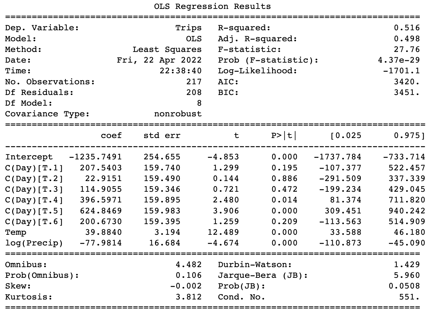
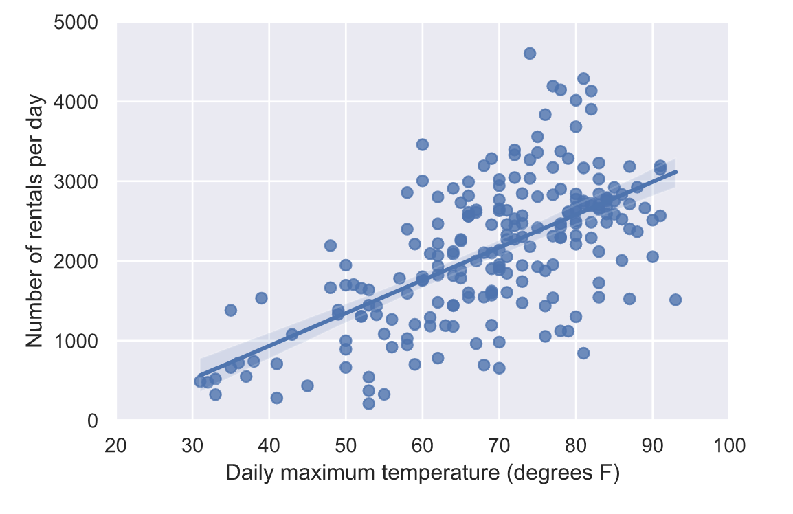
我们的模型确实捕捉到了天气的影响。在上面的汇总表中,coef列包含最左侧列中变量的系数。温度系数为≈39.9,这意味着温度每升高10度,就可以获得良好的乘坐体验≈每天还有400次骑乘!但不可能再多坐400次。最右边的两列显示了95%的置信区间,这表明该模型95%确定温度系数在33.6和46.2之间。因此,该模型非常确定每天的乘车次数会随着温度的升高而增加(因为95%的置信区间完全高于0),但这种关系到底有多强还不确定。
同样,降水量系数显著为负值,这意味着降水量越多,每天的乘车次数就越少。这是有道理的,符合我们之前的天气分析。
5.2 预测每天骑行次数
# Predict num rides and compute residualy_pred = olsfit.predict(df)resid = df.Trips-y_pred# Plot Predicted vs actualplt.figure(figsize=(12, 6))sns.set_style("darkgrid")plt.plot(df.Date.dt.dayofyear, y_pred)plt.plot(df.Date.dt.dayofyear, df.Trips)plt.legend(['Predicted', 'Actual'])plt.xlabel('Day of the Year')plt.ylabel('Number Daily Rentals')plt.title('Actual vs Predicted Rides Per Day')plt.show()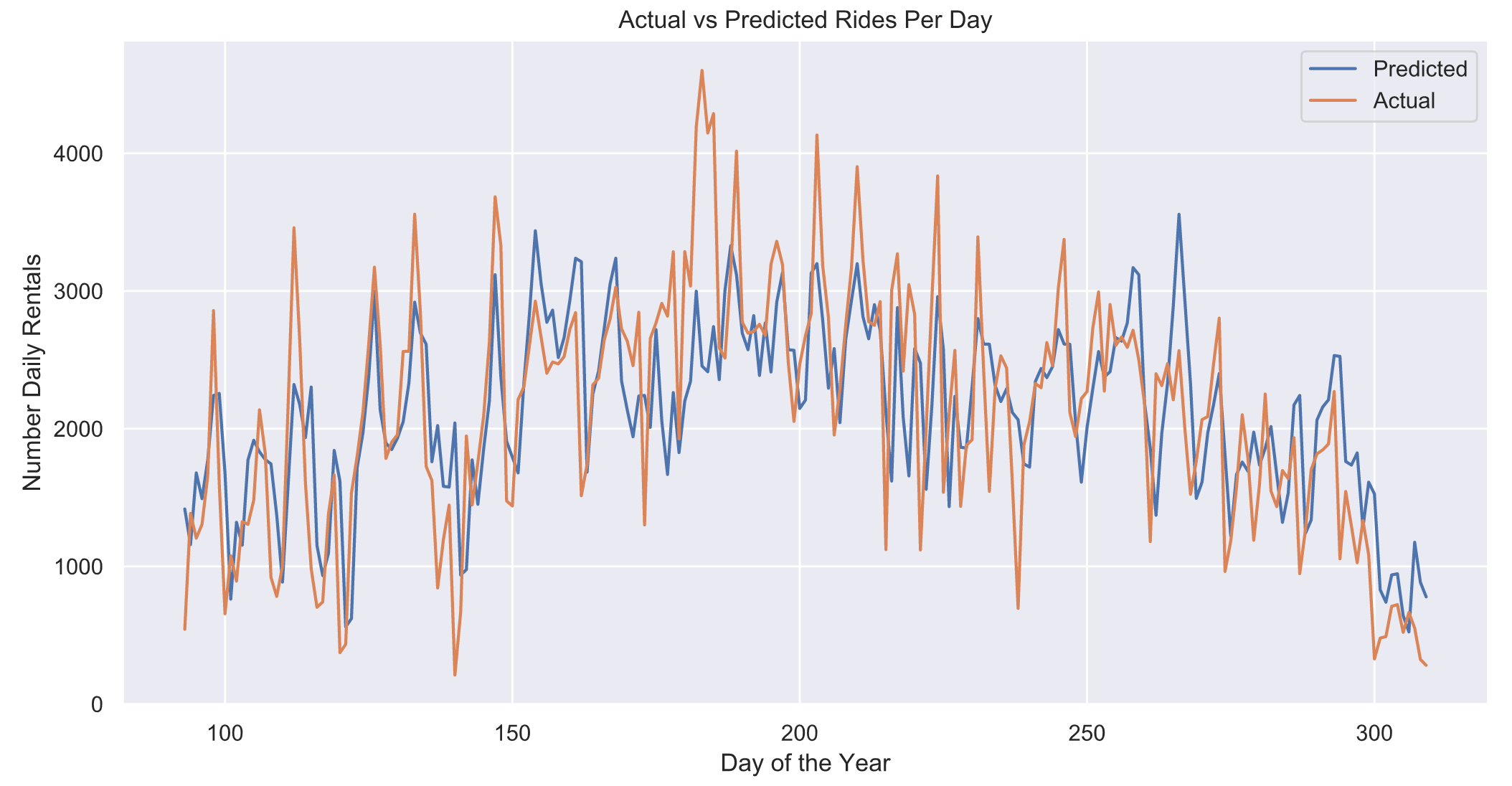
欢迎大家点赞、收藏、关注、评论啦 ,由于篇幅有限,只展示了部分核心代码。
技术交流认准下方 CSDN 官方提供的学长 QQ 名片
精彩专栏推荐订阅:
Python 毕设精品实战案例