使用Vue封装一个switch组件
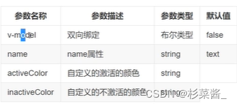
参数支持:
一、switch组件
- 基本框架和样式
<template> <div> <span class="x_switch_core"> <span class="x_switch_btn"> </span> </span> </div></template><script>export default { name: 'TwoSwitch',}</script><style lang="scss" scoped>.x_switch { display: inline-flex; align-items: center; position: relative; font-style: 14px; line-height: 20px; height: 20px; vertical-align: middle; .x-switch-input { position: absolute; width: 0; height: 0; opacity: 0; margin: 0; } .x_switch_core { margin: 0; display: inline-block; position: relative; width: 40px; height: 20px; border: 1px solid #dcdfe6; outline: none; border-radius: 10px; box-sizing: border-box; background: #dcdfe6; cursor: pointer; transition: border-color 0.3s, background-color 0.3s; vertical-align: middle; .x_switch_btn { position: absolute; top: 1px; left: 1px; border-radius: 100%; transition: all 0.3s; width: 16px; height: 16px; background: #fff; } }}// 选中的样式.x-switch-checked { .x_switch_core { border-color: #409eff; background-color: #409eff; .x_switch_btn { transform: translateX(20px); } }}</style>- 双向数据绑定
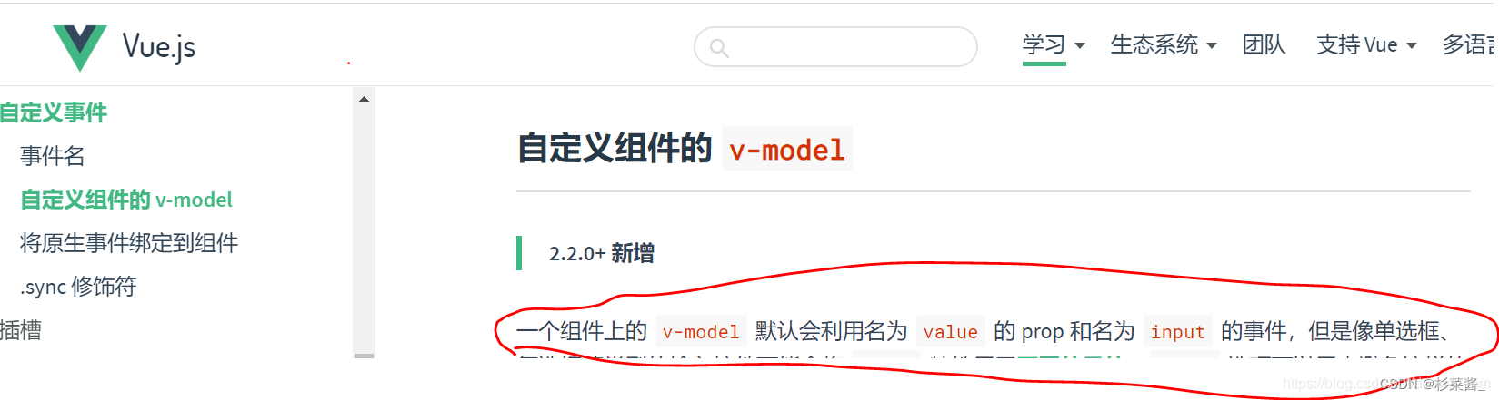
在父组件中使用v-model绑定数据,在子组件内获取value属性,并定义一个点击事件(绑定回调函数)与父组件通信,改变父组件中的绑定值。
- 父组件中:
<two-switch v-model="swFlag"></two-switch>- 子组件中,点击时改变is-checked类状态看,触发滑块滑动 :
<template> <div @click="switchClick" class="x_switch" :class="{'x-switch-checked':value}"> <span class="x_switch_core"> <span class="x_switch_btn"> </span> </span> <input type="checkbox" class="x-switch-input" :name="name" ref="input"> </div></template>将input事件触发出去,点击取反:
此时点击页面中的switch,value值会更新。
methods:{ switchClick(){ this.$emit('input',!this.value) }}
此时,页面上组件是这个效果,value值已经实现双向绑定。
但是,我们想要看到页面上组件的切换后的效果。可以给switch组件添加滑动样式。
滑动样式:
// 选中的样式.x-switch-checked { .x_switch_core { border-color: #409eff; background-color: #409eff; .x_switch_btn { transform: translateX(20px); } }}此时,点击switch时,可以改变颜色。
- 实现switch 颜色自定义
首先,需要父组件传入颜色的值,在子组件中接收。
- 父组件传递颜色参数:
<two-switch v-model="swFlag" active-color="yellow" inactive-color="red"></two-switch>- 子组件中定义ref="core"以确定要改变颜色的dom节点。
<div @click="switchClick" class="x_switch" :class="{'x-switch-checked':value}"> <span class="x_switch_core" ref="core"> <span class="x_switch_btn"> </span> </span> <input type="checkbox" class="x-switch-input" :name="name" ref="input"> </div>通过mouted钩子,在刚进入页面以及value改变时对颜色进行改变:
props:{ value:{ type: Boolean, default: false }, name:{ type: String, default: '' }, activeColor: { type: String, default: '' }, inactiveColor: { type: String, default: '' }},mounted(){ this.setColor() },methods:{ switchClick(){ // v-model 绑定的是 input 事件,子传父直接用input事件;如果不用input,则需要在父组件中用@事件 + v-bind绑定值 进行接收值, // 触发父组件中的事件 ,并传值 (子传父)this.$emit('input',!this.value)// 等待父组件的value值更新dom节点后 再调用this.$nextTick(()=>{ this.setColor()}) }, // 修改开关颜色 setColor(){ if(this.activeColor || this.inactiveColor){ let color = this.value ? this.activeColor : this.inactiveColor this.$refs.core.style.borderColor = color this.$refs.core.style.backgroundColor = color } }}- 添加name属性
当用户使用switch组件时,实际上是把它当成表单元素来使用。可能会用到组件的name属性,因此需要在switch组件中添加一个checkbox,并且当值改变的时候,也需要设置checkbox的value值。
switch组件中加入input标签,并接收父组件传过来的name值:
<template> <div @click="switchClick" class="x_switch" :class="{'x-switch-checked':value}"> <span class="x_switch_core" ref="core"> <span class="x_switch_btn"> </span> </span> <input type="checkbox" class="x-switch-input" :name="name" ref="input"> </div></template>接收name值:
props:{ name:{ type: String, default: '' } },父组件中,传递 name值:
<two-switch v-model="swFlag" active-color="yellow" inactive-color="red" name="username"></two-switch>设置标签样式,因为input标签只作为name绑定使用,因此将其隐藏起来:
// 隐藏input标签 .x-switch-input { position: absolute; width: 0; height: 0; opacity: 0; margin: 0; }在页面加载和点击时(当value的值改变时)修改input的checked值,保证和switch组件的value值同步:
mounted(){ this.setColor() }, methods:{ switchClick(){ // v-model 绑定的是 input 事件,子传父直接用input事件;如果不用input,则需要在父组件中用@事件 + v-bind绑定值 进行接收值, // 触发父组件中的事件 ,并传值 (子传父) this.$emit('input',!this.value) // 等待父组件的value值更新dom节点后 再调用 this.$nextTick(()=>{ this.setColor() }) }, // 修改开关颜色 setColor(){ if(this.activeColor || this.inactiveColor){ let color = this.value ? this.activeColor : this.inactiveColor this.$refs.core.style.borderColor = color this.$refs.core.style.backgroundColor = color } // 控制checkbox的checked(使input的值与value同步) this.$refs.input.checked = this.value } }最后,附上switch组件的全部代码:
<template> <div @click="switchClick" class="x_switch" :class="{'x-switch-checked':value}"> <span class="x_switch_core" ref="core"> <span class="x_switch_btn"> </span> </span> <input type="checkbox" class="x-switch-input" :name="name" ref="input"> </div></template><script>export default { name: 'TwoSwitch', data(){ return { } }, props:{ value:{ type: Boolean, default: false }, name:{ type: String, default: '' }, activeColor: { type: String, default: '' }, inactiveColor: { type: String, default: '' } }, mounted(){ this.setColor() }, methods:{ switchClick(){ // v-model 绑定的是 input 事件,子传父直接用input事件;如果不用input,则需要在父组件中用@事件 + v-bind绑定值 进行接收值, // 触发父组件中的事件 ,并传值 (子传父) this.$emit('input',!this.value) // 等待父组件的value值更新dom节点后 再调用 this.$nextTick(()=>{ this.setColor() }) }, // 修改开关颜色 setColor(){ if(this.activeColor || this.inactiveColor){ let color = this.value ? this.activeColor : this.inactiveColor this.$refs.core.style.borderColor = color this.$refs.core.style.backgroundColor = color } // 控制checkbox的checked(使input的值与value同步) this.$refs.input.checked = this.value } }}</script><style lang="scss" scoped>.x_switch { display: inline-flex; align-items: center; position: relative; font-style: 14px; line-height: 20px; height: 20px; vertical-align: middle;// 不让input显示出来 .x-switch-input { position: absolute; width: 0; height: 0; opacity: 0; margin: 0; } .x_switch_core { margin: 0; display: inline-block; position: relative; width: 40px; height: 20px; border: 1px solid #dcdfe6; outline: none; border-radius: 10px; box-sizing: border-box; background: #dcdfe6; cursor: pointer; transition: border-color 0.3s, background-color 0.3s; vertical-align: middle; .x_switch_btn { position: absolute; top: 1px; left: 1px; border-radius: 100%; transition: all 0.3s; width: 16px; height: 16px; background: #fff; } }}// 选中的样式.x-switch-checked { .x_switch_core { border-color: #409eff; background-color: #409eff; .x_switch_btn { transform: translateX(20px); } }}</style>如何在父组件中使用?
引入并注册之后,添加:
<switch v-model="swFlag" active-color="yellow" inactive-color="red" name="username"></switch>data(){ return { swFlag: false; } }
