space-between时,当为两个内容时中间被空出的解决方案

用flex布局时用到justify-content:space-between属性让弹性容器内的元素向两端对齐,并且平摊对应的宽度!
<div class="box"><div></div><div></div><div></div><div></div><div></div><div></div><div></div> </div> .box { width: 1000px; height: 250px; background-color: green; display: flex; justify-content: space-between; flex-wrap: wrap; align-items: center;}.box div { width: 195px; height: 100px; background-color: red;}上面代码实现的效果
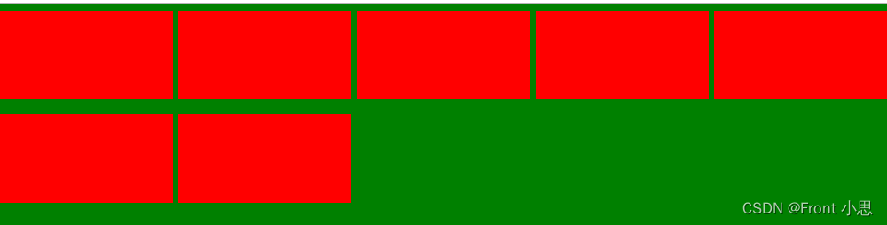
但使用justify-content:space-between属性之后,如果不是对应的整数的话,就会有对应的在中间空缺的状态,如图中,一类排五个,但是一个只有七个,第一列排满,剩下两个应该是回头下来从左边排起,但是剩下的两个占满一列并且想两边对齐了!!!
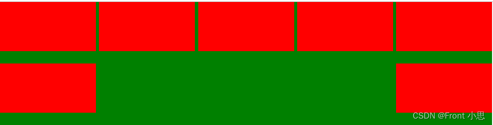
解决方案:写占位来填充:
<div class="content"> <div class="box"></div> <div class="box"></div> <div class="box"></div> <div class="box"></div> <div class="box"></div> <div class="box"></div> <div class="box"></div> <!-- 一行需要几个元素就写几个下面的标签 --> <div class="box" style="visibility: hidden;height: 0;margin: 0;"></div> <div class="box" style="visibility: hidden;height: 0;margin: 0;"></div> <div class="box" style="visibility: hidden;height: 0;margin: 0;"></div> <div class="box" style="visibility: hidden;height: 0;margin: 0;"></div> <div class="box" style="visibility: hidden;height: 0;margin: 0;"></div> </div> .content{ width: 1000px; height: 250px; background-color: green; display: flex; justify-content: space-between; flex-wrap: wrap; align-items: center;}.content .box { width: 195px; height: 100px; background-color: red;}最终效果: