【HarmonyOS】【ARKUI】鸿蒙 ets方式tabs+tabcontent 实现底部导航栏
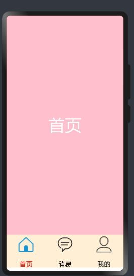
在鸿蒙开发中tab切换功能(如下图所示)是非常常见一个功能,今天描述如下功能怎么实现?开发中需要准备哪些资料?
今天我们从“资料准备”,“Tabs功能实现”,“底部按钮功能实现”,“运行效果”四个方面进行描述
1. 开发准备
1.1资料准备 想要实现如上图功能的话,需要学习“Tabs”,“TabContent”,“ Row”,“Column”,等等相关技术
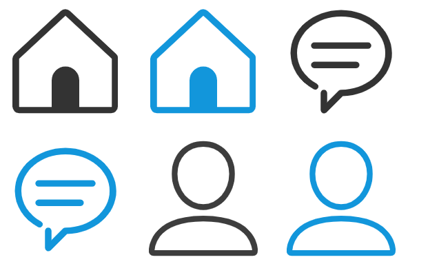
1.2 图片准备 准备六张图片(图片如下)放在resources/base/media/目录下
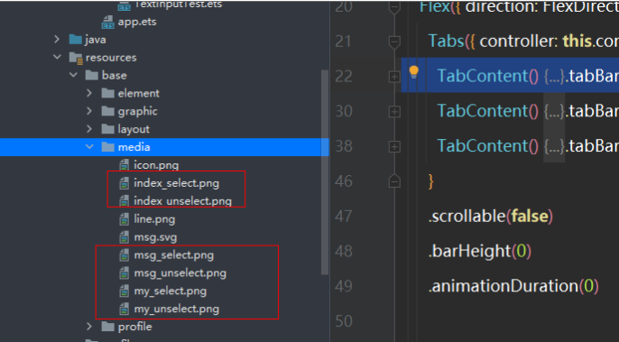
图片存放的位置
2. Tabs功能实现
2.1详细资料参考“Tabs”,“TabContent”的官方文档
代码如下
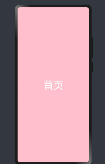
@Entry@Componentstruct MyNewsIndex { private controller: TabsController = new TabsController() build() { Flex({ direction: FlexDirection.Column, alignItems: ItemAlign.Center, justifyContent: FlexAlign.Center }) { Tabs({ controller: this.controller }) { TabContent() { Text("首页") .width('100%').height('100%') .fontSize(50) .textAlign(TextAlign.Center) .fontColor(Color.White) .backgroundColor(Color.Pink) }.tabBar('首页') TabContent() { Text("消息") .width('100%').height('100%') .fontSize(50) .textAlign(TextAlign.Center) .fontColor(Color.White) .backgroundColor(Color.Blue) }.tabBar('消息') TabContent() { Text("我的") .width('100%').height('100%') .fontSize(50) .textAlign(TextAlign.Center) .fontColor(Color.White) .backgroundColor(Color.Red) }.tabBar('我的') } .scrollable(false) .barHeight(0) .animationDuration(0) }.alignItems(VerticalAlign.Bottom).width('100%').height(120).margin({top:0,right:0,bottom:10,left:0}) } .width('100%') .height('100%') }}效果如下
3底部按钮功能实现
3.1底部功能实现主要使用“Row”,“Column”,“Text”,“Image”等相关技术实现,代码如下
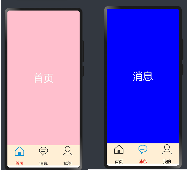
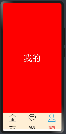
Row() { Column(){ Image($r('app.media.index_select')) .width(60).height(60) Text('首页') .size({ width: '100%', height: 60 }).textAlign(TextAlign.Center) .fontSize(20) .fontColor(Color.Red) } .layoutWeight(1) .backgroundColor(0xFFEFD5) .height("100%") Column(){ Image($r('app.media.msg_unselect')) .width(60).height(60) Text('消息') .size({ width: '100%', height: 60 }).textAlign(TextAlign.Center) .fontSize(20) .fontColor(Color.Black) } .layoutWeight(1) .backgroundColor(0xFFEFD5) .height("100%") Column(){ Image($r('app.media.my_unselect')) .width(60).height(60) Text('我的') .size({ width: '100%', height: 60 }).textAlign(TextAlign.Center) .fontSize(20) .fontColor(Color.Black) } .layoutWeight(1) .backgroundColor(0xFFEFD5) .height("100%") }.alignItems(VerticalAlign.Bottom).width('100%').height(120).margin({top:0,right:0,bottom:10,left:0})4运行效果
4.1 Tabs和按钮联动问题实现
我们在定义一个全局变量SelectPos为当前选择的索引,当点击按钮的时候对当前索引进行赋值,并对Image和字体颜色进行改变,全部代码如下
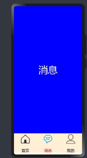
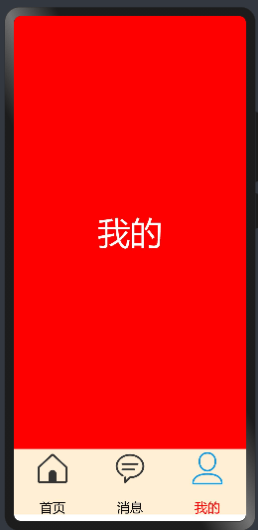
@Entry@Componentstruct MyNewsIndex { private controller: TabsController = new TabsController() @State SelectPos:number=0; public IndexClick(){ this.SelectPos=0; this.controller.changeIndex(0) } public messageClick(){ this.SelectPos=1; this.controller.changeIndex(1) } public myClick(){ this.SelectPos=2; this.controller.changeIndex(2) } build() { Flex({ direction: FlexDirection.Column, alignItems: ItemAlign.Center, justifyContent: FlexAlign.Center }) { Tabs({ controller: this.controller }) { TabContent() { Text("首页") .width('100%').height('100%') .fontSize(50) .textAlign(TextAlign.Center) .fontColor(Color.White) .backgroundColor(Color.Pink) }.tabBar('首页') TabContent() { Text("消息") .width('100%').height('100%') .fontSize(50) .textAlign(TextAlign.Center) .fontColor(Color.White) .backgroundColor(Color.Blue) }.tabBar('消息') TabContent() { Text("我的") .width('100%').height('100%') .fontSize(50) .textAlign(TextAlign.Center) .fontColor(Color.White) .backgroundColor(Color.Red) }.tabBar('我的') } .scrollable(false) .barHeight(0) .animationDuration(0) Row() { Column(){ Image((this.SelectPos==0?$r('app.media.index_select'):$r('app.media.index_unselect'))) .width(60).height(60) Text('首页') .size({ width: '100%', height: 60 }).textAlign(TextAlign.Center) .fontSize(20) .fontColor((this.SelectPos==0?Color.Red:Color.Black)) } .layoutWeight(1) .backgroundColor(0xFFEFD5) .height("100%") .onClick(this.IndexClick.bind(this)) Column(){ Image((this.SelectPos==1?$r('app.media.msg_select'):$r('app.media.msg_unselect'))) .width(60).height(60) Text('消息') .size({ width: '100%', height: 60 }).textAlign(TextAlign.Center) .fontSize(20) .fontColor((this.SelectPos==1?Color.Red:Color.Black)) } .layoutWeight(1) .backgroundColor(0xFFEFD5) .height("100%") .onClick(this.messageClick.bind(this)) Column(){ Image((this.SelectPos==2?$r('app.media.my_select'):$r('app.media.my_unselect'))) .width(60).height(60) Text('我的') .size({ width: '100%', height: 60 }).textAlign(TextAlign.Center) .fontSize(20) .fontColor((this.SelectPos==2?Color.Red:Color.Black)) } .layoutWeight(1) .backgroundColor(0xFFEFD5) .height("100%") .onClick(this.myClick.bind(this)) }.alignItems(VerticalAlign.Bottom).width('100%').height(120).margin({top:0,right:0,bottom:10,left:0}) } .width('100%') .height('100%') }}运行效果如下
更多相关学习资料:
https://developer.huawei.com/consumer/cn/forum/topic/0201787474595650145?fid=0102683795438680754?ha_source=zzh
 暑期编程PK赛
  得CSDN机械键盘等精美礼品!K6漫画书在线商城

