自定义HarmonyOS启动页组件
启动页作为应用程序首次出现的页面,该页面提供一些预加载数据的提前获取,防止应用程序出现白屏等异常,如是否第一次访问应用程序并开启应用欢迎页;判断用户登录信息进行页面跳转;消息信息懒加载等。
常见启动页参数如下表所示:
|
属性 |
类型 |
描述 |
必填 |
|
timer |
number |
倒计时时长,默认3秒 |
Y |
|
isLogo |
boolean |
显示图片类型。 false:常规图,默认; true:logo图 |
N |
|
backgroundImg |
ResourceStr |
显示图片地址 |
N |
|
companyName |
string |
企业名称 |
N |
|
mfontColor |
ResourceColor |
企业名称字体颜色 |
N |
常见启动页方法如下表所示:
|
方法 |
类型 |
描述 |
必填 |
|
skip |
void |
跳转方法 |
Y |
封装启动页参数类代码如下所示:
export class Splash {
// 倒计时时长
timer: number;
// 显示Logo
isLogo?: boolean = false;
// 页面显示图片
backgroundImg?: ResourceStr;
// 企业名称
companyName?: string;
// 企业名称字体颜色
mFontColor?: ResourceColor;
constructor(timer: number, isLogo?: boolean, backgroundImg?: ResourceStr,
companyName?: string, mFontColor?: ResourceColor) {
this.timer = timer;
this.isLogo = isLogo;
this.backgroundImg = backgroundImg;
this.companyName = companyName;
this.mFontColor = mFontColor;
}
}
@Component
export struct SplashPage {
@State mSplash: Splash = new Splash(3);
// 跳转方法
skip: () => void;
build() {
// 底部企业名称显示堆叠组件
Stack({ alignContent: Alignment.Bottom }) {
// 图片和倒计时跳转页面堆叠组件
Stack({ alignContent: Alignment.TopEnd }) {
if (this.mSplash.isLogo) {
Image(this.mSplash.backgroundImg).objectFit(ImageFit.None)
}
Button(`跳过 | ${this.mSplash.timer} s`, { type: ButtonType.Normal })
.height(42)
.padding({ left: 16, right: 16 })
.margin({ top: 16, right: 16 })
.fontSize(16).fontColor(Color.White)
.backgroundColor(Color.Gray)
.borderRadius(8)
.onClick(() => {
this.skip();
})
}
.backgroundImage(this.mSplash.isLogo ? null : this.mSplash.backgroundImg)
.backgroundImageSize(this.mSplash.isLogo ? null : { width: '100%', height: '100%' })
.width('100%').height('100%')
if (this.mSplash.companyName) {
Text(this.mSplash.companyName)
.width('100%').height(54)
.fontColor(this.mSplash.mFontColor)
.fontSize(14).fontWeight(FontWeight.Bold)
.textAlign(TextAlign.Center)
}
}
.width('100%').height('100%')
}
aboutToAppear() {
// 倒计时处理
let skipWait = setInterval(() => {
this.mSplash.timer--;
if (this.mSplash.timer === 0) {
clearInterval(skipWait);
this.skip();
}
}, 1000)
}
}
自定义组件定义完成后,还需要在模块的index.ets中将组件导出,代码如下所示:
export { Splash, SplashPage } from './src/main/ets/components/splashpage/SplashPage';
在entry模块引入自定义模块teui,打开entry目录下的package.json并在dependencies依赖列中加入如下代码:
"@tetcl/teui": "file:../teui"
注:其中"@tetcl/teui"中"tetcl/teui"需要和自定义模块teui中package.json中name属性一致。若提交到npm中心仓可直接使用"@tetcl/teui": "版本号"方式引入。引入完成后需要执行编辑器上的Sync now或者npm install进行下载同步。
在具体的页面中导入自定义启动页组件代码如下所示:
import { Splash as SplashObj, SplashPage } from '@tetcl/teui'
import router from '@ohos.router';
注:为了和页面名称不冲突,对Splash作别名处理。
在页面中引入自定义组件SplashPage并填写相关属性值及跳转方法,代码如下所示:
@Entry
@Component
struct Splash {
// 跳转到Index页面
onSkip() {
router.replaceUrl({
url: 'pages/Index'
})
}
build() {
Row() {
SplashPage({ mSplash: new SplashObj(5, true, $r('app.media.icon'),
'xxxx有限公司', 0x666666), skip: this.onSkip})
// 常规图
// SplashPage({ mSplash: new SplashObj(5, false, $r('app.media.default_bg'),
// 'xxxx有限公司', 0xF5F5F5), skip: this.onSkip})
}
.height('100%')
}
}
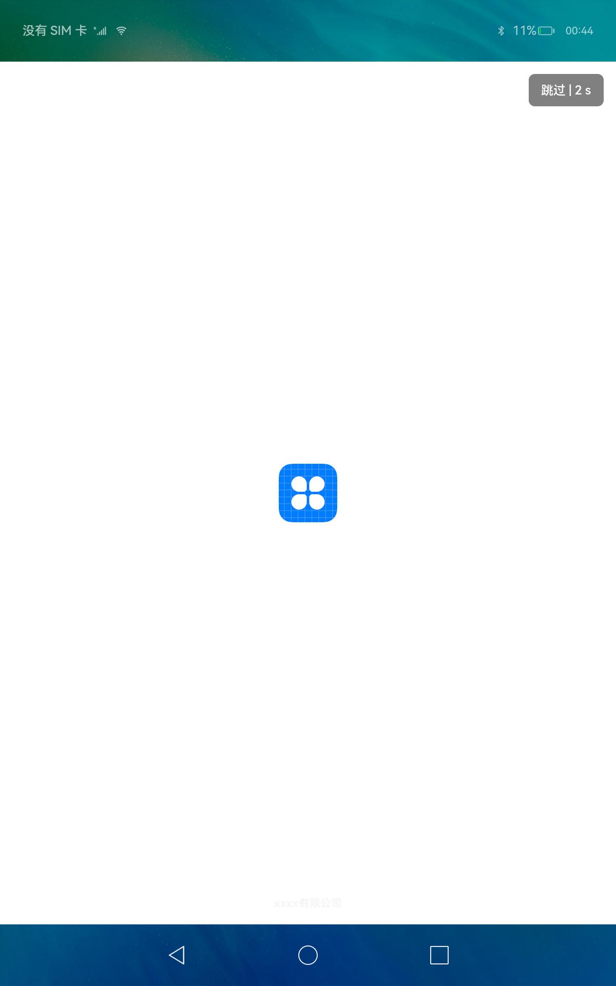
预览效果如下图所示:
自定义HarmonyOS启动页组件

