从零开始学前端:CSS元素模式的转换和CSS三大特性 --- 今天你学习了吗?(Day12)
从零开始学前端:程序猿小白也可以完全掌握!—今天你学习了吗?(Day12)
复习:从零开始学前端:复习课程 — 今天你学习了吗?(Day11)
文章目录
- 从零开始学前端:程序猿小白也可以完全掌握!—今天你学习了吗?(Day12)
前言
感觉太忙了,学习的时候有的基础以前了解过,就没那么认真,然后做题,练习,就疯狂打脸。。。

第十二节课:CSS元素模式的转换和CSS三大特性和伪元素
一、CSS元素模式的转换
1.元素显示模式
什么是元素的显示模式(分类)及其作用?
作用:
网页的标签非常多,在不同地方会用到不同类型的标签,了解他们的特点可以更好地布局我们的网页。
定义及分类:
定义:
元素显示模式就是元素(标签)以什么方式进行显示。
分类:
根据标签的类型一共可以分为三大类:
块元素和行内元素还有行内块元素三种类型。
2.块元素
常见的块元素有
~
、
、<div>、
、
、
等,其中
标签是最典型的块元素。
块级元素的特点:
- 自己独占一行。
- 高度、宽度、外边距以及内边距都可以控制。
- 宽度默认是容器(父级宽度)的100%。
注意:
- 文字类的元素内不能使用块级元素
标签主要用于存放文字,因此
里面不能放块级元素,特别是不能放
- 同理,
~
3.行内元素
常见的行内元素有
其中
行内元素的特点:
- 相邻行内元素在一行上,一行可以显示多个。
- 高、宽直接设置是无效的。
- 默认宽度就是它本身内容的宽度。
- 行内元素只能容纳文本或其他行内元素。
注意:
4.行内块元素
在行内元素中有几个特殊的标签------![]()
,他们同时具有会计与射弩和行内元素的特点。我们称他们为行内块元素。
行内块元素的特点:
- 和相邻行内元素(行内块)在一行上,但是他们之间会有空白缝隙。一行可以显示多个(行内元素特点)。
- 默认宽度就是它本身内容的宽度(行内元素特点)。
- 高度、行高、外边距以及内边距都可以控制(块级元素特点)
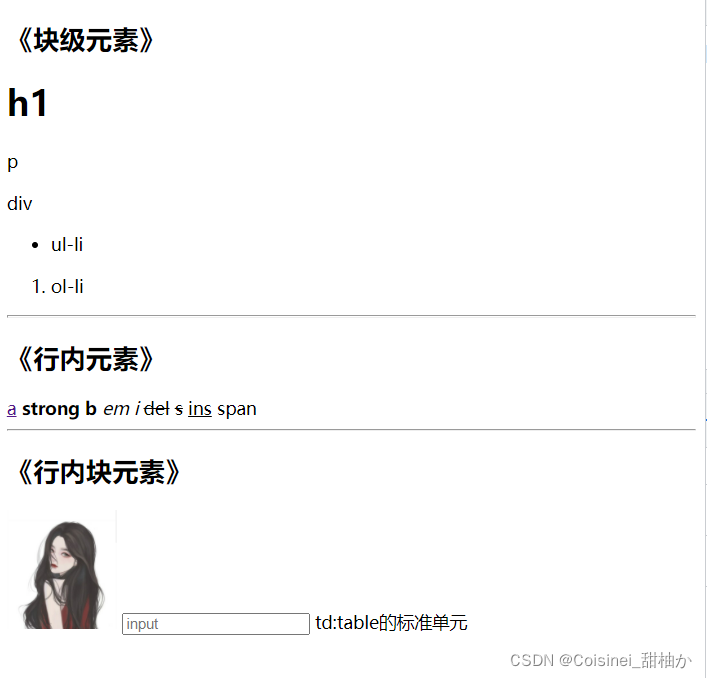
实例:
<body> <div> <h2>《块级元素》</h2> <div> <h1>h1</h1> <p>p</p> <div>div</div> <ul><li>ul-li</li></ul> <ol><li>ol-li</li></ol> </div> </div> <hr> <div> <h2>《行内元素》</h2> <div> <a href="">a</a> <strong>strong</strong> <b>b</b> <em>em</em> <i>i</i> <del>del</del> <s>s</s> <ins>ins</ins> <span>span</span> </div> </div> <hr> <div> <h2>《行内块元素》</h2> <div> <img src="../../../img素材/回眸.jpg" alt="" style="width: 100px;"> <input type="text" placeholder="input"> <td>td:table的标准单元</td> </div> </div></body>
效果图:
5.元素显示模式的转化
在特殊情况下,我们需要元素模式的转换,简单理解一个模式的元素需要另一种模式的特性,比如当我们想要增加
- 转换为块元素:display:block;(*)
- 转换为行内元素:display:inline;
- 转换为行内块元素:display:inline-block;(*)
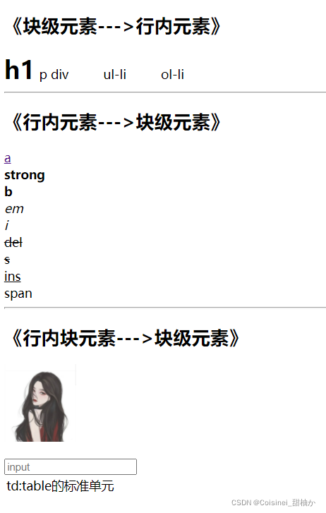
实例:
<head> <meta charset="UTF-8"> <meta http-equiv="X-UA-Compatible" content="IE=edge"> <meta name="viewport" content="width=device-width, initial-scale=1.0"> <title>CSS元素模式的转换和CSS三大特性和伪元素</title></head><body> <div> <h2>《块级元素--->行内元素》</h2> <div> <h1 style="display: inline;">h1</h1> <p style="display: inline;">p</p> <div style="display: inline;">div</div> <ul style="display: inline;"><li style="display: inline;">ul-li</li></ul> <ol style="display: inline;"><li style="display: inline;">ol-li</li></ol> </div> </div> <hr> <div> <h2>《行内元素--->块级元素》</h2> <div> <a href="" style="display: block;">a</a> <strong style="display: block;">strong</strong> <b style="display: block;">b</b> <em style="display: block;">em</em> <i style="display: block;">i</i> <del style="display: block;">del</del> <s style="display: block;">s</s> <ins style="display: block;">ins</ins> <span style="display: block;">span</span> </div> </div> <hr> <div> <h2>《行内块元素--->块级元素》</h2> <div> <img src="../../../img素材/回眸.jpg" alt="" style="display: block;height: 100px;"> <br> <input type="text" placeholder="input" style="display: block;"> <table> <tr> <td style="display: block;">td:table的标准单元</td> </tr> </table> </div> </div></body>
效果图:
转换完之后最明显的效果就是是否只能在一行显示。
二、CSS三大特性
CSS三大特性:层叠性、继承性、优先级
1. 层叠性
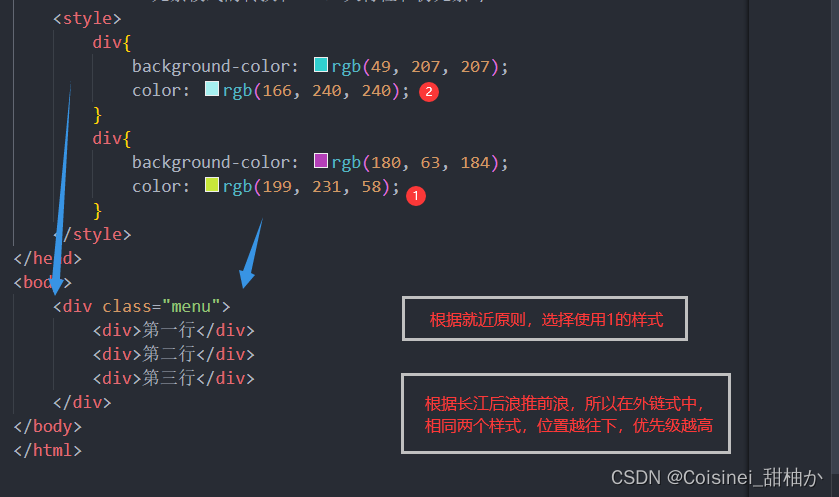
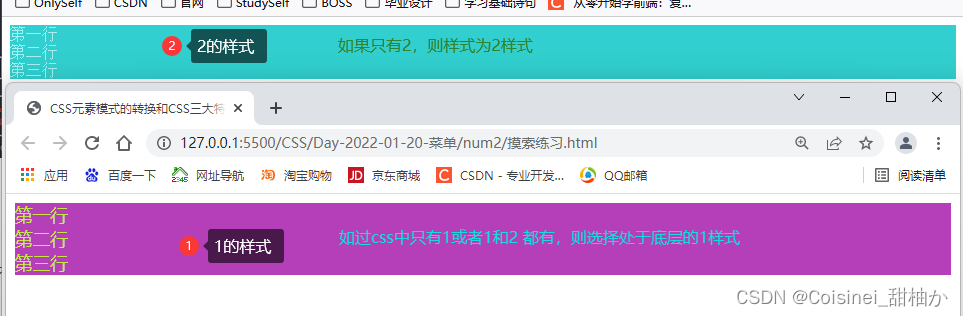
相同选择器给设置相同的样式,此时一个样式就会覆盖(层叠)另一个冲突的样式,层叠性主要解决样式冲突问题。
层叠性原则:
- 样式冲突,遵循的原则是就近原则,那个样式离结构近,就执行哪个样式
- 不冲突,不会层叠
- 长江后浪推前浪,后面的样式会覆盖前面的样式
例子:
html文件:
<html lang="en"><head> <meta charset="UTF-8"> <meta http-equiv="X-UA-Compatible" content="IE=edge"> <meta name="viewport" content="width=device-width, initial-scale=1.0"> <title>CSS元素模式的转换和CSS三大特性和伪元素</title> <style> div{ background-color: rgb(49, 207, 207); color: rgb(166, 240, 240); } div{ background-color: rgb(180, 63, 184); color: rgb(199, 231, 58); } </style></head><body> <div class="menu"> <div>第一行</div> <div>第二行</div> <div>第三行</div> </div></body></html>
效果图:
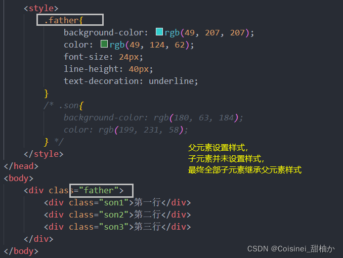
2.继承性
现实中的继承:我们继承了父亲的姓
CSS中的继承:子标签会继承父标签的某些样式,如文本颜色和字号。简单的理解就是子承父业。
- 恰当地使用继承可以简化代码,降低CSS样式的复杂性
- 子元素可以继承父元素的样式(text-、font-、line-这些元素开头的可以继承,以及color属性)
例子:
html文件:
<html lang="en"><head> <meta charset="UTF-8"> <meta http-equiv="X-UA-Compatible" content="IE=edge"> <meta name="viewport" content="width=device-width, initial-scale=1.0"> <title>CSS元素模式的转换和CSS三大特性和伪元素</title> <style> .father{ background-color: rgb(49, 207, 207); color: rgb(49, 124, 62); font-size: 24px; line-height: 40px; text-decoration: underline; } /* .son{ background-color: rgb(180, 63, 184); color: rgb(199, 231, 58); } */ </style></head><body> <div class="father"> <div class="son1">第一行</div> <div class="son2">第二行</div> <div class="son3">第三行</div> </div></body></html>
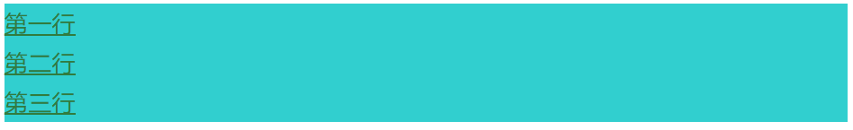
效果图:
3.优先级
当同一个元素指定多个选择器,就会有优先级的产生。
- 选择器相同,则执行层叠性
- 选择器不同,则根据选择器权重执行
选择器
选择器权重
集成/*
(0,0,0,0)----0
标签选择器
(0,0,0,1)----1
类选择器/伪元素选择器
(0,0,1,0)----10
ID选择器
(0,1,0,0)----100
行内样式
(1,0,0,0)----1000
!important重要的(color:red!important)
无穷大
注意:
- 权重是有4组数字组成,但是不会有进位。
- 可以理解为类选择器永远大于元素选择器,id选择器永远大于类选择器,以此类推。
- 等级判断从左向右,如果某一位数值相同,则判断下一位数值。
- 可以简单记忆法:通配符和继承权重为0,标签选择器为1,类(伪类)选择器为10,id选择器为100,行内样式为1000,!important无穷大。
- 继承的没有权重,如果该元素没有直接选中,不管父元素权重多高,子元素得到的权重都是0。
- 权重叠加:如果是复合选择器,则会有权重叠加,需要计算权重。(权重虽然有叠加但是不会进位)
例子:
html文件:
<html lang="en"><head> <meta charset="UTF-8"> <meta http-equiv="X-UA-Compatible" content="IE=edge"> <meta name="viewport" content="width=device-width, initial-scale=1.0"> <title>CSS元素模式的转换和CSS三大特性和伪元素</title> <style> .father{ background-color: pink; } /* son1 */ /* 标签选择器 */ a{ color: red; } /* 类选择器 */ .son1{ color: rosybrown; } /* id选择器 */ #one{ color: royalblue; } /* son2 */ /* 标签选择器 */ div:first-child{ color: red; } /* 类选择器 */ .son2{ color: rosybrown; } /* id选择器 */ #two{ color: royalblue; } /* son3 */ /* 标签选择器 */ div:second-child{ color: red; } /* 类选择器 */ .son3{ color: rosybrown; } </style></head><body> <div class="father"> <a class="son1" id="one" style="color: rgb(84, 173, 62);">第一行</a> <div class="son2" id="two">第二行</div> <div class="son3" id="three">第三行</div> </div></body></html>
效果图:
 三、练习
三、练习
 代码:
代码:
HTML:
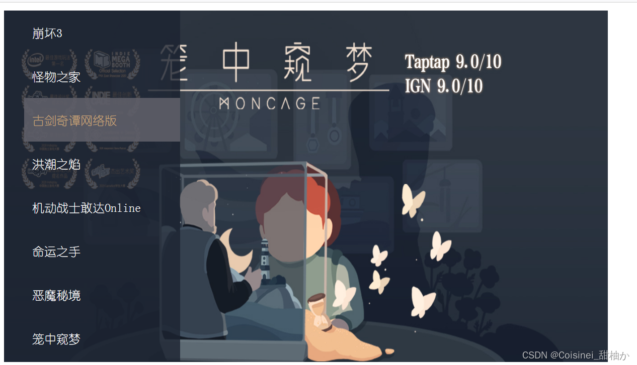
<html lang="en"><head> <meta charset="UTF-8"> <meta http-equiv="X-UA-Compatible" content="IE=edge"> <meta name="viewport" content="width=device-width, initial-scale=1.0"> <title>菜单</title> <link rel="stylesheet" href="./css/菜单.css"></head><body> <div> <!--
--> <div class="head"> <div class="back"> <ul> <li><a href="http://">崩坏3</a></li> <li><a href="http://">怪物之家</a></li> <li><a href="http://">古剑奇谭网络版</a></li> <li><a href="http://">洪潮之焰</a></li> <li><a href="http://">机动战士敢达Online</a></li> <li><a href="http://">命运之手</a></li> <li><a href="http://">恶魔秘境</a></li> <li><a href="http://">笼中窥梦</a></li> </ul> </div> </div> <!--
--> </div></body></html>
CSS:
/* .head1{ height: 500px; width: 800px; background-image: url(../../../../img素材/康娜元气波.jpg); background-size: cover;} */.head{ height: 700px ; background-image: url(../img/8work.jpg); background-size: 1200px 700px; background-repeat: no-repeat;}.head .back{ width: 350px; height: 700px ; background-color: rgba(27,35,49,0.8);}.head .back ul{ list-style-type: none; height: 700px;}li{ text-indent: 1em;}li>a{ display: block; font-family:"幼圆"; font-size: 24px; line-height: 87px; text-decoration: none; color: white;}li>a:hover{ color: rgb(203,165,118); background-color: rgba(94,94,104, 0.9);}.foot a{ height: 500px; width: 500px; display: block; background-image: url(../img/im1.jpg); background-size: 500px 500px; background-repeat: no-repeat;}div>a:link:hover{ height: 500px; width: 500px; display: block; background-image: url(../img/girl.jpg); background-size: 500px 500px; background-repeat: no-repeat;}
预习:从零开始学前端:伪元素和盒子模型 — 今天你学习了吗?(Day13)
------不经历风雨,怎能见彩虹。
标签是最典型的块元素。
块级元素的特点:
- 自己独占一行。
- 高度、宽度、外边距以及内边距都可以控制。
- 宽度默认是容器(父级宽度)的100%。
注意:
- 文字类的元素内不能使用块级元素
- 同理,
~
3.行内元素
常见的行内元素有
、、、、、、等。
其中标签是最典型的行内元素。有的地方也将行内元素称为内联元素。行内元素的特点:
- 相邻行内元素在一行上,一行可以显示多个。
- 高、宽直接设置是无效的。
- 默认宽度就是它本身内容的宽度。
- 行内元素只能容纳文本或其他行内元素。
注意:
4.行内块元素
在行内元素中有几个特殊的标签------
、,他们同时具有会计与射弩和行内元素的特点。我们称他们为行内块元素。 行内块元素的特点:
- 和相邻行内元素(行内块)在一行上,但是他们之间会有空白缝隙。一行可以显示多个(行内元素特点)。
- 默认宽度就是它本身内容的宽度(行内元素特点)。
- 高度、行高、外边距以及内边距都可以控制(块级元素特点)
实例:
<body> <div> <h2>《块级元素》</h2> <div> <h1>h1</h1> <p>p</p> <div>div</div> <ul><li>ul-li</li></ul> <ol><li>ol-li</li></ol> </div> </div> <hr> <div> <h2>《行内元素》</h2> <div> <a href="">a</a> <strong>strong</strong> <b>b</b> <em>em</em> <i>i</i> <del>del</del> <s>s</s> <ins>ins</ins> <span>span</span> </div> </div> <hr> <div> <h2>《行内块元素》</h2> <div> <img src="../../../img素材/回眸.jpg" alt="" style="width: 100px;"> <input type="text" placeholder="input"> <td>td:table的标准单元</td> </div> </div></body>效果图:
5.元素显示模式的转化
在特殊情况下,我们需要元素模式的转换,简单理解一个模式的元素需要另一种模式的特性,比如当我们想要增加
链接的触动范围。那么这个是时候就需要元素显示模式转换了。- 转换为块元素:display:block;(*)
- 转换为行内元素:display:inline;
- 转换为行内块元素:display:inline-block;(*)
实例:
<head> <meta charset="UTF-8"> <meta http-equiv="X-UA-Compatible" content="IE=edge"> <meta name="viewport" content="width=device-width, initial-scale=1.0"> <title>CSS元素模式的转换和CSS三大特性和伪元素</title></head><body> <div> <h2>《块级元素--->行内元素》</h2> <div> <h1 style="display: inline;">h1</h1> <p style="display: inline;">p</p> <div style="display: inline;">div</div> <ul style="display: inline;"><li style="display: inline;">ul-li</li></ul> <ol style="display: inline;"><li style="display: inline;">ol-li</li></ol> </div> </div> <hr> <div> <h2>《行内元素--->块级元素》</h2> <div> <a href="" style="display: block;">a</a> <strong style="display: block;">strong</strong> <b style="display: block;">b</b> <em style="display: block;">em</em> <i style="display: block;">i</i> <del style="display: block;">del</del> <s style="display: block;">s</s> <ins style="display: block;">ins</ins> <span style="display: block;">span</span> </div> </div> <hr> <div> <h2>《行内块元素--->块级元素》</h2> <div> <img src="../../../img素材/回眸.jpg" alt="" style="display: block;height: 100px;"> <br> <input type="text" placeholder="input" style="display: block;"> <table> <tr> <td style="display: block;">td:table的标准单元</td> </tr> </table> </div> </div></body>效果图:
转换完之后最明显的效果就是是否只能在一行显示。二、CSS三大特性
CSS三大特性:
层叠性、继承性、优先级1. 层叠性
相同选择器给设置相同的样式,此时一个样式就会覆盖(层叠)另一个冲突的样式,层叠性主要解决样式冲突问题。
层叠性原则:
- 样式冲突,遵循的原则是就近原则,那个样式离结构近,就执行哪个样式
- 不冲突,不会层叠
- 长江后浪推前浪,后面的样式会覆盖前面的样式
例子:
html文件:<html lang="en"><head> <meta charset="UTF-8"> <meta http-equiv="X-UA-Compatible" content="IE=edge"> <meta name="viewport" content="width=device-width, initial-scale=1.0"> <title>CSS元素模式的转换和CSS三大特性和伪元素</title> <style> div{ background-color: rgb(49, 207, 207); color: rgb(166, 240, 240); } div{ background-color: rgb(180, 63, 184); color: rgb(199, 231, 58); } </style></head><body> <div class="menu"> <div>第一行</div> <div>第二行</div> <div>第三行</div> </div></body></html>效果图:
2.继承性
现实中的继承:我们继承了父亲的姓
CSS中的继承:子标签会继承父标签的某些样式,如文本颜色和字号。简单的理解就是子承父业。- 恰当地使用继承可以简化代码,降低CSS样式的复杂性
- 子元素可以继承父元素的样式(text-、font-、line-这些元素开头的可以继承,以及color属性)
例子:
html文件:<html lang="en"><head> <meta charset="UTF-8"> <meta http-equiv="X-UA-Compatible" content="IE=edge"> <meta name="viewport" content="width=device-width, initial-scale=1.0"> <title>CSS元素模式的转换和CSS三大特性和伪元素</title> <style> .father{ background-color: rgb(49, 207, 207); color: rgb(49, 124, 62); font-size: 24px; line-height: 40px; text-decoration: underline; } /* .son{ background-color: rgb(180, 63, 184); color: rgb(199, 231, 58); } */ </style></head><body> <div class="father"> <div class="son1">第一行</div> <div class="son2">第二行</div> <div class="son3">第三行</div> </div></body></html>效果图:
3.优先级
当同一个元素指定多个选择器,就会有优先级的产生。
- 选择器相同,则执行层叠性
- 选择器不同,则根据选择器权重执行
选择器 选择器权重 集成/* (0,0,0,0)----0 标签选择器 (0,0,0,1)----1 类选择器/伪元素选择器 (0,0,1,0)----10 ID选择器 (0,1,0,0)----100 行内样式 (1,0,0,0)----1000 !important重要的(color:red!important) 无穷大 注意:
- 权重是有4组数字组成,但是不会有进位。
- 可以理解为类选择器永远大于元素选择器,id选择器永远大于类选择器,以此类推。
- 等级判断从左向右,如果某一位数值相同,则判断下一位数值。
- 可以简单记忆法:通配符和继承权重为0,标签选择器为1,类(伪类)选择器为10,id选择器为100,行内样式为1000,!important无穷大。
- 继承的没有权重,如果该元素没有直接选中,不管父元素权重多高,子元素得到的权重都是0。
- 权重叠加:如果是复合选择器,则会有权重叠加,需要计算权重。(权重虽然有叠加但是不会进位)
例子:
html文件:<html lang="en"><head> <meta charset="UTF-8"> <meta http-equiv="X-UA-Compatible" content="IE=edge"> <meta name="viewport" content="width=device-width, initial-scale=1.0"> <title>CSS元素模式的转换和CSS三大特性和伪元素</title> <style> .father{ background-color: pink; } /* son1 */ /* 标签选择器 */ a{ color: red; } /* 类选择器 */ .son1{ color: rosybrown; } /* id选择器 */ #one{ color: royalblue; } /* son2 */ /* 标签选择器 */ div:first-child{ color: red; } /* 类选择器 */ .son2{ color: rosybrown; } /* id选择器 */ #two{ color: royalblue; } /* son3 */ /* 标签选择器 */ div:second-child{ color: red; } /* 类选择器 */ .son3{ color: rosybrown; } </style></head><body> <div class="father"> <a class="son1" id="one" style="color: rgb(84, 173, 62);">第一行</a> <div class="son2" id="two">第二行</div> <div class="son3" id="three">第三行</div> </div></body></html>效果图:
三、练习
代码:HTML:
<html lang="en"><head> <meta charset="UTF-8"> <meta http-equiv="X-UA-Compatible" content="IE=edge"> <meta name="viewport" content="width=device-width, initial-scale=1.0"> <title>菜单</title> <link rel="stylesheet" href="./css/菜单.css"></head><body> <div> <!--
--> <div class="head"> <div class="back"> <ul> <li><a href="http://">崩坏3</a></li> <li><a href="http://">怪物之家</a></li> <li><a href="http://">古剑奇谭网络版</a></li> <li><a href="http://">洪潮之焰</a></li> <li><a href="http://">机动战士敢达Online</a></li> <li><a href="http://">命运之手</a></li> <li><a href="http://">恶魔秘境</a></li> <li><a href="http://">笼中窥梦</a></li> </ul> </div> </div> <!--
--> </div></body></html>CSS:
/* .head1{ height: 500px; width: 800px; background-image: url(../../../../img素材/康娜元气波.jpg); background-size: cover;} */.head{ height: 700px ; background-image: url(../img/8work.jpg); background-size: 1200px 700px; background-repeat: no-repeat;}.head .back{ width: 350px; height: 700px ; background-color: rgba(27,35,49,0.8);}.head .back ul{ list-style-type: none; height: 700px;}li{ text-indent: 1em;}li>a{ display: block; font-family:"幼圆"; font-size: 24px; line-height: 87px; text-decoration: none; color: white;}li>a:hover{ color: rgb(203,165,118); background-color: rgba(94,94,104, 0.9);}.foot a{ height: 500px; width: 500px; display: block; background-image: url(../img/im1.jpg); background-size: 500px 500px; background-repeat: no-repeat;}div>a:link:hover{ height: 500px; width: 500px; display: block; background-image: url(../img/girl.jpg); background-size: 500px 500px; background-repeat: no-repeat;}预习:从零开始学前端:伪元素和盒子模型 — 今天你学习了吗?(Day13)
------不经历风雨,怎能见彩虹。
- 同理,

