< 可视化图表技巧:实现发光(荧光)折线图 >
文章目录
- 👉 效果图
- 👉 实现代码
- 👉 下载资源
- 往期内容 💨
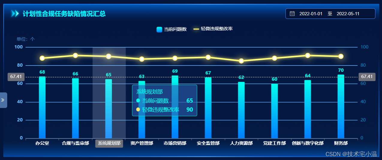
👉 效果图
深色主题效果
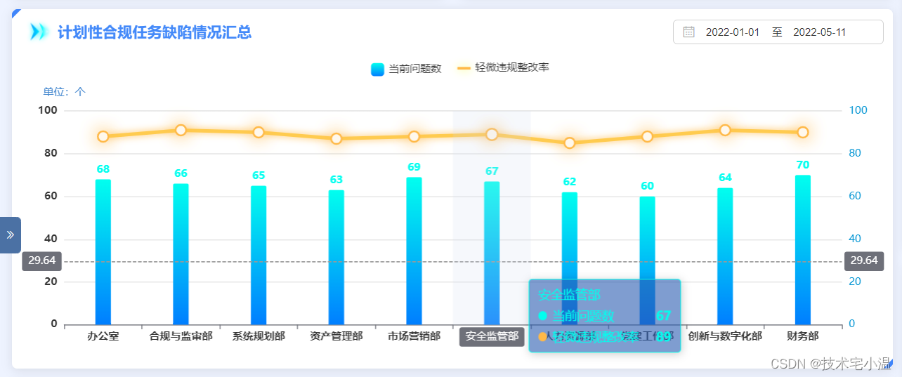
 浅色主题
浅色主题
👉 实现代码
let option = {// 鼠标悬浮弹窗样式tooltip: { trigger: 'axis', backgroundColor: 'rgba(42, 92, 176, .6)', borderColor: "rgba(0, 255, 239, 1.0)", textStyle: { color: '#00FFEF' }, axisPointer: { type: 'cross', }},grid: { top: '20%', bottom: '10%', left: '5%', right: '5%',},// 图例设置,由于两个不一样,设置属性差距大,故将其配置属性分开legend: [ { data: [ { name: '当前问题数' } ], textStyle: { color: "rgba(198, 198, 198, 1.0)" }, itemWidth: 15, // 矩形宽度 itemHeight: 15, // 矩形高度 top: '10px', left: '40%', }, { data: [ { name: '轻微违规整改率', icon: 'roundRect', // 用矩形替换 itemStyle: { shadowColor: "#f5fd5c", shadowOffsetX: 0, shadowOffsetY: 0, opacity: 1, shadowBlur: 10, type: "solid", width: 3 } } ], textStyle: { color: "rgba(198, 198, 198, 1.0)" }, itemWidth: 15, // 矩形宽度 itemHeight: 3, // 矩形高度 top: '10px', left: '50%', }],// 设置 X轴样式xAxis: [ { type: 'category', data: [ '办公室', '合规与监审部', '系统规划部', '资产管理部', '市场营销部', '安全监管部', '人力资源部', '党建工作部', '创新与数字化部', '财务部' ], axisPointer: { type: 'shadow' }, axisLabel: { color: '#fff', fontWeight: 'bold', interval:0,//使x轴横坐标全部显示 } }],// 设置 Y轴样式yAxis: [ { type: 'value', name: '单位:个', min: 0, max: 100, interval: 20, splitLine: { lineStyle: { color: "rgba(0, 102, 185, .8)" } }, axisLabel: { color: '#0094d3', formatter: '{value}' }, nameTextStyle: { color: "rgba(66, 134, 206, 1.0)" } }, { type: 'value', min: 0, max: 100, interval: 20, splitLine: { lineStyle: { color: "rgba(0, 102, 185, .8)" } }, axisLabel: { color: '#0094d3', formatter: '{value}' }, nameTextStyle: { color: "rgba(66, 134, 206, 1.0)" } }],series: [ { name: '当前问题数', type: 'bar', barWidth: "20%", // 设置柱状图样式 itemStyle: { normal: { label: { // formatter: "{b}"+"人", show: true, position: "top", textStyle: { fontWeight: "bolder", fontSize: "12", color: '#00FFEF' } }, barBorderRadius: [2, 2, 0, 0], color: new echarts.graphic.LinearGradient( 0, 0, 0, 1, [ {offset: 0, color: '#00FFEF'}, {offset: 1, color: '#007EFF'} ] ) } }, data:[68, 66, 65, 63, 69, 67, 62, 60, 64, 70], }, { name: '轻微违规整改率', type: 'line', showSymbol: true, // symbol: 'circle', // 折点设定为实心点 symbolSize: 12, // 设定实心点的大小 itemStyle: { color: '#fdea73', shadowColor: '#fdea73', shadowBlur: 20, }, lineStyle: { shadowColor: "#fdea73", shadowOffsetX: 0, shadowOffsetY: 0, opacity: 1, shadowBlur: 8, type: "solid", width: 3 }, yAxisIndex: 1, data: [88, 91, 90, 87, 88, 89, 85, 88, 91, 90], }]};Echarts实现代码如上,案例仅供参考,禁止转载。如有问题可私聊 或 评论,小温会给大伙一一解答,可能代码中存在一些问题,如发现,欢迎各位卷王们指正!🤪
👉 下载资源
点击跳转下载
往期内容 💨
🔥 < 性能提升 Get √ :如何理解 “ 回流 ” 与 “ 重绘 ” ?如何合理的减少其出现呢 ? >
🔥 < 今日份知识点:Javascript本地存储的方式有哪些?区别及应用场景? >
🔥 < 每日份知识快餐:axios是什么?如何在Vue中 封装 axios ? >
🔥 < 在Vue中 el-popover + el-tiptap 实现 富文本框输入,表格点击展示 (富文本HTML标签渲染) >
 创作打卡挑战赛
  赢取流量/现金/CSDN周边激励大奖音乐圈资讯