数据分析可视化利器 Matplotlib 和 Seaborn 常用可视化代码合集
1. Matplotlib 和 Seaborn简介与准备工作

Matplotlib 是数据科学领域最常用也是最基础的可视化工具,其最重要的特性之一就是具有良好的操作系统兼容性和图形显示底层接口兼容性(graphics backend)。Matplotlib 支持几十种图形显示接口与输出格式,这使得用户无论在哪种操作系统上都可以输出自己想要的图形格式。这种跨平台、面面俱到的特点已经成为 Matplotlib 最强大的功能之一,Matplotlib 也因此吸引了大量用户,进而形成了一个活跃的开发者团队,晋升为 Python 科学领域不可或缺的强大武器。
Matplotlib 绘制的图 Figure 主要包括 Figure、Axes、Axis 和 Artist 几个组件:
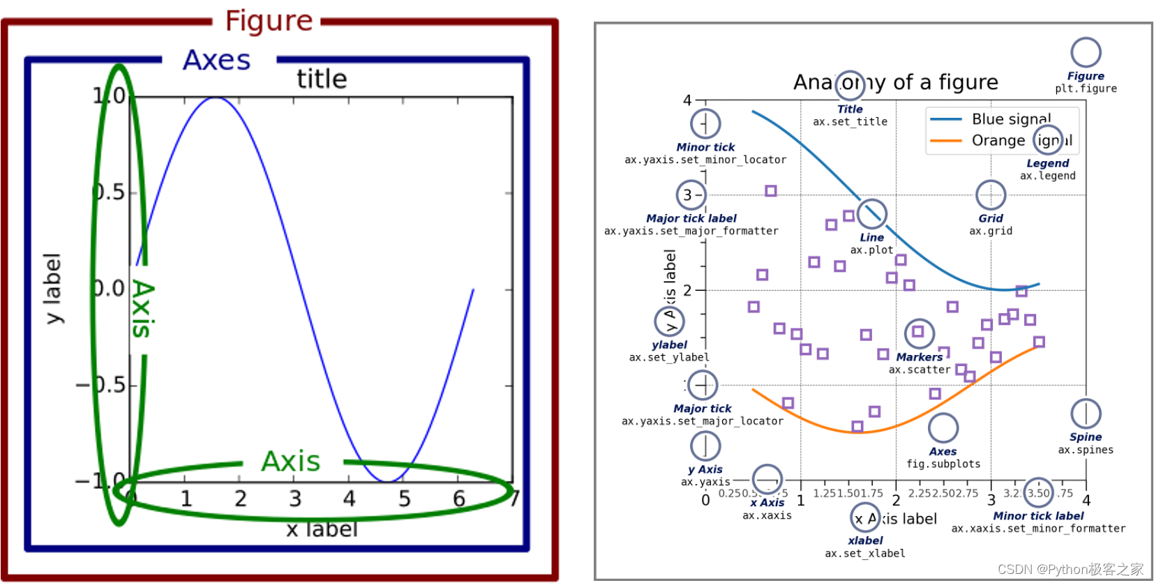
- Figure:指整个图形(包括所有的元素,比如标题、线等)
- Axes(坐标系):数据的绘图区域
- Axis(坐标轴):坐标系中的一条轴,包含大小限制、刻度和刻度标签
其中:
- 一个Figure(图)可以包含多个Axes(坐标系),但是一个Axes只能属于一个Figure。
- 一个Axes(坐标系)可以包含多个Axis(坐标轴),如2d坐标系,3d坐标系

Seaborn 是一个基于 matplotlib 且数据结构与pandas统一的统计图制作库。Seaborn框架旨在以数据可视化为中心,从统计分析层面来挖掘与理解数据。
(1)导入系统所需依赖包
import numpy as npimport pandas as pdimport matplotlib.pyplot as plt# 在 Notebook 中启动静态图形。%matplotlib inline在 Notebook 中画图时,有两种图形展现形式:
- %matplotlib notebook :启动交互式图形。
- %matplotlib inline :启动静态图形。
(2)解决中文与负号显示问题
Matplotlib显示中文时,需要设置系统所支持的中文字体,不同的电脑可能其中文字体不一样, 因此需要系统所支持的中文字体:
from matplotlib.font_manager import fontManagerimport osfonts = [font.name for font in fontManager.ttflistif os.path.exists(font.fname) and os.stat(font.fname).st_size>1e6]print(list(fonts))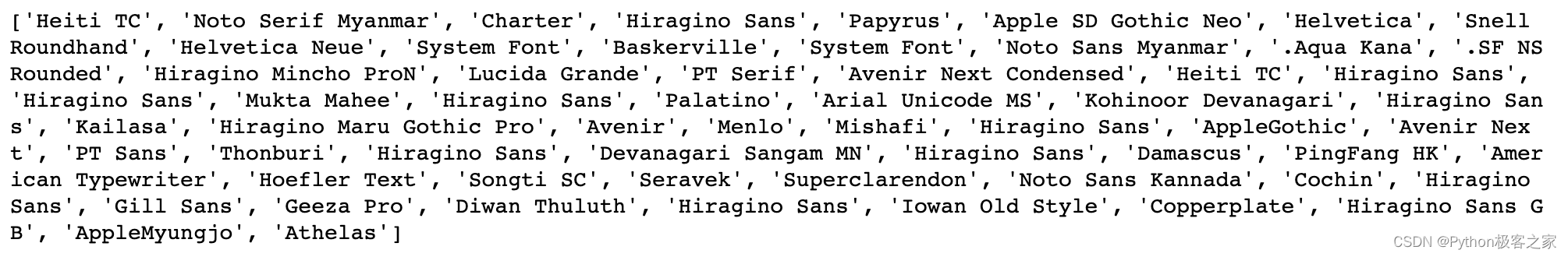
选择一种系统中文字体设置为 Matplotlib 字体,同时解决 unicode 符号乱码的问题:
# 显示中文,解决图中无法显示中文的问题plt.rcParams['font.sans-serif']=['Heiti TC']# 设置显示中文后,负号显示受影响。解决坐标轴上乱码问题plt.rcParams['axes.unicode_minus']=False(3)绘图总体风格设置
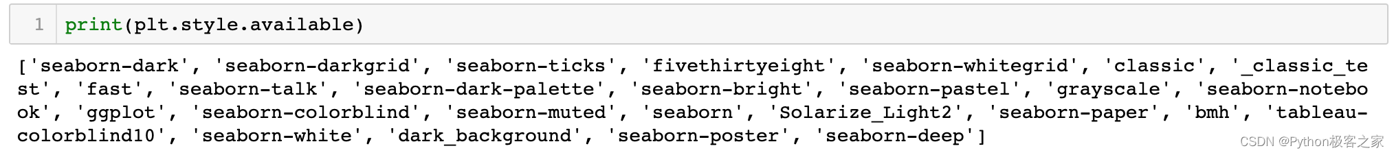
可通过 plt.style.available 命令可以看到所有可用的风格:
(4)一个简单完整的例子
# 创建一个 figure,并设置大小plt.figure(figsize=(8, 6), dpi=100)# 获取当前坐标系ax = plt.gca()# 设置将X轴的刻度值放在底部X轴上ax.xaxis.set_ticks_position('bottom')# 设置将Y轴的刻度值放在左侧y轴上ax.yaxis.set_ticks_position('left')# 设置右边坐标轴线的颜色(设置为none表示不显示)ax.spines['right'].set_color('none')# 设置顶部坐标轴线的颜色(设置为none表示不显示)ax.spines['top'].set_color('none')# 设置底部坐标轴线的位置(设置在y轴为0的位置)ax.spines['bottom'].set_position(('data', 0))# 设置左侧坐标轴线的位置(设置在x轴为0的位置)ax.spines['left'].set_position(('data', 0))x = np.linspace(0, 10, 1000)plt.plot(x, np.sin(x), color='r')plt.plot(x, x0.5)plt.title('数据可视化')plt.xlabel('X-Label')plt.ylabel('Y-Label', rotation=0)plt.xticks([0, 1, 2, 3, 4, 5, 6, 7, 8, 9, 10])plt.ylim(-2, 4)plt.legend(['$y = sin(x)$', '$y = \sqrt{x}$'])plt.text(7.2, 3.5, '这是图例')plt.scatter(3, np.sin(3), color='b')plt.annotate('x=3', (3, np.sin(3)), (4, np.sin(2)), arrowprops=dict(arrowstyle='- >', color='k'))plt.plot(x, np.cos(x))plt.savefig('s.jpg', dpi=500);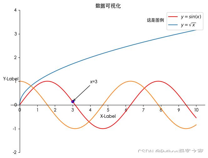
2. Matplotlib 常用可视化代码合集
2.1 折线图
x = np.linspace(0, 2, 100)plt.figure(figsize=(10, 4), dpi=100)plt.plot(x, x, label='linear')plt.plot(x, x2, label='quadratic') # etc.plt.plot(x, x3, label='cubic')plt.xlabel('x label') # 设置 X 轴标签plt.ylabel('y label') # 设置 Y 轴标签plt.title("Simple Plot") # 设置标题plt.legend() # 设置显示 legend.plt.show()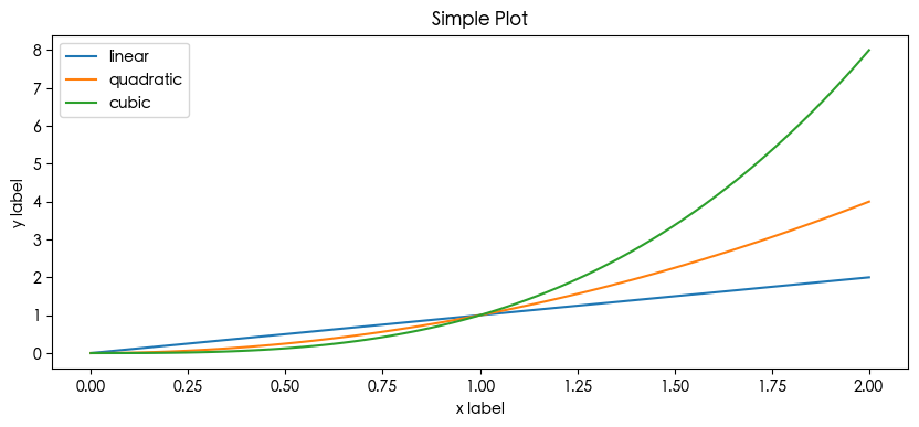
2.2 柱状图
labels = ['G1', 'G2', 'G3', 'G4', 'G5']men_means = [20, 34, 30, 35, 27]women_means = [25, 32, 34, 20, 25]x = np.arange(len(labels)) # the label locationswidth = 0.35 # the width of the barsfig, ax = plt.subplots(figsize=(8, 4), dpi=100)rects1 = ax.bar(x - width/2, men_means, width, label='Men')rects2 = ax.bar(x + width/2, women_means, width, label='Women')# Add some text for labels, title and custom x-axis tick labels, etc.ax.set_ylabel('Scores')ax.set_title('Scores by group and gender')ax.set_xticks(x, labels)ax.legend()ax.bar_label(rects1, padding=3)ax.bar_label(rects2, padding=3)fig.tight_layout()plt.show()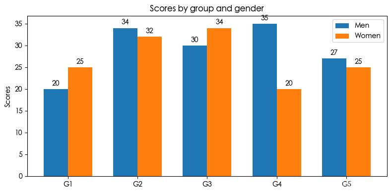
2.3 散点图
import numpy as npimport matplotlib.pyplot as pltimport matplotlib.cbook as cbook# 样例数据price_data = (cbook.get_sample_data('goog.npz', np_load=True)['price_data'].view(np.recarray))price_data = price_data[-250:]delta1 = np.diff(price_data.adj_close) / price_data.adj_close[:-1]# 散点的大小volume = (15 * price_data.volume[:-2] / price_data.volume[0])2close = 0.003 * price_data.close[:-2] / 0.003 * price_data.open[:-2]fig, ax = plt.subplots(figsize=(8, 4), dpi=100)ax.scatter(delta1[:-1], delta1[1:], c=close, s=volume, alpha=0.5)ax.set_xlabel(r'$\Delta_i$', fontsize=15)ax.set_ylabel(r'$\Delta_{i+1}$', fontsize=15)ax.set_title('Volume and percent change')ax.grid(True)fig.tight_layout()plt.show()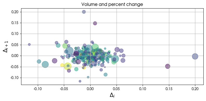
2.4 密度分布直方图
import numpy as npimport matplotlib.pyplot as pltmu, sigma = 100, 15x = mu + sigma * np.random.randn(10000)plt.figure(figsize=(8, 6), dpi=100)# the histogram of the datan, bins, patches = plt.hist(x, 50, density=True, facecolor='g', alpha=0.75)plt.xlabel('Smarts')plt.ylabel('Probability')plt.title('Histogram of IQ')plt.text(60, .025, r'$\mu=100,\ \sigma=15$')plt.xlim(40, 160)plt.ylim(0, 0.03)plt.grid(True)plt.show()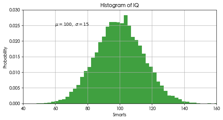
2.5 饼状图
import numpy as npimport matplotlib.pyplot as pltlabels = 'A', 'B', 'C', 'D'fracs = [15, 30, 45, 10]explode = [0, 0, 0.1, 0.1]colors = plt.get_cmap('Blues')(np.linspace(0.2, 0.7, len(x)))plt.pie(x=fracs, labels=labels, colors=colors, radius=3, autopct='%.0f%%', wedgeprops={"linewidth": 1, "edgecolor": "white"}, explode=explode, shadow=True) # autopct:显示百分比plt.show()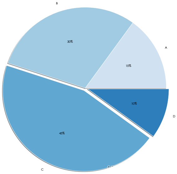
3. Seaborn 常用可视化代码合集
3.1 折线图 lineplot
plt.figure(figsize=(8, 4), dpi=100)sns.lineplot(data=fmri, x="timepoint", y="signal", hue="event")plt.title('lineplot title')plt.show()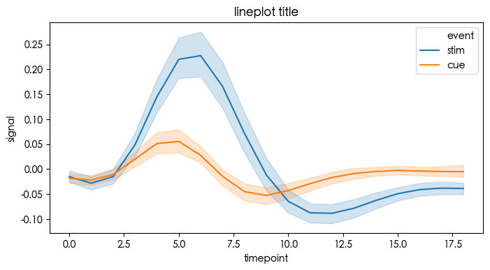
3.2 分类图 catplot
分类图表的接口,通过指定kind参数可以画出下面的八种图
Categorical scatterplots:
stripplot() (with
kind="strip"; the default)swarmplot() (with
kind="swarm")Categorical distribution plots:
boxplot() (with
kind="box")violinplot() (with
kind="violin")boxenplot() (with
kind="boxen")Categorical estimate plots:
pointplot() (with
kind="point")barplot() (with
kind="bar")countplot() (with
kind="count")
3.3 分类散点图
tips = sns.load_dataset("tips", data_home='seaborn-data')plt.figure(figsize=(8, 4), dpi=100)ax = sns.stripplot(x="day", y="total_bill", hue="smoker", data=tips, palette="Set2", dodge=True)plt.title('stripplot title')plt.legend()plt.show()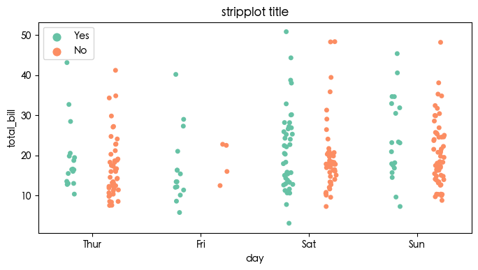
3.4 分布密度分类散点图 swarmplot
tips = sns.load_dataset("tips", data_home='seaborn-data')plt.figure(figsize=(8, 4), dpi=100)sns.swarmplot(x="day", y="total_bill", hue="smoker",data=tips, palette="Set2", dodge=True)plt.title('swarmplot title')plt.legend()plt.show()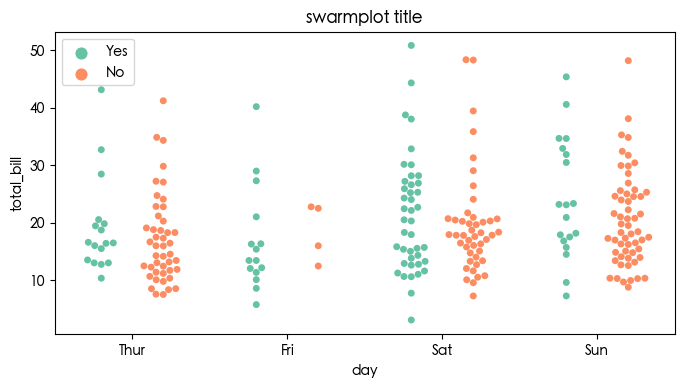
3.5 柱状图 barplot
tips = sns.load_dataset("tips", data_home='seaborn-data')plt.figure(figsize=(8, 4), dpi=100)sns.barplot(x="day", y="total_bill", hue="sex", data=tips)plt.title('barplot title')plt.legend()plt.show()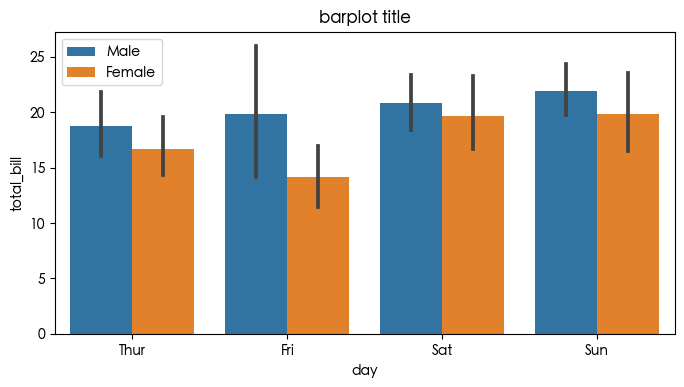
3.6 计数图 countplot
titanic = sns.load_dataset("titanic", data_home='seaborn-data')plt.figure(figsize=(8, 4), dpi=100)sns.countplot(x="class", hue="who", data=titanic)plt.title('countplot title')plt.legend()plt.show()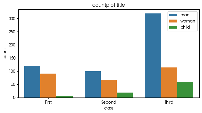
3.7 点图 pointplot
点图代表散点图位置的数值变量的中心趋势估计,并使用误差线提供关于该估计的置信区间。点图可能比条形图更有用于聚焦一个或多个分类变量的不同级别之间的比较。他们尤其善于表现交互作用:一个分类变量的层次之间的关系如何在第二个分类变量的层次之间变化。
titanic = sns.load_dataset("titanic", data_home='seaborn-data')plt.figure(figsize=(8, 4), dpi=100)sns.pointplot(x="class",y="survived",hue="sex",data=titanic,palette={"male":"g", "female":"m"},markers=["^","o"],linestyles=["-","--"])plt.title('pointplot title')plt.legend()plt.show()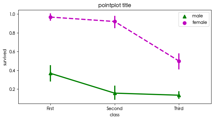
3.8 箱形图 boxplot
箱形图(Box-plot)又称为盒须图、盒式图或箱线图,是一种用作显示一组数据分散情况资料的统计图。它能显示出一组数据的最大值、最小值、中位数及上下四分位数。
titanic = sns.load_dataset("titanic", data_home='seaborn-data')plt.figure(figsize=(8, 4), dpi=100)sns.boxplot(x="alive", y="age", hue="adult_male", # hue 分类依据 data=titanic)plt.title('boxplot title')plt.legend()plt.show()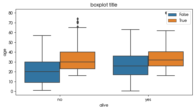
3.9 小提琴图violinplot
violinplot与boxplot扮演类似的角色,它显示了定量数据在一个(或多个)分类变量的多个层次上的分布,这些分布可以进行比较。不像箱形图中所有绘图组件都对应于实际数据点,小提琴绘图以基础分布的核密度估计为特征。
titanic = sns.load_dataset("titanic", data_home='seaborn-data')plt.figure(figsize=(8, 4), dpi=100)sns.violinplot(x="age", y="sex", hue="survived", data=titanic)plt.title('violinplot title')plt.legend()plt.show()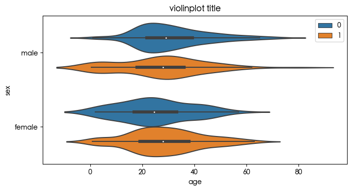
tips = sns.load_dataset("tips", data_home='seaborn-data')plt.figure(figsize=(8, 4), dpi=100)sns.violinplot(x="day", y="total_bill", data=tips, inner=None, color=".8")sns.stripplot(x="day", y="total_bill", data=tips)plt.title('violinplot title')plt.show()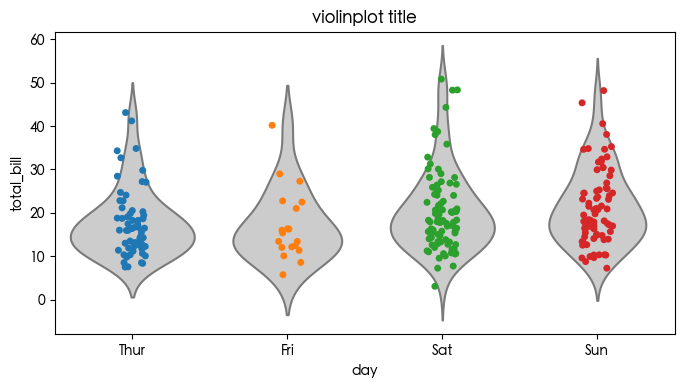
3.10 双变量分布pairplot
plt.figure(figsize=(8, 4), dpi=100)sns.pairplot(penguins)plt.show()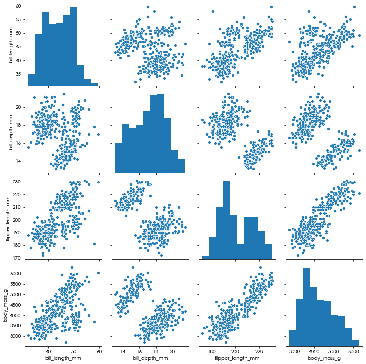
3.11 二维分布 jointplot
用于两个变量的画图,将两个变量的联合分布形态可视化出来往往会很有用。在seaborn中,最简单的实现方式是使用jointplot函数,它会生成多个面板,不仅展示了两个变量之间的关系,也在两个坐标轴上分别展示了每个变量的分布。
plt.figure(figsize=(8, 4), dpi=100)sns.jointplot(data=penguins, x="bill_length_mm", y="bill_depth_mm")plt.show()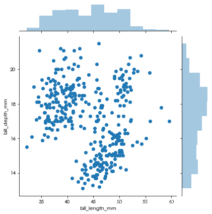
3.12 密度分布 kdeplot 和 histplot
plt.figure(figsize=(8, 4), dpi=100)sns.kdeplot(penguins['body_mass_g'])plt.show()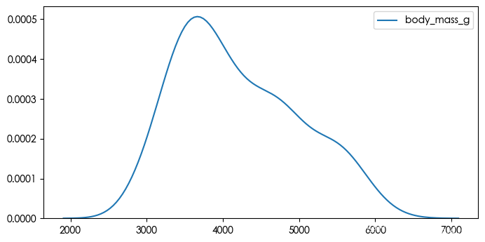
plt.figure(figsize=(8, 4), dpi=100)sns.distplot(penguins['body_mass_g'])plt.title('distplot title')plt.show()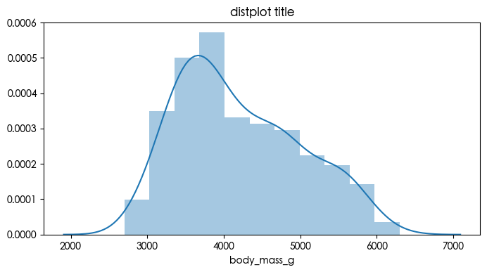
3.13 矩阵图 heatmap
uniform_data = np.random.rand(10, 12)plt.figure(figsize=(6, 4), dpi=100)sns.heatmap(uniform_data, vmin=0, vmax=1)plt.title('heatmap title')plt.show()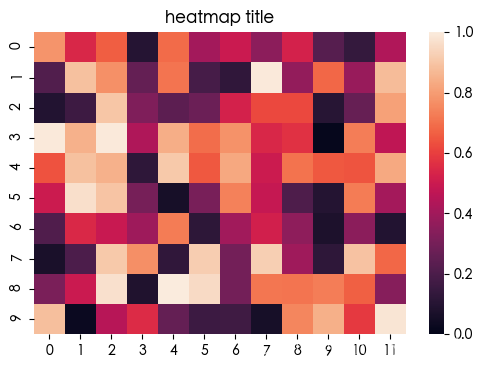
4. 结束语
Matplotlib 和 Seaborn 包含丰富的可视化功能,实际开发时,应多参考官方文档,此处仅列出数据挖掘领域中常用的基础绘图方法。
完整 Notebook 扫描下方作者 QQ 名片