【Harmony OS】【ARK UI】组件内转场api 基本使用
参考资料 文档中心
说明
从 API Version 7 开始支持。后续版本如有新增内容,则采用上角标单独标记该内容的起始版本。
组件转场主要通过transition属性进行配置转场参数,在组件插入和删除时进行过渡动效,主要用于容器组件子组件插入删除时提升用户体验(需要配合animateTo才能生效,动效时长、曲线、延时跟随animateTo中的配置)。
属性
| 名称 | 参数类型 | 默认值 | 参数描述 |
|---|---|---|---|
| transition | Object | - | 所有参数均为可选参数,详细描述见transition入参说明 |
transition入参说明
| 参数名称 | 参数类型 | 默认值 | 必填 | 参数描述 |
|---|---|---|---|---|
| type | TransitionType | All | 否 | 默认包括组件新增和删除。说明不指定Type时说明插入删除使用同一种效果。 |
| opacity | number | 1 | 否 | 设置组件转场时的透明度效果,为插入时起点和删除时终点的值。 |
| translate | {x? : number,y? : number,z? : number} | - | 否 | 设置组件转场时的平移效果,为插入时起点和删除时终点的值。 |
| scale | {x? : number,y? : number,z? : number,centerX? : number,centerY? : number} | - | 否 | 设置组件转场时的缩放效果,为插入时起点和删除时终点的值 |
| rotate | {x?: number,y?: number,z?: number,angle?: Angle,centerX?: Length,centerY?: Length} | - | 否 | 设置组件转场时的旋转效果,为插入时起点和删除时终点的值。 |
TransitionType枚举说明
| 名称 | 描述 |
|---|---|
| All | 指定当前的Transition动效生效在组件的所有变化场景。 |
| Insert | 指定当前的Transition动效生效在组件的插入场景。 |
| Delete | 指定当前的Transition动效生效在组件的删除场景。 |
示例
示例功能通过一个Button控制第二个Button的出现和消失,并通过transition配置第二个Button出现和消失的过场动画。
@Entry@Componentstruct TransitionExample { @State btn1: boolean = false @State show: string = "show" build() { Flex({ direction: FlexDirection.Column, alignItems: ItemAlign.Center,}) { Button(this.show).width(80).height(30).backgroundColor(0x317aff).margin({bottom:50}) .onClick(() => { animateTo({ duration: 1000 }, () => { this.btn1 = !this.btn1 if(this.btn1){this.show = "hide" }else{this.show = "show" } }) }) if (this.btn1) { // 插入和删除配置为不同的过渡效果 Button() { Image($r('app.media.bg1')).width("80%").height(300) }.transition({ type: TransitionType.Insert, scale : {x:0,y:1.0} }) .transition({ type: TransitionType.Delete, scale: { x: 1.0, y: 0.0 } }) } }.height(400).width("100%").padding({top:100}) }}
补充说明
scale 参数说
| 参数名 | 类型 | 必填 | 默认值 | 说明 |
|---|---|---|---|---|
| x | number | 否 | 1 | x轴的缩放倍数。 |
| y | number | 否 | 1 | y轴的缩放倍数。 |
| z | number | 否 | 1 | z轴的缩放倍数。 |
| centerX | number | string | 否 | 0 | 变换中心点x轴坐标。 |
| centerY | number | string | 否 | 0 | 变换中心点y轴坐标。 |
scale : {x:0,y:1.0,centerX:100,centerY:250}描述 从该逐渐从x轴从无到有,y轴没有扩展,从(100,250)点进去扩展
scale : {x:1,y:0,centerX:100,centerY:250}描述 从该逐渐从x轴没有扩展,y从原有的高度变无 从(100,250)点进去扩展
translate 简单实用
示例代码
@Entry@Componentstruct TranslateExample { @State btn1: boolean = false @State myText:string="显示" private onclick(){ animateTo({ duration: 1000 }, () => { this.btn1 = !this.btn1 if(this.btn1){ this.myText = "隐藏" }else{ this.myText = "显示" } }) } build() { Flex({ direction: FlexDirection.Column, alignItems: ItemAlign.Center,}) { Text(this.myText) .fontSize(50) .fontWeight(FontWeight.Bold) .onClick(this.onclick.bind(this)) if (this.btn1) { // 插入和删除配置为不同的过渡效果 Button() { Image($r('app.media.bg1')).width(300).height(300) } .transition({ type: TransitionType.Insert, translate : {x:400,y:400,z:100} }) .transition({ type: TransitionType.Delete, translate: { x: 300, y: 200 ,z:230} }) } } .width('100%') .height('100%') }}运行效果
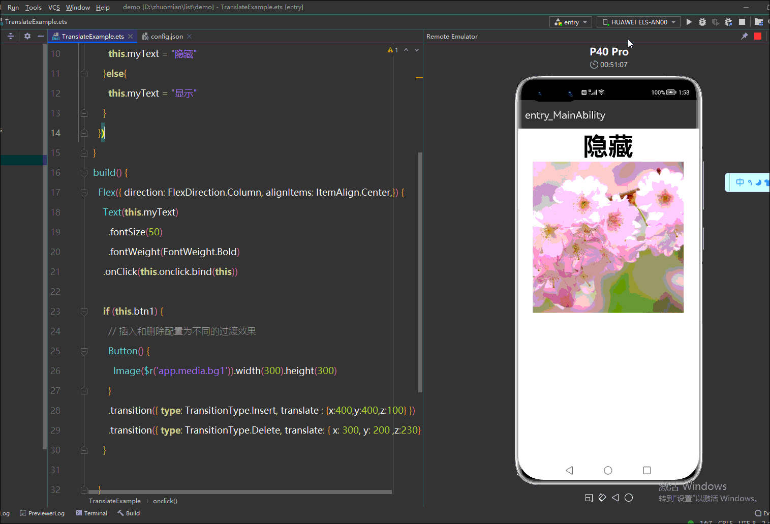
总结:transition({ type: TransitionType.Insert, translate : {x:400,y:400,z:100} })的意思
进场的时候从x轴400 y轴400 z轴100 平移到x轴0 y轴 z轴0的位置 (就是自身的位置)
transition({ type: TransitionType.Delete, translate: { x: 300, y: 200 ,z:230} })的意思
当type为TransitionType.Delete的时候,退场就是从x轴0y轴0 z周0 平移到 x轴300 y轴300 z轴230的坐标消失
rotate简单实用
rotate参数说明
| 参数名 | 类型 | 必填 | 默认值 | 说明 |
|---|---|---|---|---|
| x | number | 否 | 0 | 旋转向量 |
| y | number | 否 | 0 | 旋转向量 |
| z | number | 否 | 0 | 旋转向量 |
| centerX | number | string | 否 | 不填的话默认是该组件的中心点 | 旋转x轴的中心点 |
| centerY | number | string | 否 | 不填的话默认是该组件的中心点 | 旋转Y轴的中心点 |
| angle | number | string | 否 | 0 | 旋转角度 |
示例代码
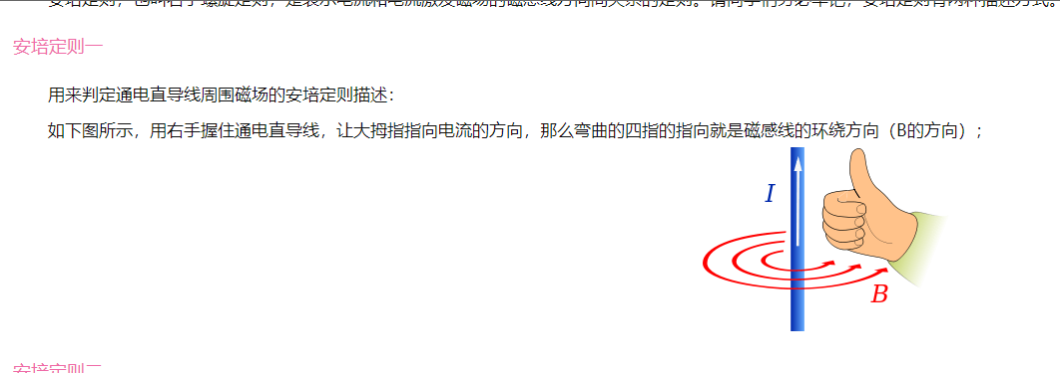
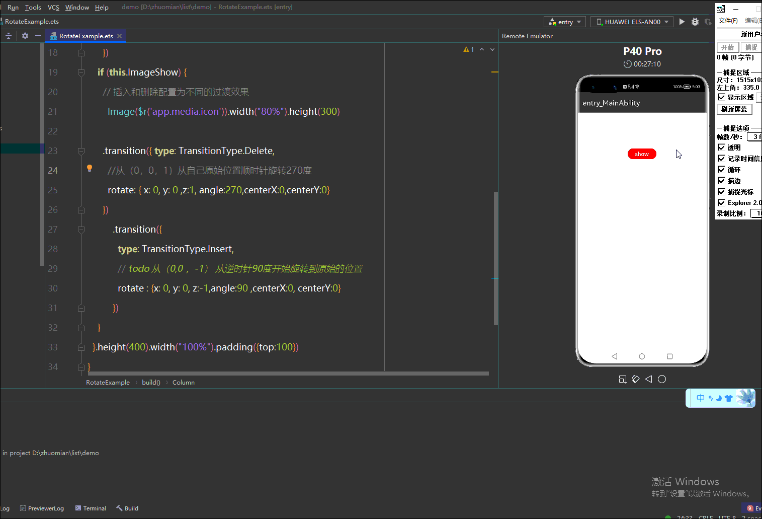
@Entry@Componentstruct RotateExample { @State ImageShow: boolean = false//Image 是否显示 @State show: string = "show" build() { Column() { Button(this.show).width(80).height(30).backgroundColor(Color.Red).margin({bottom:50}) .onClick(() => { animateTo({ duration: 5000 }, () => { this.ImageShow = !this.ImageShow if(this.ImageShow){this.show = "hide" }else{this.show = "show" } }) }) if (this.ImageShow) { // 插入和删除配置为不同的过渡效果 Image($r('app.media.icon')).width("80%").height(300) .transition({ type: TransitionType.Delete, rotate: { x: 0, y: 0 ,z:1, angle:270,centerX:0,centerY:0} //从(0,0,1)顺时针旋转270度 }) .transition({type: TransitionType.Insert,// todo 从(0,0 ,-1) 从逆时针90度开始旋转到原始的位置rotate : {x: 0, y: 0, z:-1,angle:90 ,centerX:0, centerY:0} }) } }.height(400).width("100%").padding({top:100}) }}如下图所示,我们使用是左手,不是右手切记
效果如下
总结
如上图安培定律所示左手大拇指的方向就是z的方向(0,0,-1)安装当前的桌面水平向右为x轴正方向水平向下为y轴正方向,z轴负方向就是大拇指向量,左手大拇指的方式是面向手机屏幕背面的,我们可以发现四指握旋方向是逆时针,
rotate : {x: 0, y: 0, z:-1,angle:90 ,centerX:0, centerY:0} ,其中90度,那就是从顺时针90运动原始的位置
rotate: { x: 0, y: 0 ,z:1, angle:270,centerX:0,centerY:0} (0,0,1)同样的道理,左手大拇指的方向是面向屏幕的方向的,此时四指握旋方向是顺时针,然后在旋转270后消失
欲了解更多更全技术文章,欢迎访问https://developer.huawei.com/consumer/cn/forum/?ha_source=zzh

