HarmonyOS/OpenHarmony应用开发-ArkTS自适应线性布局自适应缩放实现
自适应缩放是指在各种不同大小设备中,子组件按照预设的比例,尺寸随容器尺寸的变化而变化。在线性布局中有下列方法实现。
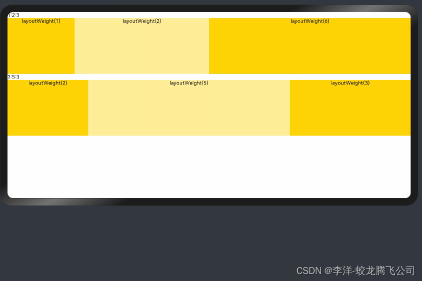
1.父容器尺寸确定时,设置了layoutWeight属性的子组件与兄弟元素占主轴尺寸按照权重进行分配,忽略元素本身尺寸设置,在任意尺寸设备下,自适应占满剩余空间。
@Entry@Componentstruct layoutWeightExample { build() { Column() { Text('1:2:3').width('100%') Row() { Column() { Text('layoutWeight(1)') .textAlign(TextAlign.Center) }.layoutWeight(2).backgroundColor(0xffd306).height('100%') Column() { Text('layoutWeight(2)') .textAlign(TextAlign.Center) }.layoutWeight(4).backgroundColor(0xffed97).height('100%') Column() { Text('layoutWeight(6)') .textAlign(TextAlign.Center) }.layoutWeight(6).backgroundColor(0xffd306).height('100%') }.backgroundColor(0xffd306).height('30%') Text('2:5:3').width('100%') Row() { Column() { Text('layoutWeight(2)') .textAlign(TextAlign.Center) }.layoutWeight(2).backgroundColor(0xffd306).height('100%') Column() { Text('layoutWeight(5)') .textAlign(TextAlign.Center) }.layoutWeight(5).backgroundColor(0xffed97).height('100%') Column() { Text('layoutWeight(3)') .textAlign(TextAlign.Center) }.layoutWeight(3).backgroundColor(0xffd306).height('100%') }.backgroundColor(0xffd306).height('30%') } }}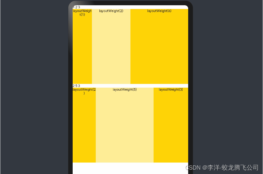
2.父容器尺寸确定时,使用百分比设置子组件以及兄弟组件的width宽度,可以保证各自元素在任意尺寸下的自适应占比。
@Entry@Componentstruct WidthExample { build() { Column() { Row() { Column() { Text('left width 20%') .textAlign(TextAlign.Center) }.width('20%').backgroundColor(0xffd306).height('100%') Column() { Text('center width 50%') .textAlign(TextAlign.Center) }.width('50%').backgroundColor(0xffed97).height('100%') Column() { Text('right width 30%') .textAlign(TextAlign.Center) }.width('30%').backgroundColor(0xffd306).height('100%') }.backgroundColor(0xffd306).height('30%') } }} 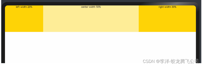
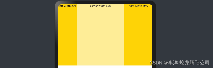
上例中,在任意大小的设备中,子组件的宽度占比固定。
参考引用自官方文档。

