CSS浮动总结
CSS浮动
1、结构伪类选择器:
1)作用与优势:
> 作用:根据元素在HTML中的结构关系查找元素
> 优势:减少对于HTML中类的依赖,有利于保持代码整洁
> 场景:常用于查找某父级选择器中的子元素
2)选择器:
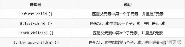
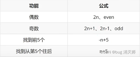
> n的注意点:
① n为:0、1、2、3、4、5、6、......
② 通过n可以组成常见公式
/* 选中第一个 */ li:first-child { background-color: pink; } /* 选中最后一个 */ li:last-child { background-color: skyblue; } /* 选中任意一个 */ li:nth-child(4) { background-color: red; } /* 选中倒数第xx个 */ li:nth-last-child(3) { background-color: blue; } /* 偶数 */ li:nth-child(2n) { background-color: blueviolet; } /* 奇数 */ li:nth-child(2n+1) { background-color: yellow; } /* 找到前xx个 */ li:nth-child(-n+3) { background-color: chartreuse; } /* 4的倍数 */ li:nth-child(4n) { background-color: coral; } 2、伪元素:
> 伪元素:一般页面中的非主体内容可以使用伪元素
> 区别:
① 元素:HTML设置的标签
② 伪元素:由CSS模拟出的标签效果
> 种类:
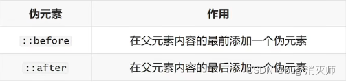
> 注意点:
① 必须设置 content 属性才能生效
② 伪元素默认是行内元素
Document .father { width: 300px; height: 300px; background-color: pink; } .father::before { /* content属性必须添加,否则伪元素不生效 */ content: '老鼠'; color: green; width: 100px; height: 100px; background-color: blue; /* 默认是行内元素,宽高不生效 */ display: block; } .father::after { content: '大米'; } 爱3、标准流(文档流):
> 标准流:又称文档流,是浏览器在渲染显示网页内容时默认采用的一套排版规则,规定了应该以何种方式排列元素
> 常见标准流排版规则:
① 块级元素:从上往下,垂直布局,独占一行
② 行内元素或行内块元素:从左往右,水平布局,空间不够自动折行
4、浮动:
Document div { /* 浏览器解析行内块或行内标签的时候,如果标签换行书写会产生一个空格 */ display: inline-block; width: 100px; height: 100px; } .one { background-color: pink; } .two { background-color: skyblue; } one two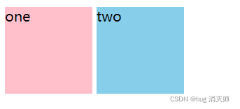
1)浮动的作用:
> 早期的作用:图文环绕
> 现在的作用:网页布局
2)浮动的代码:
Document .one { width: 100px; height: 100px; background-color: pink; float: left; } .two { width: 100px; height: 100px; background-color: skyblue; float: left; } one two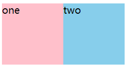
3)浮动的特点:
> 浮动元素会脱离标准流(简称:脱标),在标准流中不占位置
> 浮动元素比标准流高半个级别,可以覆盖标准流中的元素
> 浮动找浮动,下一个浮动元素会在上一个浮动元素后面左右浮动
> 浮动元素有特殊的显示效果
· 一行可以显示多个
· 可以设置宽高
> 注意点:
· 浮动的元素不能通过 text-align:center; 或者 margin:0 auto;
4)浮动的案例:
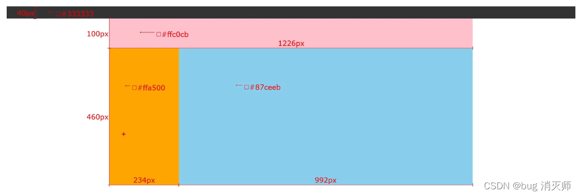
> ① 网页布局案例 -- 小米布局:
· 示例图片:
· 代码:
Document * { margin: 0; padding: 0; } .top { height: 40px; background-color: #333; } .header { margin: 0 auto; width: 1226px; height: 100px; background-color: #ffc0cb; } .content { margin: 0 auto; width: 1226px; height: 460px; } .content .one { float: left; width: 234px; height: 460px; background-color: #ffa500; } .content .two { float: left; width: 992px; height: 460px; background-color: #87ceeb; } > ② 综合案例 -- 小米模块案例:
· 示例图片: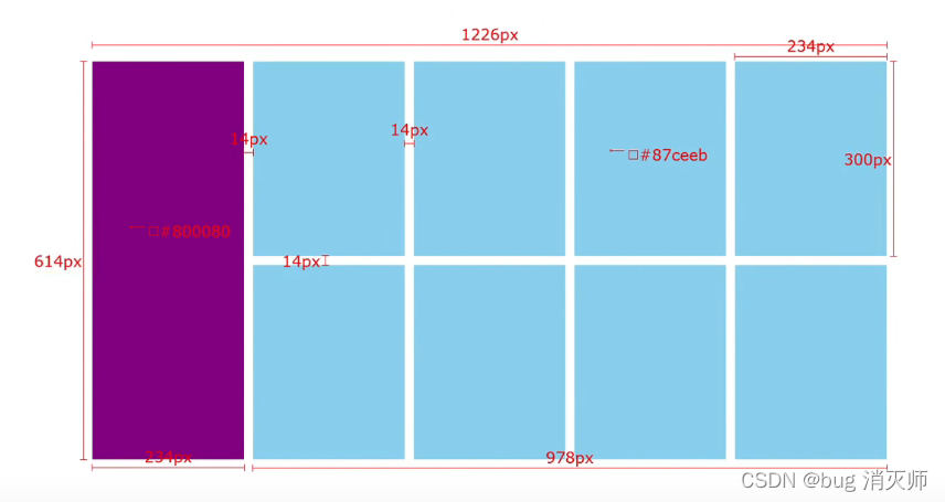
· 代码:
Document * { margin: 0; padding: 0; } .box { margin: 0 auto; width: 1226px; height: 614px; } .left { float: left; width: 234px; height: 614px; background-color: #800080; } .right { float: right; width: 978px; height: 614px; } ul { list-style: none; } .right li { margin: 0 14px 14px 0; float: left; width: 234px; height: 300px; background-color: #87ceeb; box-sizing: border-box; } /* 如果父级的宽度不够,子集会自动换行 */ .right li:nth-child(4n) { margin-right: 0; }
> ③ 综合案例 -- 网页导航案例:
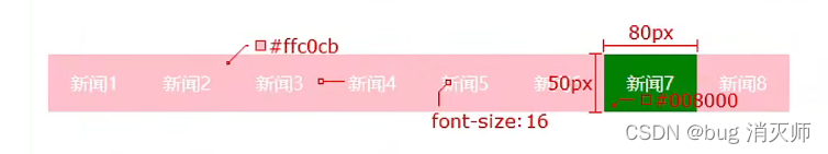
· 示例图片:
· 代码:
Document * { margin: 0; padding: 0; } .nav { margin: 50px auto; width: 640px; height: 50px; background-color: #ffc0cb; } .nav ul { list-style: none; } .nav ul li { float: left; } .nav ul li a { display: inline-block; width: 80px; height: 50px; text-align: center; line-height: 50px; text-decoration: none; color: #fff; } .nav ul li a:hover { background-color: #008000; } 5、清除浮动:
1)清除浮动的介绍:
> 含义:清除浮动带来的影响
· 影响:如果子元素浮动了,此时子元素不能撑开标准流的块级父元素
> 原因:
· 子元素浮动后脱标 → 不占位置
> 目的:
· 需要父元素有高度,从而不影响其他网页元素的布局
2)清除浮动的方法:
① 直接设置父元素高度:
> 特点:
· 优点:简单粗暴,方便
· 缺点:有些布局中不能固定父元素高度。如:新闻列表、京东推荐模块
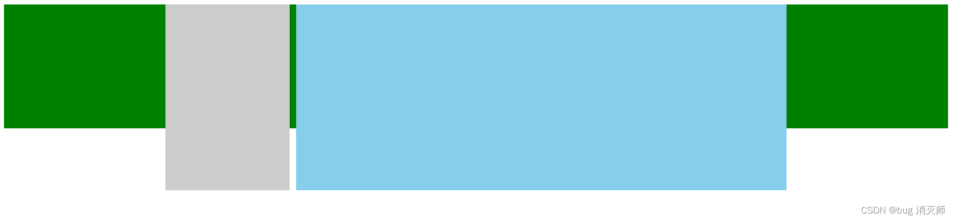
Document .top { margin: 0 auto; width: 1000px; /* height: 300px; */ background-color: pink; } .left { float: left; width: 200px; height: 300px; background-color: #ccc; } .right { float: right; width: 790px; height: 300px; background-color: skyblue; } .bottom { height: 200px; background-color: green; } ② 额外标签法:
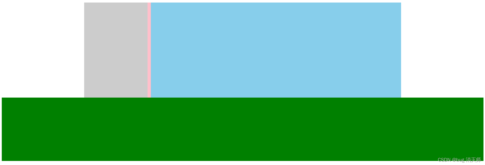
> 操作:
Ⅰ、在父元素内容的最后添加一个块级元素
Ⅱ、给添加的块级元素设置 clear:both;
> 特点:
· 缺点:会在页面中添加额外的标签,会让页面的HTML结构变得复杂
Document .top { margin: 0 auto; width: 1000px; /* height: 300px; */ background-color: pink; } .left { float: left; width: 200px; height: 300px; background-color: #ccc; } .right { float: right; width: 790px; height: 300px; background-color: skyblue; } .bottom { height: 200px; background-color: green; } .clearfix { /* 清除左右两侧浮动的影响 */ clear: both; } ③ 单伪元素清除法:
> 操作:用伪元素替代了额外标签 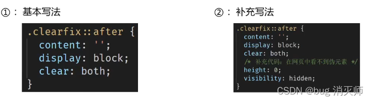
> 特点:
· 优点:项目中使用,直接给标签加类即可清除浮动
> 基本写法代码:
Document .top { margin: 0 auto; width: 1000px; /* height: 300px; */ background-color: pink; } .left { float: left; width: 200px; height: 300px; background-color: #ccc; } .right { float: right; width: 790px; height: 300px; background-color: skyblue; } .bottom { height: 200px; background-color: green; } .clearfix::after { content: ''; /* 伪元素添加的标签是行内,要求块 */ display: block; clear: both; } > 补充写法代码:
Document .top { margin: 0 auto; width: 1000px; /* height: 300px; */ background-color: pink; } .left { float: left; width: 200px; height: 300px; background-color: #ccc; } .right { float: right; width: 790px; height: 300px; background-color: skyblue; } .bottom { height: 200px; background-color: green; } .clearfix::after { content: ''; /* 伪元素添加的标签是行内,要求块 */ display: block; clear: both; /* 补充代码:在网页中看不到伪元素,为了兼容性 */ height: 0; visibility: hidden; } ④ 双伪元素清除法:
> 操作:
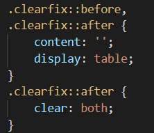
> 特点:
· 优点:项目中使用,直接给标签加类即可清除浮动
Document .top { margin: 0 auto; width: 1000px; /* height: 300px; */ background-color: pink; } .left { float: left; width: 200px; height: 300px; background-color: #ccc; } .right { float: right; width: 790px; height: 300px; background-color: skyblue; } .bottom { height: 200px; background-color: green; } /* 清除浮动 */ /* .clearfix::before 作用:解决外边距塌陷问题 外边距塌陷:父子标签,都是块级,子级加 margin 会影响父级的位置 */ .clearfix::before, .clearfix::after { content: ''; display: table; } /* 真正清除浮动的标签 */ .clearfix::after { clear: both; } ⑤ 给父元素设置 overflow : hidden;
> 操作:
· 直接给父元素设置 overflow : hidden;
> 特点:
· 优点:方便
Document /* 清除浮动 overflow */ .top { overflow: hidden; margin: 0 auto; width: 1000px; /* height: 300px; */ background-color: pink; } .left { float: left; width: 200px; height: 300px; background-color: #ccc; } .right { float: right; width: 790px; height: 300px; background-color: skyblue; } .bottom { height: 200px; background-color: green; } 6、CSS书写顺序(浏览器执行效率更高):
① 浮动 / display;
② 盒子模型: margin、border、padding、宽度、高度、背景色;
③ 文字样式。

