CSS定位装饰
一、定位
1、定位的基本介绍
网页常见布局方式:
① 标准流:
· 块级元素独占一行→垂直布局
· 行内元素/行内块元素一行显示多个→水平布局
② 浮动:
· 可以让原本垂直布局的 块级元素变成水平布局
③ 定位:
· 可以让元素自由的摆放在网页的任意位置
· 一般用于盒子之间的层叠情况
定位的常见应用场景:
1、可以解决盒子与盒子之间的层叠问题
· 定位之后的元素层级最高,可以层叠在其他盒子上面
2、可以让盒子始终固定在屏幕中的某个位置
2、定位的基本使用
使用定位的步骤:
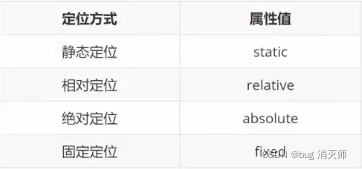
① 设置定位方式:
> 属性名:position
> 常见属性值:
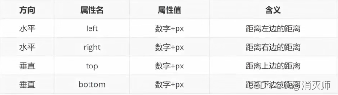
② 设置偏移值:
> 偏移值设置分为两个方向,水平和垂直方向各选一个使用即可
> 选取的原则一般是就近原则(离哪边近用哪个)
3、静态定位
> 代码:position:static;
.box { /* 静态定位,默认值,标准流 */ position: static; left: 100px; top: 200px; width: 200px; height: 200px; background-color: skyblue; } 4、相对定位
> 介绍:自恋型定位,相对于自己之前的位置进行移动
> 代码:position: relative;
> 特点:
① 需要配合方位属性实现移动
② 相对于自己原来位置进行移动
③ 在页面中占位置(原来的位置)→没有脱标
> 应用场景:
① 配合绝对定位组CP(子绝父相)
② 用于小范围的移动
.box { position: relative; left: 100px; top: 200px; /* 1. 占有原来的位置 2. 仍然具有标签原有的显示模式特点 3. 改变位置参照自己原来的位置 */ width: 200px; height: 200px; background-color: skyblue; } 注意:如果 left 和 right 都有,以 left 为准;如果 top 和 bottom 都有,以 top 为准
5、绝对定位
> 介绍:拼爹型定位,相对于非静态定位的父元素进行定位移动
> 代码:position : absolute;
> 特点:
· 需要配合方位属性实现移动
· 默认相对于浏览器可视区域进行移动
· 在页面中不占位置→已经脱标
> 应用场景:
· 配合绝对定位组CP(子绝父相)
/* 有父级,但父级没有定位,以浏览器窗口为参照进行定位 */ .box { /* 绝对定位: 先找到已经定位的父级,如果有这样的父级就以这个父级为参照物进行定位; 有父级,但父级没有定位,以浏览器窗口为参照进行定位 */ position: absolute; left: 0px; top: 0px; /* 1.脱标,不占位 2.改变标签的显示模式 特点:具有行内块特点(在一行共存,宽高生效) */ width: 200px; height: 200px; background-color: skyblue; } 6、子绝父相
Document .father { width: 400px; height: 400px; background-color: pink; } .son { /* 相对,绝对 */ /* 父级相对定位,子级绝对定位 -- 子绝父相 */ position: relative; /* position: absolute; */ width: 300px; height: 300px; background-color: skyblue; } .sun { /* 绝对定位查找父级的方式:就近找定位的父级,如果逐层查找不到这样的父级,就以浏览器窗口为参照进行定位 */ position: absolute; right: 20px; bottom: 50px; width: 200px; height: 200px; background-color: #fd555d; } > 子绝父相水平居中案例:
· 示例图:
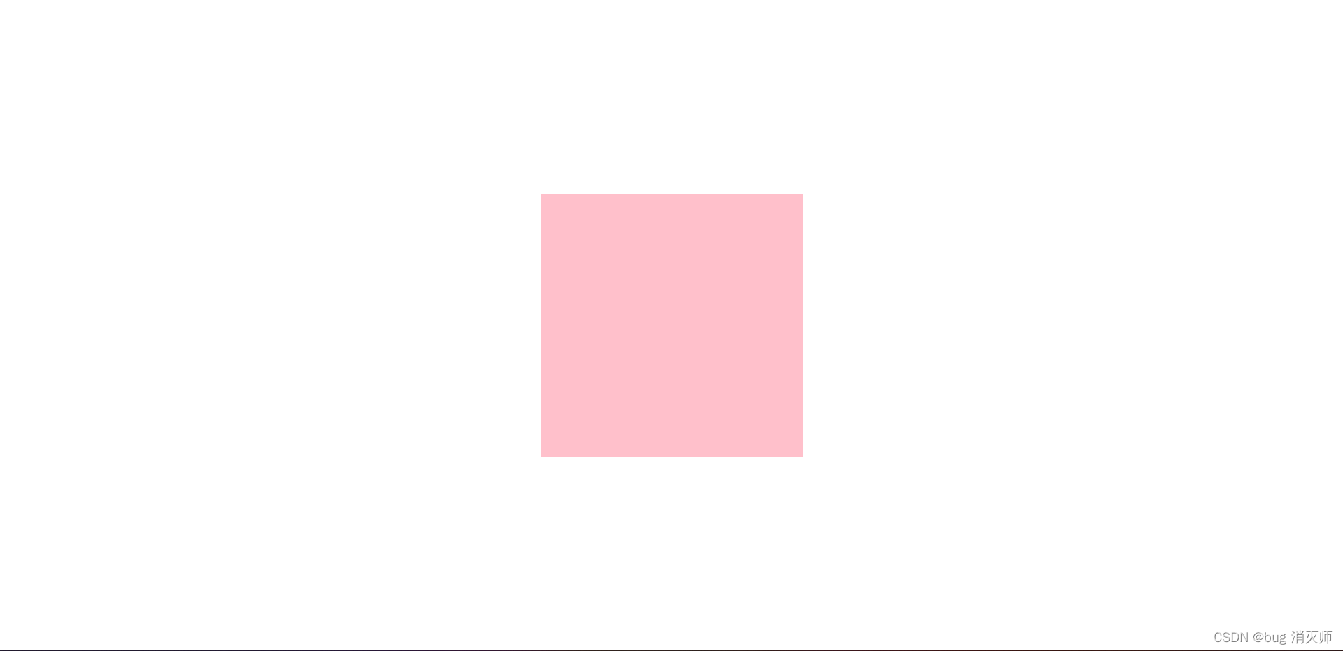
这种方式改变宽度后不适用
Document .box { /* 1. 绝对定位的盒子不能使用左右margin auto居中 */ position: absolute; /* left: 50%; 整个盒子移动到浏览器中间偏右的位置 */ left: 50%; /* 把盒子向左侧移动:自己宽度的一半 */ margin-left: -150px; top: 50%; margin-top: -150px; width: 300px; height: 300px; background-color: pink; } > 位移居中( transform: translate(-50%,-50%); ):
Document .box { /* 1. 绝对定位的盒子不能使用左右margin auto居中 */ position: absolute; left: 50%; top: 50%; /* 位移:自己宽度高度的一半 */ transform: translate(-50%,-50%); width: 300px; height: 300px; background-color: pink; } > 二维码:
· 示例图:
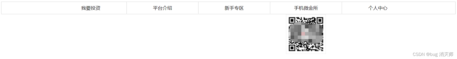
Document .nav { height: 40px; border: 1px solid #ccc; } ul { list-style: none; width: 1200px; margin: 0 auto; } ul li { float: left; width: 20%; height: 40px; box-sizing: border-box; border-right: 1px solid #ccc; text-align: center; line-height: 40px; } ul .last { border-right: none; } ul li a { /* a标签默认是行内元素,宽高由内容撑开,并且无法设置宽高,此时默认情况用户只能点击文字区域才能调整 */ /* 如果把a标签转换成块级元素,此时可以设置宽高,会让a标签范围更大,用户可以点击调整的区域也越大 */ display: block; text-decoration: none; /* 宽度不设置,块元素会默认占满一行 */ height: 40px; color: #000; } .nav ul .app { position: relative; } .nav ul .code { position: absolute; left: 50%; top: 42px; transform: translate(-50%); } 
> banner图 -- 底部半透明遮罩效果:
· 示例图:
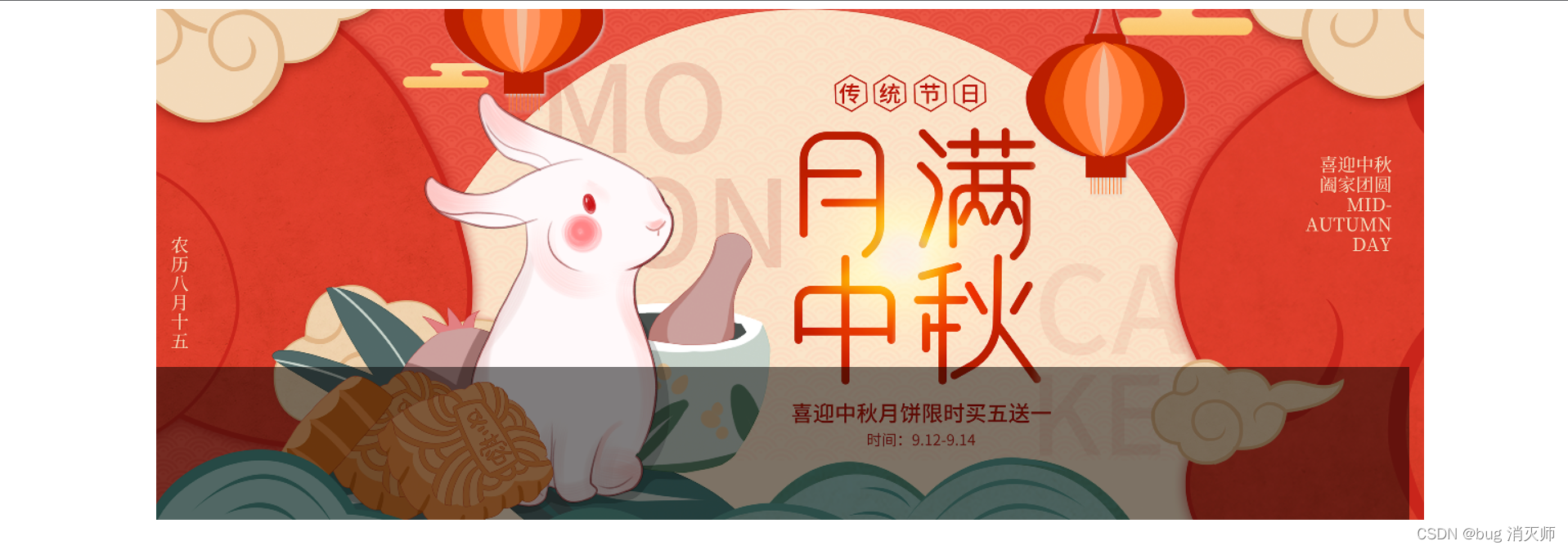
Document .banner { position: relative; margin: 0 auto; width: 1226px; height: 500px; } .mask { position: absolute; left: 0; bottom: 0; /* 绝对定位的盒子的显示模式具备行内块特点:加宽度高度生效,如果没有宽度也没有内容,盒子的宽度尺寸就是0 */ /* width: 1226px; */ /* 如果子级和父级的宽度相同 */ width: 100%; height: 150px; background-color: rgba(0,0,0,0.5); } 
7、固定定位
> 介绍:死心眼型定位,相对于浏览器进行定位移动
> 代码:position: fixed;
> 特点:
· 需要配合方位属性实现移动
· 相对于浏览器可视区域进行移动
· 在页面中不占位置→已经脱标
> 应用场景:
· 让盒子固定在屏幕中的某个位置
.box { position: fixed; left: 0; top: 0; /* 1. 脱标,不占位置 2. 改变位置参考浏览器窗口 3. 具备行内块特点 */ width: 200px; height: 200px; background-color: skyblue; } 8、元素的层级关系
> 元素层级问题:
· 不同布局方式元素的层级关系:
标准流 < 浮动 < 定位
> 不同定位之间的层级关系:
· 相对、绝对、固定默认层级相同
· 此时HTML中写在下面的元素层级更高,会覆盖上面的元素
Document div { width: 200px; height: 200px; } .one { position: absolute; left: 20px; top: 50px; /* 默认情况下,定位的盒子,后来者居上 z-index:整数; 取值越大,显示顺序越靠上,z-index的默认值是0 注意:z-index必须配合定位才生效 */ z-index: 1; background-color: pink; } .two { position: absolute; left: 50px; top: 100px; background-color: skyblue; } 二、装饰
> 认识基线(了解):
· 基线:浏览器文字类型元素排版中存在用于对齐的基线( baseline )
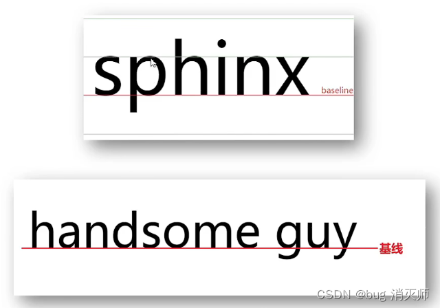
> 文字对齐问题:
· 场景:解决行内/行内块元素垂直对齐问题
· 问题:当图片和文字在一行中显示时,其实底部不是对齐的
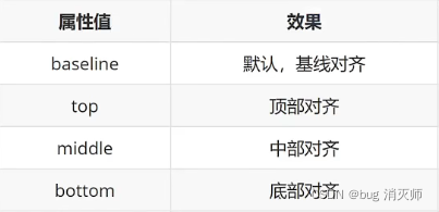
垂直对齐方式
> 属性名:vertical-align
> 属性值:
> 案例一:
Document /* 浏览器遇到行内和行内块标签当做文字处理,默认文字是按基线对齐 */ input { height: 50px; box-sizing: border-box; vertical-align: middle; } > 案例二:
Document img { vertical-align: middle; } 
> 案例三:
Document /* 去除空隙 */ .father { width: 400px; height: 400px; background-color: pink; } input { vertical-align: top; } > 案例四:
Document /* 去除空隙 */ .father { width: 400px; background-color: pink; } img { /* 浏览器把行内和行内块标签当作文字处理,默认基线对齐 */ /* 方法1 */ /* vertical-align: middle; */ /* 方法2 */ display: block; } > 案例五:
Document .father { width: 300px; height: 300px; background-color: pink; /* 文字能居中,图片不能 */ line-height: 300px; } img { vertical-align: middle; } 光标类型
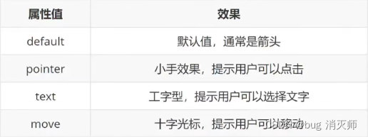
> 场景:设置鼠标光标在元素上时显示的样式
> 属性名:cursor
>常见属性值:
div { width: 200px; height: 200px; background-color: pink; cursor: pointer; /* cursor: text; */ /* cursor: move; */ } 边框圆角
> 场景:让盒子四个角变得圆润,增加页面细节,提升用户体验
> 属性名:border-radius
> 常见取值:数字+px、百分比
> 原理:
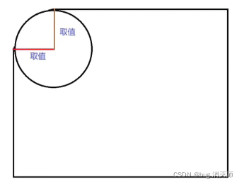
> 赋值规则:从左上角开始赋值,然后顺时针赋值,没有赋值的看对角!
.box { width: 200px; height: 200px; background-color: skyblue; margin: 50px auto; /* 一个值:表示四个角是相同的 */ border-radius: 20px; /* 四个值:左上 右上 右下 左下 -- 从左上顺时针旋转一圈 */ /* border-radius: 10px 20px 40px 80px; */ /* border-radius: 10px 40px 80px ; */ /* border-radius: 10px 80px; */ } 边框圆角的常见应用:
> 画一个正圆:
· 盒子必须是正方形
· 设置边框圆角为盒子宽高的一半 → border-radius:50%;
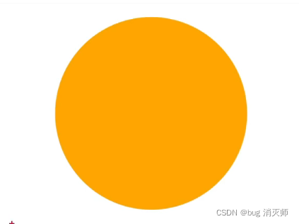
.one { margin: 50px auto; width: 200px; height: 200px; background-color: skyblue; border-radius: 50%; /* border-radius: 100px; */ } > 胶囊按钮:
· 盒子要求是长方形
· 设置 → border-radius:盒子高度的一半
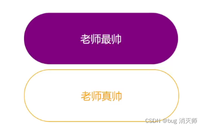
.two { width: 400px; height: 200px; background-color: pink; border-radius: 100px; } overflow溢出部分显示效果
> 溢出部分:指的是盒子内容部分所超出盒子范围的区域
> 场景:控制内容溢出部分的显示效果,如:显示、隐藏、滚动条.......
> 属性名:overflow
> 常见属性值:
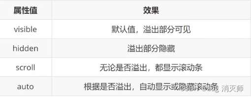
.box { width: 200px; height: 200px; background-color: skyblue; /* overflow: visible; */ /* overflow: hidden; */ /* overflow: scroll; */ overflow: auto; } 元素本身隐藏
> 场景:让某元素本身在屏幕中不可见。如:鼠标 :hover 之后元素隐藏
> 常见属性:
· visibility: hidden;
· display: none;
div { width: 200px; height: 200px; } .one { /* 占位隐藏 */ /* visibility: hidden; */ /* 不占位隐藏 */ display: none; background-color: pink; } .two { background-color: skyblue; } > 区别:
· visibility: hidden; 占位隐藏
· display: none; 不占位隐藏
> 注意点:
> 案例(导航二维码居中案例-显示隐藏效果):
Document .nav { height: 40px; border: 1px solid #ccc; } ul { list-style: none; width: 1200px; margin: 0 auto; } ul li { float: left; width: 20%; height: 40px; box-sizing: border-box; border-right: 1px solid #ccc; text-align: center; line-height: 40px; } ul .last { border-right: none; } ul li a { /* a标签默认是行内元素,宽高由内容撑开,并且无法设置宽高,此时默认情况用户只能点击文字区域才能调整 */ /* 如果把a标签转换成块级元素,此时可以设置宽高,会让a标签范围更大,用户可以点击调整的区域也越大 */ display: block; text-decoration: none; /* 宽度不设置,块元素会默认占满一行 */ height: 40px; color: #000; } .nav ul .app { position: relative; } .nav ul .code { display: none; position: absolute; left: 50%; top: 42px; transform: translate(-50%); } /* 鼠标悬停 显示二维码图片 */ .nav ul a:hover img { display: block; } 三、选择器拓展
(拓展) 元素整体透明度
> 场景:让某元素整体(包括内容)一起变透明
> 属性名:opacity
> 属性值:0~1之间的数字
· 1:表示完全不透明
· 0:表示完全透明
> 注意点:
· opacity会让元素整体透明,包括里面的内容,如:文字、子元素等......
Document div { width: 400px; height: 400px; background-color: green; opacity: 0.5; }  这个字透明吗?
