空间数据可视化&地图绘制&R语言可复现
空间数据可视化&地图绘制&R语言可复现
绘制地理空间数据是一项常见的可视化任务,需要专门的工具。通常,问题可以分解为两个问题:
- 使用一个数据源绘制地图
- 将来自另一个信息源的元数据添加到地图中。
有许多可以用于绘制地图的工具,一些流行的 GIS 软件允许点击交互进行地图开发和空间分析。这些工具具有不需要学习代码以及在地图上手动选择和放置图标和功能的便利性等优点,例如:
ArcGIS - 由 ESRI 公司开发的商业 GIS 软件,非常流行但相当昂贵
QGIS - 一个免费的开源 GIS 软件,几乎可以做 ArcGIS 可以做的任何事情
使用 R 作为 GIS 一开始似乎更令人生畏,因为它不是“点击”,而是有一个“命令行界面”(您必须编写代码才能获得所需的结果)。但是,如果您需要重复生成地图或创建可重现的分析,这是一个主要优势。
本文主要解释使用R语言绘制地图,主要用到的包有:
- rio : 导入数据
- tidyverse : 清洗、处理、绘图(包含ggplot2包)
- sf : 使用简单要素格式管理空间数据
- tmap : 生成地图,适用于交互式和静态地图
- OpenStreetMap : 在ggplot中免费添加 OSM 国内外地图作为底图
本目文录:
- 综述
- 空间数据类型 Spatial data
- 矢量数据 Vector data
- 栅格数据 Raster data
- 空间数据基本格式
- 基本地图类型
- 绘制地图准备工作
- 必备环节
- 所需R包
- 实例案例数据
- 行政边界数据
- 人口数据
- 卫生设施数据上
- 画坐标系
- 空间数据连接类型
- 点数据与多边形区域连接
- 最近的邻域连接
- 缓冲区连接
- 其他空间连接类型
- 等值域图 Choropleth 地图
- 使用ggplot绘制地图
- 底图 Basemaps
- 免费获取国内外地图OpenStreetMap
- 等高线密度热图 Contoured density heatmap
- 时间序列热图 Time series heatmap
1.综述
您的数据的空间方面可以提供很多关于爆发情况的见解,并回答以下问题:
- 当前的疾病热点在哪里?
- 随着时间的推移,热点发生了怎样的变化?
- 卫生设施的使用情况如何?是否需要任何改进?
此 GIS 页面的当前重点是解决应用流行病学家在疫情应对中的需求。我们将探索使用 tmap 和 ggplot2 包的基本空间数据可视化方法。我们还将通过 sf 包介绍一些基本的空间数据管理和查询方法。最后,我们将使用 spdep 包简要介绍空间统计的概念,例如空间关系、空间自相关和空间回归。
1.1空间数据类型 Spatial data
**地理信息系统 (GIS) **- GIS 是用于收集、管理、分析和可视化空间数据的框架或环境,GIS 中使用的空间数据的两种主要形式是矢量Vector和栅格Raster数据:
矢量数据 Vector data
GIS 中使用的最常见的空间数据格式,矢量数据由顶点vertices和路径paths的几何特征组成。矢量空间数据可以进一步分为三种广泛使用的类型:
- 点 Points - 点由表示坐标系中特定位置的坐标对 (x,y) 组成。点是最基本的空间数据形式,可用于在地图上表示一个病例(即患者家)或位置(即医院)。
- 线 Lines - 一条线由两个相连的点组成。线有长度,可用于表示道路或河流等事物。
- 多边形 Polygons - 多边形由至少三个由点连接的线段组成。多边形特征具有长度(即区域的周长)以及面积测量值。多边形可用于标注区域(即村庄)或结构(即医院的实际区域)。
栅格数据 Raster data
一种替代格式 空间数据,栅格数据是一个单元格矩阵(例如像素),每个单元格包含高度、温度、坡度、森林覆盖等信息。这些通常是航空照片、卫星图像等。栅格也可以用作“底图base maps”放在矢量数据下方。
1.2空间数据基本格式
为了在地图上直观地表示空间数据,GIS 软件要求您提供足够的信息,说明不同要素应在何处相互关联。如果您使用的是矢量数据,这对于大多数用例都是正确的,则此信息通常会存储在 shapefile 中:
Shapefiles - shapefile 是一种常见的数据格式,用于存储由线、点或多边形组成的“矢量”空间数据.单个 shapefile 实际上是至少三个文件的集合 - .shp、.shx 和 .dbf。所有这些子组件文件必须存在于给定目录(文件夹)中,以便 shapefile 可读。这些相关文件可以压缩到 ZIP 文件夹中,以便通过电子邮件发送或从网站下载。 shapefile 将包含有关要素本身的信息,以及它们在地球表面的位置。这很重要,因为虽然地球是一个球体,但地图通常是二维的。关于如何的选择 “展平flatten”空间数据会对最终地图的外观和解释产生重大影响。
坐标参考系统 (CRS) - CRS 是一种基于坐标的系统,用于定位地球表面的地理特征。它有几个关键组件:
-
坐标系 Coordinate System - 有许多不同的坐标系,因此请确保您知道您的坐标来自哪个系统。纬度/经度的度数很常见,但您也可以看到 UTM 坐标。
-
单位 Units - 了解坐标系的单位(例如十进制度 decimal degrees、米)
-
基准 Datum - 地球的特定模型版本。多年来,这些已被修订,因此请确保您的地图图层使用相同的基准。
-
投影 Projection - 对用于将真正的圆形地球投影到平坦表面(地图)的数学方程式的参考。
请记住,您可以在不使用下面显示的映射工具的情况下汇总空间数据。有时只需要一张按地理(例如地区、国家等)的简单表格!
1.3用于空间数据可视化的基本地图类型
分区统计地图 Choropleth map - 一种专题地图,其中颜色、阴影或图案用于表示与其属性值相关的地理区域。例如,较大的值可以用比较小值更深的颜色来表示。这种类型的地图在可视化变量以及它如何在定义的区域或地缘政治区域之间变化时特别有用。
案例密度热图 Case density heatmap - 一种主题图,其中颜色用于表示值的强度,但是,它不使用定义的区域或地缘政治边界对数据进行分组。这种类型的地图通常用于显示“热点”或具有高密度或点集中的区域。
点密度图 Dot density map - 一种专题地图类型,使用点来表示数据中的属性值。这种类型的地图最适合用于可视化数据的分散情况并直观地扫描集群。
比例符号地图(分级符号地图)Proportional symbols map (graduated symbols map) - 类似于等值线地图的专题地图,但不是使用颜色来指示属性的值,而是使用与值相关的符号(通常是圆形)。例如,较大的值可以用比较小值更大的符号来表示。当您想要跨地理区域可视化数据的大小或数量时,最好使用这种类型的地图。
您还可以组合几种不同类型的可视化来显示复杂的地理模式。例如,下图中的病例(点)根据其最近的医疗机构(参见图例)进行着色。大红色圆圈表示一定半径的医疗机构集水区,而鲜红色的案例点表示在任何范围之外的区域:

2.绘制地图准备工作
2.1制作地图时的几个关键项目,其中包括:
- 数据集——可以是空间数据格式(例如 shapefile,如上所述),也可以不是空间格式(例如,只是 csv)。
- 如果您的数据集不是空间格式,您还需要一个参考数据集 reference dataset。参考数据由数据的空间表示和相关属性组成,其中包括包含特定要素的位置和地址信息的材料。
- 如果您使用预定义的地理边界(例如,行政区域),通常可以从政府机构或数据共享组织免费下载参考 shapefile。如有疑问,最好从谷歌“[regions] shapefile”开始。
- 如果您有地址信息,但没有纬度和经度,您可能需要使用地理编码引擎来获取空间参考数据以供记录。
关于如何将数据集中的信息呈现。有许多不同类型的地图,重要的是要考虑哪种类型的地图最适合您的需求。
2.2导入所需要的包
此代码块显示分析所需的包的加载。在本文,我们强调来自 pacman 的 p_load(),它会在必要时安装包并加载它以供使用。您还可以使用基本 R 中的 library() 加载已安装的包。
if(!require(pacman))install.packages("pacman")pacman::p_load( rio, # to import data here, # to locate files tidyverse, # to clean, handle, and plot the data (includes ggplot2 package) sf, # to manage spatial data using a Simple Feature format tmap, # to produce simple maps, works for both interactive and static maps janitor,# to clean column names OpenStreetMap, # to add OSM basemap in ggplot map spdep, # spatial statistics showtext # 支持ggplot显示中文 ) 2.3示例案例数据
出于演示目的,我们将使用来自模拟的埃博拉流行病线列表数据框中的 1000 个病例的随机样本(在计算上,使用较少的病例更容易在本手册中显示)。linelist_cleaned.rds,数据集获取方式见文末。
由于我们对案例进行随机抽样,因此当您自行运行代码时,您的结果可能与此处演示的结果略有不同。
使用 rio 包中的 import() 函数导入数据(它处理许多文件类型,如 .xlsx、.csv、.rds )。
# 使用import函数导入数据linelist = import(here("data", "Epidemiologist_R","linelist_cleaned.rds"))接着使用sample()函数随机抽取1000个样本
# 随机抽取1000个行标签sample_rows = sample(nrow(linelist), 1000)# 子集只包含样本行和所有的列linelist = linelist[sample_rows,]现在我们想将linelist(dataframe格式)转换为“sf”类(空间特征)的对象,其中linelist 有两列“lon”和“lat”代表每个案例居住地的经度和纬度。
我们使用包 sf(空间特征)及其函数 st_as_sf() 来创建我们称为 linelist_sf 的新对象。这个新对象看起来与 linelist 基本相同,但 lon 和 lat 列已指定为坐标列,并且已为显示点时分配了坐标参考系 (CRS)。 4326 表示我们的坐标标识为基于 1984 年世界大地测量系统 (WGS84) - 这是 GPS 坐标的标准。
# 创建一个空间数据集linelist_sf <- linelist %>% sf::st_as_sf(coords = c("lon", "lat"), crs = 4326)这就是原始 linelist 数据框的样子。在此演示中,我们将仅使用列 date_onset 和geometry(由上面的经度和纬度字段构成,是数据框中的最后一列)。
head(linelist_sf)## Simple feature collection with 6 features and 28 fields## Geometry type: POINT## Dimension: XY## Bounding box: xmin: -13.26978 ymin: 8.453176 xmax: -13.21946 ymax: 8.484195## Geodetic CRS: WGS 84## case_id generation date_infection date_onset date_hospitalisation date_outcome outcome gender age age_unit age_years age_cat age_cat5 hospital infector source wt_kg ht_cm ct_blood fever chills cough aches vomit temp time_admission bmi days_onset_hosp geometry## 5680 78703f 23 2014-12-10 2014-12-13 2014-12-16 2014-12-20 Death m 16 years 16 15-19 15-19 Missing 5bf94a other 57 16717 yes no no no yes 39.3 15:01 20.43817 3 POINT (-13.25821 8.453866)## 3020 525a03 14 2014-10-21 2014-11-05 2014-11-07 2014-11-16 Death f 5 years 5 5-9 5-9 St. Mark's Maternity Hospital (SMMH) 5bc9be other 46 7123 yes no yes no yes 38.9 11:25 91.25174 2 POINT (-13.22085 8.453176)## 5154 19d49c 15 2014-09-06 2014-09-09 2014-09-16 Death f 10 years 10 10-14 10-14 Port Hospital bf6471 other 39 10117 yes no yes no no 38.5 06:39 38.23155 7 POINT (-13.26978 8.480407)## 3963 76a224 21 2015-01-05 2015-01-20 2015-01-21 2015-01-27 Recover 15 years 15 15-19 15-19 Military Hospital 674201 other 59 15222 yes no yes no no 40.0 09:16 25.53670 1 POINT (-13.22583 8.484195)## 2268 5355c3 16 2014-10-04 2014-10-05 2014-10-17 f 24 years 24 20-29 20-24 Port Hospital 63 15323 yes no yes yes no 39.7 12:52 26.91273 1 POINT (-13.21946 8.481999)## 3539 185ac2 20 2014-11-19 2014-12-10 2014-12-11 2014-12-20 Death m 5 years 5 5-9 5-9 Military Hospital 4d1c91 other 48 9322 yes no yes no no 38.8 13:25 55.49775 1 POINT (-13.25619 8.483108)# 运行以下代码,得到交互式表格# DT::datatable(head(linelist_sf, 10), rownames = FALSE, # options = list(pageLength = 8, scrollX=T), class = 'white-space: nowrap' )2.4塞拉利昂行政边界 Admin boundary shapefile
预先,我们已从或者,您可以通过我们的 The epidemiologist R下载所有示例数据或,者获取方式见文末。
现在我们将执行以下操作以在 R 中保存 Admin Level 3 shapefile:
- 导入 shapefile
- 清理列名
- 过滤行以仅保留感兴趣的区域
要导入 shapefile,我们使用 sf 中的 read_sf() 函数。它通过 here() 提供文件路径。 - 在我们的例子中,该文件位于我们的 R 项目中的“data”、“gis”和“shp”子文件夹中,文件名为“sle_adm3.shp”(有关更多信息,请参见导入和导出和 R 项目页面)。您需要提供自己的文件路径。接下来我们使用 janitor 包中的 clean_names() 来标准化 shapefile 的列名。我们还使用 filter() 只保留 admin2name 为“Western Area Urban”或“Western Area Rural”的行。
# ADM3 level cleansle_adm3_raw = st_read(here("data","Epidemiologist_R", "sle_adm3.shp"))## Reading layer `sle_adm3' from data source `/Users/cpf/Documents/paper/writting_blog/data/Epidemiologist_R/sle_adm3.shp' using driver `ESRI Shapefile'## Simple feature collection with 167 features and 19 fields## Geometry type: MULTIPOLYGON## Dimension: XY## Bounding box: xmin: -13.30901 ymin: 6.923379 xmax: -10.27056 ymax: 9.999253## Geodetic CRS: WGS 84sle_adm3 <- sle_adm3_raw %>% clean_names() %>% # standardize column names filter(admin2name %in% c("Western Area Urban", "Western Area Rural")) # filter to keep certain areas您可以在下面看到导入和清理后 shapefile 的外观。
head(sle_adm3)## Simple feature collection with 6 features and 19 fields## Geometry type: MULTIPOLYGON## Dimension: XY## Bounding box: xmin: -13.29416 ymin: 8.094272 xmax: -12.91333 ymax: 8.494073## Geodetic CRS: WGS 84## objectid admin3name admin3pcod admin3ref_n admin2name admin2pcod admin1name admin1pcod admin0name admin0pcoddate valid_on valid_to shape_leng shape_area rowcacode0 rowcacode1 rowcacode2 rowcacode3 geometry## 1 155 Koya Rural SL040101 Koya Rural Western Area Rural SL0401 WesternSL04 Sierra Leone SL 2016-08-01 2016-10-17 0.63822264 0.0136601326 SLE SLE004 SLE004001 SLE004001001 MULTIPOLYGON (((-13.02082 8...## 2 156 Mountain Rural SL040102 Mountain Rural Western Area Rural SL0401 WesternSL04 Sierra Leone SL 2016-08-01 2016-10-17 0.29268365 0.0031823435 SLE SLE004 SLE004001 SLE004001002 MULTIPOLYGON (((-13.21496 8...## 3 157 Waterloo Rural SL040103 Waterloo Rural Western Area Rural SL0401 WesternSL04 Sierra Leone SL 2016-08-01 2016-10-17 0.72265524 0.0136413976 SLE SLE004 SLE004001 SLE004001003 MULTIPOLYGON (((-13.12215 8...## 4 158 York Rural SL040104 York Rural Western Area Rural SL0401 WesternSL04 Sierra Leone SL 2016-08-01 2016-10-17 1.23916989 0.0198344753 SLE SLE004 SLE004001 SLE004001004 MULTIPOLYGON (((-13.24441 8...## 5 159 Central I SL040201 Central I Western Area Urban SL0402 WesternSL04 Sierra Leone SL 2016-08-01 2016-10-17 0.06882179 0.0001882636 SLE SLE004 SLE004002 SLE004002001 MULTIPOLYGON (((-13.22646 8...## 6 160 East I SL040203 East I Western Area Urban SL0402 WesternSL04 Sierra Leone SL 2016-08-01 2016-10-17 0.05749169 0.0001429506 SLE SLE004 SLE004002 SLE004002003 MULTIPOLYGON (((-13.2129 8....# # DT::datatable(head(sle_adm3, 10), rownames = FALSE, # options = list(pageLength = 5, scrollX=T), class = 'white-space: nowrap' )2.5人口数据 Popluation Ddata
塞拉利昂:ADM3 的人口
这些数据可以再次通过 Epirhandbook R 包下载,使用 import() 来加载 .csv 文件。我们还将导入的文件传递给 clean_names() 以标准化列名语法。
# Population by ADM3sle_adm3_pop <- import(here("data", "Epidemiologist_R", "sle_admpop_adm3_2020.csv")) %>% clean_names()这是人口文件的样子,可以查看每个辖区的男性人口、女性人口、总人口以及按年龄组分列的人口列。
head(sle_adm3_pop)## adm0_en adm0_pcode adm1_en adm1_pcode adm2_en adm2_pcodeadm3_en adm3_pcode female male total t_00_04 t_05_09 t_10_14 t_15_19 t_20_24 t_25_29 t_30_34 t_35_39 t_40_44 t_45_49 t_50_54 t_55_59 t_60_64 t_65_69 t_70_74 t_75_79 t_80plus## 1 Sierra Leone SL SouthernSL03 Bo SL0301 Badjia SL030101 4440 4630 9070 1201 1418 1084 1117 847 777 555 539 382 310 240 142 144 95 84 5186## 2 Sierra Leone SL SouthernSL03 Bo SL0301 Bagbo SL030102 14275 14585 28859 3820 4513 3450 3556 2695 2471 1765 1713 1219 988 762 450 458 300 266 162 274## 3 Sierra Leone SL SouthernSL03 Bo SL0301 Bagbwe(Bagbe) SL030103 11645 11687 23331 3088 3648 2788 2874 2179 1998 1427 1385 984 798 615 363 370 243 215 130 222## 4 Sierra Leone SL SouthernSL03 Bo SL0301Bo Town SL030191 93653 100759 194412 25732 30401 23239 23949 18154 16648 11891 11541 8208 6652 5127 3032 3087 2021 1796 1089 1847## 5 Sierra Leone SL SouthernSL03 Bo SL0301 Boama SL030104 25066 26037 51104 6763 7991 6109 6295 4772 4376 3125 3034 2157 1748 1348 797 812 531 472 287 486## 6 Sierra Leone SL SouthernSL03 Bo SL0301 Bumpe Ngao SL030105 24214 25154 49369 6535 7720 5901 6082 4610 4228 3019 2930 2084 1689 1302 770 784 513 456 277 469# # DT::datatable(head(sle_adm3_pop, 10), rownames = FALSE, # options = list(pageLength = 5, scrollX=T), class = 'white-space: nowrap' )2.6卫生设施 health Facilities
塞拉利昂:来自 OpenStreetMap 的卫生设施数据
我们使用 read_sf() 导入设施点 shapefile,再次清理列名,然后过滤以仅保留标记为“医院hospital”、“诊所clinic”或“医生doctors”的点。
sle_hf <- sf::read_sf(here("data", "Epidemiologist_R", "sle_hf.shp")) %>% clean_names() %>% filter(amenity %in% c("hospital", "clinic", "doctors"))head(sle_hf)## Simple feature collection with 6 features and 11 fields## Geometry type: POINT## Dimension: XY## Bounding box: xmin: -13.264 ymin: 8.38842 xmax: -13.14276 ymax: 8.490478## Geodetic CRS: WGS 84## # A tibble: 6 × 12##osm_id source addrfull building healthcare operatorty addrcity name amenity healthca_1 capacitype geometry## ## 1 3197529881 UNMEER ; https://data.hdx.rwlabs.org/dataset/ebola-treatment-centers China-SL Friendship Hospital, Jui hospital (-13.14276 8.38842)## 2 3197529888 UNMEER ; https://data.hdx.rwlabs.org/dataset/ebola-treatment-centers Lakka Hospital ETU hospital (-13.264 8.397)## 3 3212073781 https://data.hdx.rwlabs.org/dataset/sierra-leone-ebola-care-facilities Princess Christian Maternity Hospital hospital (-13.21935 8.489861)## 4 3339906977 MSF-CH COMMUNITY CLINIC clinic (-13.16954 8.441156)## 5 3341831443 MSF-CH Den Clinicclinic (-13.24653 8.483513)## 6 3341855623 MABELL HEALTH CENTER clinic (-13.22632 8.490479)# DT::datatable(head(sle_hf, 10), rownames = FALSE, # options = list(pageLength = 5, scrollX=T), class = 'white-space: nowrap' )3.画坐标系 Plotting coordinates
这种情况下,绘制 X-Y 坐标(经度/纬度、点)的最简单方法是直接从我们在准备部分创建的 linelist_sf 对象中将它们绘制为点。
tmap 包为静态static(“绘图”模式)和交互式interactive(“视图”模式)提供了简单的映射功能,只需几行代码。 tmap 的语法与 ggplot2 的语法类似,详情点击。
- 设置 tmap 模式。在这种情况下,我们将使用“plot”模式,它会产生静态static输出。
# view动态 or plot静态tmap_mode("plot")下面,这些点是单独绘制的。tm_shape() 与 linelist_sf 对象一起提供。然后我们通过 tm_dots() 添加点,指定大小和颜色。因为 linelist_sf 是一个 sf 对象,我们已经指定了包含纬度/经度坐标和坐标参考系(CRS)的两列:
# 绘制点tm_shape(linelist_sf) + tm_dots(size = 0.08, col = 'blue')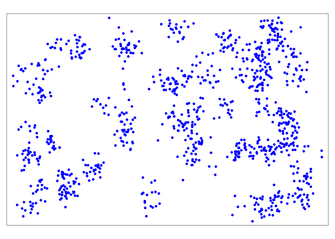
单独来看,这些点并不能告诉我们太多。所以我们还应该绘制行政边界:
我们再次使用 tm_shape(),但我们不提供案例点 shapefile,而是提供管理边界 shapefile(多边形)。
使用 bbox = argument(bbox 代表“边界框”),我们可以指定坐标边界。首先我们显示没有bbox的地图显示,然后再使用它。
# Just the administrative boundaries (polygons)# # 只是行政边界(多边形)tm_shape(sle_adm3) + # admin boundaries shapefile tm_polygons(col = "#F7F7F7")+ # show polygons in light grey tm_borders(col = "#000000", # show borders with color and line weight lwd = 2) + tm_text("admin3name") # column text to display for each polygon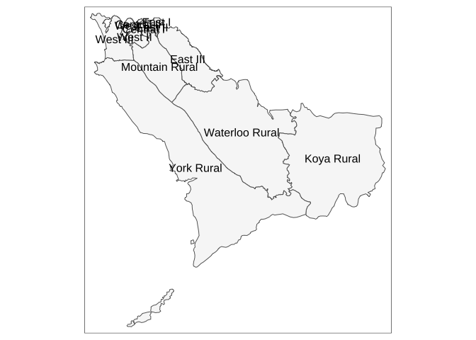
# Same as above, but with zoom from bounding box# # 同上,但从边界框缩放tm_shape(sle_adm3, bbox = c(-13.3, 8.43, # corner 左上角 -13.2, 8.5)) + # corner tm_polygons(col = "#F7F7F7") + tm_borders(col = "#000000", lwd = 2) + tm_text("admin3name")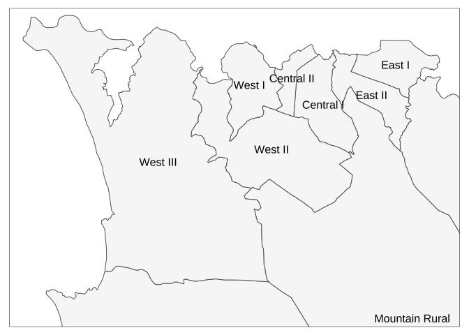
现在把点和多边形边界放在一起
# All togethertm_shape(sle_adm3, bbox = c(-13.3, 8.43, -13.2, 8.5)) + # 边界 tm_polygons(col = "#F7F7F7") + tm_borders(col = "#000000", lwd = 2) + tm_text("admin3name")+tm_shape(linelist_sf) + tm_dots(size=0.08, col='blue', alpha = 0.5) + # 点 tm_layout(title = "Distribution of Ebola cases") # give title to map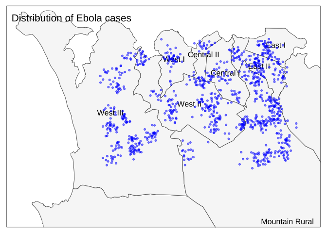
3.空间连接 Spatial joins
您可能熟悉将数据从一个数据集连接到另一个数据集。空间连接具有类似的目的,但利用了空间关系。您可以利用它们的空间关系,而不是依赖列中的公共值来正确匹配观测值,例如一个要素在另一个要素内,或与另一个要素最近的邻居,或在距另一个要素一定半径的缓冲区内,等等。
sf 包提供了多种空间连接方法。请参阅此参考中有关 st_join 方法和空间连接类型的更多文档。
3.1多边形中的点 Points in polygon
空间分配行政单位到案例 Spatial assign administrative units to cases
这是一个有趣的难题:案例行列表不包含有关案例行政单位的任何信息。尽管在初始数据收集阶段收集此类信息是理想的,但我们也可以根据其空间关系(即点与多边形相交)将行政单元分配给各个案例。
下面,我们将在空间上将案例位置(points)与 ADM3 边界(多边形polygons)相交:
- 从行列表(点)开始
- 空间连接到边界,将连接类型
join设置为“st_intersects” - 使用 select() 仅保留某些新的管理边界列
linelist_adm <- linelist_sf %>% # join the administrative boundary file to the linelist, based on spatial intersection sf::st_join(sle_adm3, join = st_intersects)sle_adms 中的所有列都已添加到行列表中!现在,每个案例都有列详细说明其所属的管理级别。在此示例中,我们只想保留两个新列(admin level 3),因此我们select()旧列名和另外两个感兴趣的列:
linelist_adm <- linelist_sf %>% # join the administrative boundary file to the linelist, based on spatial intersection sf::st_join(sle_adm3, join = st_intersects) %>% # Keep the old column names and two new admin ones of interest select(names(linelist_sf), admin3name, admin3pcod)下面,仅出于显示目的,您可以看到前十个案例以及已附加的管理级别 3 (ADM3) 管辖区,基于点在空间上与多边形形状相交的位置。
# Now you will see the ADM3 names attached to each caselinelist_adm %>% select(case_id, admin3name, admin3pcod)## Simple feature collection with 1000 features and 3 fields## Geometry type: POINT## Dimension: XY## Bounding box: xmin: -13.27095 ymin: 8.447961 xmax: -13.20589 ymax: 8.490442## Geodetic CRS: WGS 84## First 10 features:## case_id admin3name admin3pcod geometry## 5680 78703fWest III SL040208 POINT (-13.25821 8.453866)## 3020 525a03 Mountain Rural SL040102 POINT (-13.22085 8.453176)## 5154 19d49cWest III SL040208 POINT (-13.26978 8.480407)## 3963 76a224 East II SL040204 POINT (-13.22583 8.484195)## 2268 5355c3 East II SL040204 POINT (-13.21946 8.481999)## 3539 185ac2 West II SL040207 POINT (-13.25619 8.483108)## 5418 798126West III SL040208 POINT (-13.26513 8.47565)## 3874 e3ba2c West II SL040207 POINT (-13.23237 8.460837)## 2481 b345c5 West II SL040207 POINT (-13.22861 8.469415)## 2482 3ca785West III SL040208 POINT (-13.25258 8.457118)现在我们可以按行政单位来描述我们的案例——这是在空间连接之前我们无法做到的!
# Make new dataframe containing counts of cases by administrative unit# 创建包含行政单位案件计数的新数据框case_adm3 <- linelist_adm %>% # begin with linelist with new admin cols as_tibble() %>% # convert to tibble for better display group_by(admin3pcod, admin3name) %>% # group by admin unit, both by name and pcode summarise(cases = n()) %>% # summarize and count rows arrange(desc(cases))# arrange in descending orderhead(case_adm3)## # A tibble: 6 × 3## # Groups: admin3pcod [6]## admin3pcod admin3name cases## ## 1 SL040102 Mountain Rural 281## 2 SL040208 West III 214## 3 SL040207 West II 204## 4 SL040204 East II 108## 5 SL040201 Central I 54## 6 SL040203 East I 54我们还可以按行政单位创建病例计数条形图 bar plot。
在此示例中,我们以 linelist_adm 开始 ggplot(),以便我们可以应用 fct_infreq() 之类的因子函数,它按频率对条形图进行排序(有关提示,请参阅因子页面)。
ggplot( data = linelist_adm, # begin with linelist containing admin unit info mapping = aes( x = fct_rev(fct_infreq(admin3name))))+ # x-axis is admin units, ordered by frequency (reversed) geom_bar()+ # create bars, height is number of rows coord_flip()+ # flip X and Y axes for easier reading of adm units theme_classic()+ # simplify background labs( # titles and labels x = "Admin level 3", y = "Number of cases", title = "Number of cases, by adminstative unit", caption = "As determined by a spatial join, from 1000 randomly sampled cases from linelist" )
3.2最近的邻居 Nearest neighboor
寻找最近的医疗机构/集水区
了解与疾病热点相关的卫生设施的位置可能很有用。
我们可以使用 st_join() 函数(sf 包)中的 st_nearest_feature 连接方法来可视化离个别病例最近的医疗机构。
- 我们从
shapefilelinelistlinelist_sf开始 - 我们在空间上加入
sle_hf,这是卫生设施和诊所的位置(点)
# Closest health facility to each caselinelist_sf_hf <- linelist_sf %>% # begin with linelist shapefile st_join(sle_hf, join = st_nearest_feature) %>% # data from nearest clinic joined to case data select(case_id, osm_id, name, amenity) %>%# keep columns of interest, including id, name, type, and geometry of healthcare facility rename("nearest_clinic" = "name") # re-name for clarityhead(linelist_sf_hf)## Simple feature collection with 6 features and 4 fields## Geometry type: POINT## Dimension: XY## Bounding box: xmin: -13.26978 ymin: 8.453176 xmax: -13.21946 ymax: 8.484195## Geodetic CRS: WGS 84## case_id osm_id nearest_clinic amenity geometry## 5680 78703f 3341831443 Den Clinic clinic POINT (-13.25821 8.453866)## 3020 525a03 6979628967 Shriners Hospitals for Children hospital POINT (-13.22085 8.453176)## 5154 19d49c 3341831443 Den Clinic clinic POINT (-13.26978 8.480407)## 3963 76a224 4540108136 panasonic clinic POINT (-13.22583 8.484195)## 2268 5355c3 3342039261 GINER HALL COMMUNITY HOSPITAL clinic POINT (-13.21946 8.481999)## 3539 185ac2 3341831443 Den Clinic clinic POINT (-13.25619 8.483108)# DT::datatable(head(linelist_sf_hf, 10), rownames = FALSE, # options = list(pageLength = 5, scrollX=T), class = 'white-space: nowrap' )我们可以看到,约 30% 的病例中,“Den Clinic”是最近的医疗机构。
# Count cases by health facilityhf_catchment <- linelist_sf_hf %>% # begin with linelist including nearest clinic data as.data.frame() %>% # convert from shapefile to dataframe count(nearest_clinic,# count rows by "name" (of clinic) name = "case_n") %>% # assign new counts column as "case_n" arrange(desc(case_n))# arrange in descending orderhf_catchment # print to console## nearest_clinic case_n## 1Den Clinic 369## 2Shriners Hospitals for Children 321## 3 GINER HALL COMMUNITY HOSPITAL 176## 4 panasonic 43## 5 Princess Christian Maternity Hospital 33## 6 23## 7 MABELL HEALTH CENTER 22## 8ARAB EGYPT CLINIC 13# tmap_mode("view") # set tmap mode to interactive # plot the cases and clinic points tm_shape(linelist_sf_hf) + # plot cases tm_dots(size=0.08, # cases colored by nearest clinic col='nearest_clinic') + tm_shape(sle_hf) + # plot clinic facilities in large black dots tm_dots(size=0.3, col='black', alpha = 0.4) + tm_text("name") + # overlay with name of facilitytm_view(set.view = c(-13.2284, 8.4699, 13), # adjust zoom (center coords, zoom) set.zoom.limits = c(13,14))+tm_layout(title = "Cases, colored by nearest clinic")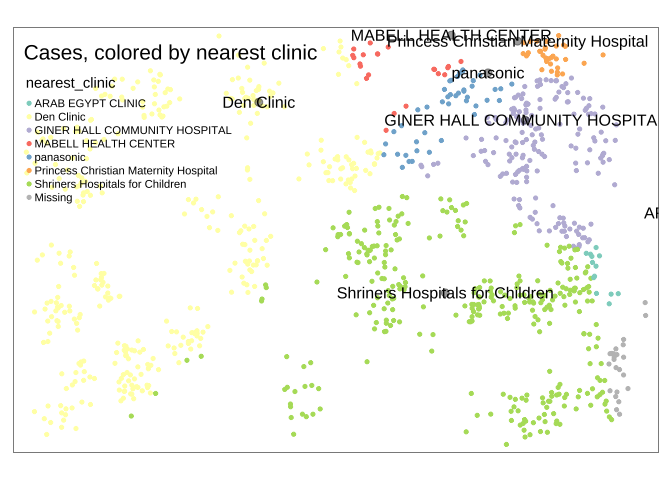
3.3缓冲区 Buffers
我们还可以探索有多少病例位于距离最近的医疗机构 2.5 公里(约 30 分钟)的步行距离内。
注意:为了更准确地计算距离,最好将您的 sf 对象重新投影到相应的本地地图投影系统,例如 UTM(地球投影到平面上)。在此示例中,为简单起见,我们将坚持使用世界大地测量系统 (WGS84) 地理坐标系(地球以球形/圆形表面表示,因此单位为十进制度)。我们将使用一般转换:1 十进制度 = ~111km。
在这篇 esri 文章中查看有关地图投影和坐标系的更多信息。该博客讨论了不同类型的地图投影,以及如何根据感兴趣的区域和地图/分析的背景选择合适的投影。
- 首先,在每个卫生设施周围创建一个半径约为 2.5 公里的圆形缓冲区。这是通过 tmap 中的函数
st_buffer()完成的。因为 地图的单位是纬度/经度十进制度,这就是“0.02”的解释方式。如果您的地图坐标系以米为单位,则必须以米为单位提供数字。
sle_hf_2k <- sle_hf %>% st_buffer(dist=0.02)# decimal degrees translating to approximately 2.5km tmap_mode("plot")# Create circular buffers# 创建循环缓冲区tm_shape(sle_hf_2k) + tm_borders(col = "black", lwd = 2)+tm_shape(sle_hf) + # plot clinic facilities in large red dots tm_dots(size=0.3, col='black') 
- 其次,我们使用
st_join()和st_intersects*的连接类型将这些缓冲区与案例(点)相交。也就是说,来自缓冲区的数据连接到它们相交的点。
# Intersect the cases with the bufferslinelist_sf_hf_2k <- linelist_sf_hf %>% st_join(sle_hf_2k, join = st_intersects, left = TRUE) %>% filter(osm_id.x== osm_id.y | is.na(osm_id.y)) %>% select(case_id, osm_id.x, nearest_clinic, amenity.x, osm_id.y)现在我们可以计算结果:nrow(linelist_sf_hf_2k[is.na(linelist_sf_hf_2k$osm_id.y),0])在 1000 个案例中没有与任何缓冲区相交(缺少该值),因此步行超过 30 分钟最近的医疗机构。
# Cases which did not get intersected with any of the health facility bufferslinelist_sf_hf_2k %>% filter(is.na(osm_id.y)) %>% nrow()## [1] 1000我们可以将结果可视化,使得不与任何缓冲区相交的案例显示为红色。
# tmap_mode("view")# First display the cases in points 首先以点显示案例tm_shape(linelist_sf_hf) + tm_dots(size=0.08, col='nearest_clinic') +# plot clinic facilities in large black dots 用大黑点绘制诊所设施tm_shape(sle_hf) + tm_dots(size=0.3, col='black')+ # Then overlay the health facility buffers in polylines 然后在折线中覆盖卫生设施缓冲区tm_shape(sle_hf_2k) + tm_borders(col = "black", lwd = 2) +# Highlight cases that are not part of any health facility buffers 用红点突出显示不属于任何卫生设施缓冲区的病例# in red dots tm_shape(linelist_sf_hf_2k %>% filter(is.na(osm_id.y))) + tm_dots(size=0.1, col='red') +tm_view(set.view = c(-13.2284,8.4699, 13), set.zoom.limits = c(13,14))+# add title tm_layout(title = "Cases by clinic catchment area")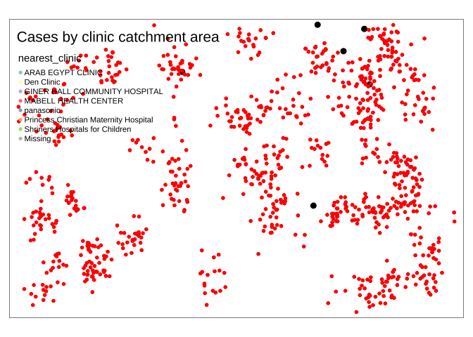
3.4其他空间连接类型
参数join的替代值包括文档:
- st_contains_properly
- st_contains
- st_covered_by
- st_covers
- st_crosses
- st_disjoint
- st_equals_exact
- st_equals
- st_is_within_distance
- st_nearest_feature
- st_overlaps
- st_touches
- st_within
4.等值域图 Choropleth 地图
Choropleth 地图可用于按预定义区域(通常是行政单位或卫生区域)可视化您的数据。例如,在疫情应对中,这有助于针对高发病率的特定地区分配资源。
现在我们已经为所有案例分配了行政单位名称(请参阅上面的空间连接部分),我们可以开始按区域映射案例计数(等值域图)。由于我们还有 ADM3 的人口数据,我们可以将此信息添加到之前创建的 case_adm3 表中。
我们从上一步中创建的数据框 case_adm3 开始,它是每个行政单位及其案例数量的汇总表。
- 人口数据 sle_adm3_pop 使用 dplyr 的 left_join() 连接,基于 case_adm3 数据帧中的 admin3pco 列和 sle_adm3_pop 数据帧中的 adm_pcode 列的共同值。请参阅加入数据页面)。
- select() 应用于新的数据框,只保留有用的列 - total 是总人口
- 每 10,000 人口中的病例数计算为带有 mutate() 的新列
# Add population data and calculate cases per 10K populationcase_adm3 <- case_adm3 %>% left_join(sle_adm3_pop, # add columns from pop dataset by = c("admin3pcod" = "adm3_pcode")) %>% # join based on common values across these two columns 基于这两列的共同值连接 select(names(case_adm3), total) %>% # keep only important columns, including total population mutate(case_10kpop = round(cases/total * 10000, 3)) # make new column with case rate per 10000, rounded to 3 decimalscase_adm3 # print to console for viewing## # A tibble: 10 × 5## # Groups: admin3pcod [10]## admin3pcod admin3name cases total case_10kpop## ## 1 SL040102 Mountain Rural 281 3399382.7 ## 2 SL040208 West III 214 21025210.2 ## 3 SL040207 West II 204 14510914.1 ## 4 SL040204 East II 108 9982110.8 ## 5 SL040201 Central I 54 69683 7.75## 6 SL040203 East I 54 68284 7.91## 7 SL040206 West I 42 60186 6.98## 8 SL040202 Central II 25 2387410.5 ## 9 SL040205 East III 11 500134 0.22## 10 7 NANA将此表与 ADM3 多边形 shapefile 连接以进行映射
case_adm3_sf <- case_adm3 %>% # begin with cases & rate by admin unit left_join(sle_adm3, by="admin3pcod") %>% # join to shapefile data by common column select(objectid, admin3pcod, # keep only certain columns of interest admin3name = admin3name.x, # clean name of one column admin2name, admin1name, cases, total, case_10kpop, geometry) %>% # keep geometry so polygons can be plotted drop_na(objectid) %>% # drop any empty rows st_as_sf() # convert to shapefile# tmap modetmap_mode("plot") # view static map# plot polygonstm_shape(case_adm3_sf) + tm_polygons("cases") + # color by number of cases column tm_text("admin3name") # name display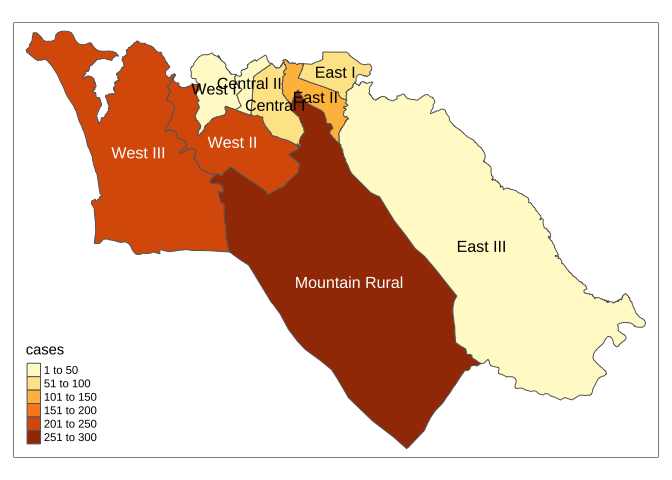
我们还可以绘制发病率图
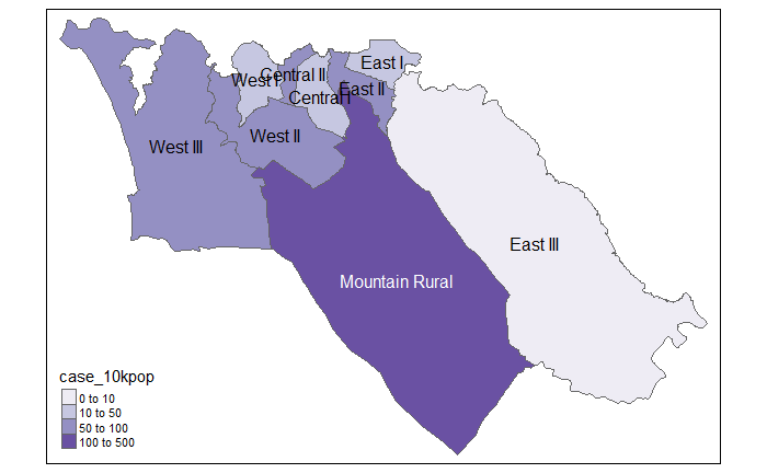
# Cases per 10K populationtmap_mode("plot") # static viewing mode# plottm_shape(case_adm3_sf) + # plot polygons tm_polygons("case_10kpop", # color by column containing case ratebreaks=c(0, 10, 50, 100), # define break points for colorspalette = "Purples"# use a purple color palette) + tm_text("admin3name") # display text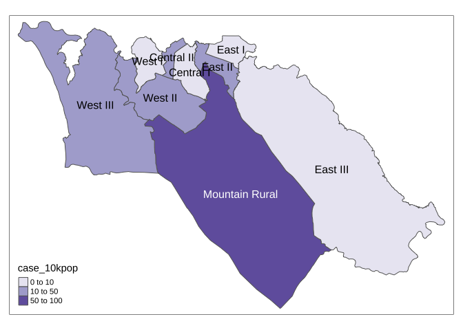
5.使用 ggplot2
进行映射如果您已经熟悉使用 ggplot2,则可以使用该包来创建数据的静态映射。 geom_sf() 函数将根据数据中的特征(点、线或多边形)绘制不同的对象。例如,您可以在 ggplot() 中使用 geom_sf(),使用 sf 数据和多边形几何来创建等值线图。
为了说明这是如何工作的,我们可以从我们之前使用的 ADM3 多边形 shapefile 开始。回想一下,这些是塞拉利昂的 3 级管理员区域:
sle_adm3## Simple feature collection with 12 features and 19 fields## Geometry type: MULTIPOLYGON## Dimension: XY## Bounding box: xmin: -13.29894 ymin: 8.094272 xmax: -12.91333 ymax: 8.499809## Geodetic CRS: WGS 84## First 10 features:## objectid admin3name admin3pcod admin3ref_n admin2name admin2pcod admin1name admin1pcod admin0name admin0pcoddate valid_on valid_to shape_leng shape_area rowcacode0 rowcacode1 rowcacode2 rowcacode3 geometry## 1155 Koya Rural SL040101 Koya Rural Western Area Rural SL0401 WesternSL04 Sierra Leone SL 2016-08-01 2016-10-17 0.63822264 1.366013e-02 SLE SLE004 SLE004001 SLE004001001 MULTIPOLYGON (((-13.02082 8...## 2156 Mountain Rural SL040102 Mountain Rural Western Area Rural SL0401 WesternSL04 Sierra Leone SL 2016-08-01 2016-10-17 0.29268365 3.182343e-03 SLE SLE004 SLE004001 SLE004001002 MULTIPOLYGON (((-13.21496 8...## 3157 Waterloo Rural SL040103 Waterloo Rural Western Area Rural SL0401 WesternSL04 Sierra Leone SL 2016-08-01 2016-10-17 0.72265524 1.364140e-02 SLE SLE004 SLE004001 SLE004001003 MULTIPOLYGON (((-13.12215 8...## 4158 York Rural SL040104 York Rural Western Area Rural SL0401 WesternSL04 Sierra Leone SL 2016-08-01 2016-10-17 1.23916989 1.983448e-02 SLE SLE004 SLE004001 SLE004001004 MULTIPOLYGON (((-13.24441 8...## 5159 Central I SL040201 Central I Western Area Urban SL0402 WesternSL04 Sierra Leone SL 2016-08-01 2016-10-17 0.06882179 1.882636e-04 SLE SLE004 SLE004002 SLE004002001 MULTIPOLYGON (((-13.22646 8...## 6160 East I SL040203 East I Western Area Urban SL0402 WesternSL04 Sierra Leone SL 2016-08-01 2016-10-17 0.05749169 1.429506e-04 SLE SLE004 SLE004002 SLE004002003 MULTIPOLYGON (((-13.2129 8....## 7161 East II SL040204 East II Western Area Urban SL0402 WesternSL04 Sierra Leone SL 2016-08-01 2016-10-17 0.08397463 1.494827e-04 SLE SLE004 SLE004002 SLE004002004 MULTIPOLYGON (((-13.22653 8...## 8162 Central II SL040202 Central II Western Area Urban SL0402 WesternSL04 Sierra Leone SL 2016-08-01 2016-10-17 0.04878431 6.513035e-05 SLE SLE004 SLE004002 SLE004002002 MULTIPOLYGON (((-13.23154 8...## 9163West III SL040208West III Western Area Urban SL0402 WesternSL04 Sierra Leone SL 2016-08-01 2016-10-17 0.30219417 1.698296e-03 SLE SLE004 SLE004002 SLE004002008 MULTIPOLYGON (((-13.28529 8...## 10 164 West I SL040206 West I Western Area Urban SL0402 WesternSL04 Sierra Leone SL 2016-08-01 2016-10-17 0.06952030 1.822183e-04 SLE SLE004 SLE004002 SLE004002006 MULTIPOLYGON (((-13.24677 8...我们可以使用 dplyr 的 left_join() 函数来添加我们想要映射到 shapefile 对象的数据。在这种情况下,我们将使用之前创建的 case_adm3 数据框来汇总行政区域的病例数;但是,我们可以使用相同的方法来映射存储在数据框中的任何数据。
sle_adm3_dat <- sle_adm3 %>% inner_join(case_adm3, by = "admin3pcod") # inner join = retain only if in both data objectsselect(sle_adm3_dat, admin3name.x, cases) # print selected variables to console## Simple feature collection with 9 features and 2 fields## Geometry type: MULTIPOLYGON## Dimension: XY## Bounding box: xmin: -13.29894 ymin: 8.384533 xmax: -13.12612 ymax: 8.499809## Geodetic CRS: WGS 84## admin3name.x cases geometry## 1 Mountain Rural 281 MULTIPOLYGON (((-13.21496 8...## 2 Central I 54 MULTIPOLYGON (((-13.22646 8...## 3 East I 54 MULTIPOLYGON (((-13.2129 8....## 4 East II 108 MULTIPOLYGON (((-13.22653 8...## 5 Central II 25 MULTIPOLYGON (((-13.23154 8...## 6West III 214 MULTIPOLYGON (((-13.28529 8...## 7 West I 42 MULTIPOLYGON (((-13.24677 8...## 8 West II 204 MULTIPOLYGON (((-13.25698 8...## 9East III 11 MULTIPOLYGON (((-13.20465 8...要按区域制作病例计数柱形图,使用 ggplot2,我们可以调用 geom_col(),如下所示:
ggplot(data=sle_adm3_dat) + geom_col(aes(x=fct_reorder(admin3name.x, cases, .desc=T), # reorder x axis by descending 'cases' #通过降序“案例”对 x 轴重新排序 y=cases)) + # y axis is number of cases by region theme_bw() + labs( # set figure text title="Number of cases, by administrative unit", x="Admin level 3", y="Number of cases" ) + guides(x=guide_axis(angle=45))# angle x-axis labels 45 degrees to fit better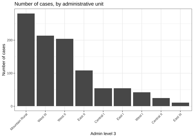
如果我们想使用 ggplot2 来制作案例计数的等值线图,我们可以使用类似的语法来调用 geom_sf() 函数:
ggplot(data=sle_adm3_dat) + geom_sf(aes(fill=cases)) # set fill to vary by case count variable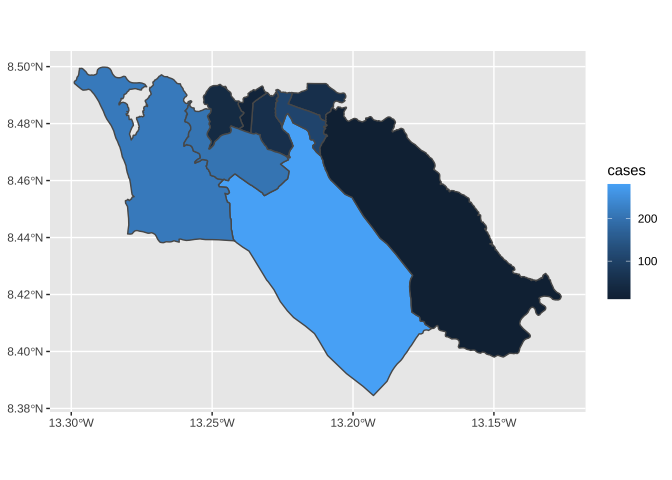
然后,我们可以使用与 ggplot2 一致的语法来自定义地图的外观,例如:
ggplot(data=sle_adm3_dat) + geom_sf(aes(fill=cases)) + scale_fill_continuous(high="#54278f", low="#f2f0f7") + # change color gradient theme_bw() + labs(title = "Number of cases, by administrative unit", # set figure textsubtitle = "Admin level 3" )
对于习惯使用 ggplot2 的 R 用户,geom_sf() 提供了一个简单直接的实现,适用于基本的地图可视化。要了解更多信息,请阅读 geom_sf() 小插图或 ggplot2 书。
6.底图 Basemaps
6.1 OpenStreetMap
下面我们将描述如何使用 OpenStreetMap 功能为 ggplot2 地图实现底图。替代方法包括使用 ggmap,它需要在 Google 上免费注册(详情)。
OpenStreetMap 是一个协作项目,旨在创建免费的可编辑世界地图。基础地理位置数据(例如城市位置、道路、自然特征、机场、学校、医院、道路等)被认为是项目的主要输出。
首先我们加载 OpenStreetMap 包,我们将从中获取我们的底图。
然后,我们创建对象映射,我们使用 OpenStreetMap 包(文档)中的函数 openmap() 定义它。我们提供以下内容:
- upperLeft 和 lowerRight 两个坐标对指定底图切片的范围 在这种情况下,我们从 linelist 行中放入了 max 和 min,因此地图将动态响应数据
- zoom = (如果为 null 它自动确定)
- type = 底图的类型 - 我们列出了几个 这里的可能性和代码当前使用第一个([1])“osm”
- mergeTiles = 我们选择了TRUE,所以底图都合并为一个
# load packagepacman::p_load(OpenStreetMap)# Fit basemap by range of lat/long coordinates. Choose tile typemap <- OpenStreetMap::openmap( upperLeft = c(max(linelist$lat, na.rm=T), max(linelist$lon, na.rm=T)), # limits of basemap tile lowerRight = c(min(linelist$lat, na.rm=T), min(linelist$lon, na.rm=T)), zoom = NULL, type = c("osm", "stamen-toner", "stamen-terrain", "stamen-watercolor", "esri","esri-topo")[1])如果我们现在使用 OpenStreetMap 包中的 autoplot.OpenStreetMap() 绘制此底图,您会看到轴上的单位不是纬度/经度坐标。它使用不同的坐标系。要正确显示案例住所(以纬度/经度存储),必须更改此设置。
autoplot.OpenStreetMap(map)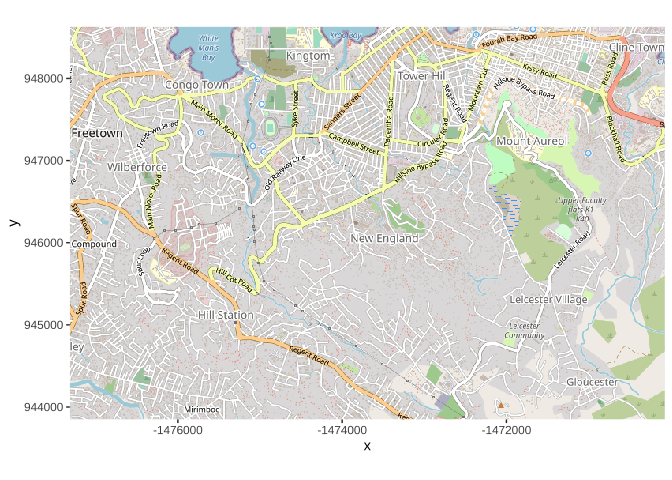
因此,我们想使用 OpenStreetMap 包中的 openproj() 函数将地图转换为纬度/经度。我们提供底图地图,还提供我们想要的坐标参考系 (CRS)。我们通过为 WGS 1984 投影提供“proj.4”字符串来做到这一点,但您也可以通过其他方式提供 CRS。 (请参阅此页面以更好地了解 proj.4 字符串是什么)
# Projection WGS84map_latlon <- openproj(map, projection = "+proj=longlat +ellps=WGS84 +datum=WGS84 +no_defs")现在,当我们创建绘图时,我们看到沿轴是纬度和经度坐标。坐标系已转换。现在,如果重叠,我们的案例将正确绘制!
# Plot map. Must use "autoplot" in order to work with ggplotautoplot.OpenStreetMap(map_latlon)
7.等高线密度热图 Contoured density heatmaps
下面我们描述了如何在底图上实现案例的等高线密度热图,从一个线列表(每个案例一行)开始。
- 从 OpenStreetMap 创建底图切片,如上所述
- 使用 latitude 和 longitude 列从 linelist 中绘制案例
- 使用 ggplot2 中的 stat_density_2d()将点转换为密度热图
当我们有一个具有纬度/经度坐标的底图时,我们可以使用其居住地的经度/纬度坐标将我们的案例绘制在顶部。基于函数 autoplot。 OpenStreetMap() 创建底图,ggplot2 函数将很容易添加到顶部,如下所示的 geom_point():
# Plot map. Must be autoplotted to work with ggplotautoplot.OpenStreetMap(map_latlon)+ # begin with the basemap geom_point( # add xy points from linelist lon and lat columns data = linelist, aes(x = lon, y = lat), size = 1, alpha = 0.5, show.legend = FALSE) + # drop legend entirely labs(x = "Longitude", # titles & labelsy = "Latitude",title = "Cumulative cases")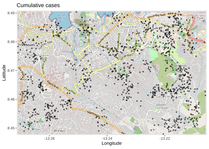
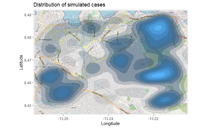
上面的地图可能难以解释,尤其是在点重叠的情况下。因此,您可以改为使用 ggplot2 函数 stat_density_2d() 绘制 2d 密度图。您仍在使用 linelist 纬度/经度坐标,但会执行 2D 内核密度估计,并使用等高线显示结果 - 就像地形图一样。在此处阅读完整文档。
# begin with the basemapautoplot.OpenStreetMap(map_latlon)+ # add the density plot ggplot2::stat_density_2d( data = linelist, aes( x = lon, y = lat, fill = ..level.., alpha = ..level..), bins = 10, geom = "polygon", contour_var = "count", show.legend = F) + # specify color scale scale_fill_gradient(low = "black", high = "red")+ # labels labs(x = "Longitude",y = "Latitude",title = "Distribution of cumulative cases")
7.2 时间序列热图 Time series heatmap
上面的密度热图显示了累积案例cumulative cases。我们可以通过基于症状发作月份的热图来检查随着时间和空间的爆发,从线条列表中派生出来。
我们从linelist开始,创建一个带有发病年份和月份的新列。 base R 中的 format() 函数改变了日期的显示方式。在这种情况下,我们想要“YYYY-MM”。
linelist = linelist %>% mutate(date_onset_ym = format(date_onset, "%Y-%m"))# Examine the values table(linelist$date_onset_ym, useNA = "always")## ## 2014-04 2014-05 2014-06 2014-07 2014-08 2014-09 2014-10 2014-11 2014-12 2015-01 2015-02 2015-03 2015-04 ##37 13 38 77 181 204 134 100 73 54 42 32 42现在,我们简单地通过 ggplot2 将 facetting 引入密度热图。应用 facet_wrap(),将新列用作行。为了清楚起见,我们将分面列的数量设置为 3。
# packagespacman::p_load(OpenStreetMap, tidyverse)# begin with the basemapautoplot.OpenStreetMap(map_latlon)+ # add the density plot ggplot2::stat_density_2d( data = linelist, aes( x = lon, y = lat, fill = ..level.., alpha = ..level..), bins = 10, geom = "polygon", contour_var = "count", show.legend = F) + # specify color scale scale_fill_gradient(low = "black", high = "red")+ # labels labs(x = "Longitude",y = "Latitude",title = "Distribution of cumulative cases over time")+ # facet the plot by month-year of onset facet_wrap(~ date_onset_ym, ncol = 4) 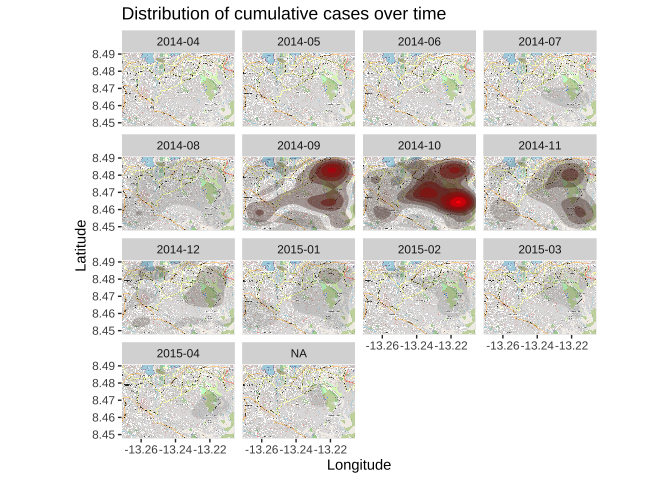
Reference
the handbook team. (2021). R for applied epidemiology and public health | The Epidemiologist R Handbook. Epirhandbook.com. https://epirhandbook.com/en/index.html
tmap: get started! (2020). R-Project.org. https://cran.r-project.org/web/packages/tmap/vignettes/tmap-getstarted.html
Geometric binary predicates on pairs of simple feature geometry sets — geos_binary_pred. (2017). Github.io. https://r-spatial.github.io/sf/reference/geos_binary_pred.html
Visualise sf objects — CoordSf. (2022). Tidyverse.org. https://ggplot2.tidyverse.org/reference/ggsf.html