R语言数据可视化ggplot2-检验变量相关性图形汇总
可视化用于检验变量相关性
本文介绍的图主要有助于检查两个变量的相关程度。共涉及图形包括:
- 1.散点图 Scatterplot
- 2.带环绕的散点图 Scatterplot with Encircling
- 3.抖动图 Jitter Plot
- 4.计数图 Counts Chart
- 5.气泡图 Bubble Plot
- 6.边际直方图/箱线图 Marginal Histogram / Boxplot
- 7.相关图 Correlogram
1.散点图 Scatterplot
数据分析最常用的图无疑是散点图。每当你想了解两个变量之间关系的性质时,第一选择总是散点图。它可以使用 geom_point() 绘制。此外,默认情况下绘制平滑线的 geom_smooth 可以通过设置 method='lm' 调整以绘制最佳拟合线。
# 导入所需包和数据options(scipen=999) # 关闭科学记数法,如 1e+48library(ggplot2)theme_set(theme_bw()) # 设置 theme_bw()为默认主题.data("midwest", package = "ggplot2") # 导入数据# midwest <- read.csv("http://goo.gl/G1K41K") # 数据源# Scatterplotgg <- ggplot(midwest, aes(x=area, y=poptotal)) + geom_point(aes(col=state, size=popdensity)) + geom_smooth(method="loess", se=F) + xlim(c(0, 0.1)) + ylim(c(0, 500000)) + labs(subtitle="Area Vs Population", y="Population", x="Area", title="Scatterplot", caption = "Source: midwest")plot(gg)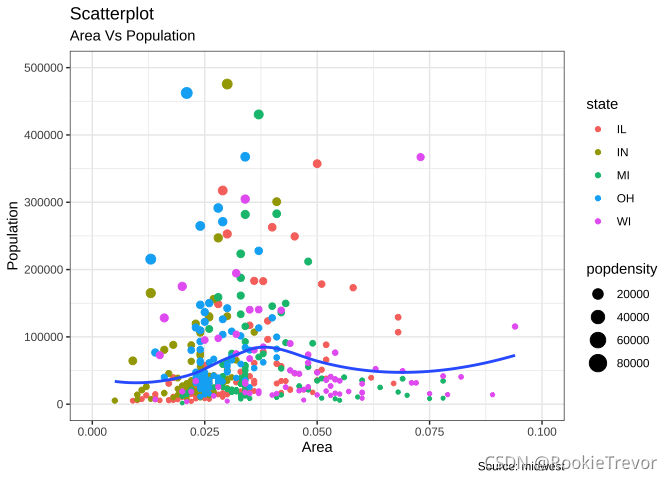
2.带环绕的散点图 Scatterplot With Encircling
在展示结果时,有时我会在图表中圈出某些特殊的点或区域,以引起人们对那些特殊情况的注意。这可以使用 ggalt 包中的 geom_encircle() 方便地完成。
在 geom_encircle() 中,将数据设置为仅包含点(行)或兴趣的新数据框。此外,可以使用曲线以便刚好包围想要强调的点。曲线的颜色和大小(粗细)也可以修改。见下面的例子。
# install 'ggalt' pkg# devtools::install_github("hrbrmstr/ggalt")options(scipen = 999)library(ggplot2)library(ggalt)# 希望强调的区域midwest_select <- midwest[midwest$poptotal > 350000 & midwest$poptotal <= 500000 & midwest$area > 0.01 & midwest$area < 0.1, ]# Plotggplot(midwest, aes(x=area, y=poptotal)) + geom_point(aes(col=state, size=popdensity)) + # draw points geom_smooth(method="loess", se=F) + xlim(c(0, 0.1)) + ylim(c(0, 500000)) + # draw smoothing line geom_encircle(aes(x=area, y=poptotal), data=midwest_select, color="red", size=2, expand=0.08) + # encircle labs(subtitle="Area Vs Population", y="Population", x="Area", title="Scatterplot + Encircle", caption="Source: midwest")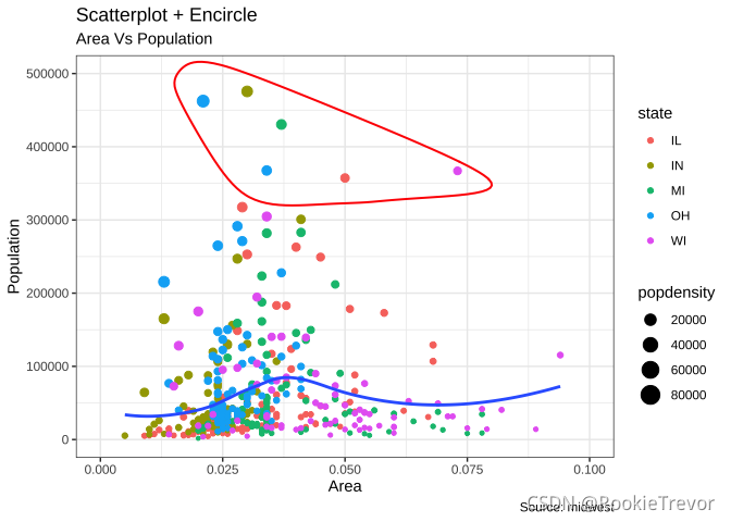
3.抖动图 Jitter Plot
让我们看一个新的数据来绘制散点图。这一次,我将使用 mpg 数据集绘制城市里程 (cty) 与高速公路里程 (hwy)。
# load package and datalibrary(ggplot2)data(mpg, package="ggplot2") # alternate source: "http://goo.gl/uEeRGu")theme_set(theme_bw()) # pre-set the bw theme.g <- ggplot(mpg, aes(cty, hwy))# Scatterplotg + geom_point() + geom_smooth(method="lm", se=F) + labs(subtitle="mpg: city vs highway mileage", y="hwy", x="cty", title="Scatterplot with overlapping points", caption="Source: midwest")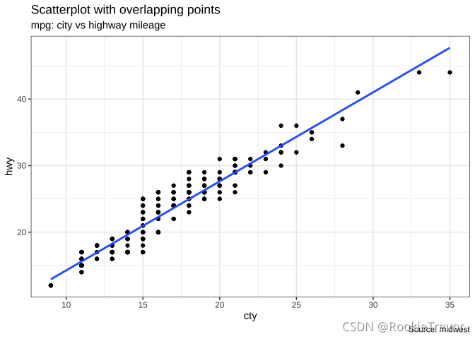
我们这里有一个 mpg 数据集中城市和高速公路里程的散点图。我们已经看到了一个类似的散点图,它看起来很整洁,并且清楚地说明了城市里程 (cty) 和高速公路里程 (hwy) 之间的相关性。
但是,这个看似合理的描述却隐藏了什么内容。你可以找到嘛?
dim(mpg)## [1] 234 11原始数据有 234 个数据点,但图表显示的点似乎更少。发生了什么?这是因为有许多重叠点显示为单个点。 cty 和 hwy 在源数据集中都是整数这一事实使得隐藏这个细节更加方便。因此,下次使用整数制作散点图时要格外小心。
那么如何处理呢?有几个选项。我们可以使用 jitter_geom() 制作抖动图。顾名思义,重叠点根据宽度参数(width)控制的阈值在其原始位置周围随机抖动。
# load package and datalibrary(ggplot2)data(mpg, package="ggplot2")# mpg <- read.csv("http://goo.gl/uEeRGu")# Scatterplottheme_set(theme_bw()) # pre-set the bw theme.g <- ggplot(mpg, aes(cty, hwy))g + geom_jitter(width = .5, size=1) + labs(subtitle="mpg: city vs highway mileage", y="hwy", x="cty", title="Jittered Points")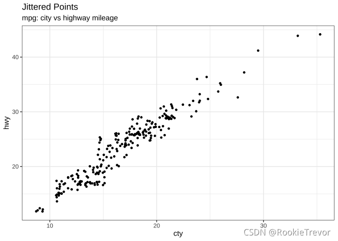
现在揭示更多点。宽度越大,点从其原始位置移动得越多。
4.计数图 Counts Chart
克服数据点重叠问题的第二种选择是使用计数图。哪里有更多的点重叠,圆圈的大小就会变大。
# load package and datalibrary(ggplot2)data(mpg, package="ggplot2")# mpg <- read.csv("http://goo.gl/uEeRGu")# Scatterplottheme_set(theme_bw()) # pre-set the bw theme.g <- ggplot(mpg, aes(cty, hwy))g + geom_count(col="tomato3", show.legend=F) + labs(subtitle="mpg: city vs highway mileage", y="hwy", x="cty", title="Counts Plot")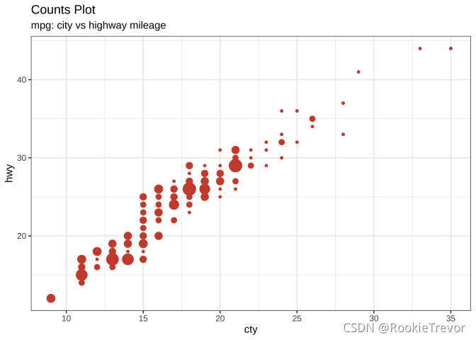
5.气泡图 Bubble plot
虽然散点图可以比较2个连续变量之间的关系,但如果您想基于以下基础了解基础组内的关系,则气泡图非常有用:
- 一个分类变量(通过改变颜色)
- 另一个连续变量(通过改变点的大小)。
简而言之,如果您有 4 维数据,其中两个是数字(X 和 Y),另一个是分类变量(颜色)和另一个数字变量(大小),则气泡图更合适。
气泡图清楚地区分了displ之间的差异范围以及最佳拟合线(lines-of-best-fit varies)的斜率如何变化,从而提供了更好的组间视觉比较。
# load package and datalibrary(ggplot2)data(mpg, package="ggplot2")# mpg <- read.csv("http://goo.gl/uEeRGu")mpg_select <- mpg[mpg$manufacturer %in% c("audi", "ford", "honda", "hyundai"), ]# Scatterplottheme_set(theme_bw()) # pre-set the bw theme.g <- ggplot(mpg_select, aes(displ, cty)) + labs(subtitle="mpg: Displacement vs City Mileage",title="Bubble chart")g + geom_jitter(aes(col=manufacturer, size=hwy)) + geom_smooth(aes(col=manufacturer), method="lm", se=F)
6.边际直方图/箱线图
如果要在同一图表中显示关系和分布,请使用边际直方图。它在散点图的边缘有一个 X 和 Y 变量的直方图。
这可以使用ggExtra包中的 ggMarginal() 函数来实现。除了直方图,您还可以通过设置相应的类型选项来选择绘制边际箱线图或密度图。
# load package and datalibrary(ggplot2)library(ggExtra)data(mpg, package="ggplot2")# mpg <- read.csv("http://goo.gl/uEeRGu")# Scatterplottheme_set(theme_bw()) # pre-set the bw theme.mpg_select <- mpg[mpg$hwy >= 35 & mpg$cty > 27, ]g <- ggplot(mpg, aes(cty, hwy)) + geom_count() + geom_smooth(method="lm", se=F)ggMarginal(g, type = "histogram", fill="transparent")ggMarginal(g, type = "boxplot", fill="transparent")
# ggMarginal(g, type = "density", fill="transparent")7.相关图 Correlogram
相关图让您检查同一数据帧中存在的多个连续变量的相关性。这可以使用 corrplot 包方便地实现。
# devtools::install_github("kassambara/ggcorrplot")library(ggplot2)library(ggcorrplot)# Correlation matrixdata(mtcars)corr <- round(cor(mtcars), 1)# Plotggcorrplot(corr, hc.order = TRUE, type = "lower", lab = TRUE, lab_size = 3, method="circle", colors = c("tomato2", "white", "springgreen3"), title="Correlogram of mtcars", ggtheme=theme_bw)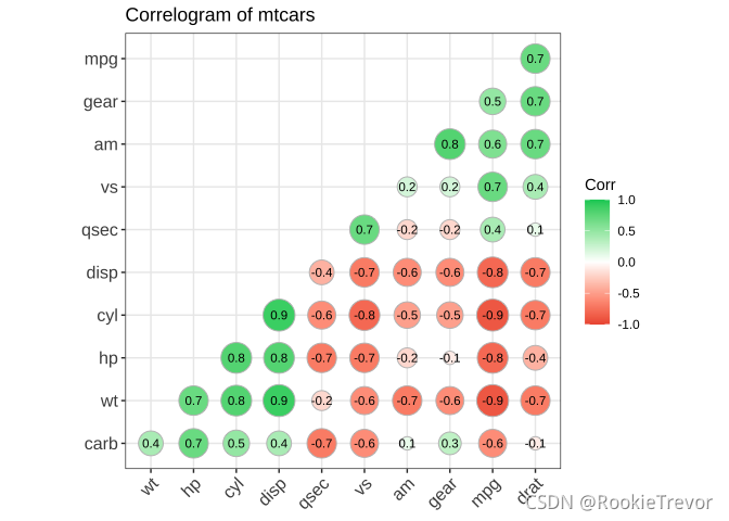
文章首发于WX公众号:R语言vs科研