线形进度条的几种实现方式
在大屏可视化应用中,进度条可以直观地表现出某个指标的进度,进度条的展示形式又有很多种,例如环形进度条,线性进度条等,环形进度条的实现方案可以参考之前写的一篇文章SVG绘制圆环进度条 https://blog.csdn.net/qq_40289557/article/details/123061211?spm=1001.2014.3001.5501
本章节针对线形进度条的几种实现方案提供一下个人的见解及具体的实现方案(以vue为技术栈),希望能够给大家带来一个抛砖引玉的效果,展示效果如下:
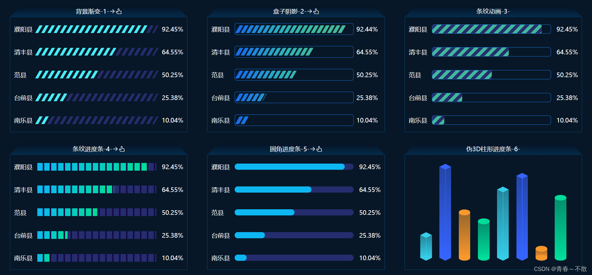
点击标题上方的小手可切换展示形式: 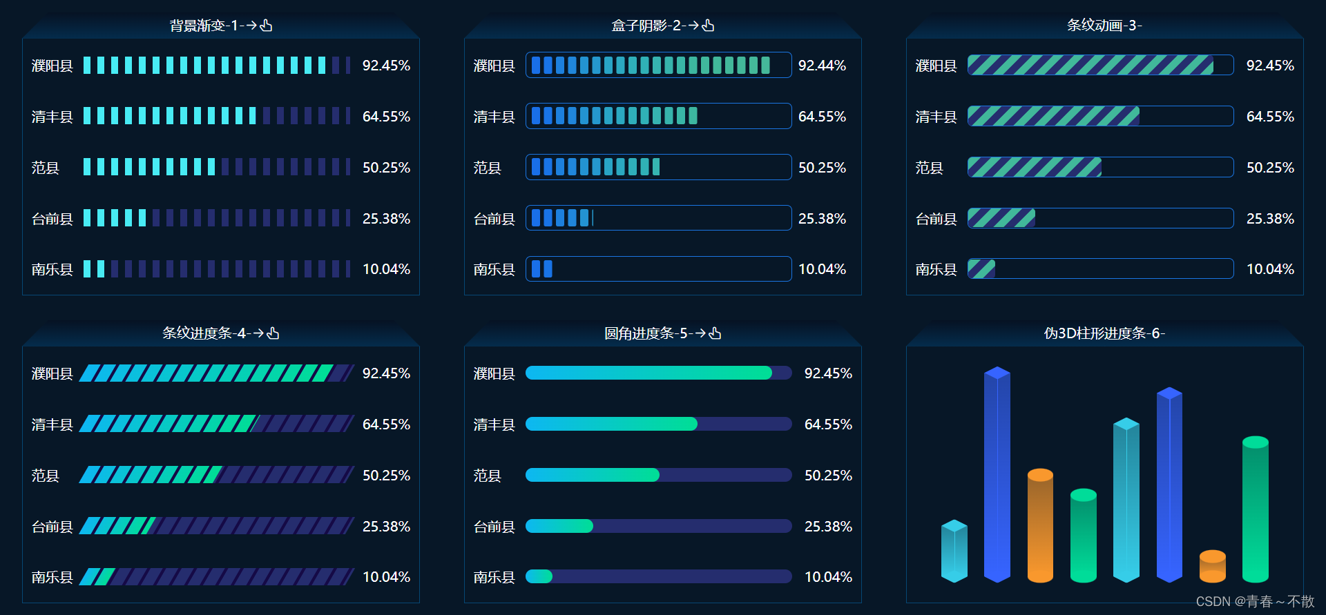
首先,框架页面代码如下,依次将六个进度条组件引入,通过组件传值的方式将个性化参数传递给子组件:
背景渐变-1- 盒子阴影-2- 条纹动画-3- 条纹进度条-4- 圆角进度条-5- 伪3D柱形进度条-6- import BgGradient from "./bggradient";import BoxShadow from "./boxshadow";import Stripe from "./stripe";import GapLine from "./gapline";import GradientBar from "./gradientbar";import LineCircle from "./linecircle";export default { name: "SVGLineIndex", components: { BgGradient, BoxShadow, Stripe, GapLine, GradientBar, LineCircle, }, data() { return { skew1: 0, skew2: 0, skew3: -30, bgColor: "linear-gradient(to right, #0db7f2, #00de95)", }; }, methods: { handleClick1() { if (this.skew1 === 0) { this.skew1 = -30; } else { this.skew1 = 0; } }, handleClick2() { if (this.skew2 === 0) { this.skew2 = -30; } else { this.skew2 = 0; } }, handleClick3() { if (this.skew3 === 0) { this.skew3 = -30; } else { this.skew3 = 0; } }, handleClick4() { if (this.bgColor === "#0db7f2") { this.bgColor = "linear-gradient(to right, #0db7f2, #00de95)"; } else { this.bgColor = "#0db7f2"; } }, },};.progress { display: flex; flex-wrap: wrap; justify-content: space-around; align-content: space-around; width: 100%; height: 100%; background-color: #071727; overflow: hidden;}.svg-module { width: 30%; height: 46%;}.module-content { width: 100%; height: calc(100% - 30px); padding: 10px; border: 1px solid #064774; color: #fff; box-sizing: border-box;}.module-title { position: relative; z-index: 1; width: 100%; height: 30px; line-height: 30px; font-size: 16px; text-align: center; color: #fff;}.module-title::before,.module-title::after { content: ""; position: absolute; z-index: -1; top: 0; width: 50%; height: 100%; background-image: linear-gradient(to bottom, #061223, #042c4c);}.module-title::before { left: 0; transform: skew(-45deg); transform-origin: left bottom;}.module-title::after { right: 0; transform: skew(45deg); transform-origin: right bottom;}.enable-click { cursor: pointer;}1.首先看第一个图表“背景渐变-1-”的实现方式,采用了背景层+进度条两层叠加的方式实现,这里妙用了CSS属性中的background可以平铺的特点,结合线性渐变和扭曲等特性,即可实现各种展示效果,具体实现逻辑如下:
{{ item.name }} {{ item.rate }} export default { name: "BgGradient", props: { skew: { type: Number, default: 0, }, }, data() { return { dataList: [ { name: "濮阳县", value: 92.45, rate: "92.45%" }, { name: "清丰县", value: 64.55, rate: "64.55%" }, { name: "范县", value: 50.25, rate: "50.25%" }, { name: "台前县", value: 25.38, rate: "25.38%" }, { name: "南乐县", value: 10.04, rate: "10.04%" }, ], }; },};.container { display: flex; width: 100%; height: 100%; justify-content: center; flex-wrap: wrap; align-content: space-between;}.type-box { display: flex; align-items: center; width: 100%; height: 40px;}.type-name { width: 60px; font-size: 16px; color: #fff;}.type-progress { position: relative; flex: 1; height: 20px; /* 核心代码 */ background: linear-gradient(to right, #252d6e 50%, transparent 50%) 0 0/16px 100% repeat-x; transform: skew(var(--skew));}.type-progress-rect { width: 100%; height: 100%; /* 核心代码 */ background: linear-gradient(to right, #48ebf4 50%, transparent 50%) 0 0/16px 100% repeat-x;}.type-num { width: 70px; font-size: 16px; color: #fff; text-align: right;}2.第二个图表“盒子阴影-2-” ,图表有一个个带圆角的小格子组成,从左往右有一个渐变效果,该类图表最容易实现的一种方案是借助CSS属性之box-shadow属性,通过设置格子的圆角程度、宽度、盒子阴影的偏移量、扭曲角度即可实现各种展示效果,代码如下:
{{ item.name }} {{ item.rate }} export default { name: "BoxShadow", props: { skew: { type: Number, default: 0, }, }, data() { return { dataList: [ { name: "濮阳县", value: 92.44, rate: "92.44%" }, { name: "清丰县", value: 64.55, rate: "64.55%" }, { name: "范县", value: 50.25, rate: "50.25%" }, { name: "台前县", value: 25.38, rate: "25.38%" }, { name: "南乐县", value: 10.04, rate: "10.04%" }, ], }; },};.container { display: flex; width: 100%; height: 100%; justify-content: center; flex-wrap: wrap; align-content: space-between;}.type-box { display: flex; align-items: center; width: 100%; height: 40px;}.type-name { width: 60px; font-size: 16px; color: #fff;}.type-progress { position: relative; flex: 1; height: 30px; border: 1px solid #1a76e3; border-radius: 6px;}.type-num { width: 70px; font-size: 16px; color: #fff; text-align: center;}.progress { display: flex; align-items: center; height: 100%; box-shadow: 0 0 #176ce9; overflow: hidden; transform: skew(var(--skew));}.progress::before { content: ""; display: block; margin-left: 6px; border-radius: 2px; width: 10px; height: 20px; background-color: #196fe8; /* 核心代码 */ box-shadow: 14px 0 #1974e6, 28px 0 #1d80dd, 42px 0 #2086db, 56px 0 #2393d2, 70px 0 #2598ce, 84px 0 #29a4c5, 98px 0 #2ba9c1, 112px 0 #2fafba, 126px 0 #30b1b6, 140px 0 #36b4b0, 154px 0 #37b4ac, 168px 0 #39b6a6, 182px 0 #3db7a0, 196px 0 #40b89c, 210px 0 #41b89a, 224px 0 #42b89a, 238px 0 #43b89a, 252px 0 #44b89a, 266px 0 #45b89a, 280px 0 #46b89a, 294px 0 #47b89a, 308px 0 #48b89a;}3.第三个图表“条纹动画-3-”,这个图表是第一个图表的升级版,在背景的基础上引入了动画属性,通过不间断的位置偏移,实现一个带动画的进度条,代码如下:
{{ item.name }} {{ item.rate }} export default { name: "Stripe", data() { return { dataList: [ { name: "濮阳县", value: 92.45, rate: "92.45%" }, { name: "清丰县", value: 64.55, rate: "64.55%" }, { name: "范县", value: 50.25, rate: "50.25%" }, { name: "台前县", value: 25.38, rate: "25.38%" }, { name: "南乐县", value: 10.04, rate: "10.04%" }, ], }; },};.container { display: flex; width: 100%; height: 100%; justify-content: center; flex-wrap: wrap; align-content: space-between;}.type-box { display: flex; align-items: center; width: 100%; height: 40px;}.type-name { width: 60px; font-size: 16px; color: #fff;}.type-num { width: 70px; font-size: 16px; color: #fff; text-align: right;}.type-progress { flex: 1; height: 24px; border: 1px solid #1a76e3; border-radius: 6px;}.type-percent { height: 100%; border-radius: 4px; /* 核心代码 */ background: linear-gradient( to right bottom, #41b89a 25%, #252d6e 25%, #252d6e 50%, #41b89a 50%, #41b89a 75%, #252d6e 75% ) 0 0/24px 24px; animation: animate 1s linear infinite;}@keyframes animate { 0% { background-position-x: 0; } 100% { background-position-x: 24px; }}4.第四个图表“条纹进度条-4-”,这个图表采用了三层堆叠的方式实现,分别是浅色背景层、彩色进度层和最上边的分割线层(分割线的颜色和背景层保持一致是实现的关键),具体代码如下:
{{ item.name }} {{ item.rate }} export default { name: "GapLine", props: { skew: { type: Number, default: 0, }, }, data() { return { dataList: [ { name: "濮阳县", value: 92.45, rate: "92.45%" }, { name: "清丰县", value: 64.55, rate: "64.55%" }, { name: "范县", value: 50.25, rate: "50.25%" }, { name: "台前县", value: 25.38, rate: "25.38%" }, { name: "南乐县", value: 10.04, rate: "10.04%" }, ], }; },};.container { display: flex; width: 100%; height: 100%; justify-content: center; flex-wrap: wrap; align-content: space-between;}.type-box { display: flex; align-items: center; width: 100%; height: 40px;}.type-name { width: 60px; font-size: 16px; color: #fff;}.type-progress { position: relative; flex: 1; height: 20px; transform: skew(var(--skew));}.type-progress::before,.type-progress::after { content: ""; position: absolute; left: 0; top: 0; width: 100%; height: 100%;}/* 浅色背景层 */.type-progress::before { z-index: -1; background-color: #252d6e;}/* 分割线层 */.type-progress::after { z-index: 1; background: linear-gradient(to right, transparent 80%, #150a46 80%) 0 0/18px 100% repeat-x;}/* 进度层 */.progress { width: 100%; height: 100%; background: linear-gradient(to right, #0db7f2, #00de95);}.type-num { width: 70px; font-size: 16px; color: #fff; text-align: right;}5.第五个图表“圆角进度条-5-”,这类图表应用场景比较广泛,在大屏可视化中应用比较频繁,和以上4中图表实现方式相比,也更简单,该图表是由两层堆叠而成,浅色背景层和彩色的进度层,当然可以结合渐变特性,实现更个性化的进度条展示效果,代码如下:
{{ item.name }} {{ item.rate }} export default { name: "GradientBar", props: { bgColor: { type: String, default: 'linear-gradient(to right, #0db7f2, #00de95)', }, }, data() { return { dataList: [ { name: "濮阳县", value: 92.45, rate: "92.45%" }, { name: "清丰县", value: 64.55, rate: "64.55%" }, { name: "范县", value: 50.25, rate: "50.25%" }, { name: "台前县", value: 25.38, rate: "25.38%" }, { name: "南乐县", value: 10.04, rate: "10.04%" }, ], }; },};.container { display: flex; width: 100%; height: 100%; justify-content: center; flex-wrap: wrap; align-content: space-between;}.type-box { display: flex; align-items: center; width: 100%; height: 40px;}.type-name { width: 60px; font-size: 16px; color: #fff;}.type-progress { position: relative; flex: 1; height: 16px; border-radius: 10px; background-color: #252d6e;}.progress { width: 100%; height: 100%; border-radius: 10px; /* 核心代码 */ background: var(--background);}.type-num { width: 70px; font-size: 16px; color: #fff; text-align: right;}6.第六个图表“伪3D柱形进度条-6-”,这类图表实现方式并不复杂,其实可以看成由三部分组成,柱体,头部、尾部;实现的难点在于如何添加头部和尾部的标记图形,这里使用了CSS属性中的clip-path属性,对指定区域进行裁剪,即可实现各种标记图形,代码如下:
export default { name: "LineCircle", data() { return { dataList: [ { id: 1, rate: "25%" }, { id: 2, rate: "100%" }, { id: 3, rate: "50%" }, { id: 4, rate: "40%" }, { id: 5, rate: "75%" }, { id: 6, rate: "90%" }, { id: 7, rate: "10%" }, { id: 8, rate: "66%" }, ], }; },};.bar-box { display: flex; align-items: flex-end; justify-content: space-around; padding: 20px; box-sizing: border-box; width: 100%; height: 100%;}.bar-item { position: relative; width: 30px; height: 0; box-sizing: border-box; transition: height 1s ease;}/* 核心代码 */.bar-box .bar-item:nth-child(4n + 1) { background: linear-gradient( to top, rgba(54, 205, 232, 1), rgba(54, 205, 232, 0.6) ); --marker-bg: rgb(54, 205, 232); --clip-path: polygon(50% 0%, 100% 50%, 50% 100%, 0 50%); --line-opacity: 1;}.bar-box .bar-item:nth-child(4n + 2) { background: linear-gradient( to top, rgba(54, 100, 255, 1), rgba(54, 100, 255, 0.6) ); --marker-bg: rgb(54, 100, 255); --clip-path: polygon(50% 0%, 100% 50%, 50% 100%, 0 50%); --line-opacity: 1;}.bar-box .bar-item:nth-child(4n + 3) { background: linear-gradient( to top, rgba(249, 152, 45, 1), rgba(249, 152, 45, 0.6) ); --marker-bg: rgb(249, 152, 45); --clip-path: none; --line-opacity: 0;}.bar-box .bar-item:nth-child(4n) { background: linear-gradient( to top, rgba(0, 220, 153, 1), rgba(0, 220, 153, 0.6) ); --marker-bg: rgb(0, 220, 153); --clip-path: none; --line-opacity: 0;}/ 柱子中间的线条,模拟棱角 */.bar-item .bar-line { position: absolute; left: 50%; top: 0; width: 1px; height: 100%; background: var(--marker-bg); opacity: var(--line-opacity);}/* 柱子的上下头部添加两个平行四边形 */.bar-item::before,.bar-item::after { content: ""; position: absolute; left: 0; width: 100%; /* 高度始终是宽度的一半 */ padding-top: 50%; border-radius: 50%; clip-path: var(--clip-path); z-index: 10; background-color: var(--marker-bg);}.bar-item::before { top: 0; transform: translateY(-50%);}.bar-item::after { bottom: 0; transform: translateY(50%);}当然,线形进度条的实现方案不限于以上几种,扎实的CSS基础知识结合个人的奇思妙想,可实现各式各样的进度条,如果大家有其它更好的实现方案,不防分享一下,一起进步、一起成长。

