Harmonyos Next 应用主题定制与样式管理(下)_鸿蒙4.3控制中心主题下载
文章目录
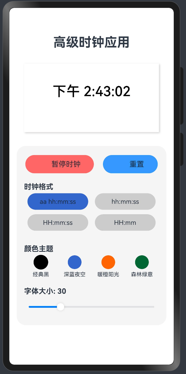
效果演示
简介
在鸿蒙OS应用开发中,良好的UI设计和主题定制对于提升用户体验至关重要。本教程将介绍如何在鸿蒙OS应用中实现主题定制、样式管理以及动态切换主题,帮助开发者创建更加美观、灵活的用户界面。
主题定义与管理
1. 定义主题类型
首先,我们需要定义一个主题类型接口,用于描述主题的属性:
interface ThemeType { name: string, // 主题名称 color: string, // 主要颜色 background: string // 背景颜色}2. 创建主题集合
接下来,我们可以创建一个主题集合,包含多种预定义的主题:
private themes: ThemeType[] = [ { name: \'经典黑\', color: \'#000000\', background: \'#FFFFFF\' }, { name: \'深蓝夜空\', color: \'#3366CC\', background: \'#F0F8FF\' }, { name: \'暖橙阳光\', color: \'#FF6600\', background: \'#FFFAF0\' }, { name: \'森林绿意\', color: \'#006633\', background: \'#F0FFF0\' }];3. 使用状态变量跟踪当前主题
使用@State装饰器定义状态变量,用于跟踪当前选择的主题:
@State selectedTheme: number = 0; // 默认使用第一个主题@State themeColor: string = \'#000000\'; // 当前主题颜色应用主题到UI组件
1. 应用背景颜色
Rect() .width(\'90%\') .height(150) .fill(this.themes[this.selectedTheme].background) .radius(15) .shadow({ radius: 10, color: \'#33000000\', offsetX: 5, offsetY: 5 })2. 应用文本颜色
Text(\'示例文本\') .fontSize(16) .fontColor(this.themeColor) .fontWeight(FontWeight.Medium)3. 应用半透明效果
通过在颜色代码后添加透明度值,可以实现半透明效果:
Text(\'半透明文本\') .fontColor(this.themeColor + \'99\') // 99表示约60%的不透明度主题切换功能实现
1. 创建主题选择界面
Text(\'颜色主题\') .fontSize(16) .fontWeight(FontWeight.Bold) .alignSelf(ItemAlign.Start) .margin({ left: \'5%\', bottom: 5 })Flex({ wrap: FlexWrap.Wrap, justifyContent: FlexAlign.SpaceAround }) { ForEach(this.themes, (theme: ThemeType, index) => { Column() { Circle({ width: 30, height: 30 }) .fill(theme.color) .stroke(this.selectedTheme === index ? \'#000000\' : \'transparent\') .strokeWidth(2) Text(theme.name) .fontSize(12) .margin({ top: 5 }) } .width(\'22%\') .onClick(() => { this.selectedTheme = index; this.themeColor = theme.color; }) })}.width(\'90%\').margin({ bottom: 20 })2. 主题切换逻辑
当用户点击主题选项时,更新状态变量并应用新主题:
.onClick(() => { this.selectedTheme = index; this.themeColor = theme.color;})动画效果增强
为了使主题切换更加平滑,我们可以添加动画效果:
Text(\'示例文本\') .fontColor(this.themeColor) .fontSize(30) .animation({ duration: 500, // 动画持续时间(毫秒) curve: Curve.EaseOut // 动画曲线 })样式参数化与定制
1. 字体大小调整
使用滑块控件实现字体大小的动态调整:
@State fontSize: number = 30; // 默认字体大小// 字体大小调整滑块Text(\'字体大小: \' + this.fontSize) .fontSize(16) .fontWeight(FontWeight.Bold) .alignSelf(ItemAlign.Start) .margin({ left: \'5%\', bottom: 5 })Slider({ value: this.fontSize, min: 20, max: 60, step: 2, style: SliderStyle.OutSet}) .width(\'90%\') .showTips(true) .onChange((value: number) => { this.fontSize = value; })2. 格式选择
创建多个预设格式,并允许用户选择:
@State selectedFormat: string = \'aa hh:mm:ss\'; // 默认格式private formatOptions: string[] = [\'aa hh:mm:ss\', \'hh:mm:ss\', \'HH:mm:ss\', \'HH:mm\'];// 格式选择界面Text(\'时钟格式\') .fontSize(16) .fontWeight(FontWeight.Bold) .alignSelf(ItemAlign.Start) .margin({ left: \'5%\', bottom: 5 })Flex({ wrap: FlexWrap.Wrap, justifyContent: FlexAlign.SpaceAround }) { ForEach(this.formatOptions, (format: string, index) => { Button({ type: ButtonType.Capsule }) { Text(format) .fontSize(14) } .backgroundColor(this.selectedFormat === format ? \'#3366CC\' : \'#CCCCCC\') .width(\'45%\') .height(36) .margin({ bottom: 10 }) .onClick(() => { this.selectedFormat = format; }) })}.width(\'90%\').margin({ bottom: 20 })布局优化
1. 使用嵌套布局
通过嵌套的布局容器,可以更好地组织UI元素:
Column() { // 标题区域 Text(\'应用标题\') .fontSize(28) .fontWeight(FontWeight.Bold) .margin({ top: 20, bottom: 30 }) // 内容区域 Stack() { // 背景 Rect() .width(\'90%\') .height(150) .fill(this.themes[this.selectedTheme].background) .radius(15) // 前景内容 Column() { // 内容元素 } .width(\'100%\') .justifyContent(FlexAlign.Center) } .width(\'100%\') // 控制区域 Column() { // 控制元素 } .width(\'100%\') .padding({ top: 20, bottom: 20 }) .backgroundColor(\'#F5F5F5\') .borderRadius(20)}.width(\'100%\').height(\'100%\').backgroundColor(\'#FFFFFF\').padding({ left: 16, right: 16 })2. 响应式设计
使用百分比和弹性布局,确保应用在不同屏幕尺寸上都能正常显示:
.width(\'90%\') // 使用百分比宽度.height(150) // 固定高度Flex({ wrap: FlexWrap.Wrap, justifyContent: FlexAlign.SpaceAround }) { // 自动换行的弹性布局}实际应用示例
下面是一个完整的示例,展示了如何实现主题定制和样式管理:
@Entry@Componentstruct ThemeDemo { @State selectedTheme: number = 0; @State themeColor: string = \'#000000\'; @State fontSize: number = 30; @State selectedFormat: string = \'aa hh:mm:ss\'; private themes: ThemeType[] = [ { name: \'经典黑\', color: \'#000000\', background: \'#FFFFFF\' }, { name: \'深蓝夜空\', color: \'#3366CC\', background: \'#F0F8FF\' }, { name: \'暖橙阳光\', color: \'#FF6600\', background: \'#FFFAF0\' }, { name: \'森林绿意\', color: \'#006633\', background: \'#F0FFF0\' } ]; private formatOptions: string[] = [\'aa hh:mm:ss\', \'hh:mm:ss\', \'HH:mm:ss\', \'HH:mm\']; build() { Column() { // 标题 Text(\'主题定制示例\') .fontSize(28) .fontWeight(FontWeight.Bold) .margin({ top: 20, bottom: 30 }) // 内容区域 Stack() { // 背景 Rect() .width(\'90%\') .height(150) .fill(this.themes[this.selectedTheme].background) .radius(15) .shadow({ radius: 10, color: \'#33000000\', offsetX: 5, offsetY: 5 }) // 示例文本 Text(\'示例文本\') .fontColor(this.themeColor) .fontSize(this.fontSize) .fontWeight(FontWeight.Medium) .animation({ duration: 500, curve: Curve.EaseOut }) } .width(\'100%\') .margin({ bottom: 30 }) // 控制区域 Column() { // 主题选择 Text(\'颜色主题\') .fontSize(16) .fontWeight(FontWeight.Bold) .alignSelf(ItemAlign.Start) .margin({ left: \'5%\', bottom: 5 }) Flex({ wrap: FlexWrap.Wrap, justifyContent: FlexAlign.SpaceAround }) { ForEach(this.themes, (theme: ThemeType, index) => { Column() { Circle({ width: 30, height: 30 }) .fill(theme.color) .stroke(this.selectedTheme === index ? \'#000000\' : \'transparent\') .strokeWidth(2) Text(theme.name) .fontSize(12) .margin({ top: 5 }) } .width(\'22%\') .onClick(() => { this.selectedTheme = index; this.themeColor = theme.color; }) }) } .width(\'90%\') .margin({ bottom: 20 }) // 字体大小调整 Text(\'字体大小: \' + this.fontSize) .fontSize(16) .fontWeight(FontWeight.Bold) .alignSelf(ItemAlign.Start) .margin({ left: \'5%\', bottom: 5 }) Slider({ value: this.fontSize, min: 20, max: 60, step: 2, style: SliderStyle.OutSet }) .width(\'90%\') .showTips(true) .onChange((value: number) => { this.fontSize = value; }) } .width(\'100%\') .padding({ top: 20, bottom: 20 }) .backgroundColor(\'#F5F5F5\') .borderRadius(20) } .width(\'100%\') .height(\'100%\') .backgroundColor(\'#FFFFFF\') .padding({ left: 16, right: 16 }) }}总结
通过本教程,我们学习了如何在鸿蒙OS应用中实现主题定制和样式管理。通过定义主题类型、创建主题集合、使用状态变量跟踪当前主题,以及应用主题到UI组件,我们可以轻松实现主题切换功能。此外,我们还学习了如何添加动画效果、实现样式参数化与定制,以及优化布局,以提升用户体验。希望这些技巧能帮助你创建更加美观、灵活的鸿蒙OS应用。


