微信小程序-自定义导航栏(多机型适配)_微信小程序自定义导航栏
一、前言
-
window.location.href = “https://blog.csdn.net/2301_76459194?spm=1011.2266.3001.5343”
-
微信小程序中的导航栏,因官方限制,使用不够灵活,故使用自定义导航栏,可实现一些特殊需求.
-
例如:
图标返回或跳转、文字返回或跳转、logo展示、下拉菜单、搜索、tab切换、二维码扫描等场景 -
二、注意事项
注意事项、1
- 需要在
app.json的window属性设置全局自定义导航或在页面.json设置页面自定义导航
\"window\": { \"navigationStyle\":\"custom\", },注意事项、2
- 需要在子组件中开启多slot支持
Component({ options: { multipleSlots: true // 在组件定义时的选项中启用多slot支持 },})注意事项、3
注意事项、4
- 文章内容兼容部分场景及需求,具体左右间距根据业务中的ui设计或实际需求自行调整
三、代码注释详解
- 使用父组件传入的
navBgc、navColor控制背景色及字体 backIcon控制图标的显隐,backText控制文字的显隐navBarLeft与navBarCenter两个插槽分别控制左侧及中间的显示内容- 通过
wx.getSystemInfoSync()获取状态栏相关信息,statusBarHeight属性为状态栏高度 - 通过
wx.getMenuButtonBoundingClientRect()获取胶囊相关信息,top属性为胶囊上部高度 - 利用公式
(胶囊上部全部高度-状态栏高度)*2 + 胶囊高度 = 导航栏高度(不包含状态栏)计算出导航栏高度
子组件wxml
<view class=\"navBox\" style=\"background-color:{{navBgc}};color:{{navColor}}\"> <view class=\"statusBar\" style=\"height:{{statusBarHeight}}px;\">这是个状态栏,仅做演示使用 <view class=\"navBar\" style=\"height:{{navBarHeight}}px\"> <image src=\"/resource/imgs/backIcon.png\" mode=\"heightFix\" bindtap=\"back\" wx:if=\"{{backIcon}}\" /> <view bindtap=\"back\" wx:if=\"{{backText}}\">返回 {{navTitle}} 子组件js
// components/HeadNav/HeadNav.jsComponent({ options: { multipleSlots: true // 在组件定义时的选项中启用多slot支持 }, // 页面的初始数据 data: { // 状态栏高度 statusBarHeight: null, // 导航栏高度 navBarHeight: null }, properties: { // 是否显示回退图标 backIcon: { type: Boolean, value: true }, // 是否显示回退文字 backText: { type: Boolean, value: false }, // 标题 navTitle: { type: String, value: \'标题\' }, // 背景色 navBgc: { type: String, value: \'#00b26a\' }, // 字体颜色 navColor: { type: String, value: \'white\' }, }, lifetimes: { // 此生命周期在组件实例进入页面节点树时执行 attached() { // 判断获取微信小程序胶囊API是否可用 if (wx.canIUse(\'getMenuButtonBoundingClientRect\')) { // 获取状态栏高度(电量时间通知等信息) 单位px let sysInfo = wx.getSystemInfoSync(); // 获取微信小程序胶囊布局位置信息 let rect = wx.getMenuButtonBoundingClientRect(); // 通过下列公式保证胶囊位于除状态栏外的竖向中间位置,多机型适配 // (胶囊上部全部高度-状态栏高度)*2 + 胶囊高度 = 导航栏高度(不包含状态栏) let navBarHeight = (rect.top - sysInfo.statusBarHeight) * 2 + rect.height; this.setData({ statusBarHeight: sysInfo.statusBarHeight, navBarHeight: navBarHeight }) } else { wx.showToast({ title: \'您的微信版本过低,界面可能会显示不正常\', icon: \'none\', duration: 4000 }); } } }, methods: { // 回退图标或返回文字 back() { //此处可依照需求自行扩展其他跳转形式,如tabbar,指定页面等等,本次仅演示回退 wx.navigateBack() }, },})子组件css(附css/sass两版)
1.sass
.navBar{ // left和center同时存在则两边靠边中间自适应(默认两边靠边中间自适应) // left和center只存在一个则居中显示 // 即三盒子与一盒子得切换关系 display: flex; justify-content: space-between; align-items: center; // 左右间距可根据需求自由调整 // 此次演示暂定下列数值,具体数值可根据ui设计或视觉效果自由调整 .navBarLeft{ display: flex; align-items: center; margin-left: 40rpx; image{ width: 50rpx; height: 50rpx; } } .navBarCenter{ margin-right: 120rpx; display: flex; align-items: center; }}input{ margin-right: 60rpx; width: 300rpx; height: 60rpx; background-color: #fff; border-radius: 50rpx; padding-left: 20rpx; font-size: 28rpx; position: relative; ::after{ content: \'搜索\'; position: absolute; right: 30rpx; top: 50%; transform: translateY(-50%); background-color: #fff; color: #00b26a; }}2.css
@charset \"UTF-8\";.navBar { display: flex; justify-content: space-between; align-items: center;}.navBar .navBarLeft { display: flex; align-items: center; margin-left: 40rpx;}.navBar .navBarLeft image { width: 50rpx; height: 50rpx;}.navBar .navBarCenter { margin-right: 120rpx; display: flex; align-items: center;}input { margin-right: 60rpx; width: 300rpx; height: 60rpx; background-color: #fff; border-radius: 50rpx; padding-left: 20rpx; font-size: 28rpx; position: relative;}input ::after { content: \'搜索\'; position: absolute; right: 30rpx; top: 50%; transform: translateY(-50%); background-color: #fff; color: #00b26a;}四、演示场景使用代码
父组件wxml
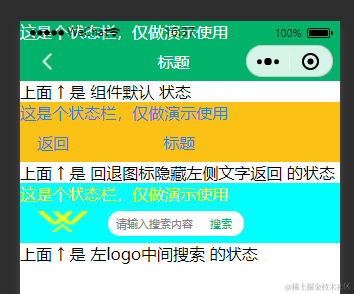
上面 ↑ 是 组件默认 状态<HeadNav navTitle=\"标题\" navBgc=\"#fbc115\" navColor=\"#2d7cee\" backIcon=\"{{false}}\" backText=\"{{true}}\"> 上面 ↑ 是 回退图标隐藏左侧文字返回 的状态<HeadNav navTitle=\"\" navBgc=\"aqua\" navColor=\"yellow\" backIcon=\"{{false}}\"> 上面 ↑ 是 左logo中间搜索 的状态

