Vue3+UniApp:在单个页面实现固定 TabBar 的多种方式_uniapp tabbar
目录
- 前言
- 1. 自定义 view
- 2. uni-segmented-control
- 3. uni-nav-bar
前言
🤟 找工作,来万码优才:👉 #小程序://万码优才/r6rqmzDaXpYkJZF
在 UniApp 开发中,tabBar 通常是通过 pages.json 配置的,适用于整个应用的全局导航

然而,在某些场景下,我们可能需要只在特定的页面展示 tabBar,而不会影响其他页面的布局。这就需要使用 自定义 tabBar,可以通过 view 组件、uni-segmented-control 组件或 uni-nav-bar 组件等方式来实现
以下是几种适用场景:
-
局部页面导航:
例如,一个订单管理页面,用户可以在 “进行中” 和 “已完成” 之间切换,而不影响全局 tabBar -
底部固定的二级导航:
例如,在 “记录” 页面,提供 “待审核” 和 “已审核” 选项,方便用户切换,而不会影响其他页面 -
顶部导航栏的切换:
适用于不适合使用底部 tabBar 的场景,如数据管理页面,用户可以在 “待审核” 和 “已审核” 之间切换
1. 自定义 view
<template> <view class=\"container\"> <view class=\"fixed-tabbar\"> <view class=\"tab-item\" :class=\"{ active: currentTab === 0 }\" @click=\"currentTab = 0\"> <text>测试A</text> </view> <view class=\"tab-item\" :class=\"{ active: currentTab === 1 }\" @click=\"currentTab = 1\"> <text>测试B</text> </view> </view> </view></template><script>export default { data() { return { currentTab: 0, // 当前选中的 tab }; }};</script><style scoped>.container { display: flex; flex-direction: column; height: 100vh;}.content { flex: 1; overflow-y: auto; /* 让内容可以滚动 */ padding-bottom: 60px; /* 避免被底部 tabBar 遮挡 */}.fixed-tabbar { position: fixed; bottom: 0; left: 0; width: 100%; height: 50px; display: flex; justify-content: space-around; align-items: center; background-color: #fff; border-top: 1px solid #ddd;}.tab-item { flex: 1; text-align: center; padding: 10px; font-size: 14px; color: #666;}.tab-item.active { color: #007AFF; font-weight: bold;}</style>截图如下:
fixed-tabbar 采用 position: fixed; bottom: 0;,始终固定在页面底部
使用 currentTab 变量控制当前选中的 tab,并根据 active 类名高亮
padding-bottom: 60px; 避免页面内容被 tabBar 遮挡

类似如果需要放到页面顶部:
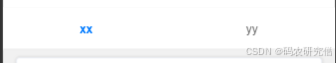
以下是vue格式:
部分
<view class=\"fixed-tabbar-top\"> <view class=\"tab-item\" :class=\"{ active: currentTab === 0 }\" @click=\"currentTab = 0\" > <text>xx</text> </view> <view class=\"tab-item\" :class=\"{ active: currentTab === 1 }\" @click=\"goToDamageRecord\" > <text>yy</text> </view></view> 部分
.fixed-tabbar-top { position: fixed; top: 0; left: 0; width: 100%; height: 50px; display: flex; justify-content: space-around; align-items: center; background-color: #fff; border-bottom: 1px solid #ddd; z-index: 1000;}.tab-item { flex: 1; text-align: center; padding: 10px; font-size: 14px; color: #666;}.tab-item.active { color: #007AFF; font-weight: bold;}✅
<script setup>import { ref } from \'vue\'import { useRouter } from \'vue-router\'const currentTab = ref(0)const router = useRouter()const goToDamageRecord = () => { currentTab.value = 1 router.push(\'/damage-record\') // 替换为你的路由路径}</script>如果是uniapp格式,需要这么调整js内部:
methods: { // 你的已有方法... goToDamageRecord() { this.currentTab = 1 uni.navigateTo({ url: \'/pages/damage-record/index\' // 修改为你实际的路径 }) }}2. uni-segmented-control
以轻量级方式切换不同的页面内容,不需要固定的底部 tabBar
<template> <view> <uni-segmented-control :current=\"currentTab\" :values=\"[\'测试A\', \'测试B\']\" @clickItem=\"switchTab\" /> <view v-if=\"currentTab === 0\"> <uni-card title=\"测试A\"> <text>这里是测试A...</text> </uni-card> </view> <view v-else> <uni-card title=\"测试B\"> <text>这里是测试B...</text> </uni-card> </view> </view></template><script>export default { data() { return { currentTab: 0 // 默认选中第一个 }; }, methods: { switchTab(index) { this.currentTab = index; } }};</script>截图如下:
uni-segmented-control 提供顶部 tab,点击时 @clickItem 触发 switchTab 进行切换
仅 currentTab === 0 时展示
适用于无需固定底部导航栏的场景,如数据筛选切换

3. uni-nav-bar
顶部导航,在标题栏左右提供不同的 Tab 切换按钮
<template> <view> <uni-nav-bar > <template v-slot:left> <view @click=\"switchTab(0)\" :class=\"{ active: currentTab === 0 }\">测试A</view> </template> <template v-slot:right> <view @click=\"switchTab(1)\" :class=\"{ active: currentTab === 1 }\">测试B</view> </template> </uni-nav-bar> <view v-if=\"currentTab === 0\"> <uni-card title=\"测试A\"> <text>这里是测试A...</text> </uni-card> </view> <view v-else> <uni-card title=\"测试B\"> <text>这里是测试B...</text> </uni-card> </view> </view></template><script>export default { data() { return { currentTab: 0 }; }, methods: { switchTab(index) { this.currentTab = index; } }};</script><style scoped>.active { font-weight: bold; color: #007AFF;}</style>uni-nav-bar 作为导航栏,在左右 slot 里添加点击切换的按钮。
switchTab 控制当前显示的内容


