HarmonyOS开发样式布局
个人简介
👨💻个人主页: 魔术师
📖学习方向: 主攻前端方向,正逐渐往全栈发展
🚴个人状态: 研发工程师,现效力于政务服务网事业
🇨🇳人生格言: “心有多大,舞台就有多大。”
📚推荐学习: 🍉Vue2 🍋Vue3 🍓Vue2/3项目实战 🥝Node.js实战 🍒Three.js 🍇鸿蒙开发
🪧使用备注:仅供学习交流 严禁用于商业用途 ,若发现侵权内容请及时联系作者
📤更新进度:持续更新内容
🤙个人名片:每篇文章最下方都有加入方式,旨在交流学习&资源分享,快加入进来吧
HarmonyOS开发样式布局目录
文章目录
-
- 个人简介
- HarmonyOS开发样式布局目录
- 样式布局
-
- 1. 基础布局
- [2. 堆叠布局(Stack)](https://developer.huawei.com/consumer/cn/doc/harmonyos-references-V5/ts-container-stack-V5)
- [3. 弹性布局](https://developer.huawei.com/consumer/cn/doc/harmonyos-references-V5/ts-universal-attributes-flex-layout-V5)
- [4. 网格布局](https://developer.huawei.com/consumer/cn/doc/harmonyos-references-V5/grid-and-column-V5)
- [5. 相对布局(RelativeContainer)](https://developer.huawei.com/consumer/cn/doc/harmonyos-references-V5/ts-container-relativecontainer-V5)
- [6. 滚动条说明(Scroll)](https://developer.huawei.com/consumer/cn/doc/harmonyos-references-V5/ts-container-scroll-V5)
样式布局
1. 基础布局
用途:用于实现垂直或水平排列的简单布局,适用于需要线性排列的场景(如导航栏、列表等)。
- Column:纵向排列(从上到下)。
- Row:横向排列(从左到右)。
关键属性
- 纵向布局(Column)案例:
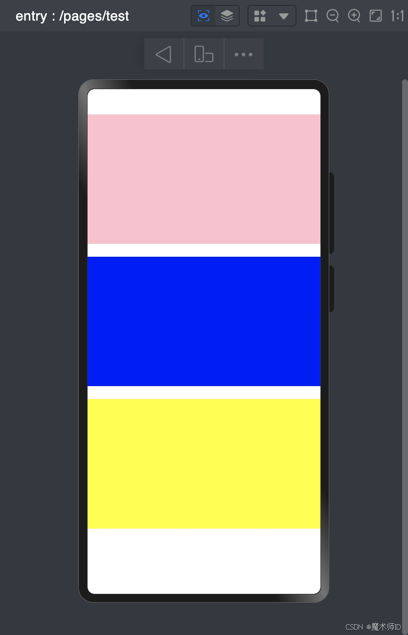
@Entry@Componentstruct Test{ build() { Column(){ // 纵向布局(Column) Column({ space: 20 }) { Row().width(\'100%\').height(200).backgroundColor(Color.Pink) Row().width(\'100%\').height(200).backgroundColor(Color.Blue) Row().width(\'100%\').height(200).backgroundColor(Color.Yellow) }.width(\'100%\').height(\'100%\') // // 横向布局(Row) // Row({ space: 20 }) { // Column().width(100).height(\'100%\').backgroundColor(Color.Pink) // Column().width(100).height(\'100%\').backgroundColor(Color.Blue) // Column().width(100).height(\'100%\').backgroundColor(Color.Yellow) // }.width(\'100%\').height(\'100%\') } .width(\'100%\') .height(\'100%\') }}- 横向布局(Row)案例:
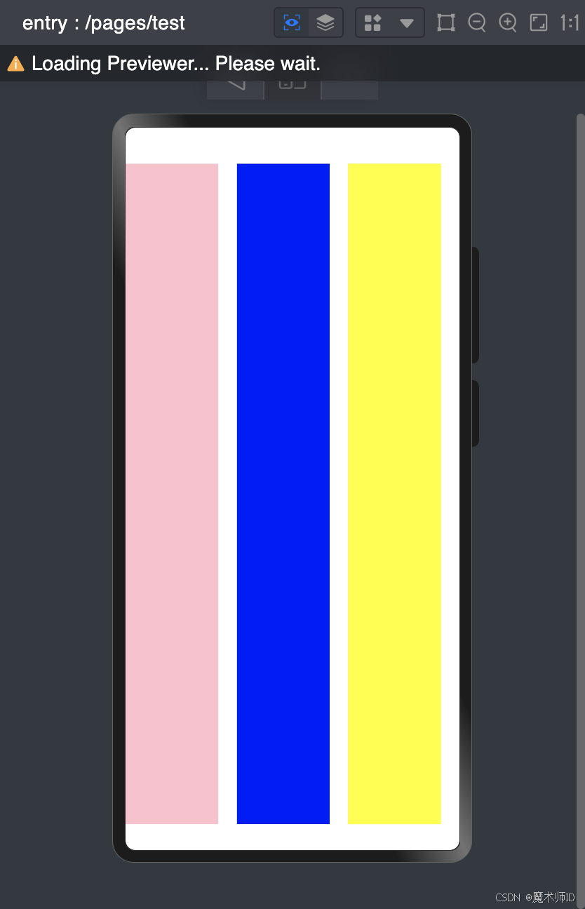
@Entry@Componentstruct Test{ build() { Column(){ // 横向布局(Row) Row({ space: 20 }) { Column().width(100).height(\'100%\').backgroundColor(Color.Pink) Column().width(100).height(\'100%\').backgroundColor(Color.Blue) Column().width(100).height(\'100%\').backgroundColor(Color.Yellow) }.width(\'100%\').height(\'100%\') } .width(\'100%\') .height(\'100%\') }}Row 和Column的布局方式成为线性布局- 不是横向排列就是纵向排列
● 线性布局中永远不会产生换行
● 均不支持出现滚动条
● 横向排列的垂直居中,总行排列的水平居中
● 主轴-排列方向的轴
● 侧轴-排列方向垂直的轴
2. 堆叠布局(Stack)
用途:用于实现层叠效果,后添加的组件会覆盖前一个组件,适合需要重叠的复杂布局(如弹窗、图层叠加)。
关键属性
Stack的参数 可以设置子组件的排列方式alignContent
-
Top(顶部)
-
TopStart(左上角)
-
TopEnd(右上角)
-
Start(左侧)
-
End(右侧)
-
Center(中间)
-
Bottom(底部)
-
BottomStart(左下角)
-
BottomEnd(右下角)
-
案例:
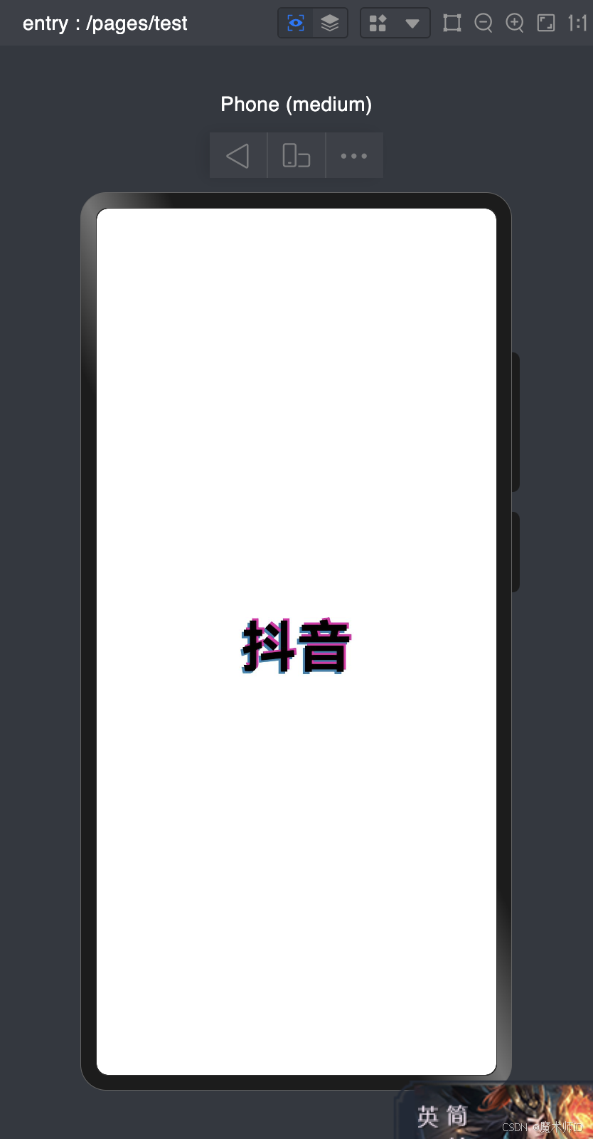
@Entry@Componentstruct Test { build() { Row() { Stack() { Text(\'抖音\') .fontSize(50) .fontWeight(FontWeight.Bold) .fontColor(\'#ff2d83b3\') .translate({ x:-2, y:2 }) .zIndex(1) Text(\'抖音\') .fontSize(50) .fontWeight(FontWeight.Bold) .fontColor(\'#ffe31fa9\') .translate({ x:2, y:-2 }) .zIndex(2) Text(\'抖音\') .fontSize(50) .fontWeight(FontWeight.Bold) .fontColor(\'#ff030000\') .translate({ x:0, y:0 }) .zIndex(3) } .width(\'100%\') } .height(\'100%\') }}3. 弹性布局
用途:通过灵活的主轴和交叉轴对齐,适配不同屏幕尺寸和动态内容(如自适应导航栏、卡片布局)。
关键属性
案例:
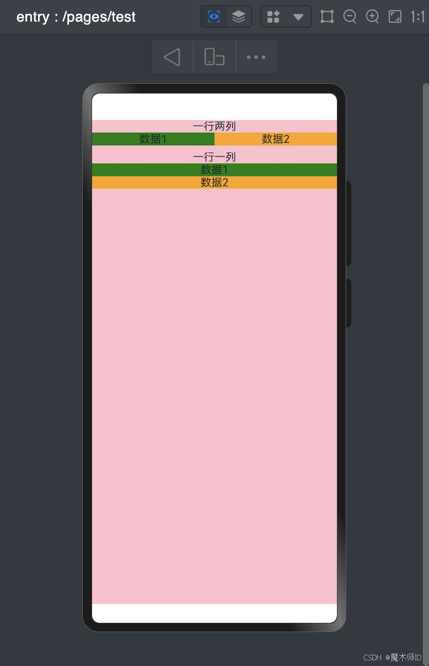
@Entry@Componentstruct Test { build() { Flex({ direction: FlexDirection.Column }){ Column(){ Text(\'一行两列\') Flex(){ Text(\'数据1\') .width(\'50%\') .backgroundColor(Color.Green) .textAlign(TextAlign.Center) Text(\'数据2\') .width(\'50%\') .backgroundColor(Color.Orange) .textAlign(TextAlign.Center) } } Column(){ Text(\'一行一列\') Flex({direction:FlexDirection.Column}){ Text(\'数据1\') .width(\'100%\') .backgroundColor(Color.Green) .textAlign(TextAlign.Center) Text(\'数据2\') .width(\'100%\') .backgroundColor(Color.Orange) .textAlign(TextAlign.Center) } }.margin({ top:\'10\' }) } .width(\'100%\') .height(\'100%\') .backgroundColor(Color.Pink) }}4. 网格布局
用途:通过行列划分实现复杂布局(如商品列表、仪表盘),支持响应式设计。
关键属性
案例:
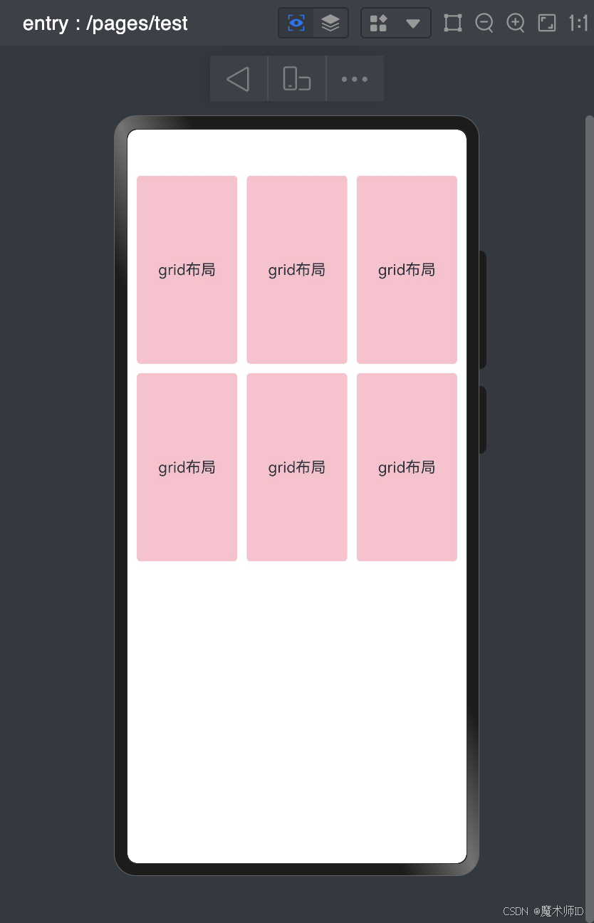
@Entry@Componentstruct Test { build() { Grid() { GridItemCases() GridItemCases() GridItemCases() GridItemCases() GridItemCases() GridItemCases() } .width(\"100%\") .height(\"100%\") .columnsTemplate(\"1fr 1fr 1fr\") .columnsGap(10) .rowsGap(10) .padding(10) }}@Componentstruct GridItemCases { build() { GridItem() { Row() { Column() { Text(\"grid布局\") } .width(\'100%\') } .height(200) .borderRadius(4) .backgroundColor(Color.Pink) } }}5. 相对布局(RelativeContainer)
用途:通过锚点规则实现精准的相对定位,适合需要动态调整位置的场景(如动态弹窗、自定义表单)。
关键属性
案例:
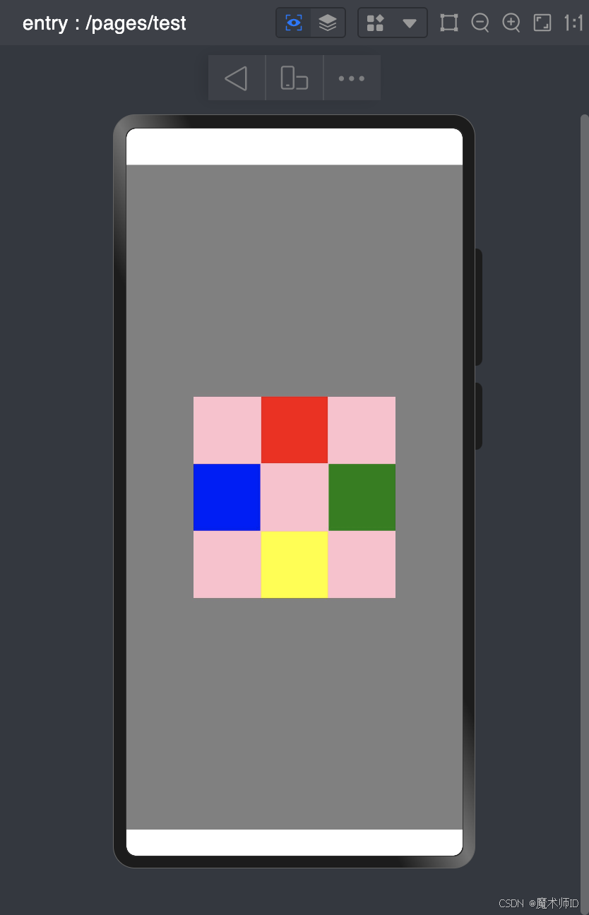
@Entry@Componentstruct Test { build() { RelativeContainer() { RelativeContainer() { Row(){} .width(\'33%\') .aspectRatio(1) .alignRules({ top: { anchor: \'__container__\', align: VerticalAlign.Top }, middle: { anchor: \'__container__\', align: HorizontalAlign.Center } }) .backgroundColor(Color.Red) Row(){} .width(\'33%\') .aspectRatio(1) .alignRules({ bottom: { anchor: \'__container__\', align: VerticalAlign.Bottom }, middle: { anchor: \'__container__\', align: HorizontalAlign.Center } }) .backgroundColor(Color.Yellow) Row(){} .width(\'33%\') .aspectRatio(1) .alignRules({ center: { anchor: \'__container__\', align: VerticalAlign.Center }, left: { anchor: \'__container__\', align: HorizontalAlign.Start } }) .backgroundColor(Color.Blue) .zIndex(2) Row(){} .width(\'33%\') .aspectRatio(1) .alignRules({ center: { anchor: \'__container__\', align: VerticalAlign.Center }, right: { anchor: \'__container__\', align: HorizontalAlign.End } }) .backgroundColor(Color.Green) } .width(\'60%\') .aspectRatio(1) .backgroundColor(Color.Pink) .alignRules({ center: { anchor: \'__container__\', align: VerticalAlign.Center }, middle: { anchor: \'__container__\', align: HorizontalAlign.Center } }) } .height(\'100%\') .width(\'100%\') .id(\'firstContainer\') .backgroundColor(Color.Gray) }}6. 滚动条说明(Scroll)
用途:实现可滚动区域,适用于内容超出容器大小的场景(如长列表、图文详情页)。
关键属性


