很多人应该经常遇到,H5上面调试好的布局,到小程序或者APP上,各种手机分辨率切换后,高度就不一致了;
这里我分享一个我自己想到的解决办法;
比如,首页数据只允许一屏显示完,如图:
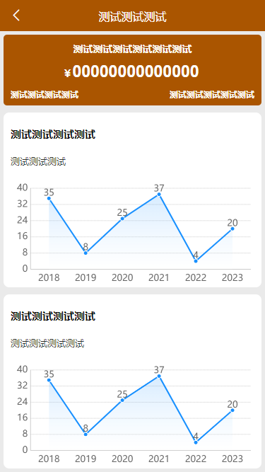
想要实现这样的,屏幕不让滚动,兼容各种手机分辨率,高度始终都自适应的;
代码示例:
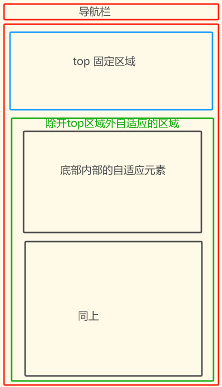
<template><view class=\"bodys flex-column-nocenter\" :style=\"{\'height\':bodysHeight+\'px\'}\">//这里是整个页面的盒子<uv-navbar :placeholder=\"true\" bg-color=\"#fff\" title=\"首页\"></uv-navbar>//这是导航栏<view class=\"p-10 boxSizing h-100 flex1 flex-column-nocenter\">//这是除开导航栏外的盒子<view class=\"top\">//这是内部顶部的区域</view><view class=\"bbottom \" :style=\"{\'height\':bottomHeight+\'px\'}\">//内部底部区域<view class=\"cardBox2 mt-20 flex-column-nocenter\" :style=\"{\'height\':(bottomHeight/2)+\'px\'}\">//底部内需要自适应的父级盒子<view class=\"lengH\"></view><view class=\"charts-box\" :style=\"{\'height\':chartHeight+\'px\'}\">//底部内需要自适应的区域</view></view><view class=\"cardBox2 mt-20 flex-column-nocenter\" :style=\"{\'height\':(bottomHeight/2)+\'px\'}\">//底部内需要自适应的父级盒子<view class=\"lengH\"></view><view class=\"charts-box\" :style=\"{\'height\':chartHeight+\'px\'}\">//底部内需要自适应的区域</view></view></view></view></view></template><script>export default {data() {return {chartHeight:0,bottomSafeArea:0,topHeight:0,screenHeight:0,bodysHeight:0,bottomHeight:0}},onReady() {this.getServerData();},watch: {},mounted() {const systemInfo = uni.getSystemInfoSync();this.screenHeight = systemInfo.screenHeight;this.topHeight = uni.getSystemInfoSync().statusBarHeight;this.bottomSafeArea = getIphoneBottomHeight();this.calculateNoticBoxHeight();},methods: {calculateNoticBoxHeight() {const query = uni.createSelectorQuery().in(this);query.select(\'.top\').boundingClientRect(data => {console.log(\"data=======\",data.height); if (data) { this.bodysHeight = this.screenHeight - 90; this.bottomHeight = this.bodysHeight - data.height - this.topHeight - this.bottomSafeArea +20; }else{ console.log(\"22222222222\"); }}).exec();query.select(\'.lengH\').boundingClientRect(data => {console.log(\"data=======\",data.height); if (data) { this.chartHeight = (this.bottomHeight/2) - data.height - 30; console.log(\"chartHeight\",this.chartHeight); this.$forceUpdate() }else{ console.log(\"22222222222\"); }}).exec();}},}</script><style scoped lang=\"scss\">.bodys {background-color: #eaeaea;padding-bottom: 20rpx;overflow: hidden;height: 100vh;}.top {width: 100%;height: 200rpx;background-color: $bg-index;border-radius: 10rpx;z-index: 9; }.charts-box { width: 100%; margin-top: 30rpx; }</style>

