使用Python绘制金融数据可视化工具
前言
本人不是金融相关专业,下述的程序是由deepseek生成, 对于K线图啥的其实也不是很了解,所以有什么问题希望有了解的同学可以在评论区或者私信进行联系。
文章的目的主要是想进行快速的绘制图表,然后想扩展一下就想到了金融行业,目前来说可能还存在绘制失败的问题,只能接收标准的行列的Excel表格(有些的Excel表格在表头前还有一个大的提示信息),还有对于太多数据的情况坐标轴会进行重叠。
安装相关的库
pip install pandas numpy matplotlib PyQt5 chardet mplfinance核心的绘图代码
if chart_type == \"折线图\": ax.plot(self.df[x_col], self.df[y_col], marker=\'o\', color=\'green\', linestyle=\'-\', linewidth=1, markersize=3) elif chart_type == \"柱状图\": ax.bar(self.df[x_col], self.df[y_col], color=\'orange\', alpha=0.7) elif chart_type == \"条形图\": ax.barh(self.df[x_col], self.df[y_col], color=\'purple\', alpha=0.7) elif chart_type == \"面积图\": ax.fill_between(self.df[x_col], self.df[y_col], color=\'skyblue\', alpha=0.5) elif chart_type == \"散点图\": ax.scatter(self.df[x_col], self.df[y_col], color=\'blue\', alpha=0.7) if indicator == \"K线图\": self.plot_candlestick(df, date_col, open_col, high_col, low_col, close_col, volume=False) elif indicator == \"K线+成交量\": self.plot_candlestick(df, date_col, open_col, high_col, low_col, close_col, volume=True) elif indicator == \"MACD\": self.plot_macd(df, date_col, close_col) elif indicator == \"布林带\": self.plot_bollinger_bands(df, date_col, close_col) elif indicator == \"RSI\": self.plot_rsi(df, date_col, close_col)相关参考链接
Python绘图库及图像类型之基础图表_ax.axvline(x, 0, 1, color = \"k\", ls = \':\', lw = 0.-CSDN博客![]() https://blog.csdn.net/weixin_64066303/article/details/148433762?spm=1001.2014.3001.5502Python绘图库及图像类型之高级可视化_统计学疾病地理热图举例-CSDN博客
https://blog.csdn.net/weixin_64066303/article/details/148433762?spm=1001.2014.3001.5502Python绘图库及图像类型之高级可视化_统计学疾病地理热图举例-CSDN博客![]() https://blog.csdn.net/weixin_64066303/article/details/148450750?spm=1001.2014.3001.5502Python绘图库及图像类型之特殊领域可视化_fluent中创建注释选项annotate-CSDN博客
https://blog.csdn.net/weixin_64066303/article/details/148450750?spm=1001.2014.3001.5502Python绘图库及图像类型之特殊领域可视化_fluent中创建注释选项annotate-CSDN博客![]() https://blog.csdn.net/weixin_64066303/article/details/148450970?spm=1001.2014.3001.5502
https://blog.csdn.net/weixin_64066303/article/details/148450970?spm=1001.2014.3001.5502
生成金融行业测试数据
利用pandas和numpy库创建包含股票交易数据(如开盘价、收盘价、成交量等)和财务指标(市盈率、市净率等)的模拟数据集。用户可以指定生成的天数和公司数量,数据会被保存为Excel文件并包含说明文字。脚本通过设置随机种子确保结果可重复,适用于金融数据分析和可视化程序的测试场景。
import pandas as pdimport numpy as npfrom datetime import datetime, timedeltaimport randomdef generate_financial_test_data(num_days=30, num_companies=5): \"\"\" 生成金融行业测试数据 参数: num_days: 生成多少天的数据 num_companies: 生成多少家公司的数据 返回: DataFrame: 包含生成的金融测试数据 \"\"\" # 设置随机种子以确保可重复性 np.random.seed(42) random.seed(42) # 生成日期序列 end_date = datetime.now() start_date = end_date - timedelta(days=num_days - 1) dates = pd.date_range(start_date, end_date, freq=\'D\') # 公司列表 companies = [ \"阿里巴巴\", \"腾讯控股\", \"中国平安\", \"贵州茅台\", \"招商银行\", \"美团点评\", \"京东集团\", \"中国移动\", \"比亚迪\", \"宁德时代\" ][:num_companies] # 行业分类 industries = [\"科技\", \"金融\", \"消费\", \"能源\", \"医疗\"] # 生成数据 data = [] for date in dates: for company in companies: # 基础价格在50-500之间 base_price = random.uniform(50, 500) # 生成股票数据 open_price = round(base_price * random.uniform(0.95, 1.05), 2) close_price = round(open_price * random.uniform(0.97, 1.03), 2) high_price = round(max(open_price, close_price) * random.uniform(1.0, 1.05), 2) low_price = round(min(open_price, close_price) * random.uniform(0.95, 1.0), 2) volume = random.randint(100000, 5000000) # 生成财务指标 pe_ratio = round(random.uniform(5, 50), 2) pb_ratio = round(random.uniform(0.8, 8), 2) dividend_yield = round(random.uniform(0, 0.05), 4) market_cap = round(random.uniform(1e9, 1e12), 2) # 随机涨跌 change = round(close_price - open_price, 2) change_percent = round(change / open_price * 100, 2) # 行业分类 industry = random.choice(industries) data.append([ date.strftime(\'%Y-%m-%d\'), company, industry, open_price, close_price, high_price, low_price, volume, change, change_percent, pe_ratio, pb_ratio, dividend_yield, market_cap ]) # 创建DataFrame columns = [ \'日期\', \'公司名称\', \'行业\', \'开盘价\', \'收盘价\', \'最高价\', \'最低价\', \'成交量\', \'涨跌额\', \'涨跌幅(%)\', \'市盈率\', \'市净率\', \'股息率\', \'市值\' ] df = pd.DataFrame(data, columns=columns) return dfdef save_to_excel(df, filename=\"金融测试数据.xlsx\"): \"\"\"将数据保存为Excel文件\"\"\" # 设置Excel写入引擎 writer = pd.ExcelWriter(filename, engine=\'openpyxl\') # 写入数据 df.to_excel(writer, index=False, sheet_name=\'股票数据\') # 添加一些说明性文字 workbook = writer.book worksheet = writer.sheets[\'股票数据\'] # 添加说明 worksheet.cell(row=1, column=len(df.columns) + 2, value=\"数据说明:\") worksheet.cell(row=2, column=len(df.columns) + 2, value=\"1. 本数据为随机生成的金融测试数据\") worksheet.cell(row=3, column=len(df.columns) + 2, value=\"2. 可用于测试数据可视化程序\") worksheet.cell(row=4, column=len(df.columns) + 2, value=\"3. 数据包含多家公司的股票价格和财务指标\") # 保存文件 writer.close() print(f\"数据已保存到 {filename}\")if __name__ == \"__main__\": # 生成30天、5家公司的数据 financial_data = generate_financial_test_data(num_days=30, num_companies=5) # 保存为Excel文件 save_to_excel(financial_data) # 打印前几行数据 print(\"\\n生成的数据样例:\") print(financial_data.head())Excel数据可视化工具
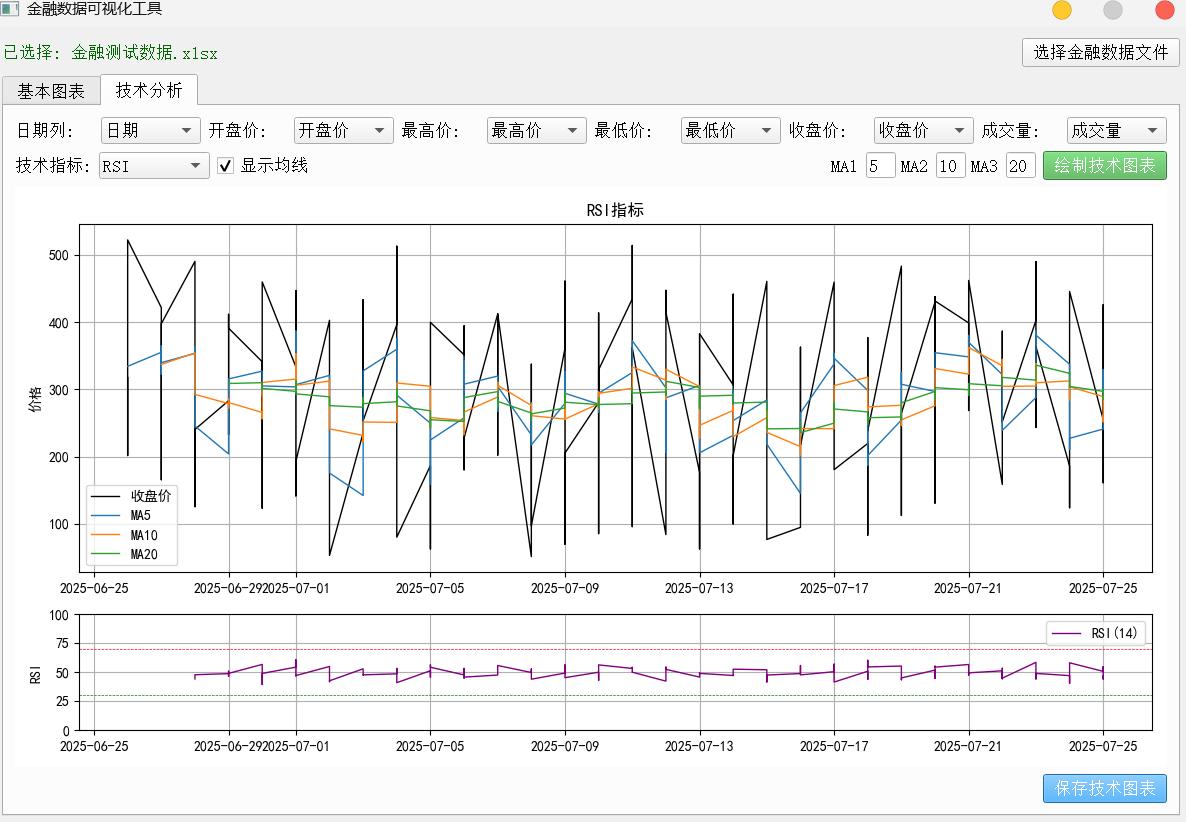
基于PyQt5的GUI分析工具,支持加载CSV/Excel文件,提供基础图表(折线图、柱状图等)和技术分析指标(K线、MACD、布林带、RSI等)的可视化功能。工具采用模块化设计,包含数据自动检测、图表交互和保存功能,适用于金融数据分析和可视化测试场景。
import sysimport pandas as pdimport matplotlib.pyplot as pltfrom matplotlib.backends.backend_qt5agg import FigureCanvasQTAgg as FigureCanvasfrom PyQt5.QtWidgets import (QApplication, QMainWindow, QVBoxLayout, QHBoxLayout, QWidget, QPushButton, QLabel, QComboBox, QFileDialog, QLineEdit, QMessageBox, QCheckBox, QTabWidget)from PyQt5.QtCore import Qtimport chardetfrom mplfinance.original_flavor import candlestick_ohlcimport matplotlib.dates as mdatesfrom matplotlib.gridspec import GridSpec# 设置matplotlib支持中文显示plt.rcParams[\'font.sans-serif\'] = [\'SimHei\'] # 用来正常显示中文标签plt.rcParams[\'axes.unicode_minus\'] = False # 用来正常显示负号class FinancialPlotter(QMainWindow): def __init__(self): super().__init__() self.setWindowTitle(\"金融数据可视化工具\") self.setWindowFlags(Qt.WindowCloseButtonHint | Qt.WindowMinimizeButtonHint) # 初始化变量 self.df = None self.file_path = None self.date_col = None self.ohlc_cols = {} # 创建主部件和布局 main_widget = QWidget() self.setCentralWidget(main_widget) main_layout = QVBoxLayout(main_widget) # 文件选择区域 file_layout = QHBoxLayout() self.file_label = QLabel(\"未选择文件\") self.file_label.setStyleSheet(\"color: #666; font-style: italic;\") file_button = QPushButton(\"选择金融数据文件\") file_button.setStyleSheet(\"QPushButton {padding: 5px 10px;}\") file_button.clicked.connect(self.load_file) file_layout.addWidget(self.file_label, stretch=1) file_layout.addWidget(file_button) main_layout.addLayout(file_layout) # 创建选项卡 self.tabs = QTabWidget() main_layout.addWidget(self.tabs) # 基本图表选项卡 self.basic_tab = QWidget() self.tabs.addTab(self.basic_tab, \"基本图表\") self.setup_basic_tab() # 技术分析选项卡 self.tech_tab = QWidget() self.tabs.addTab(self.tech_tab, \"技术分析\") self.setup_tech_tab() # 设置窗口大小并居中 self.resize(1200, 800) self.center_window() def center_window(self): \"\"\"将窗口居中显示\"\"\" screen = QApplication.primaryScreen().geometry() size = self.geometry() self.move( (screen.width() - size.width()) // 2, (screen.height() - size.height()) // 2 ) def setup_basic_tab(self): \"\"\"设置基本图表选项卡\"\"\" layout = QVBoxLayout(self.basic_tab) # 图表控制区域 control_layout = QHBoxLayout() # 图表类型选择 control_layout.addWidget(QLabel(\"图表类型:\")) self.chart_type = QComboBox() self.chart_type.addItems([\"折线图\", \"柱状图\", \"条形图\", \"面积图\", \"散点图\"]) self.chart_type.setStyleSheet(\"QComboBox {padding: 3px;}\") control_layout.addWidget(self.chart_type) # X轴选择 control_layout.addWidget(QLabel(\"X轴:\")) self.x_axis = QComboBox() self.x_axis.setStyleSheet(\"QComboBox {padding: 3px;}\") control_layout.addWidget(self.x_axis) # Y轴选择 control_layout.addWidget(QLabel(\"Y轴:\")) self.y_axis = QComboBox() self.y_axis.setStyleSheet(\"QComboBox {padding: 3px;}\") control_layout.addWidget(self.y_axis) # 标题输入 control_layout.addWidget(QLabel(\"标题:\")) self.title_input = QLineEdit() self.title_input.setPlaceholderText(\"输入图表标题\") self.title_input.setStyleSheet(\"QLineEdit {padding: 3px;}\") control_layout.addWidget(self.title_input) # 绘制按钮 plot_button = QPushButton(\"绘制图表\") plot_button.setStyleSheet(\"QPushButton {padding: 5px 10px; background-color: #4CAF50; color: white;}\") plot_button.clicked.connect(self.plot_basic_chart) control_layout.addWidget(plot_button) layout.addLayout(control_layout) # 图表区域 self.basic_figure = plt.figure(figsize=(10, 6), dpi=100) self.basic_canvas = FigureCanvas(self.basic_figure) layout.addWidget(self.basic_canvas, stretch=1) # 保存按钮 save_button = QPushButton(\"保存图表\") save_button.setStyleSheet(\"QPushButton {padding: 5px 10px; background-color: #2196F3; color: white;}\") save_button.clicked.connect(lambda: self.save_chart(self.basic_figure)) layout.addWidget(save_button, alignment=Qt.AlignRight) def setup_tech_tab(self): \"\"\"设置技术分析选项卡\"\"\" layout = QVBoxLayout(self.tech_tab) # 技术指标选择区域 tech_control_layout = QHBoxLayout() # 日期列选择 tech_control_layout.addWidget(QLabel(\"日期列:\")) self.date_column = QComboBox() self.date_column.setStyleSheet(\"QComboBox {padding: 3px;}\") tech_control_layout.addWidget(self.date_column) # OHLC列选择 tech_control_layout.addWidget(QLabel(\"开盘价:\")) self.open_column = QComboBox() self.open_column.setStyleSheet(\"QComboBox {padding: 3px;}\") tech_control_layout.addWidget(self.open_column) tech_control_layout.addWidget(QLabel(\"最高价:\")) self.high_column = QComboBox() self.high_column.setStyleSheet(\"QComboBox {padding: 3px;}\") tech_control_layout.addWidget(self.high_column) tech_control_layout.addWidget(QLabel(\"最低价:\")) self.low_column = QComboBox() self.low_column.setStyleSheet(\"QComboBox {padding: 3px;}\") tech_control_layout.addWidget(self.low_column) tech_control_layout.addWidget(QLabel(\"收盘价:\")) self.close_column = QComboBox() self.close_column.setStyleSheet(\"QComboBox {padding: 3px;}\") tech_control_layout.addWidget(self.close_column) tech_control_layout.addWidget(QLabel(\"成交量:\")) self.volume_column = QComboBox() self.volume_column.setStyleSheet(\"QComboBox {padding: 3px;}\") tech_control_layout.addWidget(self.volume_column) layout.addLayout(tech_control_layout) # 技术指标选择 indicator_layout = QHBoxLayout() # 技术指标选择 indicator_layout.addWidget(QLabel(\"技术指标:\")) self.tech_indicator = QComboBox() self.tech_indicator.addItems([\"K线图\", \"K线+成交量\", \"MACD\", \"布林带\", \"RSI\"]) self.tech_indicator.setStyleSheet(\"QComboBox {padding: 3px;}\") indicator_layout.addWidget(self.tech_indicator) # 移动平均线选择(新增子布局,使MA相关控件更紧凑) ma_layout = QHBoxLayout() ma_layout.setSpacing(5) # 设置控件之间的间距为5像素 self.ma_check = QCheckBox(\"显示均线\") self.ma_check.setChecked(True) ma_layout.addWidget(self.ma_check) # MA1 ma1_label = QLabel(\"MA1:\") ma1_label.setFixedWidth(30) # 固定标签宽度,避免文字过长导致间距变大 ma_layout.addWidget(ma1_label) self.ma1 = QLineEdit(\"5\") self.ma1.setFixedWidth(30) # 固定输入框宽度 ma_layout.addWidget(self.ma1) # MA2 ma2_label = QLabel(\"MA2:\") ma2_label.setFixedWidth(30) ma_layout.addWidget(ma2_label) self.ma2 = QLineEdit(\"10\") self.ma2.setFixedWidth(30) ma_layout.addWidget(self.ma2) # MA3 ma3_label = QLabel(\"MA3:\") ma3_label.setFixedWidth(30) ma_layout.addWidget(ma3_label) self.ma3 = QLineEdit(\"20\") self.ma3.setFixedWidth(30) ma_layout.addWidget(self.ma3) # 将MA子布局添加到主布局 indicator_layout.addLayout(ma_layout) # 绘制按钮 tech_plot_button = QPushButton(\"绘制技术图表\") tech_plot_button.setStyleSheet(\"QPushButton {padding: 5px 10px; background-color: #4CAF50; color: white;}\") tech_plot_button.clicked.connect(self.plot_tech_chart) indicator_layout.addWidget(tech_plot_button) layout.addLayout(indicator_layout) # 技术图表区域 self.tech_figure = plt.figure(figsize=(10, 8), dpi=100) self.tech_canvas = FigureCanvas(self.tech_figure) layout.addWidget(self.tech_canvas, stretch=1) # 保存按钮 tech_save_button = QPushButton(\"保存技术图表\") tech_save_button.setStyleSheet(\"QPushButton {padding: 5px 10px; background-color: #2196F3; color: white;}\") tech_save_button.clicked.connect(lambda: self.save_chart(self.tech_figure)) layout.addWidget(tech_save_button, alignment=Qt.AlignRight) def detect_encoding(self, file_path): \"\"\"检测文件编码\"\"\" with open(file_path, \'rb\') as f: rawdata = f.read(10000) # 读取前10000字节用于检测编码 result = chardet.detect(rawdata) return result[\'encoding\'] def load_file(self): \"\"\"加载金融数据文件\"\"\" file_path, _ = QFileDialog.getOpenFileName( self, \"选择金融数据文件\", \"\", \"数据文件 (*.xlsx *.xls *.csv)\" ) if file_path: self.file_path = file_path self.file_label.setText(f\"已选择: {file_path.split(\'/\')[-1]}\") self.file_label.setStyleSheet(\"color: #006400; font-style: normal;\") try: if file_path.endswith(\'.csv\'): # 检测文件编码 encoding = self.detect_encoding(file_path) # 对于CSV文件,尝试自动检测标题行 with open(file_path, \'r\', encoding=encoding) as f: lines = f.readlines() # 寻找第一个看起来像标题的行(包含多个非空列) header_row = 0 for i, line in enumerate(lines): cols = line.strip().split(\',\') if len(cols) > 1 and any(col.strip() for col in cols): header_row = i break # 重新读取文件,指定编码和标题行 self.df = pd.read_csv(file_path, header=header_row, encoding=encoding) else: # 对于Excel文件,使用pandas自动检测标题行 self.df = pd.read_excel(file_path, header=None) # 寻找第一个看起来像标题的行(包含多个非空值) header_row = 0 for i in range(len(self.df)): if self.df.iloc[i].count() > 1: # 如果一行中有多个非空值 header_row = i break # 重新读取文件,指定标题行 self.df = pd.read_excel(file_path, header=header_row) # 清理数据:删除全空的行和列 self.df.dropna(how=\'all\', inplace=True) self.df.dropna(axis=1, how=\'all\', inplace=True) # 确保列名为字符串格式 self.df.columns = self.df.columns.astype(str) # 更新轴选择下拉框 self.update_axis_comboboxes() QMessageBox.information(self, \"成功\", f\"已成功加载数据,共 {len(self.df)} 行\") except Exception as e: QMessageBox.critical(self, \"错误\", f\"无法读取文件:\\n{str(e)}\") self.df = None def update_axis_comboboxes(self): \"\"\"更新所有轴选择下拉选项\"\"\" if self.df is not None: columns = [str(col) for col in self.df.columns.tolist()] # 更新基本图表选项卡的下拉框 self.x_axis.clear() self.y_axis.clear() self.x_axis.addItems(columns) self.y_axis.addItems(columns) # 默认选择第一列和第二列 if len(columns) >= 1: self.x_axis.setCurrentIndex(0) if len(columns) >= 2: self.y_axis.setCurrentIndex(1) # 更新技术分析选项卡的下拉框 self.date_column.clear() self.open_column.clear() self.high_column.clear() self.low_column.clear() self.close_column.clear() self.volume_column.clear() self.date_column.addItems(columns) self.open_column.addItems(columns) self.high_column.addItems(columns) self.low_column.addItems(columns) self.close_column.addItems(columns) self.volume_column.addItems(columns) # 尝试自动识别OHLC列 for col in columns: col_lower = col.lower() if \'date\' in col_lower or \'时间\' in col or \'日期\' in col: self.date_column.setCurrentText(col) elif \'open\' in col_lower or \'开盘\' in col: self.open_column.setCurrentText(col) elif \'high\' in col_lower or \'最高\' in col: self.high_column.setCurrentText(col) elif \'low\' in col_lower or \'最低\' in col: self.low_column.setCurrentText(col) elif \'close\' in col_lower or \'收盘\' in col: self.close_column.setCurrentText(col) elif \'volume\' in col_lower or \'成交量\' in col or \'交易量\' in col: self.volume_column.setCurrentText(col) def plot_basic_chart(self): \"\"\"绘制基本图表\"\"\" if self.df is None: QMessageBox.warning(self, \"警告\", \"请先选择数据文件\") return x_col = self.x_axis.currentText() y_col = self.y_axis.currentText() chart_type = self.chart_type.currentText() title = self.title_input.text() or f\"{y_col} vs {x_col}\" # 清除之前的图表 self.basic_figure.clear() ax = self.basic_figure.add_subplot(111) try: # 根据选择的图表类型绘制 if chart_type == \"折线图\": ax.plot(self.df[x_col], self.df[y_col], marker=\'o\', color=\'green\', linestyle=\'-\', linewidth=1, markersize=3) elif chart_type == \"柱状图\": ax.bar(self.df[x_col], self.df[y_col], color=\'orange\', alpha=0.7) elif chart_type == \"条形图\": ax.barh(self.df[x_col], self.df[y_col], color=\'purple\', alpha=0.7) elif chart_type == \"面积图\": ax.fill_between(self.df[x_col], self.df[y_col], color=\'skyblue\', alpha=0.5) elif chart_type == \"散点图\": ax.scatter(self.df[x_col], self.df[y_col], color=\'blue\', alpha=0.7) # 设置标题和标签 ax.set_title(title, fontsize=12, pad=20) ax.set_xlabel(x_col, fontsize=10) ax.set_ylabel(y_col, fontsize=10) # 自动调整布局 self.basic_figure.tight_layout() # 旋转x轴标签以避免重叠 if len(self.df[x_col]) > 5: plt.xticks(rotation=45, ha=\'right\') # 刷新画布 self.basic_canvas.draw() except Exception as e: QMessageBox.critical(self, \"错误\", f\"绘制图表时出错:\\n{str(e)}\") def plot_tech_chart(self): \"\"\"绘制技术分析图表\"\"\" if self.df is None: QMessageBox.warning(self, \"警告\", \"请先选择数据文件\") return # 获取选择的列 date_col = self.date_column.currentText() open_col = self.open_column.currentText() high_col = self.high_column.currentText() low_col = self.low_column.currentText() close_col = self.close_column.currentText() volume_col = self.volume_column.currentText() if self.volume_column.currentText() else None indicator = self.tech_indicator.currentText() try: # 准备数据 df = self.df.copy() df[date_col] = pd.to_datetime(df[date_col]) df = df.sort_values(date_col) # 计算移动平均线 ma1 = int(self.ma1.text()) if self.ma1.text().isdigit() else 5 ma2 = int(self.ma2.text()) if self.ma2.text().isdigit() else 10 ma3 = int(self.ma3.text()) if self.ma3.text().isdigit() else 20 df[f\'MA{ma1}\'] = df[close_col].rolling(ma1).mean() df[f\'MA{ma2}\'] = df[close_col].rolling(ma2).mean() df[f\'MA{ma3}\'] = df[close_col].rolling(ma3).mean() # 清除之前的图表 self.tech_figure.clear() # 根据选择的指标绘制图表 if indicator == \"K线图\": self.plot_candlestick(df, date_col, open_col, high_col, low_col, close_col, volume=False) elif indicator == \"K线+成交量\": self.plot_candlestick(df, date_col, open_col, high_col, low_col, close_col, volume=True) elif indicator == \"MACD\": self.plot_macd(df, date_col, close_col) elif indicator == \"布林带\": self.plot_bollinger_bands(df, date_col, close_col) elif indicator == \"RSI\": self.plot_rsi(df, date_col, close_col) # 刷新画布 self.tech_canvas.draw() except Exception as e: QMessageBox.critical(self, \"错误\", f\"绘制技术图表时出错:\\n{str(e)}\") def plot_candlestick(self, df, date_col, open_col, high_col, low_col, close_col, volume=True): \"\"\"绘制K线图\"\"\" # 设置图表布局 if volume: gs = GridSpec(2, 1, height_ratios=[3, 1]) ax1 = self.tech_figure.add_subplot(gs[0]) ax2 = self.tech_figure.add_subplot(gs[1], sharex=ax1) else: ax1 = self.tech_figure.add_subplot(111) # 准备K线图数据 df[\'date_num\'] = mdates.date2num(df[date_col]) ohlc = df[[\'date_num\', open_col, high_col, low_col, close_col]].values # 绘制K线图 candlestick_ohlc(ax1, ohlc, width=0.6, colorup=\'r\', colordown=\'g\') # 绘制移动平均线 if self.ma_check.isChecked(): ma1 = int(self.ma1.text()) if self.ma1.text().isdigit() else 5 ma2 = int(self.ma2.text()) if self.ma2.text().isdigit() else 10 ma3 = int(self.ma3.text()) if self.ma3.text().isdigit() else 20 ax1.plot(df[date_col], df[f\'MA{ma1}\'], label=f\'MA{ma1}\', linewidth=1) ax1.plot(df[date_col], df[f\'MA{ma2}\'], label=f\'MA{ma2}\', linewidth=1) ax1.plot(df[date_col], df[f\'MA{ma3}\'], label=f\'MA{ma3}\', linewidth=1) ax1.legend() # 设置K线图标题和标签 ax1.set_title(\"K线图\", fontsize=12) ax1.set_ylabel(\"价格\", fontsize=10) ax1.grid(True) # 格式化x轴日期 ax1.xaxis_date() self.tech_figure.autofmt_xdate() # 绘制成交量 if volume and hasattr(self, \'volume_column\'): volume_col = self.volume_column.currentText() if volume_col in df.columns: # 计算涨跌颜色 colors = [\'r\' if close >= open else \'g\' for close, open in zip(df[close_col], df[open_col])] ax2.bar(df[date_col], df[volume_col], color=colors, width=0.6) ax2.set_ylabel(\"成交量\", fontsize=10) ax2.grid(True) self.tech_figure.tight_layout() def plot_macd(self, df, date_col, close_col): \"\"\"绘制MACD指标\"\"\" ax1 = self.tech_figure.add_subplot(111) # 计算MACD exp12 = df[close_col].ewm(span=12, adjust=False).mean() exp26 = df[close_col].ewm(span=26, adjust=False).mean() macd = exp12 - exp26 signal = macd.ewm(span=9, adjust=False).mean() histogram = macd - signal # 绘制价格和移动平均线 ax1.plot(df[date_col], df[close_col], label=\'收盘价\', color=\'black\', linewidth=1) if self.ma_check.isChecked(): ma1 = int(self.ma1.text()) if self.ma1.text().isdigit() else 5 ma2 = int(self.ma2.text()) if self.ma2.text().isdigit() else 10 ma3 = int(self.ma3.text()) if self.ma3.text().isdigit() else 20 ax1.plot(df[date_col], df[f\'MA{ma1}\'], label=f\'MA{ma1}\', linewidth=1) ax1.plot(df[date_col], df[f\'MA{ma2}\'], label=f\'MA{ma2}\', linewidth=1) ax1.plot(df[date_col], df[f\'MA{ma3}\'], label=f\'MA{ma3}\', linewidth=1) ax1.set_title(\"MACD指标\", fontsize=12) ax1.set_ylabel(\"价格\", fontsize=10) ax1.grid(True) ax1.legend() # 创建MACD子图 ax2 = ax1.twinx() ax2.plot(df[date_col], macd, label=\'MACD\', color=\'blue\', linewidth=1) ax2.plot(df[date_col], signal, label=\'信号线\', color=\'red\', linewidth=1) # 绘制柱状图 colors = [\'g\' if val >= 0 else \'r\' for val in histogram] ax2.bar(df[date_col], histogram, color=colors, width=0.6, alpha=0.5) ax2.axhline(0, color=\'gray\', linestyle=\'--\', linewidth=0.5) ax2.set_ylabel(\"MACD\", fontsize=10) ax2.legend(loc=\'upper right\') self.tech_figure.tight_layout() def plot_bollinger_bands(self, df, date_col, close_col): \"\"\"绘制布林带\"\"\" ax = self.tech_figure.add_subplot(111) # 计算布林带 window = 20 sma = df[close_col].rolling(window).mean() std = df[close_col].rolling(window).std() upper_band = sma + 2 * std lower_band = sma - 2 * std # 绘制价格和布林带 ax.plot(df[date_col], df[close_col], label=\'收盘价\', color=\'black\', linewidth=1) ax.plot(df[date_col], sma, label=f\'{window}日均线\', color=\'blue\', linewidth=1) ax.plot(df[date_col], upper_band, label=\'上轨\', color=\'red\', linewidth=1, linestyle=\'--\') ax.plot(df[date_col], lower_band, label=\'下轨\', color=\'green\', linewidth=1, linestyle=\'--\') # 填充布林带区域 ax.fill_between(df[date_col], upper_band, lower_band, color=\'gray\', alpha=0.1) ax.set_title(\"布林带\", fontsize=12) ax.set_ylabel(\"价格\", fontsize=10) ax.grid(True) ax.legend() self.tech_figure.tight_layout() def plot_rsi(self, df, date_col, close_col): \"\"\"绘制RSI指标\"\"\" # 设置图表布局 gs = GridSpec(2, 1, height_ratios=[3, 1]) ax1 = self.tech_figure.add_subplot(gs[0]) ax2 = self.tech_figure.add_subplot(gs[1], sharex=ax1) # 绘制价格和移动平均线 ax1.plot(df[date_col], df[close_col], label=\'收盘价\', color=\'black\', linewidth=1) if self.ma_check.isChecked(): ma1 = int(self.ma1.text()) if self.ma1.text().isdigit() else 5 ma2 = int(self.ma2.text()) if self.ma2.text().isdigit() else 10 ma3 = int(self.ma3.text()) if self.ma3.text().isdigit() else 20 ax1.plot(df[date_col], df[f\'MA{ma1}\'], label=f\'MA{ma1}\', linewidth=1) ax1.plot(df[date_col], df[f\'MA{ma2}\'], label=f\'MA{ma2}\', linewidth=1) ax1.plot(df[date_col], df[f\'MA{ma3}\'], label=f\'MA{ma3}\', linewidth=1) ax1.set_title(\"RSI指标\", fontsize=12) ax1.set_ylabel(\"价格\", fontsize=10) ax1.grid(True) ax1.legend() # 计算RSI delta = df[close_col].diff() gain = delta.where(delta > 0, 0) loss = -delta.where(delta < 0, 0) avg_gain = gain.rolling(14).mean() avg_loss = loss.rolling(14).mean() rs = avg_gain / avg_loss rsi = 100 - (100 / (1 + rs)) # 绘制RSI ax2.plot(df[date_col], rsi, label=\'RSI(14)\', color=\'purple\', linewidth=1) ax2.axhline(70, color=\'red\', linestyle=\'--\', linewidth=0.5) ax2.axhline(30, color=\'green\', linestyle=\'--\', linewidth=0.5) ax2.set_ylabel(\"RSI\", fontsize=10) ax2.set_ylim(0, 100) ax2.grid(True) ax2.legend() self.tech_figure.tight_layout() def save_chart(self, figure): \"\"\"保存图表为图片\"\"\" if self.df is None: QMessageBox.warning(self, \"警告\", \"没有可保存的图表\") return file_path, _ = QFileDialog.getSaveFileName( self, \"保存图表\", \"financial_chart\", \"PNG 图片 (*.png);;JPEG 图片 (*.jpg);;PDF 文件 (*.pdf);;SVG 矢量图 (*.svg)\" ) if file_path: try: figure.savefig(file_path, bbox_inches=\'tight\', dpi=300) QMessageBox.information(self, \"成功\", f\"图表已保存到:\\n{file_path}\") except Exception as e: QMessageBox.critical(self, \"错误\", f\"保存图表时出错:\\n{str(e)}\")if __name__ == \"__main__\": app = QApplication(sys.argv) app.setStyle(\'Fusion\') # 使用Fusion样式,看起来更现代 # 设置全局字体 font = app.font() font.setPointSize(10) app.setFont(font) window = FinancialPlotter() window.show() sys.exit(app.exec_())