50天50个小项目 (Vue3 + Tailwindcss V4) ✨ | 3dBackgroundBoxes(3D背景盒子组件)
📅 我们继续 50 个小项目挑战!—— 3dBackgroundBoxes组件
仓库地址:https://github.com/SunACong/50-vue-projects
项目预览地址:https://50-vue-projects.vercel.app/
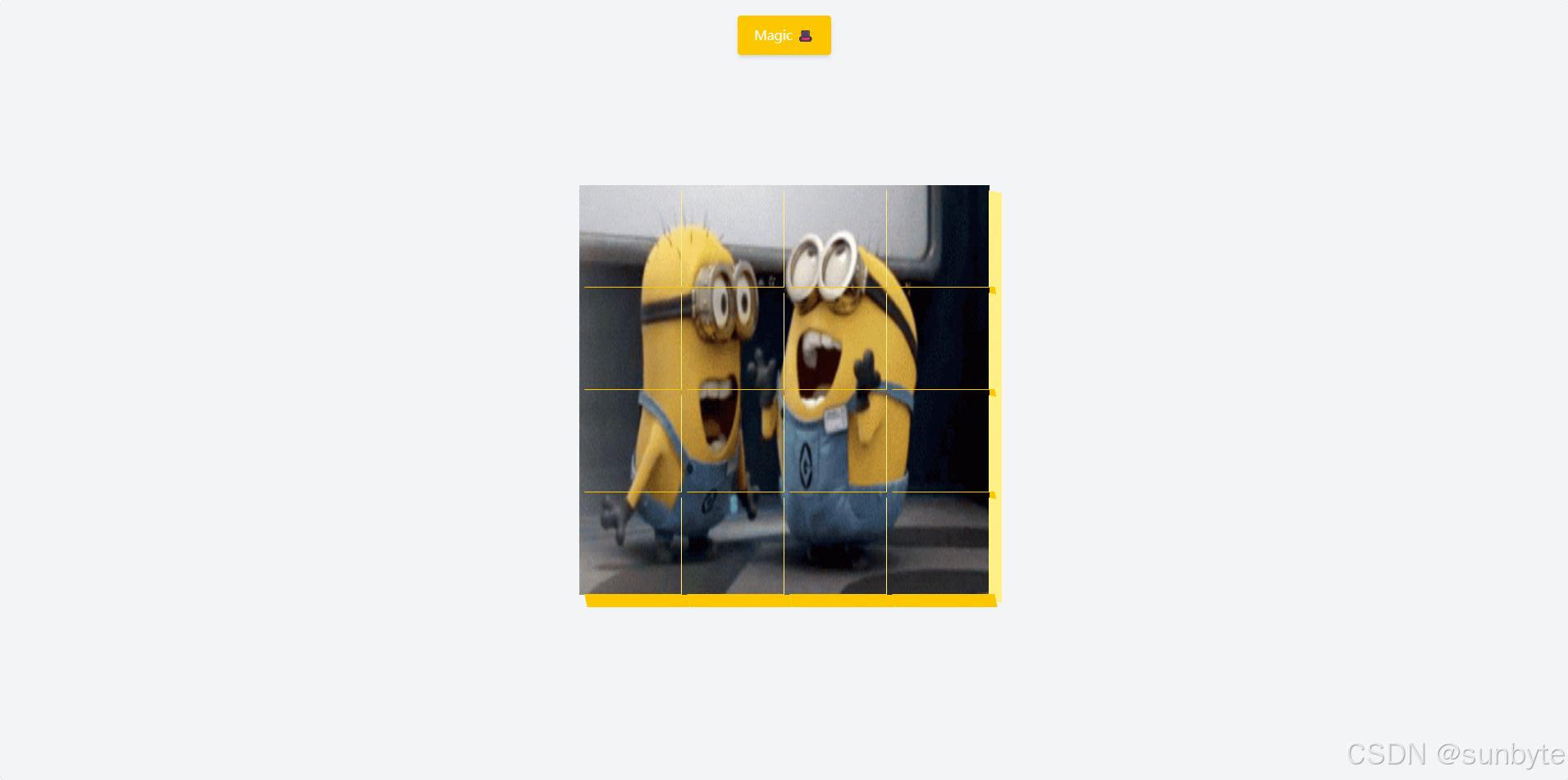
使用 Vue 3 的 语法结合 Tailwind CSS 来创建一个充满魔法感的交互式动画组件 —— “魔法盒子”。当你点击“Magic”按钮时,整个盒子阵列会放大并旋转,带来一种神奇的视觉体验!
准备好施展魔法了吗?让我们开始吧!✨
📝 应用目标
- 使用 Vue 3 Composition API 管理响应式状态
- 动态生成 4×4 的盒子网格
- 实现点击按钮触发整体缩放与旋转动画
- 利用背景定位实现 Gif 动画的分块显示
- 添加 3D 边框效果增强立体感
- 使用 Tailwind CSS 快速构建布局与过渡效果
🔧 技术实现点
ref 和 onMounted 管理状态与生命周期isBig 和 boxesv-for 循环生成@click 事件绑定:class:style🖌️ 组件实现
🎨 模板结构
<template> <div class=\"flex h-screen flex-col items-center justify-center overflow-hidden bg-gray-100\"> <button @click=\"isBig = !isBig\" class=\"font-poppins fixed top-5 z-50 transform rounded bg-yellow-400 px-5 py-3 text-white shadow-md transition-all duration-200 hover:shadow-lg active:translate-y-1 active:shadow-none\"> Magic 🎩 </button> <div :class=\"[ \'relative flex flex-wrap justify-around transition-all duration-400\', isBig ? \'h-[600px] w-[600px]\' : \'h-[500px] w-[500px]\', ]\"> <div v-for=\"(box, index) in boxes\" :key=\"index\" :class=\"[ \'relative h-[125px] w-[125px] transition-all duration-400\', isBig ? \'rotate-360\' : \'rotate-0\', ]\" :style=\"{ backgroundImage: \'url(https://media.giphy.com/media/EZqwsBSPlvSda/giphy.gif)\', backgroundRepeat: \'no-repeat\', backgroundSize: \'500px 500px\', backgroundPosition: `${box.x}px ${box.y}px`, }\"> <div class=\"absolute top-2 right-[-15px] h-full w-4 skew-y-12 transform bg-yellow-200\"></div> <div class=\"absolute bottom-[-15px] left-2 h-4 w-full skew-x-12 transform bg-yellow-400\"></div> </div> </div> </div></template>模板部分包含两个核心区域:
- 魔法按钮:固定在顶部,点击后切换
isBig状态。 - 盒子容器:包含 16 个盒子,每个盒子显示 Gif 图片的不同区域,并带有 3D 边框。
💻 脚本逻辑
<script setup> import { ref, onMounted } from \'vue\' // 响应式状态管理 const isBig = ref(false) const boxes = ref([]) // 创建盒子数据 function createBoxes() { const boxArray = [] for (let i = 0; i < 4; i++) { for (let j = 0; j < 4; j++) { boxArray.push({ x: -j * 125, y: -i * 125, }) } } boxes.value = boxArray } // 组件挂载时创建盒子 onMounted(() => { createBoxes() })</script>脚本部分负责:
- 定义
isBig响应式变量控制动画状态。 - 定义
boxes数组存储每个盒子的背景偏移位置。 - 在
onMounted钩子中调用createBoxes()生成 4×4 的盒子数据。
🎨 Tailwind CSS 样式重点
h-screenflex-colitems-center / justify-centeroverflow-hiddenbg-gray-100fixed top-5z-50transformroundedbg-yellow-400 / text-whiteshadow-md / hover:shadow-lgactive:translate-y-1active:shadow-nonerelative / flex-wraptransition-all duration-400h-[125px] w-[125px]rotate-360 / rotate-0absolute top-2 right-[-15px]skew-y-12bg-yellow-200 / bg-yellow-400🔍 关键功能解析
✅ 背景分块显示技术
通过设置 backgroundSize: \'500px 500px\' 并为每个盒子设置不同的 backgroundPosition(x: -j * 125, y: -i * 125),实现了将一张大图(或Gif)切割成16块分别显示的效果。
✅ 动画同步控制
使用 isBig 变量统一控制容器尺寸和所有盒子的旋转状态,确保动画同步进行。
✅ 3D 边框模拟
利用两个倾斜的 div(.skew-y-12 和 .skew-x-12)模拟出立体边框效果,增强视觉层次感。
📁 常量定义 + 组件路由
constants/index.js 添加组件预览常量:
{ id: 40, title: \'3dBackgroundBoxes\', image: \'https://50projects50days.com/img/projects-img/40-3d-background-boxes.png\', link: \'3dBackgroundBoxes\', },router/index.js 中添加路由选项:
{ path: \'/3dBackgroundBoxes\', name: \'3dBackgroundBoxes\', component: () => import(\'@/projects/3dBackgroundBoxes.vue\'), },🏁 总结
想让你的魔法盒子更炫酷?试试这些扩展:
- ✅ 添加音效:点击时播放魔法音效
- ✅ 随机旋转角度:每个盒子旋转角度不同
- ✅ 颜色主题切换:支持多种配色方案
- ✅ 手势控制:支持触摸滑动触发动画
- ✅ 粒子特效:点击时释放小星星或火花动画
👉 下一篇,我们将完成VerifyAccountUi组件,实现了一个非常使用的验证码UI组件。🚀
感谢阅读,欢迎点赞、收藏和分享 😊

