50天50个小项目 (Vue3 + Tailwindcss V4) ✨ | ImageCarousel(图片轮播组件)
📅 我们继续 50 个小项目挑战!—— ImageCarousel组件
仓库地址:https://github.com/SunACong/50-vue-projects
项目预览地址:https://50-vue-projects.vercel.app/
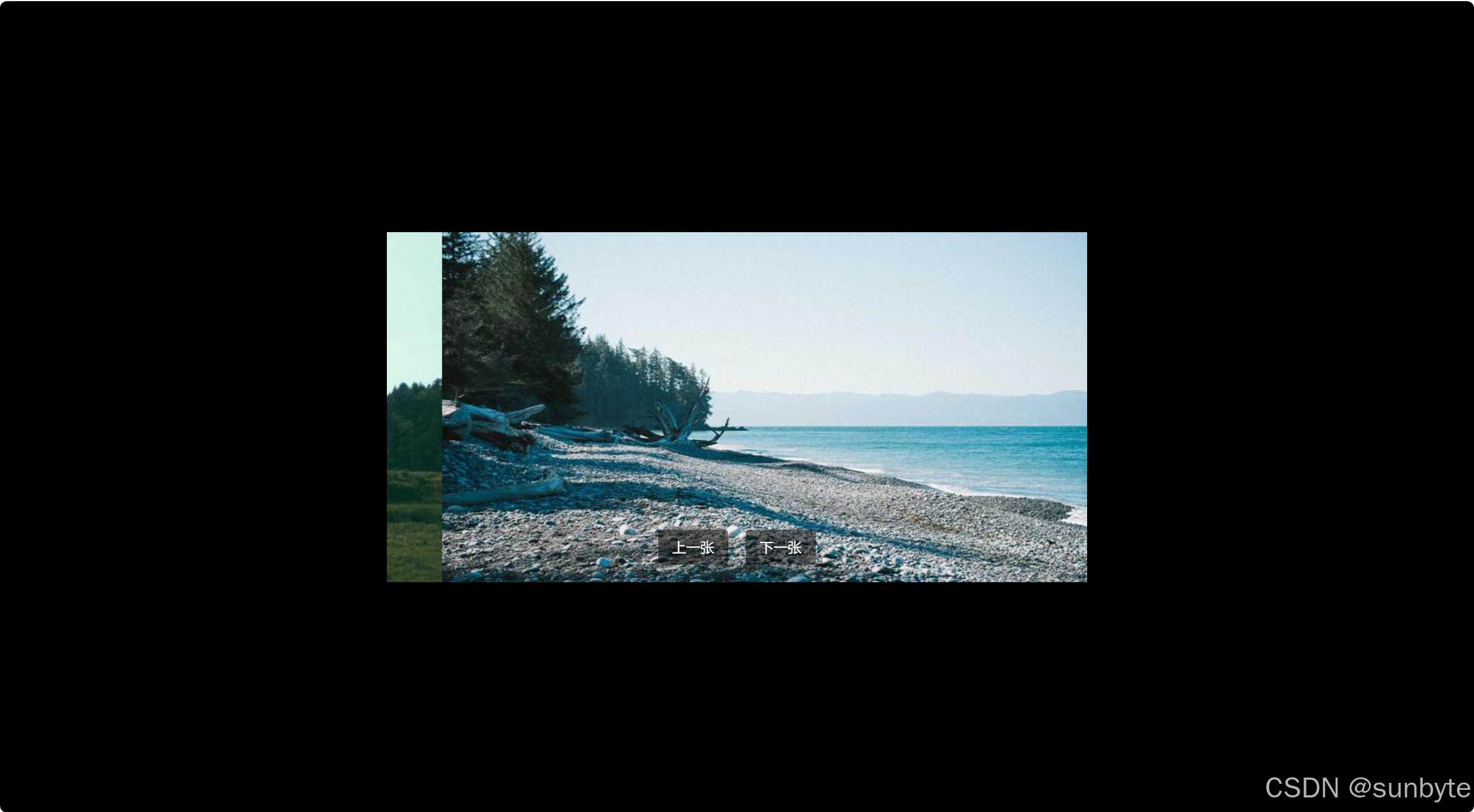
使用 Vue 3 的 语法以及 Tailwind CSS 来构建一个简洁且功能齐全的图片轮播组件(Carousel)。该组件不仅支持手动切换上一张和下一张图片,还具备自动播放功能。
🎯 应用目标
- 使用 Vue 3 Composition API 管理状态
- 利用 Tailwind CSS 快速构建响应式布局
- 实现自动播放和手动切换功能
- 组件结构清晰、易于扩展
⚙️ 技术实现点
ref 和生命周期钩子控制状态与行为currentIndextranslateXtransform 属性实现平滑过渡效果setInterval 定时器实现🧱 组件实现
模板结构
<template> <div class=\"absolute top-1/2 left-1/2 h-[400px] w-[800px] -translate-x-1/2 -translate-y-1/2 overflow-hidden\"> <div class=\"flex h-full transition-transform duration-500 ease-in-out\" :style=\"{ transform: `translateX(-${currentIndex * 100}%)` }\"> <img v-for=\"(image, index) in images\" :key=\"index\" :src=\"image\" class=\"h-[400px] w-[800px] object-cover\" /> </div> <div class=\"absolute bottom-5 left-1/2 flex -translate-x-1/2 gap-5\"> <button @click=\"prevImage\" class=\"cursor-pointer rounded border-none bg-[rgba(0,0,0,0.5)] px-4 py-2 text-white hover:bg-[rgba(0,0,0,0.8)]\"> 上一张 </button> <button @click=\"nextImage\" class=\"cursor-pointer rounded border-none bg-[rgba(0,0,0,0.5)] px-4 py-2 text-white hover:bg-[rgba(0,0,0,0.8)]\"> 下一张 </button> </div> </div></template>模板部分展示了如何创建一个居中的轮播容器,并包含了一个用于滚动图片的轨道和两个控制按钮(“上一张”和“下一张”)。
脚本逻辑
<script setup>import { ref, onMounted, onUnmounted } from \'vue\'// 模拟图片数组,可根据实际需求替换const images = ref([ \'https://picsum.photos/id/10/800/400\', \'https://picsum.photos/id/11/800/400\', \'https://picsum.photos/id/12/800/400\', \'https://picsum.photos/id/13/800/400\',])const currentIndex = ref(0)let autoPlayTimer = null// 切换到上一张图片const prevImage = () => { currentIndex.value = (currentIndex.value - 1 + images.value.length) % images.value.length}// 切换到下一张图片const nextImage = () => { currentIndex.value = (currentIndex.value + 1) % images.value.length}// 自动轮播函数const startAutoPlay = () => { autoPlayTimer = setInterval(() => { nextImage() }, 3000)}// 组件挂载时开始自动轮播onMounted(() => { startAutoPlay()})// 组件卸载时清除定时器onUnmounted(() => { clearInterval(autoPlayTimer)})</script>脚本部分定义了图片列表、当前展示图片的索引、自动播放逻辑以及生命周期钩子。通过这些设置,实现了组件的初始化、自动播放及清理工作。
🎨 Tailwind CSS 样式重点
以下是本文中使用的 Tailwind CSS 类及其作用的详细说明:
absolutetop-1/2 left-1/2-translate-x-1/2 -translate-y-1/2h-[400px] w-[800px]overflow-hiddentransition-transform duration-500 ease-in-outease-in-outobject-coverhover:bg-[rgba(0,0,0,0.8)]🔍 关键功能解析
✅ 手动切换
通过点击“上一张”和“下一张”按钮,用户可以手动切换到前后图片。这里巧妙地使用模运算确保索引值在数组范围内循环。
✅ 自动播放
组件挂载后会自动开始播放,每隔三秒切换到下一张图片。组件卸载时会清除定时器,避免内存泄漏。
✅ 动画过渡
利用 Tailwind CSS 提供的 transition-transform 类,实现了图片切换时的平滑过渡效果,提升了用户体验。
📁 常量定义 + 组件路由
constants/index.js 添加组件预览常量:
{ id: 35, title: \'Image Carousel\', image: \'https://50projects50days.com/img/projects-img/35-image-carousel.png\', link: \'ImageCarousel\', },router/index.js 中添加路由选项:
{ path: \'/ImageCarousel\', name: \'ImageCarousel\', component: () => import(\'@/projects/ImageCarousel.vue\'), },🏁 总结
使用 Vue 3 的 Composition API 结合 Tailwind CSS 创建一个功能完善的图片轮播组件。
你可以扩展这个基础的图片轮播组件:
- ✅ 添加指示器(Indicators):显示当前是第几张图片,支持点击切换。
- ✅ 触控滑动(Touch Support):支持在移动端通过滑动手势切换图片。
- ✅ 暂停自动播放:当鼠标悬停在轮播图上时暂停自动播放。
- ✅ 动态加载图片:从后端接口获取图片数据。
- ✅ 响应式设计:根据屏幕尺寸自适应轮播图宽度和高度。
👉 下一篇,我们将完成VerifyAccountUi组件,实现一个验证码验证组件UI。🚀
感谢阅读,欢迎点赞、收藏和分享 😊

