【轮播图】H5端轮播图、横向滑动、划屏效果实现方案——Vue3+CSS position/CSS scroller
文章目录
- 定位实现滑屏效果
-
- 前置知识
-
- CSS: touch-action属性
- CSS: transform属性
- 触摸事件
- forEach
- 回调占位符
- 准备阶段
- 实现移动效果
- 实现跟手效果
- 触摸结束优化
- 完整代码
- 滚动实现滑屏效果
-
- 前置知识
-
- CSS: scroll-snap-type属性
- 准备阶段
- 实现滑动效果
- 实现吸附效果
- 滚动条隐藏
- 存在问题
- 完整代码
- scrollLeft实现滑屏效果(最佳实践)
-
- 前置知识
-
- DOM: scrollLeft
- DOM: scrollWidth
- @scroll事件
- 准备阶段
本文将详细介绍如何使用Vue3实现移动端流畅的划屏交互效果。我们将深入探讨触摸事件处理、页面动态切换和动画优化的完整实现方案。文章将重点解析三个关键方法:handleTouchStart记录触摸起点、handleTouchMove实现实时跟手效果、handleTouchEnd处理页面切换逻辑,特别会讲解pages.forEach循环在重置页面位置和恢复过渡动画中的重要作用。同时会分享性能优化技巧,包括transform动画的优势、直接DOM操作与Vue响应式的平衡,以及滑动阈值的合理设置,帮助开发者掌握移动端滑动交互的核心实现原理。
定位实现滑屏效果
实现了一个典型的移动端页面滑动容器,具有以下特点:
- 支持左右滑动切换不同颜色的页面
- 滑动时有实时跟手效果
- 滑动结束后有平滑的过渡动画
- 边界检测防止越界
前置知识
CSS: touch-action属性
touch-action 是 CSS 的一个属性,用来控制元素如何响应触摸操作(如滑动、缩放等)。
常见取值:
auto:默认,浏览器自行处理触摸行为。none:完全禁用浏览器默认的触摸行为(如滚动、缩放)。pan-x:允许水平滑动,禁止垂直滑动和缩放。pan-y:允许垂直滑动,禁止水平滑动和缩放。manipulation:允许滑动,但禁用双击缩放(提高响应速度)。
示例:
/* 禁用默认触摸行为,防止滚动 */.prevent-scroll { touch-action: none;}/* 只允许垂直滑动 */.vertical-only { touch-action: pan-y;}适用场景:
- 自定义触摸手势(如画板、游戏)。
- 防止滑动冲突(如地图内嵌滚动列表)。
简单说,它让开发者能精细控制触摸交互,避免浏览器默认行为的干扰。
CSS: transform属性
transform: 是 CSS 中**把元素当成一张图来变形**的属性。
一次可以写多个 2D/3D 函数,空格隔开,按从左到右的顺序逐个执行。
- 常用 2D 函数
translate(x, y)transform: translate(20px, -10px)translateX(x) / translateY(y)translateX(50%)scale(sx, sy)scale(1.2, .8)rotate(angle)rotate(45deg)skew(ax, ay)skew(30deg, 10deg)- 常用 3D 函数
translate3d(x,y,z)scale3d(sx,sy,sz)rotateX(a) / rotateY(a) / rotateZ(a)- 组合示例
.box { transform: translateX(100px) rotate(45deg) scale(1.2);}先右移 100 px,再旋转 45°,最后放大 1.2 倍。
- 性能与注意点
- 不占文档流:变形后原位置仍保留(不像
position:absolute会脱离)。 - 硬件加速:大多数浏览器对
transform开 GPU 加速,动画较流畅。 - 不影响兄弟元素:不会像
margin那样推挤别人。
触摸事件
HTML 的触摸事件有 4 个核心,按触发顺序:
- touchstart:手指刚碰到屏幕
- touchmove:手指在屏幕上滑动(连续触发)
- touchend:手指离开屏幕
- touchcancel:系统中断(如来电、弹窗)
每个事件对象里都带 touches / changedTouches 等列表,可拿到触点坐标。
事件对象属性:
- touches:当前屏幕上所有接触点集合。
- targetTouches:事件绑定元素上的接触点集合。
- changedTouches:触发此事件时状态改变的接触点集合(touchstart时即新出现的点)。
forEach
forEach 是数组的每个元素都跑一次的方法——给它一个回调函数,它把数组里的元素挨个传进去执行,不返回新数组,纯粹“副作用”。
基本语法:
array.forEach((value, index, array) => { /* 干点啥 */});- value:当前元素
- index:当前下标(可选)
- array:原数组本身(几乎不用)
示例:
[\'a\',\'b\',\'c\'].forEach((v,i)=>console.log(i,v));// 0 a// 1 b// 2 c回调占位符
在 JavaScript 的 forEach 回调里:
pages.forEach((_, i) => { ... })_ 就是占位符:
-
含义:“这个位置的参数我不打算用,随便起个名字占坑”。
-
这里
_对应的是数组元素(page 对象),但循环体里只用索引 i,所以用_表示“忽略它”。
这是一种常见习惯写法,读代码的人一看就明白“这个值被故意忽略了”。
准备阶段
基本结构代码:
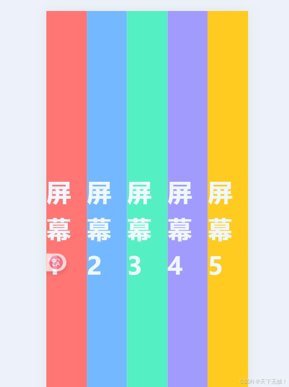
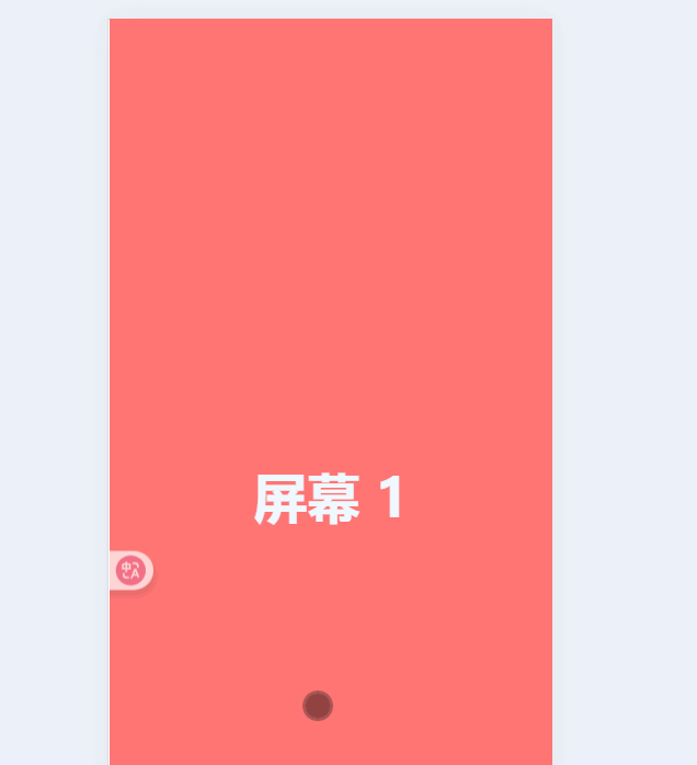
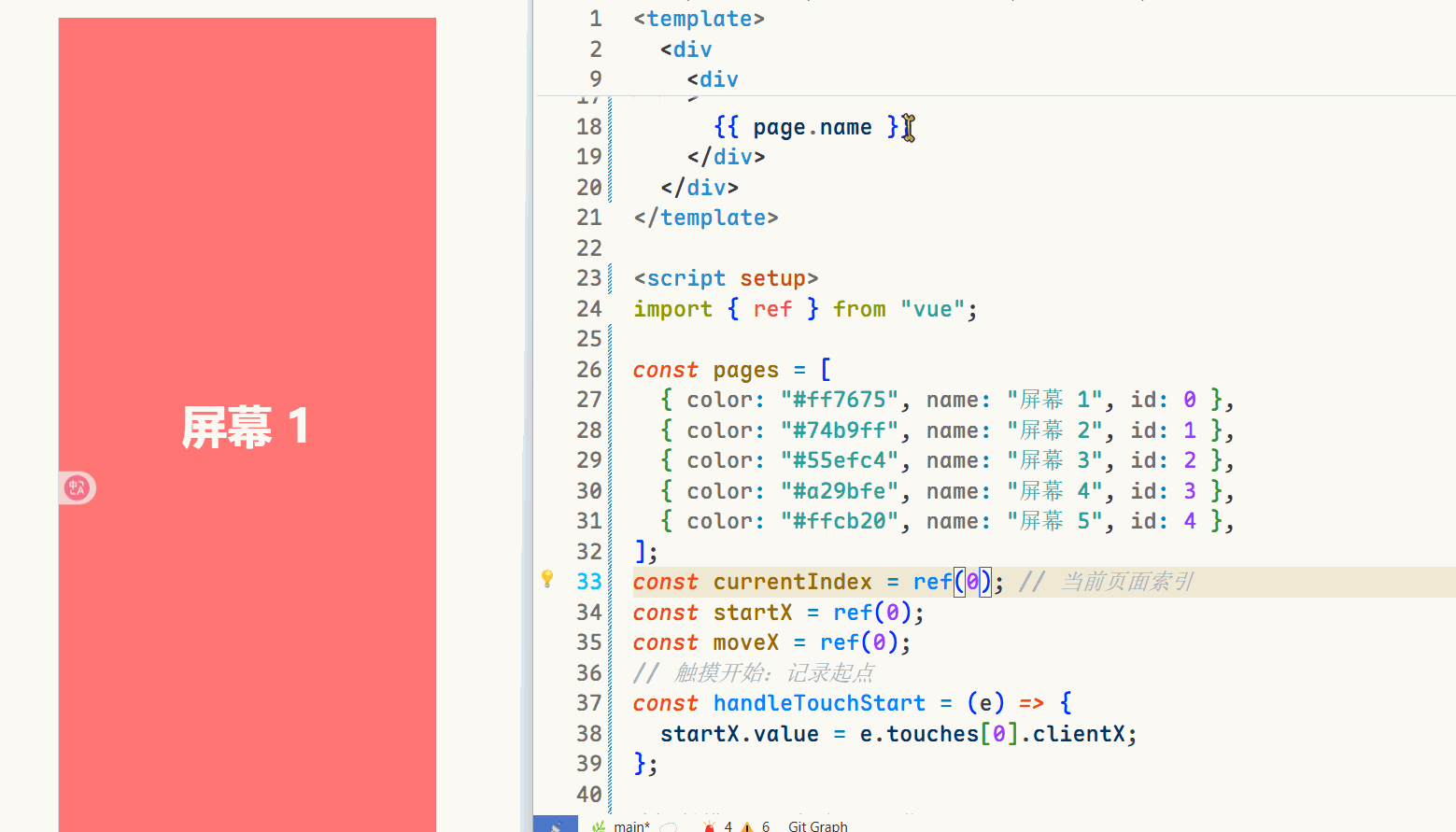
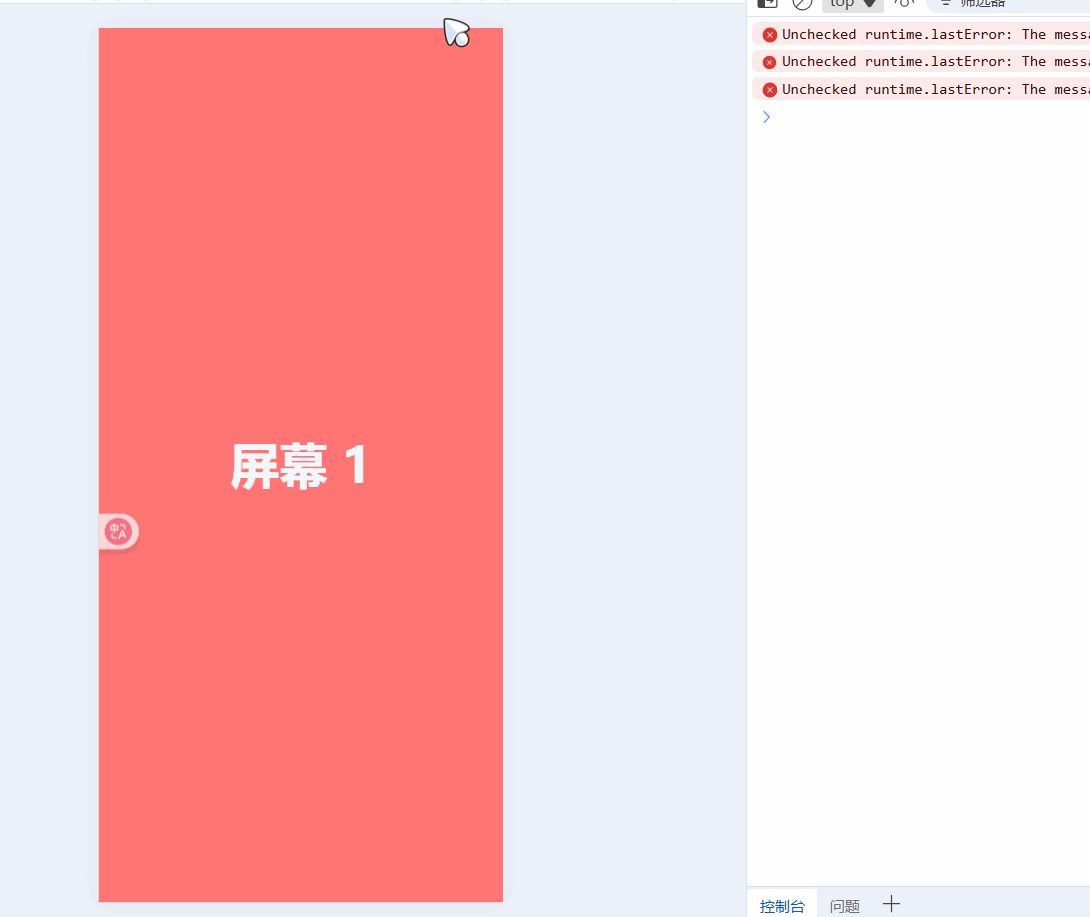
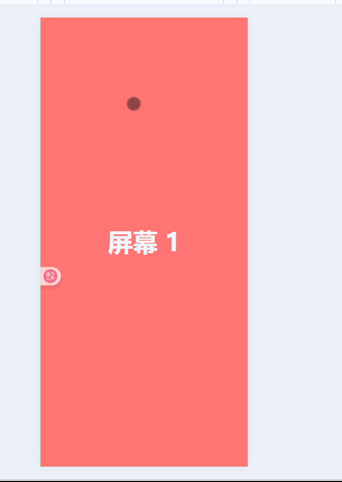
{{ page.name }} import { ref } from \"vue\";const pages = [ { color: \"#ff7675\", name: \"屏幕 1\", id: 0 }, { color: \"#74b9ff\", name: \"屏幕 2\", id: 1 }, { color: \"#55efc4\", name: \"屏幕 3\", id: 2 }, { color: \"#a29bfe\", name: \"屏幕 4\", id: 3 }, { color: \"#ffcb20\", name: \"屏幕 5\", id: 4 },];// 触摸开始const handleTouchStart = (e) => {};// 触摸移动const handleTouchMove = (e) => {};// 触摸结束const handleTouchEnd = () => {};.page-container {}.page {}目前没有样式的效果如下:
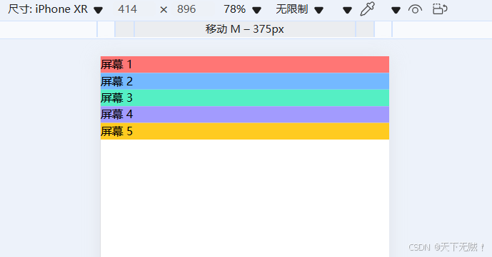
所有内容都是堆叠在一起的,而目前我们想要的效果是每个屏幕沾满一个页面,然后通过滑动来切换,
先给内容来个沾满全屏的宽度和高度:
.page-container { width: 100vw; height: 100vh;}.page { width: 100%; height: 100%;}
在处理一下page中的文字样式吧:
.page { width: 100%; height: 100%; display: flex; justify-content: center; align-items: center; font-size: 50px; font-weight: 700; color: aliceblue;}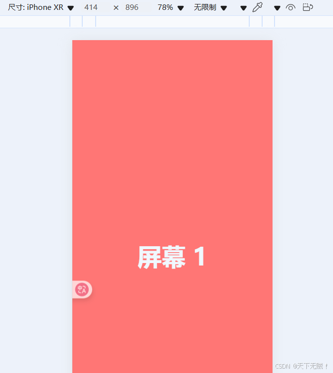
现在所有页面都是呈现竖向排列的,与我们横向滑动的效果相违背,所以需要使用定位效果将 所有页面重叠在一起,然后再做移动效果来实现划屏效果:
.page-container { width: 100vw; height: 100vh; position: relative; overflow: hidden; touch-action: none;}.page { width: 100%; height: 100%; display: flex; justify-content: center; align-items: center; font-size: 50px; font-weight: 700; color: aliceblue; position: absolute;}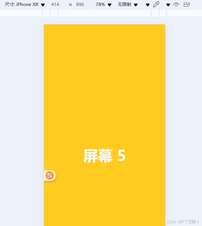
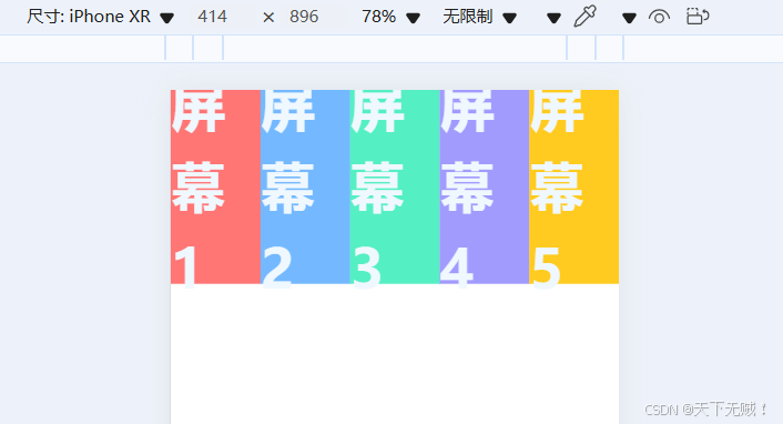
现在,所有屏幕都堆叠在一起了! 接下来使用transform属性让所有屏幕从左至右以此排列:
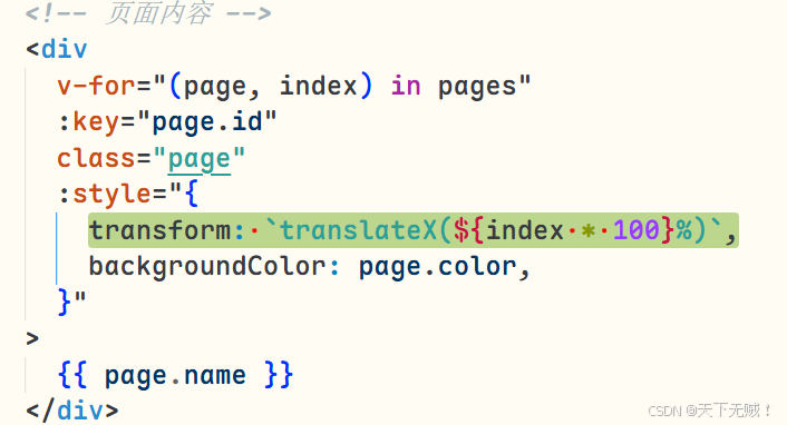
:style=\"{ transform: `translateX(${index * 100}%)`, backgroundColor: page.color, }\"可能看不出效果,我们可以调小page 的宽高查看:width: 20%; height: 20%;
实现移动效果
接下来的内容就是重点啦!🫵💯
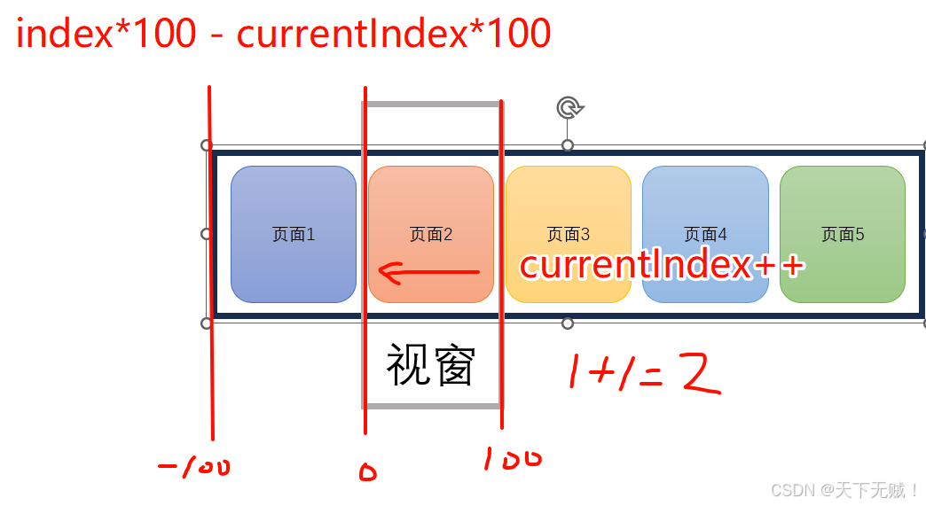
移动实现原理:视窗不变,让每个page分别向负方向移动
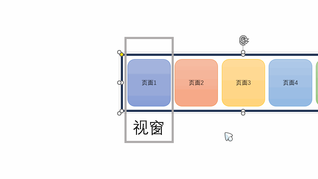
{{ page.name }} // 声明一个currentIndex import { ref } from \"vue\";const currentIndex = ref(0); // 当前页面索引可以通过改变const currentIndex = ref(2);中的变量来查看页面效果。
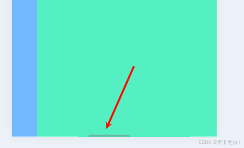
晓得了切换原理,接下来实现触摸事件啦🫴
流程示意图:
const currentIndex = ref(0); // 当前页面索引const startX = ref(0);const moveX = ref(0);// 触摸开始:记录起点const handleTouchStart = (e) => { startX.value = e.touches[0].clientX;};// 触摸移动:实时跟随手指滑动const handleTouchMove = (e) => { moveX.value = e.touches[0].clientX - startX.value;};// 触摸结束:判断滑动方向并切换页面const handleTouchEnd = () => { if (Math.abs(moveX.value)) { if (moveX.value > 0 && currentIndex.value > 0) { currentIndex.value--; // 向右滑,上一页 } else if (moveX.value < 0 && currentIndex.value < pages.length - 1) { currentIndex.value++; // 向左滑,下一页 } }};现在就可以通过滑动屏幕来实现切换效果了:
触发的有点灵敏,我们给handleTouchEnd添加一个滑动阈值:
const handleTouchEnd = () => { const threshold = 50; // 滑动阈值(像素) if (Math.abs(moveX.value) > threshold) { if (moveX.value > 0 && currentIndex.value > 0) { currentIndex.value--; // 向右滑,上一页 } else if (moveX.value < 0 && currentIndex.value < pages.length - 1) { currentIndex.value++; // 向左滑,下一页 } }};再添加一个css平滑过渡效果:
.page { //... transition: transform 0.3s ease; /* 平滑过渡 */}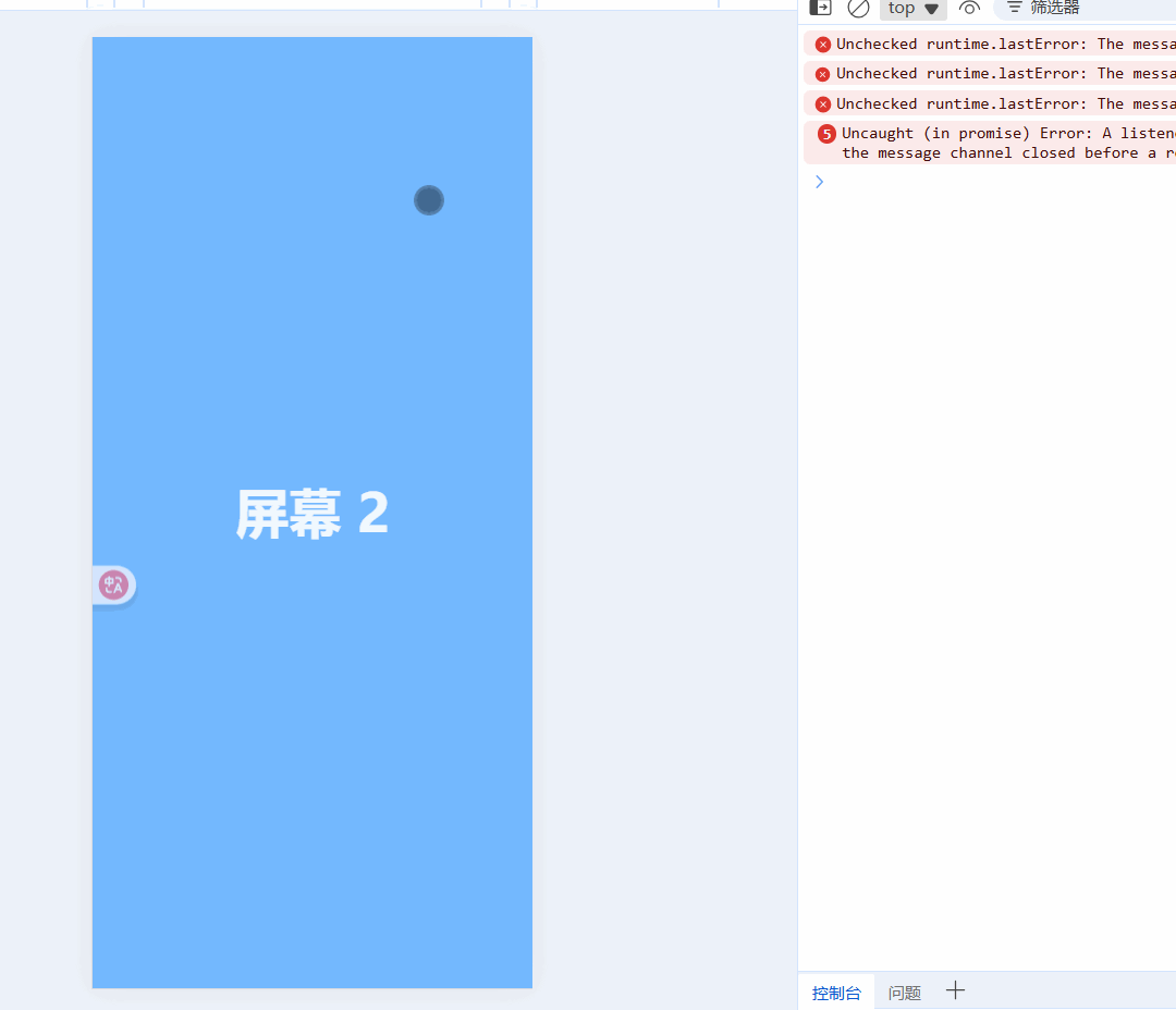
实现跟手效果
现在就要点丝滑😻效果了,不过还不够还要添加跟手效果:
{{ page.name }} const pageRef = ref(null);// 触摸移动:实时跟随手指滑动const handleTouchMove = (e) => { moveX.value = e.touches[0].clientX - startX.value; // 跟手效果 pages.forEach((_, i) => { const page = pageRef.value[i]; if (page) { page.style.transform = `translateX(${ i * 100 - currentIndex.value * 100 + moveX.value / 10 }%)`; page.style.transition = \"none\"; // 禁用过渡效果,保证跟手效果流畅 } });};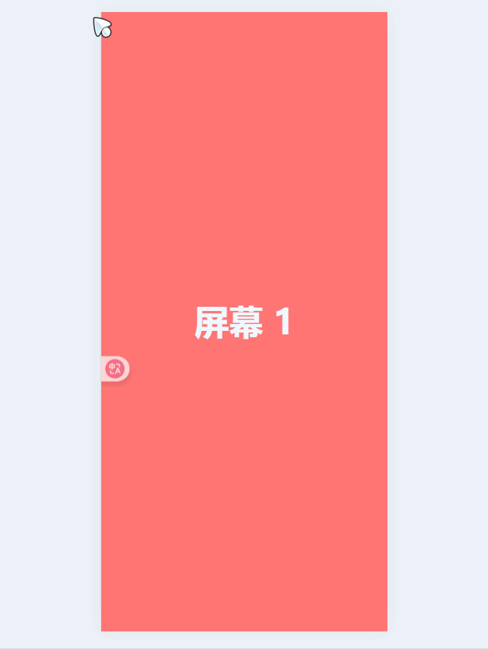
实现原理详解
- 获取移动距离:
moveX.value = e.touches[0].clientX - startX.value计算出手指从触摸开始到当前位置的水平移动距离
- 实时更新页面位置:
- 遍历所有页面元素,为每个页面计算新的
transform值 - 基础位置:
i * 100 - currentIndex.value * 100确保页面按顺序排列 - 跟手偏移:
+ moveX.value / 10添加移动距离的1/10作为跟手效果(除以10是为了降低跟手灵敏度)
- 遍历所有页面元素,为每个页面计算新的
- 禁用过渡效果:
page.style.transition = \"none\"临时禁用CSS过渡效果,确保跟手时的即时响应
触摸结束优化
// 触摸结束:判断滑动方向并切换页面const handleTouchEnd = () => { //.... // 重置位置并启用过渡动画 pages.forEach((_, i) => { const page = document.querySelectorAll(\".page\")[i]; if (page) { page.style.transform = `translateX(${ i * 100 - currentIndex.value * 100 }%)`; page.style.transition = \"transform 0.3s ease\"; } }); moveX.value = 0;};handleTouchEnd 里那段 pages.forEach(...) 只有一句话:把 5 张“页面”一次性摆到正确位置,并补上过渡动画。
-
计算目标位置
i * 100 - currentIndex.value * 100i * 100:第 i 张默认排在“第 i 屏”位置(0%、100%、200% …)。- 减去
currentIndex * 100:把当前要显示的那一页拉回 0%(即屏幕正中)。
结果:所有页瞬间排成一排,当前页居中,其余页在左右两侧。
-
设置样式
transform赋刚才算出的值,让页面“归位”。transition = \"transform 0.3s ease\":把被handleTouchMove关掉的过渡重新打开,回弹时有动画。
-
重置
moveX.value = 0:为下一次手势准备。
最后得到的效果如下:( 对此我们的轮播图实现效果也完成啦🎉)
完整代码
{{ page.name }} import { ref } from \"vue\";const pages = [ { color: \"#ff7675\", name: \"屏幕 1\", id: 0 }, { color: \"#74b9ff\", name: \"屏幕 2\", id: 1 }, { color: \"#55efc4\", name: \"屏幕 3\", id: 2 }, { color: \"#a29bfe\", name: \"屏幕 4\", id: 3 }, { color: \"#ffcb20\", name: \"屏幕 5\", id: 4 },];const currentIndex = ref(0); // 当前页面索引const startX = ref(0);const moveX = ref(0);// 触摸开始:记录起点const handleTouchStart = (e) => { startX.value = e.touches[0].clientX;};const pageRef = ref(null);// 触摸移动:实时跟随手指滑动const handleTouchMove = (e) => { moveX.value = e.touches[0].clientX - startX.value; // 跟手效果 pages.forEach((_, i) => { const page = pageRef.value[i]; if (page) { page.style.transform = `translateX(${ i * 100 - currentIndex.value * 100 + moveX.value / 10 }%)`; page.style.transition = \"none\"; // 禁用过渡效果,保证跟手效果流畅 } });};// 触摸结束:判断滑动方向并切换页面const handleTouchEnd = () => { const threshold = 200; // 滑动阈值(像素) if (Math.abs(moveX.value) > threshold) { if (moveX.value > 0 && currentIndex.value > 0) { currentIndex.value--; // 向右滑,上一页 } else if (moveX.value < 0 && currentIndex.value { const page = pageRef.value[i]; if (page) { page.style.transform = `translateX(${ i * 100 - currentIndex.value * 100 }%)`; page.style.transition = \"transform 0.3s ease\"; } }); moveX.value = 0;};.page-container { width: 100vw; height: 100vh; position: relative; overflow: hidden; touch-action: none;}.page { width: 100%; height: 100%; display: flex; justify-content: center; align-items: center; font-size: 50px; font-weight: 700; color: aliceblue; position: absolute; transition: transform 0.3s ease; /* 平滑过渡 */}使用节流优化性能
方法一: 通过lodash库
安装lodash:
npm install lodash-es<script setup>import { ref } from \"vue\";import { throttle } from \'lodash-es\'; // 或者使用自定义节流函数// ... existing code ...const handleTouchMove = throttle((e) => { moveX.value = e.touches[0].clientX - startX.value; // 跟手效果 pages.forEach((_, i) => { const page = pageRef.value[i]; if (page) { page.style.transform = `translateX(${ i * 100 - currentIndex.value * 100 + moveX.value / 10 }%)`; page.style.transition = \"none\"; } });}, 16); // 约60fps的间隔// ... existing code ...</script>或者使用自定义的简单节流实现:
<script setup>import { ref } from \"vue\";// ... existing code ...let lastTime = 0;const handleTouchMove = (e) => { const now = Date.now(); if (now - lastTime < 16) return; // 约60fps lastTime = now; moveX.value = e.touches[0].clientX - startX.value; // ... rest of the original code ...};// ... existing code ...</script>
滚动实现滑屏效果
前置知识
CSS: scroll-snap-type属性
scroll-snap-type 是 CSS 中的一个属性,用于控制滚动容器的滚动行为,特别是当用户滚动时,内容是否以及如何“吸附”到特定的停止点。
这个属性定义在滚动容器上,它决定了滚动的轴向以及吸附行为的严格程度。
基本语法:
scroll-snap-type: none | [ x | y | block | inline | both ] [ mandatory | proximity ]?;取值说明:
- 轴向 (Axis):
none:不启用滚动吸附。这是默认值。x:在水平轴上启用滚动吸附。y:在垂直轴上启用滚动吸附。block:在块级方向上启用吸附(在大多数书写模式下等同于y)。inline:在内联方向上启用吸附(在大多数书写模式下等同于x)。both:在两个轴上都启用吸附。
- 严格程度 (Strictness):
mandatory:强制吸附。当滚动操作结束时(例如用户松开鼠标、手指或滚动停止),视口必须停留在一个吸附点上。如果内容区域不足以滚动到下一个/上一个点,用户可能无法滚动。proximity:邻近吸附。滚动操作结束时,如果当前视口位置足够接近一个吸附点,浏览器会自动滚动到该点。但如果用户停止在两个吸附点之间较远的位置,可能不会发生吸附。用户体验更灵活。
示例:
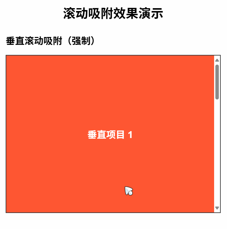
滚动吸附示例 body { font-family: Arial, sans-serif; margin: 0; padding: 20px; } h1 { text-align: center; margin-bottom: 30px; } /* 垂直方向强制吸附 */ .container { scroll-snap-type: y mandatory; overflow-y: scroll; height: 400px; border: 2px solid #333; margin-bottom: 40px; } /* 水平方向邻近吸附 */ .horizontal-slider { display: flex; scroll-snap-type: x proximity; overflow-x: scroll; scroll-behavior: smooth; border: 2px solid #333; margin-bottom: 40px; } /* 子元素需要设置吸附点 */ .item { scroll-snap-align: start; flex: 0 0 100%; height: 300px; display: flex; align-items: center; justify-content: center; font-size: 24px; font-weight: bold; color: white; } /* 垂直容器中的项目样式 */ .container .item { height: 400px; } /* 为不同项目设置不同背景色 */ .item:nth-child(1) { background-color: #FF5733; } .item:nth-child(2) { background-color: #33FF57; } .item:nth-child(3) { background-color: #3357FF; } .item:nth-child(4) { background-color: #F333FF; } 滚动吸附效果演示
垂直滚动吸附(强制)
<div class=\"container\"> <div class=\"item\">垂直项目 1