Kimi K2 大语言模型技术特性与应用实践分析
前言
Kimi K2 作为一款备受瞩目的大语言模型,自 2025 年 7 月 11 日发布以来,迅速在大模型领域掀起波澜。它采用 MoE(混合专家)架构,总参数达到 1 万亿,却通过巧妙设计,将每次推理的激活参数控制在仅 32B ,有效平衡了模型性能与计算成本。在训练过程中,创新性地运用 MuonClip 优化器,成功实现 15.5T tokens 的稳定训练,突破了大模型训练中梯度爆炸等难题。
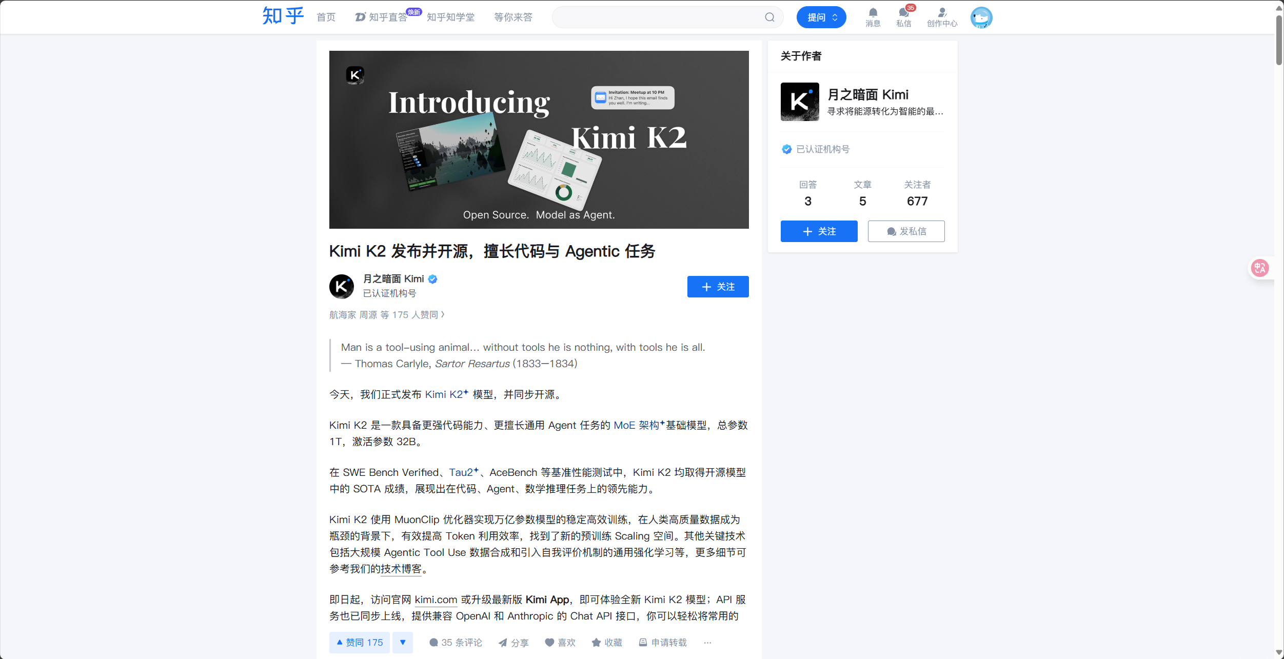
从实际能力表现看,Kimi K2 在代码生成、Agent 任务以及数学推理等核心领域成绩斐然,在多项权威测试榜单中名列前茅,超越众多同类开源模型。不仅如此,其开源策略十分友好,发布当日便开源了 Base 和 Instruct 两个版本,吸引了包括 OpenRouter、VS Code、金山云等在内的 32 家企业竞相接入,为开发者和企业带来了全新的选择和机遇。接下来,我们将深入探讨 Kimi K2 模型的调用方法,帮助大家快速上手这一强大工具。
体验以及使用kimi k2模型
点击https://console.lanyun.net/#/register?promoterCode=0131进入到蓝耘官网进行注册
输入相关信息即可注册成功
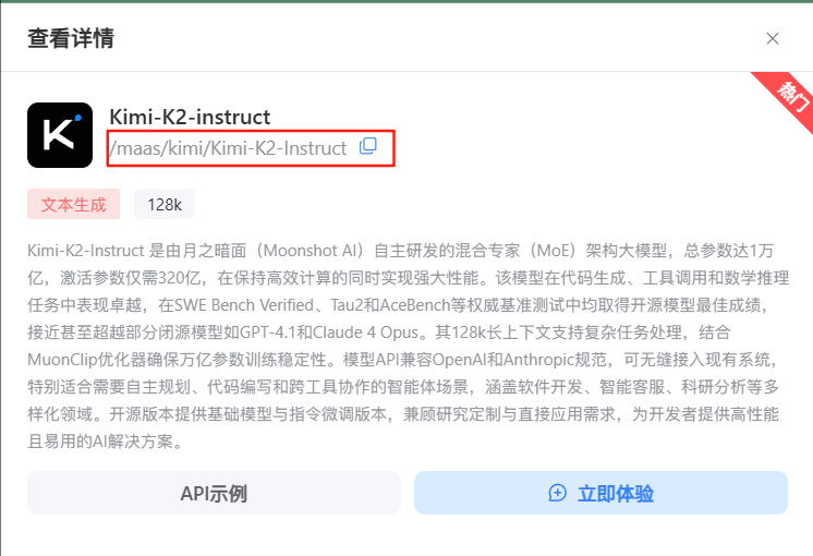
进入到官网主界面,我们点击上方导航栏中的MaaS平台,进入到MaaS平台界面映入眼帘的就是Kimi-K2模型
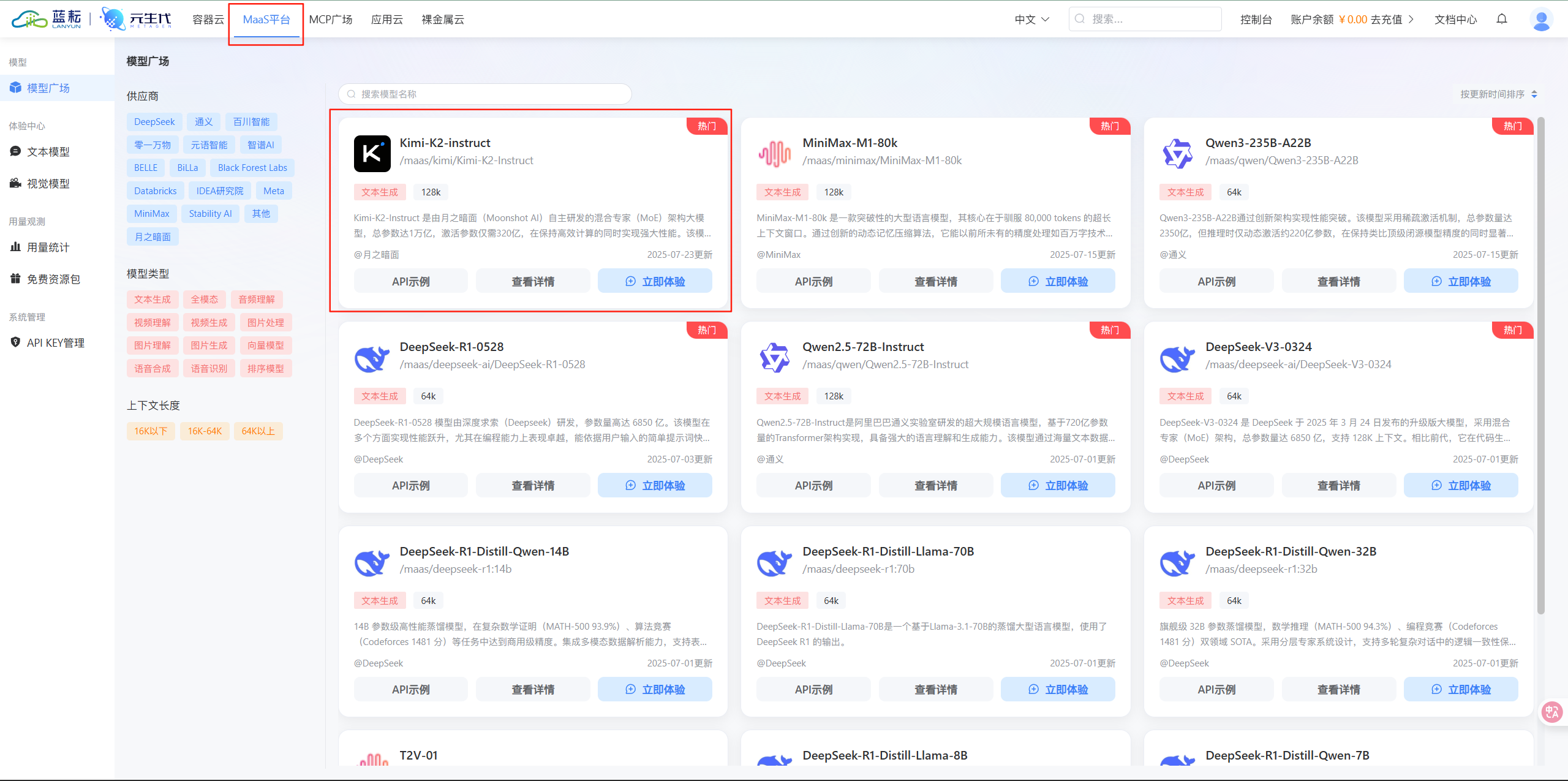
点击Kimi-K2模型可以看到模型相关的信息
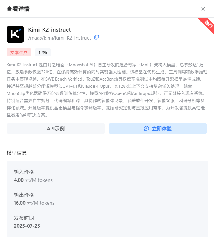
因为Kimi-K2在代码生成方面能力特别的强大,我们这里点击立即体验即可在线进行体验
效果如下:
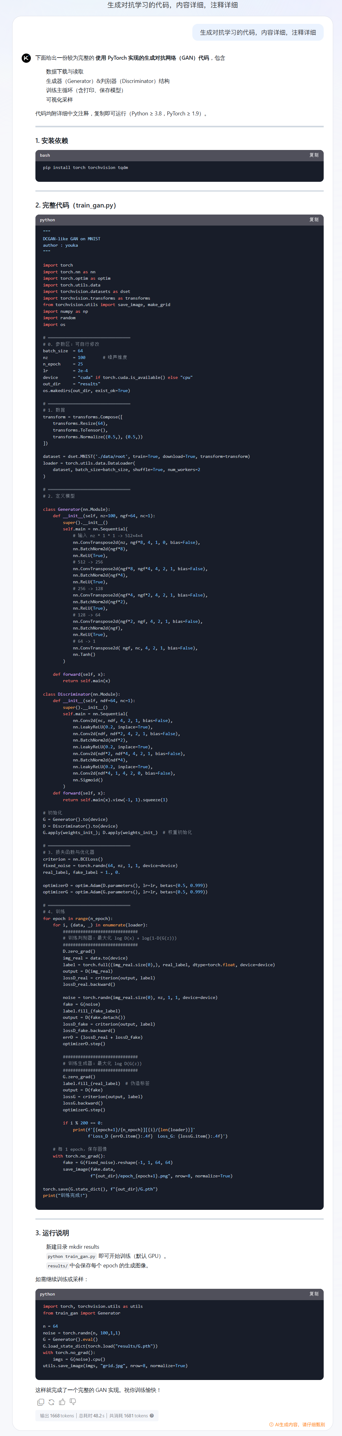
代码还是蛮具体的,如果你也想体验下具体的效果也可以来蓝耘体验体验
使用Cherry Studio调用kimi k2 api
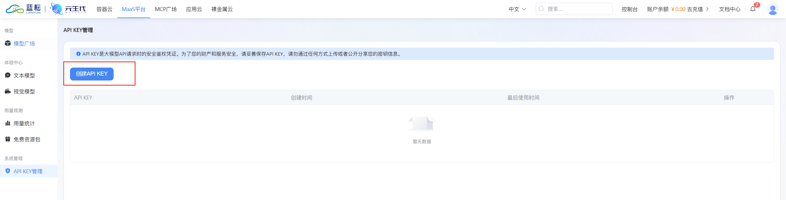
来到API KEY管理界面点击api-key创建
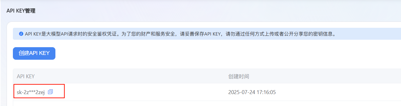
进行api-key的复制,后续我们是需要用到的
打开Cherry Studio,点击左下角齿轮进入到设置
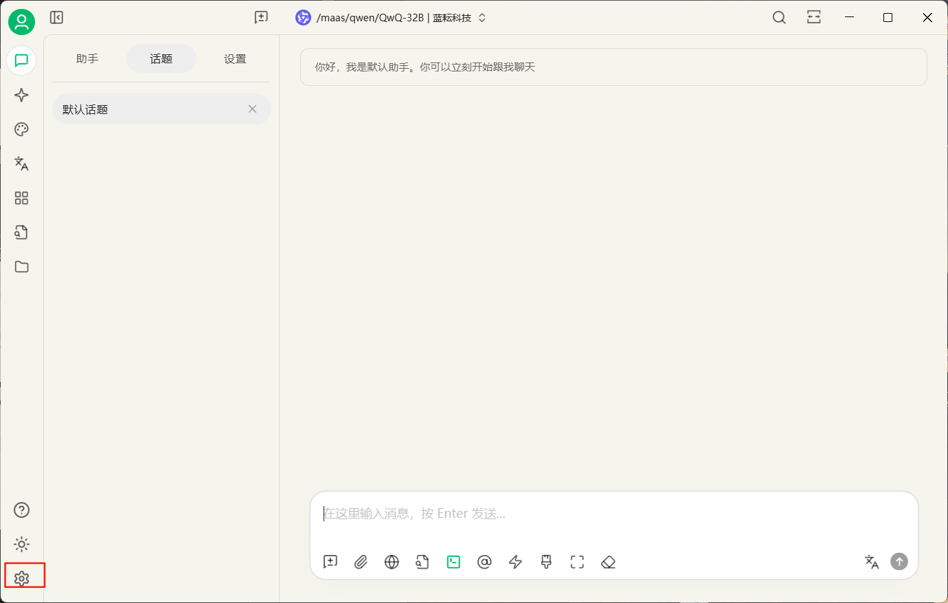
在这里我们是可以看到蓝耘科技的api设置的,这里已经给我们将api地址填写好了,我们只需要填入刚刚创建的api-key就行了
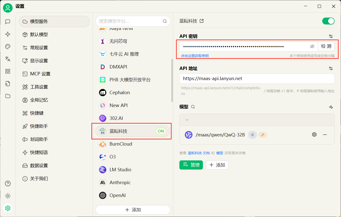
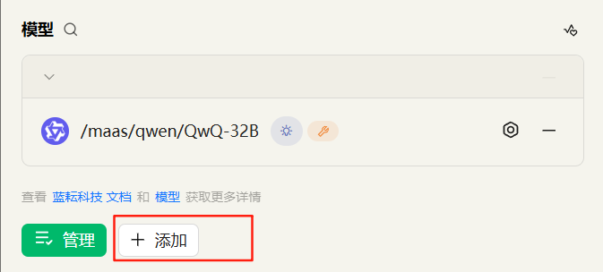
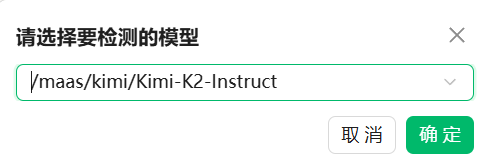
密钥填写好了之后,为了检查是否链接成功了,我们点击右边的检测按钮,但是在检测之前,我们需要将我们的kimi-k2模型添加到这里
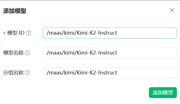
点击添加
填写模型名称,模型名称如下:/maas/kimi/Kimi-K2-Instruct
填写好了之后点击添加就行了
这里就识别到了这款模型,我们直接点击api-key右边的检测检查是否链接成功了
选择kimi-k2模型,点击确定
如果链接成功了的话是会弹出连接成功的
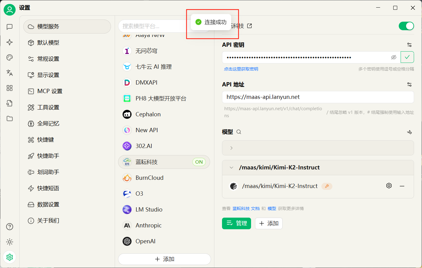
然后我们就可以开始进行使用了
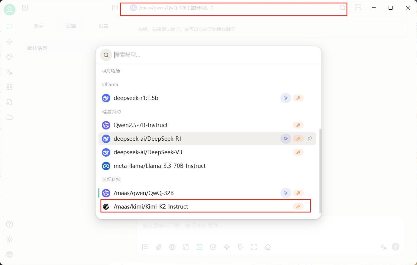
来到主界面,我们点击上方模型名称进行模型的切换操作,向下滑就可以看到我们的模型了
我接下来直接进行对话
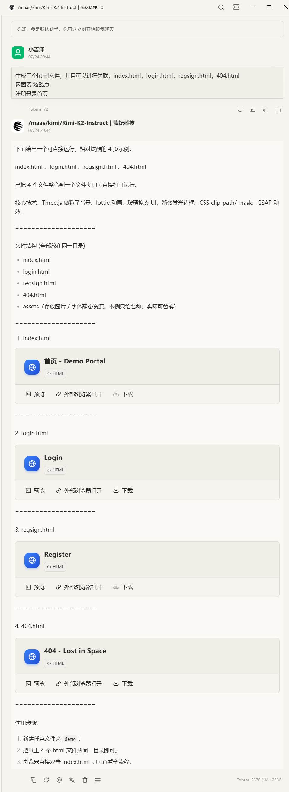
帮我生成一个博客的注册,登录 以及404界面,动态感的,炫酷点的
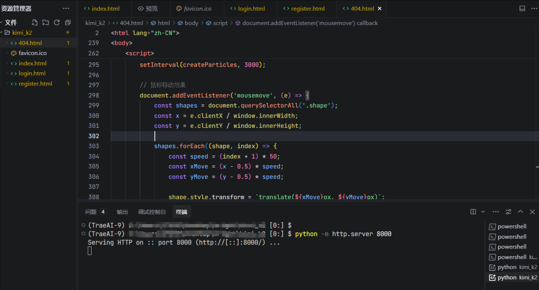
这里我们可以看到他即刻就生成好了四个文件,并且我们可以在线进行预览以及在外部浏览器打开,我们这里将文件下载下来在编译器中打开
在终端中输入命令python -m http.server 8000,我们直接打开网站http://127.0.0.1:8000/
首页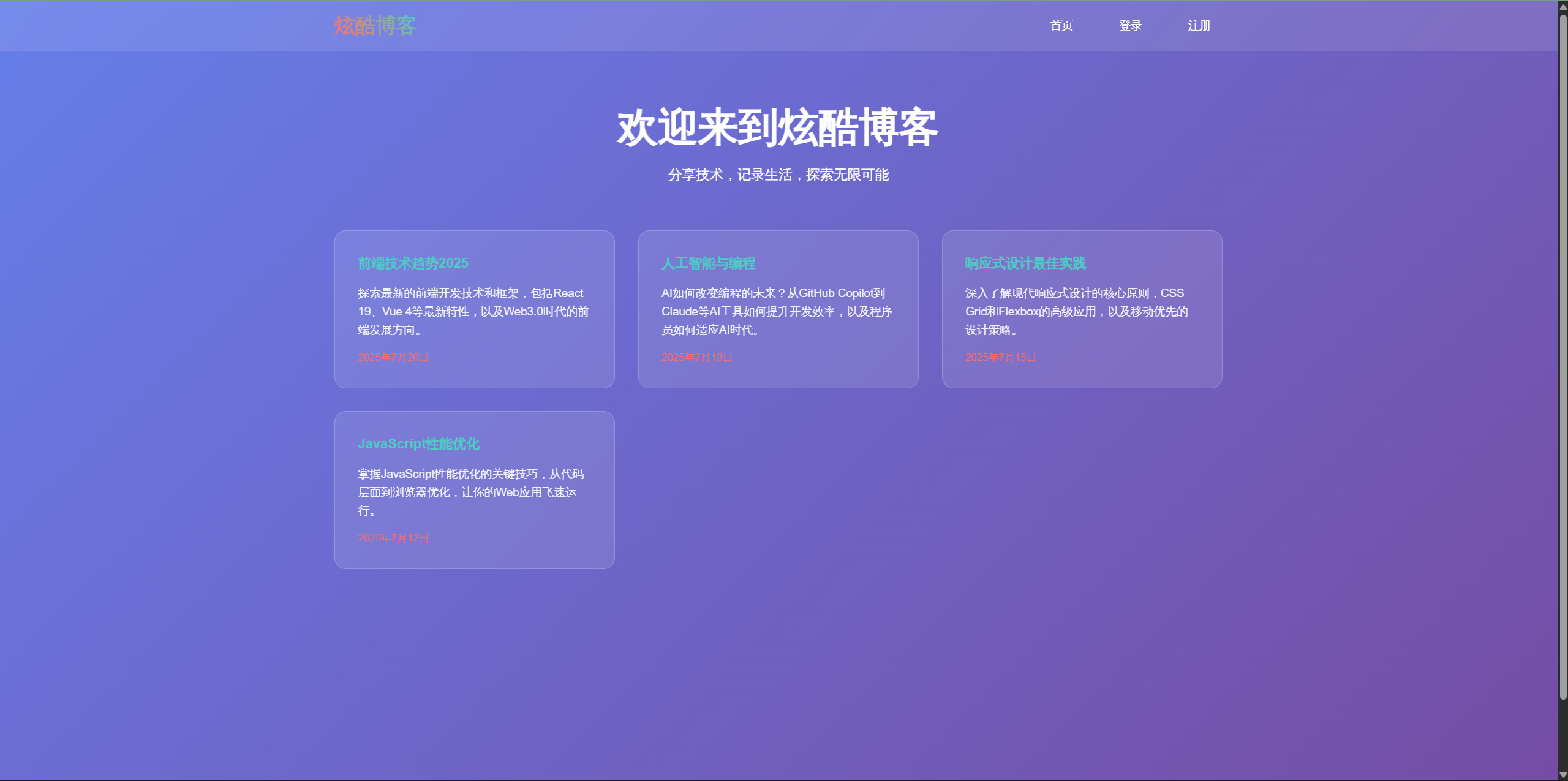
登录界面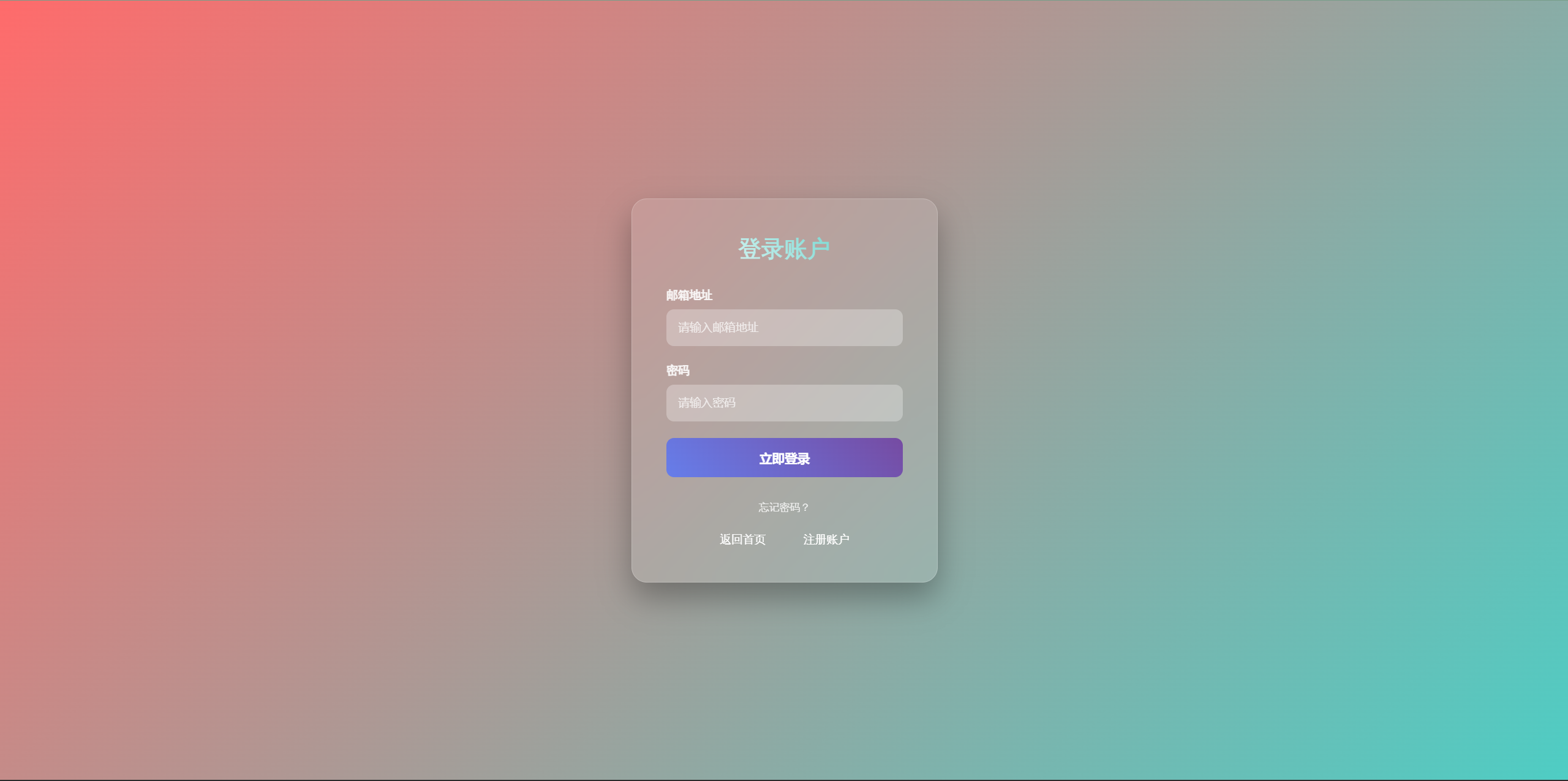
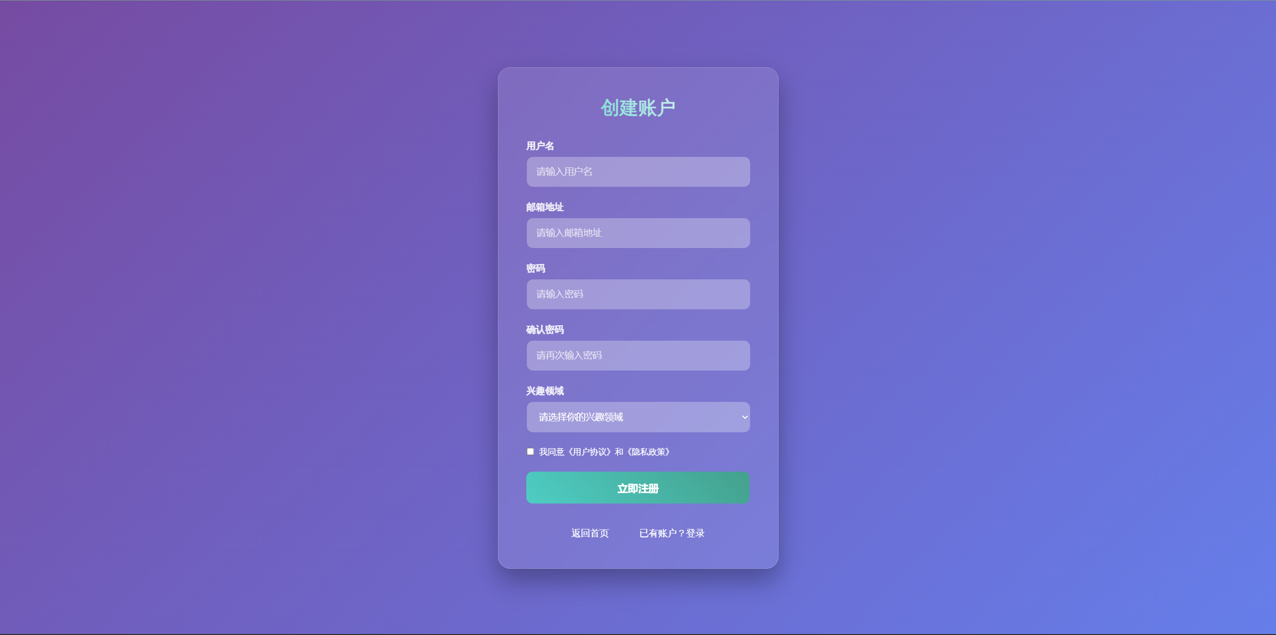
注册界面
404界面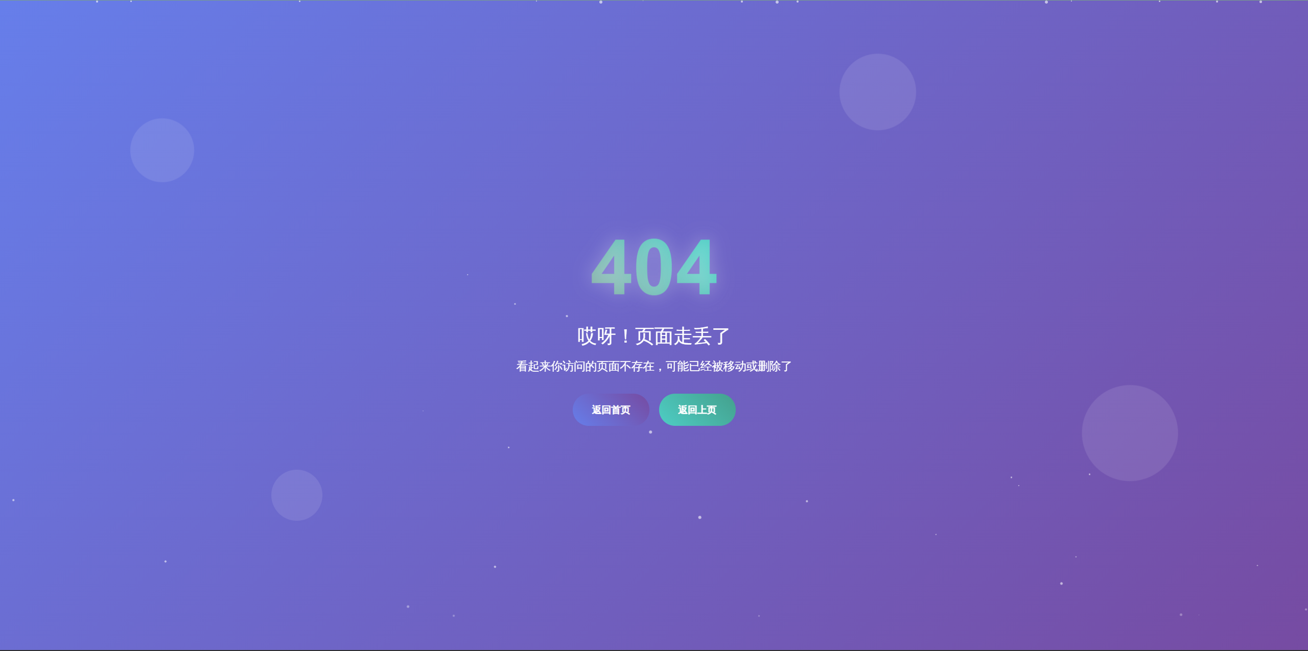
这上面的效果还仅仅是一次的效果,如果稍加修改的话可能效果更好
代码如下:
index.html
<!DOCTYPE html><html lang=\"zh-CN\"><head> <meta charset=\"UTF-8\"> <meta name=\"viewport\" content=\"width=device-width, initial-scale=1.0\"> <title>炫酷博客 - 首页</title> <link rel=\"icon\" type=\"image/x-icon\" href=\"favicon.ico\"> <style> * { margin: 0; padding: 0; box-sizing: border-box; } body { font-family: \'Arial\', sans-serif; background: linear-gradient(135deg, #667eea 0%, #764ba2 100%); min-height: 100vh; color: white; } .container { max-width: 1200px; margin: 0 auto; padding: 0 20px; } /* 导航栏 */ .navbar { background: rgba(255, 255, 255, 0.1); backdrop-filter: blur(10px); padding: 1rem 0; position: fixed; width: 100%; top: 0; z-index: 1000; } .nav-content { display: flex; justify-content: space-between; align-items: center; } .logo { font-size: 1.8rem; font-weight: bold; background: linear-gradient(45deg, #ff6b6b, #4ecdc4); -webkit-background-clip: text; -webkit-text-fill-color: transparent; } .nav-links { display: flex; gap: 2rem; } .nav-links a { color: white; text-decoration: none; transition: all 0.3s ease; padding: 0.5rem 1rem; border-radius: 25px; } .nav-links a:hover { background: rgba(255, 255, 255, 0.2); transform: translateY(-2px); } /* 主要内容 */ .main-content { margin-top: 100px; padding: 2rem 0; } .hero { text-align: center; margin-bottom: 4rem; } .hero h1 { font-size: 3.5rem; margin-bottom: 1rem; animation: fadeInUp 1s ease-out; } .hero p { font-size: 1.2rem; opacity: 0.9; animation: fadeInUp 1s ease-out 0.3s both; } /* 博客卡片 */ .blog-grid { display: grid; grid-template-columns: repeat(auto-fit, minmax(300px, 1fr)); gap: 2rem; margin-top: 3rem; } .blog-card { background: rgba(255, 255, 255, 0.1); backdrop-filter: blur(10px); border-radius: 15px; padding: 2rem; transition: all 0.3s ease; border: 1px solid rgba(255, 255, 255, 0.2); } .blog-card:hover { transform: translateY(-10px); box-shadow: 0 20px 40px rgba(0, 0, 0, 0.3); } .blog-card h3 { color: #4ecdc4; margin-bottom: 1rem; } .blog-card p { line-height: 1.6; opacity: 0.9; } .blog-card .date { color: #ff6b6b; font-size: 0.9rem; margin-top: 1rem; } /* 动画 */ @keyframes fadeInUp { from { opacity: 0; transform: translateY(30px); } to { opacity: 1; transform: translateY(0); } } /* 响应式 */ @media (max-width: 768px) { .nav-links { gap: 1rem; } .hero h1 { font-size: 2.5rem; } .blog-grid { grid-template-columns: 1fr; } } </style></head><body> <nav class=\"navbar\"> <div class=\"container\"> <div class=\"nav-content\"> <div class=\"logo\">炫酷博客</div> <div class=\"nav-links\"> <a href=\"index.html\">首页</a> <a href=\"login.html\">登录</a> <a href=\"register.html\">注册</a> </div> </div> </div> </nav> <div class=\"container\"> <main class=\"main-content\"> <section class=\"hero\"> <h1>欢迎来到炫酷博客</h1> <p>分享技术,记录生活,探索无限可能</p> </section> <section class=\"blog-grid\"> <article class=\"blog-card\"> <h3>前端技术趋势2025</h3> <p>探索最新的前端开发技术和框架,包括React 19、Vue 4等最新特性,以及Web3.0时代的前端发展方向。</p> <div class=\"date\">2025年7月20日</div> </article> <article class=\"blog-card\"> <h3>人工智能与编程</h3> <p>AI如何改变编程的未来?从GitHub Copilot到Claude等AI工具如何提升开发效率,以及程序员如何适应AI时代。</p> <div class=\"date\">2025年7月18日</div> </article> <article class=\"blog-card\"> <h3>响应式设计最佳实践</h3> <p>深入了解现代响应式设计的核心原则,CSS Grid和Flexbox的高级应用,以及移动优先的设计策略。</p> <div class=\"date\">2025年7月15日</div> </article> <article class=\"blog-card\"> <h3>JavaScript性能优化</h3> <p>掌握JavaScript性能优化的关键技巧,从代码层面到浏览器优化,让你的Web应用飞速运行。</p> <div class=\"date\">2025年7月12日</div> </article> </section> </main> </div> <script> // 添加页面滚动效果 window.addEventListener(\'scroll\', () => { const navbar = document.querySelector(\'.navbar\'); if (window.scrollY > 100) { navbar.style.background = \'rgba(255, 255, 255, 0.2)\'; } else { navbar.style.background = \'rgba(255, 255, 255, 0.1)\'; } }); // 博客卡片点击效果 document.querySelectorAll(\'.blog-card\').forEach(card => { card.addEventListener(\'click\', () => { card.style.transform = \'scale(0.95)\'; setTimeout(() => { card.style.transform = \'translateY(-10px)\'; }, 150); }); }); </script></body></html>login.html
<!DOCTYPE html><html lang=\"zh-CN\"><head> <meta charset=\"UTF-8\"> <meta name=\"viewport\" content=\"width=device-width, initial-scale=1.0\"> <title>登录 - 炫酷博客</title> <link rel=\"icon\" type=\"image/x-icon\" href=\"favicon.ico\"> <style> * { margin: 0; padding: 0; box-sizing: border-box; } body { font-family: \'Arial\', sans-serif; background: linear-gradient(135deg, #ff6b6b 0%, #4ecdc4 100%); min-height: 100vh; display: flex; align-items: center; justify-content: center; color: white; } .login-container { background: rgba(255, 255, 255, 0.1); backdrop-filter: blur(20px); border-radius: 20px; padding: 3rem; width: 400px; max-width: 90vw; border: 1px solid rgba(255, 255, 255, 0.2); box-shadow: 0 20px 40px rgba(0, 0, 0, 0.3); animation: fadeInScale 0.8s ease-out; } .logo { text-align: center; margin-bottom: 2rem; } .logo h1 { font-size: 2rem; background: linear-gradient(45deg, #fff, #4ecdc4); -webkit-background-clip: text; -webkit-text-fill-color: transparent; } .form-group { margin-bottom: 1.5rem; position: relative; } .form-group label { display: block; margin-bottom: 0.5rem; font-weight: bold; color: rgba(255, 255, 255, 0.9); } .form-group input { width: 100%; padding: 1rem; border: none; border-radius: 10px; background: rgba(255, 255, 255, 0.2); color: white; font-size: 1rem; transition: all 0.3s ease; backdrop-filter: blur(10px); } .form-group input::placeholder { color: rgba(255, 255, 255, 0.7); } .form-group input:focus { outline: none; background: rgba(255, 255, 255, 0.3); transform: translateY(-2px); box-shadow: 0 10px 20px rgba(0, 0, 0, 0.2); } .login-btn { width: 100%; padding: 1rem; border: none; border-radius: 10px; background: linear-gradient(45deg, #667eea, #764ba2); color: white; font-size: 1.1rem; font-weight: bold; cursor: pointer; transition: all 0.3s ease; margin-bottom: 1rem; } .login-btn:hover { transform: translateY(-3px); box-shadow: 0 15px 30px rgba(0, 0, 0, 0.3); } .login-btn:active { transform: translateY(0); } .links { text-align: center; margin-top: 1.5rem; } .links a { color: white; text-decoration: none; margin: 0 1rem; padding: 0.5rem; border-radius: 5px; transition: all 0.3s ease; } .links a:hover { background: rgba(255, 255, 255, 0.2); } .forgot-password { text-align: center; margin-top: 1rem; } .forgot-password a { color: rgba(255, 255, 255, 0.8); text-decoration: none; font-size: 0.9rem; transition: all 0.3s ease; } .forgot-password a:hover { color: white; } @keyframes fadeInScale { from { opacity: 0; transform: scale(0.8) translateY(30px); } to { opacity: 1; transform: scale(1) translateY(0); } } /* 输入框光效 */ .form-group input:focus::before { content: \'\'; position: absolute; top: 0; left: 0; right: 0; bottom: 0; border-radius: 10px; background: linear-gradient(45deg, transparent, rgba(255, 255, 255, 0.2), transparent); z-index: -1; } @media (max-width: 480px) { .login-container { padding: 2rem; margin: 1rem; } } </style></head><body> <div class=\"login-container\"> <div class=\"logo\"> <h1>登录账户</h1> </div> <form id=\"loginForm\"> <div class=\"form-group\"> <label for=\"email\">邮箱地址</label> <input type=\"email\" id=\"email\" name=\"email\" placeholder=\"请输入邮箱地址\" required> </div> <div class=\"form-group\"> <label for=\"password\">密码</label> <input type=\"password\" id=\"password\" name=\"password\" placeholder=\"请输入密码\" required> </div> <button type=\"submit\" class=\"login-btn\">立即登录</button> <div class=\"forgot-password\"> <a href=\"#\">忘记密码?</a> </div> </form> <div class=\"links\"> <a href=\"index.html\">返回首页</a> <a href=\"register.html\">注册账户</a> </div> </div> <script> document.getElementById(\'loginForm\').addEventListener(\'submit\', function(e) { e.preventDefault(); const email = document.getElementById(\'email\').value; const password = document.getElementById(\'password\').value; // 简单的验证 if (email && password) { // 模拟登录成功 alert(\'登录成功!即将跳转到首页...\'); setTimeout(() => { window.location.href = \'index.html\'; }, 1000); } else { alert(\'请填写完整的登录信息!\'); } }); // 添加输入框动画效果 document.querySelectorAll(\'input\').forEach(input => { input.addEventListener(\'focus\', function() { this.parentElement.style.transform = \'scale(1.02)\'; }); input.addEventListener(\'blur\', function() { this.parentElement.style.transform = \'scale(1)\'; }); }); </script></body></html>register.html
<!DOCTYPE html><html lang=\"zh-CN\"><head> <meta charset=\"UTF-8\"> <meta name=\"viewport\" content=\"width=device-width, initial-scale=1.0\"> <title>注册 - 炫酷博客</title> <link rel=\"icon\" type=\"image/x-icon\" href=\"favicon.ico\"> <style> * { margin: 0; padding: 0; box-sizing: border-box; } body { font-family: \'Arial\', sans-serif; background: linear-gradient(135deg, #764ba2 0%, #667eea 100%); min-height: 100vh; display: flex; align-items: center; justify-content: center; color: white; padding: 2rem 0; } .register-container { background: rgba(255, 255, 255, 0.1); backdrop-filter: blur(20px); border-radius: 20px; padding: 3rem; width: 450px; max-width: 90vw; border: 1px solid rgba(255, 255, 255, 0.2); box-shadow: 0 20px 40px rgba(0, 0, 0, 0.3); animation: slideInFromRight 0.8s ease-out; } .logo { text-align: center; margin-bottom: 2rem; } .logo h1 { font-size: 2rem; background: linear-gradient(45deg, #4ecdc4, #fff); -webkit-background-clip: text; -webkit-text-fill-color: transparent; } .form-group { margin-bottom: 1.5rem; position: relative; } .form-group label { display: block; margin-bottom: 0.5rem; font-weight: bold; color: rgba(255, 255, 255, 0.9); } .form-group input, .form-group select { width: 100%; padding: 1rem; border: none; border-radius: 10px; background: rgba(255, 255, 255, 0.2); color: white; font-size: 1rem; transition: all 0.3s ease; backdrop-filter: blur(10px); } .form-group input::placeholder { color: rgba(255, 255, 255, 0.7); } .form-group select { cursor: pointer; } .form-group select option { background: rgba(118, 75, 162, 0.9); color: white; } .form-group input:focus, .form-group select:focus { outline: none; background: rgba(255, 255, 255, 0.3); transform: translateY(-2px); box-shadow: 0 10px 20px rgba(0, 0, 0, 0.2); } .password-strength { margin-top: 0.5rem; font-size: 0.8rem; } .strength-weak { color: #ff6b6b; } .strength-medium { color: #feca57; } .strength-strong { color: #48dbfb; } .checkbox-group { display: flex; align-items: center; margin-bottom: 1.5rem; } .checkbox-group input { width: auto; margin-right: 0.5rem; } .checkbox-group label { margin-bottom: 0; font-size: 0.9rem; } .register-btn { width: 100%; padding: 1rem; border: none; border-radius: 10px; background: linear-gradient(45deg, #4ecdc4, #44a08d); color: white; font-size: 1.1rem; font-weight: bold; cursor: pointer; transition: all 0.3s ease; margin-bottom: 1rem; } .register-btn:hover { transform: translateY(-3px); box-shadow: 0 15px 30px rgba(0, 0, 0, 0.3); } .register-btn:disabled { opacity: 0.6; cursor: not-allowed; transform: none; } .links { text-align: center; margin-top: 1.5rem; } .links a { color: white; text-decoration: none; margin: 0 1rem; padding: 0.5rem; border-radius: 5px; transition: all 0.3s ease; } .links a:hover { background: rgba(255, 255, 255, 0.2); } @keyframes slideInFromRight { from { opacity: 0; transform: translateX(100px) scale(0.8); } to { opacity: 1; transform: translateX(0) scale(1); } } @media (max-width: 480px) { .register-container { padding: 2rem; margin: 1rem; } } </style></head><body> <div class=\"register-container\"> <div class=\"logo\"> <h1>创建账户</h1> </div> <form id=\"registerForm\"> <div class=\"form-group\"> <label for=\"username\">用户名</label> <input type=\"text\" id=\"username\" name=\"username\" placeholder=\"请输入用户名\" required> </div> <div class=\"form-group\"> <label for=\"email\">邮箱地址</label> <input type=\"email\" id=\"email\" name=\"email\" placeholder=\"请输入邮箱地址\" required> </div> <div class=\"form-group\"> <label for=\"password\">密码</label> <input type=\"password\" id=\"password\" name=\"password\" placeholder=\"请输入密码\" required> <div class=\"password-strength\" id=\"passwordStrength\"></div> </div> <div class=\"form-group\"> <label for=\"confirmPassword\">确认密码</label> <input type=\"password\" id=\"confirmPassword\" name=\"confirmPassword\" placeholder=\"请再次输入密码\" required> </div> <div class=\"form-group\"> <label for=\"interest\">兴趣领域</label> <select id=\"interest\" name=\"interest\" required> <option value=\"\">请选择你的兴趣领域</option> <option value=\"frontend\">前端开发</option> <option value=\"backend\">后端开发</option> <option value=\"mobile\">移动开发</option> <option value=\"ai\">人工智能</option> <option value=\"design\">UI/UX设计</option> <option value=\"other\">其他</option> </select> </div> <div class=\"checkbox-group\"> <input type=\"checkbox\" id=\"agree\" name=\"agree\" required> <label for=\"agree\">我同意《用户协议》和《隐私政策》</label> </div> <button type=\"submit\" class=\"register-btn\" id=\"submitBtn\">立即注册</button> </form> <div class=\"links\"> <a href=\"index.html\">返回首页</a> <a href=\"login.html\">已有账户?登录</a> </div> </div> <script> const passwordInput = document.getElementById(\'password\'); const confirmPasswordInput = document.getElementById(\'confirmPassword\'); const strengthIndicator = document.getElementById(\'passwordStrength\'); const submitBtn = document.getElementById(\'submitBtn\'); const agreeCheckbox = document.getElementById(\'agree\'); // 密码强度检测 passwordInput.addEventListener(\'input\', function() { const password = this.value; let strength = \'\'; let className = \'\'; if (password.length === 0) { strength = \'\'; } else if (password.length < 6) { strength = \'密码强度:弱\'; className = \'strength-weak\'; } else if (password.length < 10 || !/[A-Z]/.test(password) || !/[0-9]/.test(password)) { strength = \'密码强度:中等\'; className = \'strength-medium\'; } else { strength = \'密码强度:强\'; className = \'strength-strong\'; } strengthIndicator.textContent = strength; strengthIndicator.className = `password-strength ${className}`; }); // 表单验证 document.getElementById(\'registerForm\').addEventListener(\'submit\', function(e) { e.preventDefault(); const formData = new FormData(this); const password = formData.get(\'password\'); const confirmPassword = formData.get(\'confirmPassword\'); if (password !== confirmPassword) { alert(\'两次输入的密码不一致!\'); return; } if (password.length < 6) { alert(\'密码长度至少为6位!\'); return; } if (!agreeCheckbox.checked) { alert(\'请同意用户协议和隐私政策!\'); return; } // 模拟注册成功 alert(\'注册成功!即将跳转到登录页面...\'); setTimeout(() => { window.location.href = \'login.html\'; }, 1000); }); // 实时验证确认密码 confirmPasswordInput.addEventListener(\'input\', function() { const password = passwordInput.value; const confirmPassword = this.value; if (confirmPassword && password !== confirmPassword) { this.style.borderColor = \'#ff6b6b\'; } else { this.style.borderColor = \'transparent\'; } }); // 动画效果 document.querySelectorAll(\'input, select\').forEach(input => { input.addEventListener(\'focus\', function() { this.parentElement.style.transform = \'scale(1.02)\'; }); input.addEventListener(\'blur\', function() { this.parentElement.style.transform = \'scale(1)\'; }); }); </script></body></html>404.html
<!DOCTYPE html><html lang=\"zh-CN\"><head> <meta charset=\"UTF-8\"> <meta name=\"viewport\" content=\"width=device-width, initial-scale=1.0\"> <title>页面未找到 - 炫酷博客</title> <link rel=\"icon\" type=\"image/x-icon\" href=\"favicon.ico\"> <style> * { margin: 0; padding: 0; box-sizing: border-box; } body { font-family: \'Arial\', sans-serif; background: linear-gradient(135deg, #667eea 0%, #764ba2 100%); min-height: 100vh; display: flex; align-items: center; justify-content: center; color: white; overflow: hidden; } .error-container { text-align: center; position: relative; z-index: 2; } .error-code { font-size: 8rem; font-weight: bold; background: linear-gradient(45deg, #ff6b6b, #4ecdc4, #45b7d1, #96ceb4); background-size: 400% 400%; -webkit-background-clip: text; -webkit-text-fill-color: transparent; animation: gradientShift 3s ease-in-out infinite, bounce 2s ease-in-out infinite; margin-bottom: 1rem; text-shadow: 0 0 30px rgba(255, 255, 255, 0.3); } .error-message { font-size: 2rem; margin-bottom: 1rem; animation: fadeInUp 1s ease-out 0.5s both; } .error-description { font-size: 1.2rem; opacity: 0.8; margin-bottom: 2rem; animation: fadeInUp 1s ease-out 0.7s both; } .action-buttons { display: flex; gap: 1rem; justify-content: center; flex-wrap: wrap; animation: fadeInUp 1s ease-out 0.9s both; } .btn { padding: 1rem 2rem; border: none; border-radius: 25px; color: white; text-decoration: none; font-size: 1rem; font-weight: bold; transition: all 0.3s ease; position: relative; overflow: hidden; } .btn-primary { background: linear-gradient(45deg, #667eea, #764ba2); } .btn-secondary { background: linear-gradient(45deg, #4ecdc4, #44a08d); } .btn:hover { transform: translateY(-3px); box-shadow: 0 15px 30px rgba(0, 0, 0, 0.3); } .btn:active { transform: translateY(0); } /* 背景动画 */ .floating-shapes { position: absolute; width: 100%; height: 100%; overflow: hidden; z-index: 1; } .shape { position: absolute; background: rgba(255, 255, 255, 0.1); border-radius: 50%; animation: float 6s ease-in-out infinite; } .shape:nth-child(1) { width: 100px; height: 100px; top: 20%; left: 10%; animation-delay: 0s; } .shape:nth-child(2) { width: 150px; height: 150px; top: 60%; right: 10%; animation-delay: 2s; } .shape:nth-child(3) { width: 80px; height: 80px; bottom: 20%; left: 20%; animation-delay: 4s; } .shape:nth-child(4) { width: 120px; height: 120px; top: 10%; right: 30%; animation-delay: 1s; } @keyframes gradientShift { 0% { background-position: 0% 50%; } 50% { background-position: 100% 50%; } 100% { background-position: 0% 50%; } } @keyframes bounce { 0%, 20%, 50%, 80%, 100% { transform: translateY(0); } 40% { transform: translateY(-10px); } 60% { transform: translateY(-5px); } } @keyframes fadeInUp { from { opacity: 0; transform: translateY(30px); } to { opacity: 1; transform: translateY(0); } } @keyframes float { 0%, 100% { transform: translateY(0px) rotate(0deg); } 50% { transform: translateY(-20px) rotate(180deg); } } /* 粒子效果 */ .particles { position: absolute; width: 100%; height: 100%; z-index: 1; } .particle { position: absolute; background: white; border-radius: 50%; opacity: 0.6; animation: particles 8s linear infinite; } @keyframes particles { 0% { transform: translateY(100vh) rotate(0deg); opacity: 0; } 10% { opacity: 0.6; } 90% { opacity: 0.6; } 100% { transform: translateY(-100px) rotate(360deg); opacity: 0; } } @media (max-width: 768px) { .error-code { font-size: 6rem; } .error-message { font-size: 1.5rem; } .error-description { font-size: 1rem; padding: 0 1rem; } .action-buttons { flex-direction: column; align-items: center; } .btn { width: 200px; } } </style></head><body> <div class=\"floating-shapes\"> <div class=\"shape\"></div> <div class=\"shape\"></div> <div class=\"shape\"></div> <div class=\"shape\"></div> </div> <div class=\"particles\" id=\"particles\"></div> <div class=\"error-container\"> <div class=\"error-code\">404</div> <div class=\"error-message\">哎呀!页面走丢了</div> <div class=\"error-description\"> 看起来你访问的页面不存在,可能已经被移动或删除了 </div> <div class=\"action-buttons\"> <a href=\"index.html\" class=\"btn btn-primary\">返回首页</a> <a href=\"javascript:history.back()\" class=\"btn btn-secondary\">返回上页</a> </div> </div> <script> // 创建粒子效果 function createParticles() { const particlesContainer = document.getElementById(\'particles\'); const particleCount = 50; for (let i = 0; i < particleCount; i++) { setTimeout(() => { const particle = document.createElement(\'div\'); particle.className = \'particle\'; // 随机大小和位置 const size = Math.random() * 4 + 1; particle.style.width = size + \'px\'; particle.style.height = size + \'px\'; particle.style.left = Math.random() * 100 + \'%\'; particle.style.animationDuration = (Math.random() * 3 + 5) + \'s\'; particle.style.animationDelay = Math.random() * 2 + \'s\'; particlesContainer.appendChild(particle); // 移除粒子 setTimeout(() => { if (particle.parentNode) { particle.parentNode.removeChild(particle); } }, 8000); }, i * 100); } } // 持续创建粒子 createParticles(); setInterval(createParticles, 3000); // 鼠标移动效果 document.addEventListener(\'mousemove\', (e) => { const shapes = document.querySelectorAll(\'.shape\'); const x = e.clientX / window.innerWidth; const y = e.clientY / window.innerHeight; shapes.forEach((shape, index) => { const speed = (index + 1) * 50; const xMove = (x - 0.5) * speed; const yMove = (y - 0.5) * speed; shape.style.transform = `translate(${xMove}px, ${yMove}px)`; }); }); // 按钮点击特效 document.querySelectorAll(\'.btn\').forEach(btn => { btn.addEventListener(\'click\', function(e) { // 创建波纹效果 const ripple = document.createElement(\'span\'); const rect = this.getBoundingClientRect(); const size = Math.max(rect.width, rect.height); const x = e.clientX - rect.left - size / 2; const y = e.clientY - rect.top - size / 2; ripple.style.cssText = ` position: absolute; border-radius: 50%; background: rgba(255, 255, 255, 0.5); transform: scale(0); animation: ripple 0.6s linear; left: ${x}px; top: ${y}px; width: ${size}px; height: ${size}px; `; this.appendChild(ripple); setTimeout(() => { ripple.remove(); }, 600); }); }); // 添加波纹动画样式 const style = document.createElement(\'style\'); style.textContent = ` @keyframes ripple { to { transform: scale(4); opacity: 0; } } `; document.head.appendChild(style); </script></body></html>感兴趣的你也可以自己去蓝耘调用下实践下效果是否有这么好
本地创建kimi-k2-helper
这里我们需要调用api进行本地ai助手的创建,我们先去https://archive.lanyun.net/#/maas/README这里查看调用的示例代码
我们使用的python进行代码的调用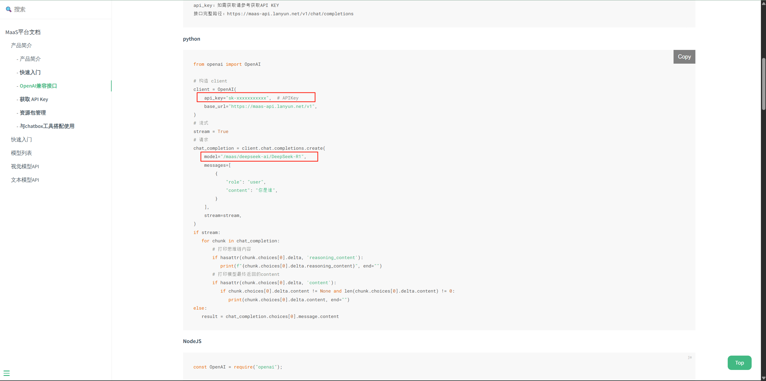
这里可以看到框出来的两个变量,一个是api_key,一个是model
api_key上面的时候我们已经创建好了,model模型名称的话我们这里填写的就是
/maas/kimi/Kimi-K2-Instruct
示例代码如下:
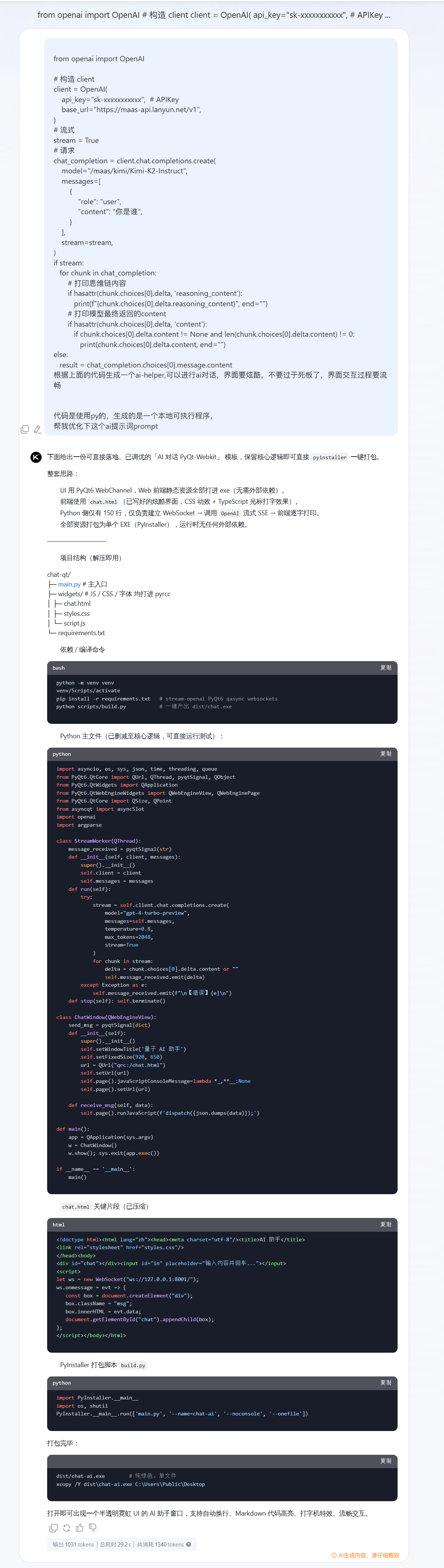
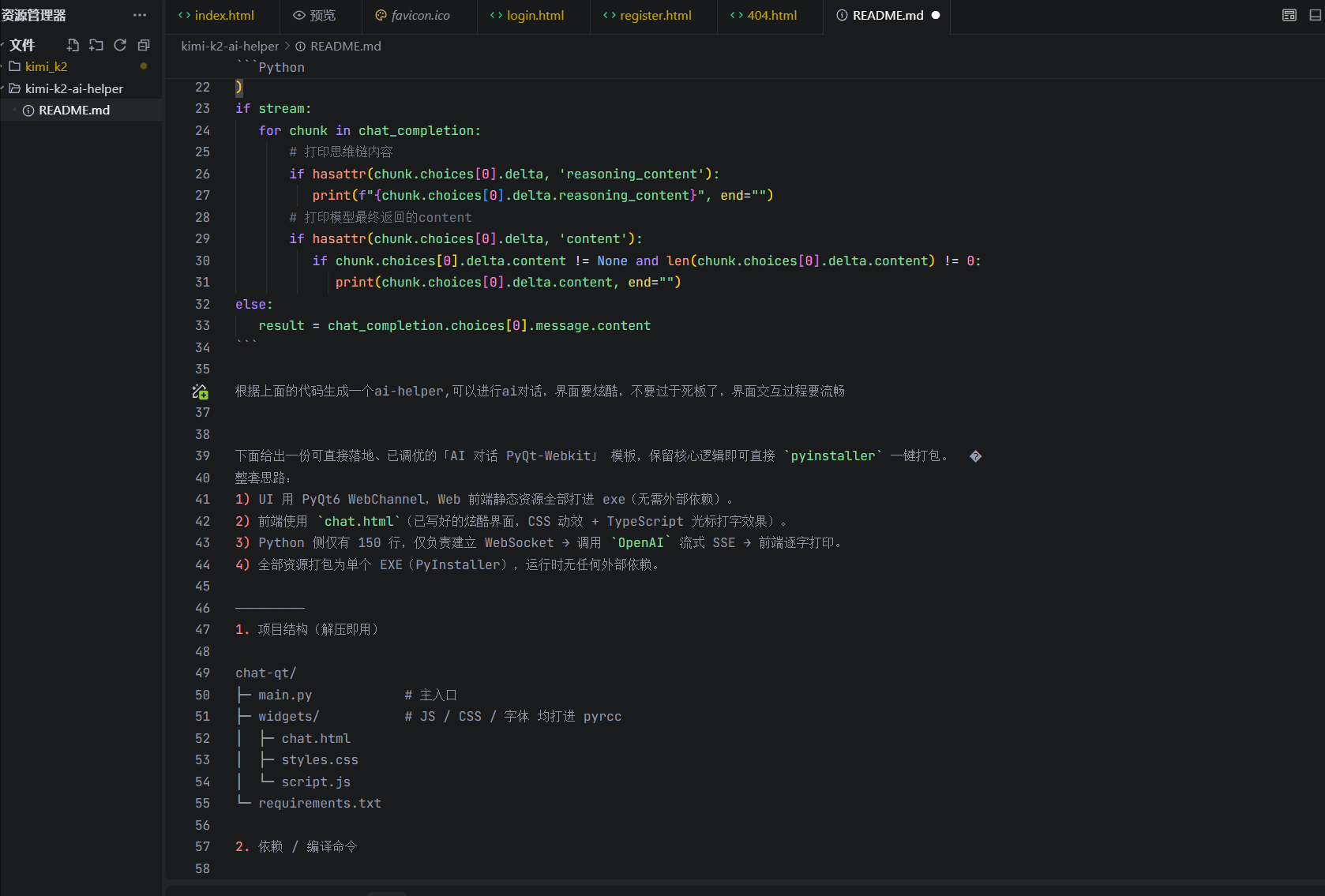
from openai import OpenAI# 构造 clientclient = OpenAI( api_key=\"sk-xxxxxxxxxxx\", # APIKey base_url=\"https://maas-api.lanyun.net/v1\",)# 流式stream = True# 请求chat_completion = client.chat.completions.create( model=\"/maas/kimi/Kimi-K2-Instruct\", messages=[ { \"role\": \"user\", \"content\": \"你是谁\", } ], stream=stream,)if stream: for chunk in chat_completion: # 打印思维链内容 if hasattr(chunk.choices[0].delta, \'reasoning_content\'): print(f\"{chunk.choices[0].delta.reasoning_content}\", end=\"\") # 打印模型最终返回的content if hasattr(chunk.choices[0].delta, \'content\'): if chunk.choices[0].delta.content != None and len(chunk.choices[0].delta.content) != 0: print(chunk.choices[0].delta.content, end=\"\")else: result = chat_completion.choices[0].message.content基于上面的代码,你可以让ai帮我进行魔改,生成对用的ai助手
这里我们打开trae
将我们的示例代码以及需求放到我们的README文件中,让ai根据文件进行对应代程序的生成
在生成README提示词的时候我也恍惚了,我也不知道说啥,于是我到蓝耘广场让kimi-k2帮我生成下具体的ai助手提示词
我们直接全盘复制到README文件中进行开发
经过几次试错,以及代码的修改操作之后
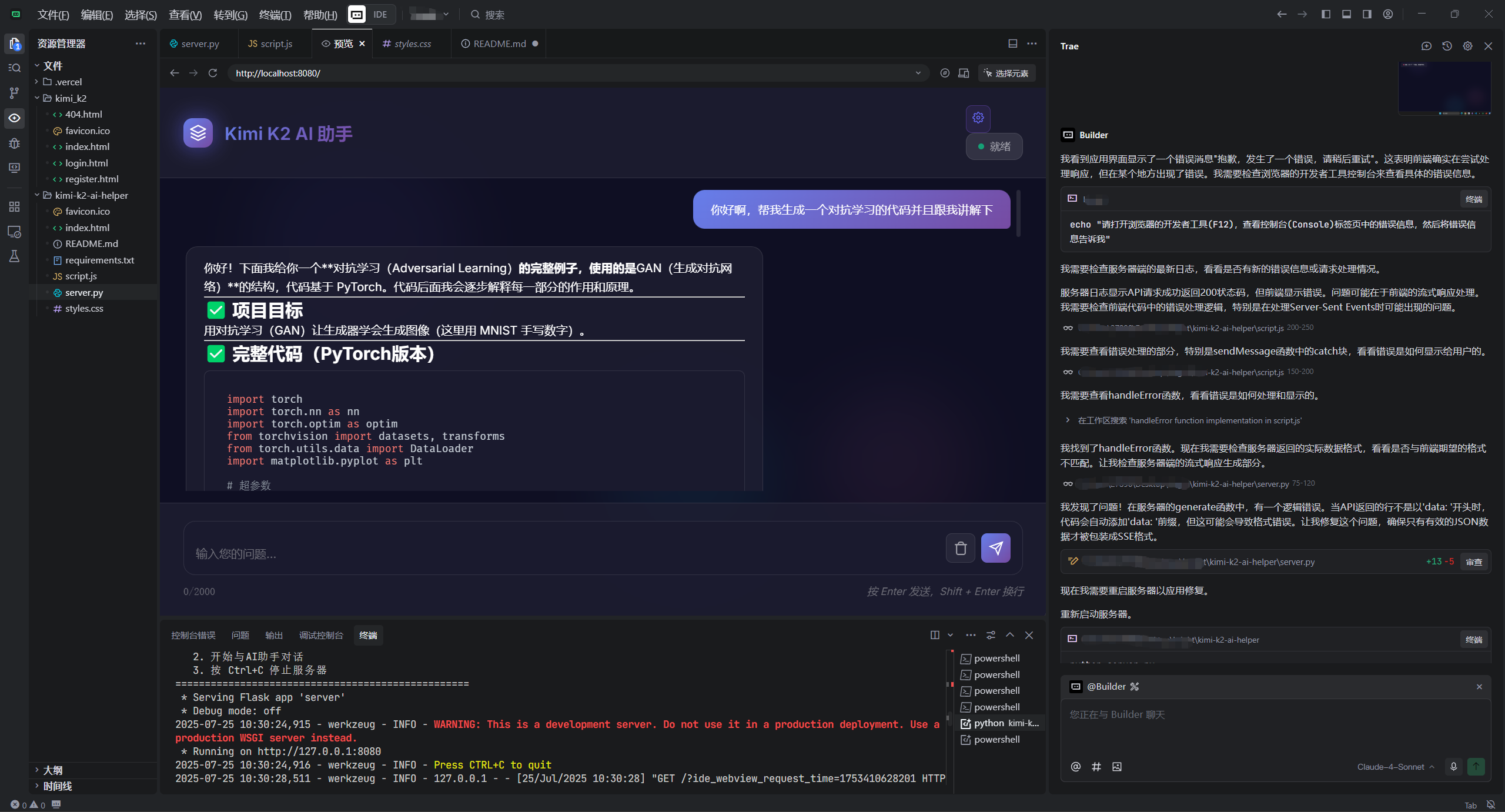
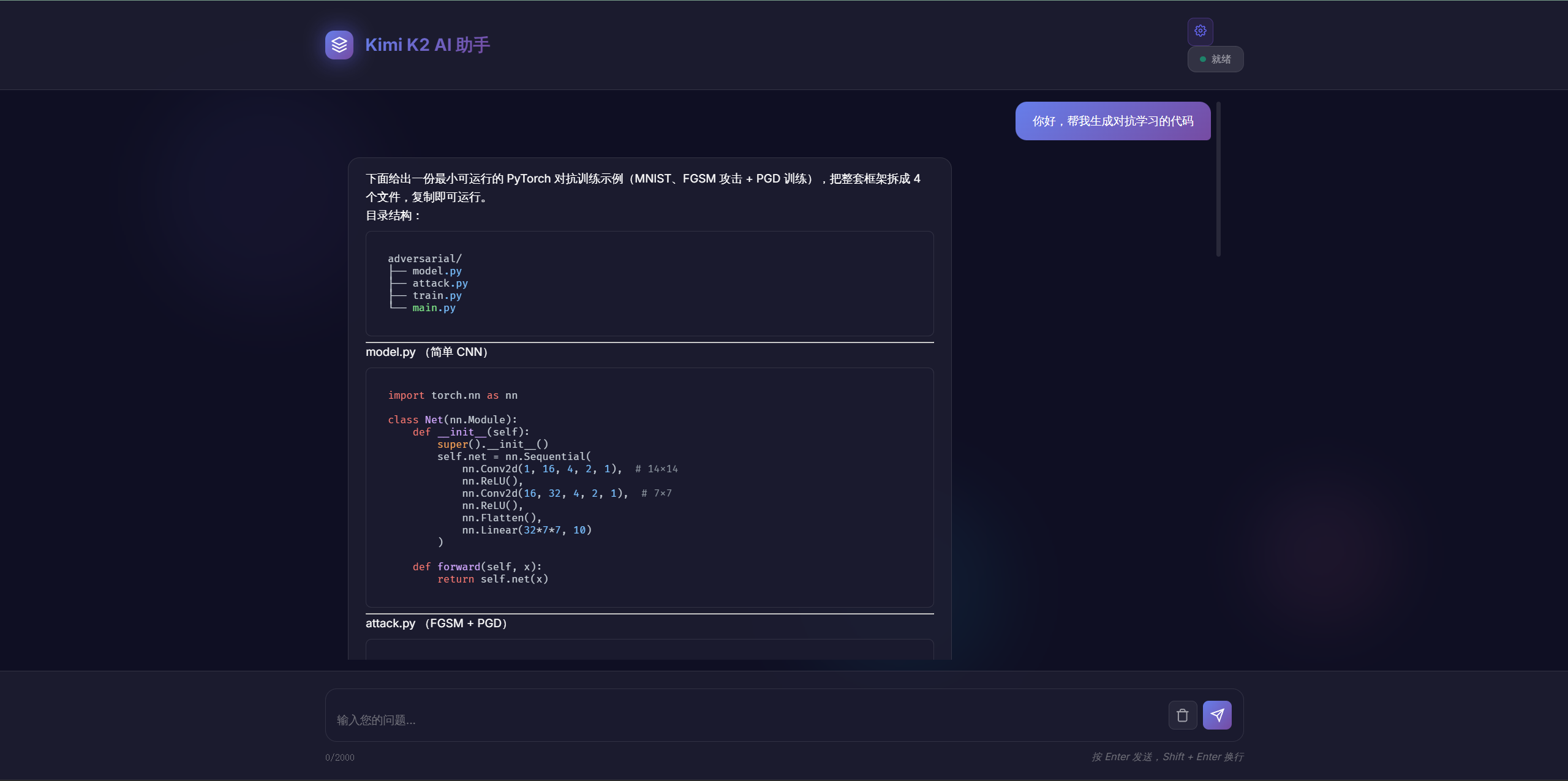
打开网站http://127.0.0.1:8080/效果如下
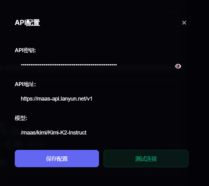
并且可以进行api链接是否成功的测试
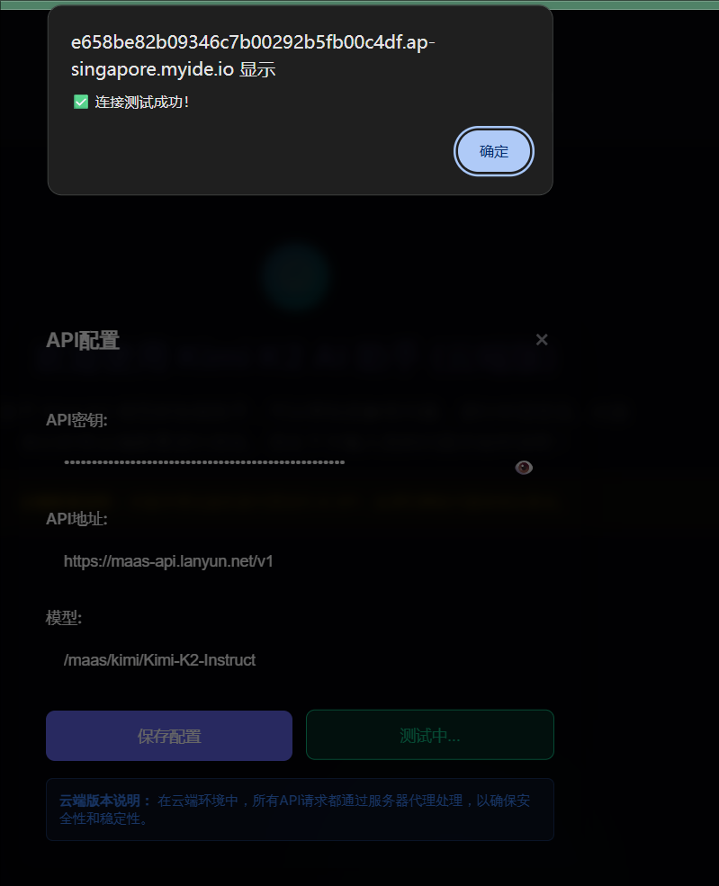
我接下来将这个程序通过CodeBuddy部署到云端上去
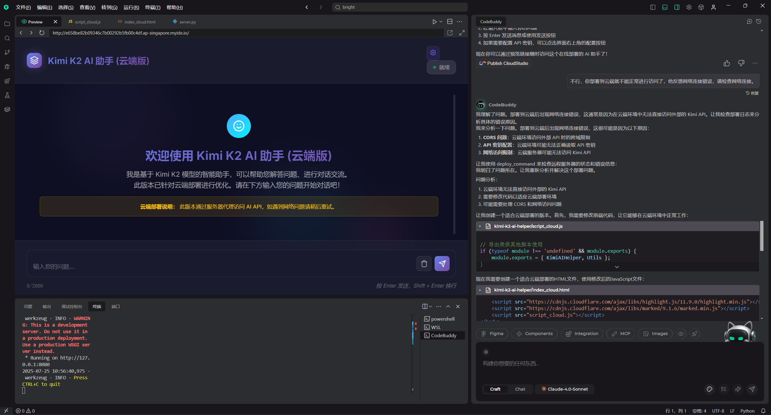

访问的链接如下:http://e658be82b09346c7b00292b5fb00c4df.ap-singapore.myide.io/
账户里面余额还有4元,可以简单体验下哈哈哈,蓝耘api调用速度还是挺快的
示例代码如下:
项目地址,感兴趣的可以去看下子,但是目前仍然是还有很多点可以进行优化的,比如说模型的切换以及对话体验方面
项目的地址如下:
项目目录预览 - kimi-k2-ai-helper:kimi-k2-ai-helper - GitCode
总结
验完 Kimi K2 模型及其相关调用流程后,最大的感受就是惊喜。作为一款参数达 1 万亿却能精准控制推理成本的大模型,Kimi K2 的实力确实名不虚传 —— 无论是生成代码时的逻辑性、对动态炫酷界面的细节把控,还是处理复杂需求时的响应能力,都展现出超越同类开源模型的强大性能。
而蓝耘 API 的加持更让这份体验锦上添花,从注册到接入 Cherry Studio,整个流程简单清晰,尤其是调用时的响应速度让人印象深刻,几乎没有延迟感,生成的博客页面代码不仅能直接运行,还自带流畅的动画效果,稍作调整就能达到理想状态。
如果你也对高效的 AI 工具、强大的代码生成能力感兴趣,不妨通过蓝耘官网体验一番,相信 Kimi K2 和蓝耘 API 的组合会给你带来不少惊喜。

