开源 我写了个 Flutter 组件 ducafe_ui_core
开源 我写了个 Flutter 组件 ducafe_ui_core
视频
https://www.bilibili.com/video/BV17PPWeAEom/
前言
原文 Flutter 组件 ducafe_ui_core:提升开发效率的利器
许多群友询问我关于 ducafe_ui_core 的使用方法。这个组件是我将之前项目中频繁重复使用的功能独立抽取出来,以便在新项目中引入,从而提升开发效率。如果你想系统地学习 Flutter,欢迎关注我的新课程 woo2025。在本文中,我将介绍 ducafe_ui_core 包含的各种功能。
参考
https://ducafecat.com/course/flutter-woo-2025
https://pub.dev/packages/ducafe_ui_core
功能介绍
添加依赖
https://pub.dev/packages/ducafe_ui_core
pubspec.yaml
dependencies: ... ducafe_ui_core: ^1.0.61 设计稿适配
编辑 lib/main.dart ,初始屏幕适配
class MyApp extends StatelessWidget { const MyApp({super.key}); Widget build(BuildContext context) { return ScreenUtilInit( designSize: const Size(375, 812), builder: (context, child) { return MaterialApp( title: \'Flutter Demo\', theme: ThemeData( colorScheme: ColorScheme.fromSeed(seedColor: Colors.deepPurple), useMaterial3: true, ), home: const MyHomePage(title: \'Flutter Demo Home Page\'), ); }, ); }}包裹 ScreenUtilInit
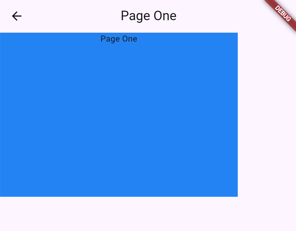
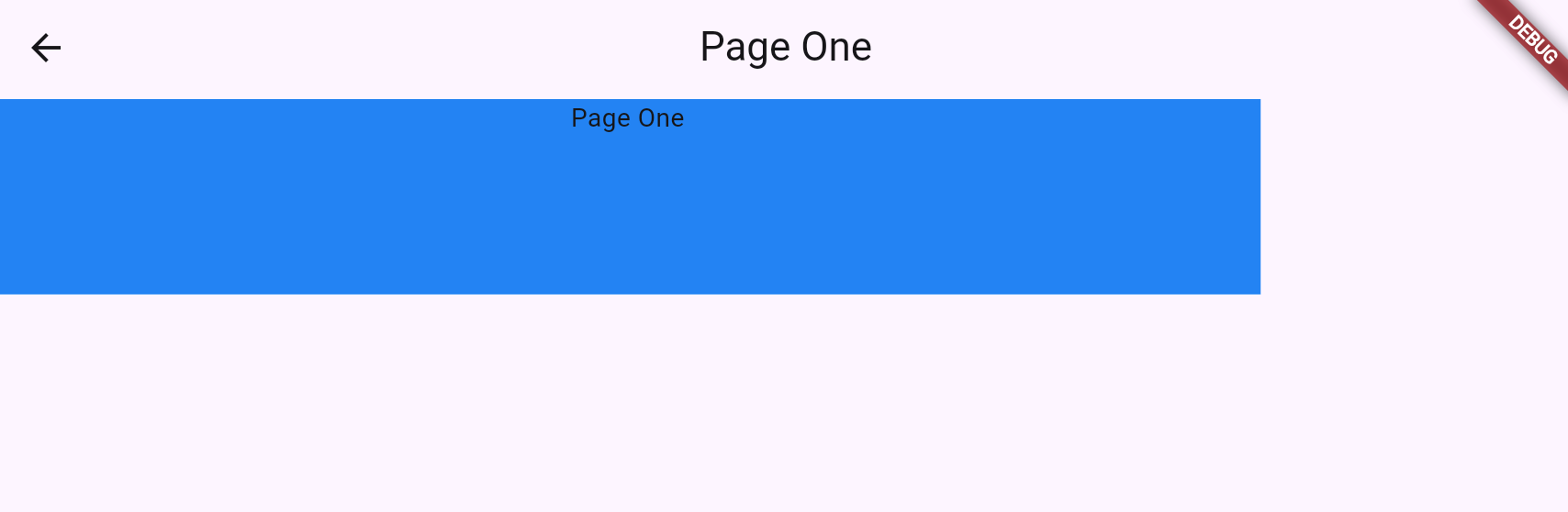
编写 lib/page1.dart
Widget _buildView() { return Container( color: Colors.blue, width: 300.w, height: 300.h, child: Column( children: [ Text(\'Page One\'), ], ), ); }通过 .w .h 动态适配计算
编辑 lib/main.dart ,跳转到新页面
void _incrementCounter() { // 上下文导航操作 context.navigator.pushMaterial(const PageOne()); // 原始写法 // Navigator.push( // context, MaterialPageRoute(builder: (context) => const PageOne())); }用 web 方式启动,方便测试内容区域尺寸变化
方正屏幕
又长又矮屏幕
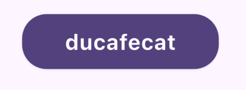
2 视图层打薄
打薄后代码
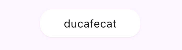
Widget _buildView() { return Text(\"ducafecat\") .fontSize(22) .alignment(Alignment.center) .borderRadius(all: 15) .ripple() .backgroundColor(Colors.white, animate: true) .clipRRect(all: 25) // clip ripple .borderRadius(all: 25, animate: true) .elevation( pressed ? 0 : 1, borderRadius: BorderRadius.circular(25), shadowColor: Color(0x30000000), ) // shadow borderRadius .padding(vertical: 12) // margin .onTap( () => print(\'onTap\'), ) .scale(all: pressed ? 0.95 : 1.0, animate: true) .animate(Duration(milliseconds: 150), Curves.easeOut) .tight( height: 80, width: 200, ) .center(); }原始方式代码
Widget _buildView() { return Center( child: GestureDetector( onTapDown: (_) => setState(() => pressed = true), onTapUp: (_) => setState(() => pressed = false), onTapCancel: () => setState(() => pressed = false), child: AnimatedContainer( duration: Duration(milliseconds: 150), curve: Curves.easeOut, height: 80, width: 200, transform: Matrix4.identity()..scale(pressed ? 0.95 : 1.0), child: Material( color: Colors.white, elevation: pressed ? 0 : 1, shadowColor: Color(0x30000000), borderRadius: BorderRadius.circular(25), child: InkWell( onTap: () => print(\'onTap\'), borderRadius: BorderRadius.circular(25), child: Container( padding: EdgeInsets.symmetric(vertical: 12), alignment: Alignment.center, child: Text( \"ducafecat\", style: TextStyle( fontSize: 22, ), ), ), ), ), ), ), );}扩展方法:
- animate: 为组件添加动画效果
- align: 设置组件对齐方式
- alignCenter: 居中对齐组件
- alignLeft: 左对齐组件
- alignRight: 右对齐组件
- alignTop: 顶部对齐组件
- alignBottom: 底部对齐组件
- parent: 应用父组件
- padding: 为组件添加内边距
- paddingBottom: 添加底部内边距
- paddingHorizontal: 添加水平内边距
- paddingLeft: 添加左侧内边距
- paddingRight: 添加右侧内边距
- paddingTop: 添加顶部内边距
- paddingVertical: 添加垂直内边距
- paddingDirectional: 添加方向性内边距
- sliverPadding: 为 Sliver 组件添加内边距
- opacity: 设置组件透明度
- offstage: 控制组件的可见性
- neumorphism: 添加凹凸效果
- boxShadow: 添加阴影效果
- ripple: 添加涟漪效果
- rotate: 旋转组件
- scale: 缩放组件
- translate: 平移组件
- transform: 应用变换
- overflow: 控制组件溢出行为
- scrollable: 使组件可滚动
- expanded: 在 Flex 容器中扩展组件
- flexible: 在 Flex 容器中使组件灵活
- positioned: 在 Stack 中定位组件
- positionedDirectional: 在 Stack 中按方向定位组件
- inkWell: 添加墨水效果和点击事件
- safeArea: 将组件放置在安全区域
- semanticsLabel: 添加语义标签
- gestures: 添加手势识别
- center: 居中组件
- fittedBox: 使组件适应父组件
- fractionallySizedBox: 根据父组件比例设置大小
- card: 将组件包装在卡片中
- limitedBox: 限制组件的最大大小
- material: 将组件包装在 Material 中
- mouseRegion: 添加鼠标交互区域
3 主题样式
快速写一个依据当前主题的主按钮。
通过 context.colors.scheme 方式读取样式配置。
Widget _buildView() { var scheme = context.colors.scheme; return Text(\"ducafecat\") .fontSize(22) .fontWeight(FontWeight.bold) .textStyle(TextStyle(color: scheme.onPrimary)) .alignment(Alignment.center) .borderRadius(all: 15) .ripple() .backgroundColor(scheme.primary, animate: true) .clipRRect(all: 25) // clip ripple .borderRadius(all: 25, animate: true) .elevation( pressed ? 0 : 1, borderRadius: BorderRadius.circular(25), shadowColor: Color(0x30000000), ) // shadow borderRadius .padding(vertical: 12) // margin .onTap( () => print(\'onTap\'), ) .scale(all: pressed ? 0.95 : 1.0, animate: true) .animate(Duration(milliseconds: 150), Curves.easeOut) .tight( height: 80, width: 200, ) .center(); }扩展:
primary: 主要颜色primaryLight: 主要颜色的亮色版本primaryDark: 主要颜色的暗色版本canvas: 画布颜色scaffoldBackground: 脚手架背景色card: 卡片颜色divider: 分割线颜色focus: 焦点颜色hover: 悬停颜色highlight: 高亮颜色splash: 水波纹颜色unselectedWidget: 未选中部件的颜色disabled: 禁用状态颜色secondaryHeader: 次要标题颜色dialogBackground: 对话框背景色indicator: 指示器颜色hint: 提示文字颜色scheme: 完整的颜色方案shadow: 阴影颜色
4 工具类
4.1 屏幕尺寸信息
示例:
context.screenWidth扩展:
screenWidth: 获取屏幕宽度screenHeight: 获取屏幕高度bottomBarHeight: 获取底部导航栏高度statusBarHeight: 获取状态栏高度textScaleFactor: 获取文本缩放因子scaleWidth: 获取宽度的缩放因子scaleHeight: 获取高度的缩放因子
4.2 时间差
示例:
// 创建一个 5 秒的 DurationDuration fiveSeconds = 5.seconds;扩展:
- microseconds: 将数字转换为微秒的 Duration
- milliseconds: 将数字转换为毫秒的 Duration
- seconds: 将数字转换为秒的 Duration
- minutes: 将数字转换为分钟的 Duration
- hours: 将数字转换为小时的 Duration
- days: 将数字转换为天的 Duration
- months: 将数字转换为月的 Duration(假设一个月为 30 天)
- quarters: 将数字转换为季度的 Duration(假设一个季度为 90 天)
- quadrimesters: 将数字转换为四个月的 Duration(假设四个月为 120 天)
- years: 将数字转换为年的 Duration(假设一年为 365 天)
- future: 启动一个延迟 delayed
4.3 Icon 扩展
// 创建一个原始图标Icon originalIcon = Icon(Icons.star, size: 24, color: Colors.yellow);// 使用 copyWith() 创建一个新图标,修改大小和颜色Icon newIcon = originalIcon.copyWith(size: 32, color: Colors.red);// 仅修改图标大小Icon largerIcon = originalIcon.iconSize(48);// 仅修改图标颜色Icon blueIcon = originalIcon.iconColor(Colors.blue);4.4 List 集合
示例:
List<Widget> widgets = [Widget1(), Widget2(), Widget3()];Widget column = widgets.toColumn( mainAxisAlignment: MainAxisAlignment.center, crossAxisAlignment: CrossAxisAlignment.start, separator: Divider(),);扩展:
- toColumn(): 将 Widget 列表转换为 Column
- toColumnSpace(): 将 Widget 列表转换为带有间距的 Column
- toRow(): 将 Widget 列表转换为 Row
- toRowSpace(): 将 Widget 列表转换为带有间距的 Row
- toStack(): 将 Widget 列表转换为 Stack
- toListView(): 将 Widget 列表转换为 ListView
- toWrap(): 将 Widget 列表转换为 Wrap
4.5 媒体查询
示例:
class MyWidget extends StatelessWidget { Widget build(BuildContext context) { // 获取屏幕宽度 double screenWidth = context.sizes.width; // 获取屏幕高度 double screenHeight = context.sizes.height; // 获取屏幕边距 EdgeInsets padding = context.sizes.padding; // 获取设备像素比 double pixelRatio = context.sizes.devicePixelRatio; // 使用可能为空的属性 double? maybeWidth = context.sizes.maybeWidth; return Container( width: screenWidth * 0.8, height: screenHeight * 0.5, padding: padding, child: Text( \'Device Pixel Ratio: $pixelRatio\', style: TextStyle(fontSize: 16 * context.sizes.textScaler.scale(1.0)), ), ); }}扩展:
- width: 屏幕宽度
- height: 屏幕高度
- padding: 屏幕边距
- viewInsets: 视图插入
- systemGestureInsets: 系统手势插入
- viewPadding: 视图边距
- devicePixelRatio: 设备像素比
- textScaler: 文本缩放器
4.6 导航扩展
示例:
context.navigator.pushMaterial(NewPage());扩展:
- canPop: 检查是否可以弹出当前路由
- maybePop: 尝试弹出当前路由
- pop: 弹出当前路由
- popUntil: 弹出路由直到满足条件
- push: 推送新路由
- pushMaterial: 使用 MaterialPageRoute 推送新页面
- pushCupertino: 使用 CupertinoPageRoute 推送新页面
- popAndPushNamed: 弹出当前路由并推送命名路由
- pushAndRemoveUntil: 推送新路由并删除之前的路由直到满足条件
- pushNamed: 推送命名路由
- pushNamedAndRemoveUntil: 推送命名路由并删除之前的路由直到满足条件
- pushReplacement: 推送新路由并替换当前路由
- pushReplacementMaterial: 使用 MaterialPageRoute 推送新页面并替换当前路由
- pushReplacementCupertino: 使用 CupertinoPageRoute 推送新页面并替换当前路由
- pushReplacementNamed: 推送命名路由并替换当前路由
- removeRoute: 移除指定路由
- removeRouteBelow: 移除指定路由下方的路由
- replace: 替换指定路由
- replaceRouteBelow: 替换指定路由下方的路由
4.7 数字转内边距
示例:
// 创建所有方向上偏移量为 16 的内边距EdgeInsets padding1 = 16.paddingAll();// 创建水平方向上偏移量为 20 的内边距EdgeInsets padding2 = 20.paddingHorizontal();// 创建垂直方向上偏移量为 10 的内边距EdgeInsets padding3 = 10.paddingVertical();// 创建只有顶部偏移量为 8 的内边距EdgeInsets padding4 = 8.paddingTop();// 创建只有左侧偏移量为 12 的内边距EdgeInsets padding5 = 12.paddingLeft();// 创建只有右侧偏移量为 15 的内边距EdgeInsets padding6 = 15.paddingRight();// 创建只有底部偏移量为 5 的内边距EdgeInsets padding7 = 5.paddingBottom();扩展:
- paddingAll: 创建所有方向上偏移量相等的内边距
- paddingHorizontal: 创建水平方向上对称的内边距
- paddingVertical: 创建垂直方向上对称的内边距
- paddingTop: 创建只有顶部内边距的 EdgeInsets
- paddingLeft: 创建只有左侧内边距的 EdgeInsets
- paddingRight: 创建只有右侧内边距的 EdgeInsets
- paddingBottom: 创建只有底部内边距的 EdgeInsets
4.8 平台查询
示例:
class MyWidget extends StatelessWidget { Widget build(BuildContext context) { if (context.isAndroid) { return Text(\'This is an Android device\'); } else if (context.isIOS) { return Text(\'This is an iOS device\'); } else if (context.isMacOS) { return Text(\'This is a MacOS device\'); } else if (context.isWindows) { return Text(\'This is a Windows device\'); } else if (context.isLinux) { return Text(\'This is a Linux device\'); } else if (context.isFuchsia) { return Text(\'This is a Fuchsia device\'); } else { return Text(\'Unknown platform\'); } }}扩展:
- platform: 获取当前平台
- isAndroid: 检查当前系统是否为 Android
- isIOS: 检查当前系统是否为 iOS
- isMacOS: 检查当前系统是否为 MacOS
- isWindows: 检查当前系统是否为 Windows
- isFuchsia: 检查当前系统是否为 Fuchsia
- isLinux: 检查当前系统是否为 Linux
4.9 数字转 SizedBox
示例:
// 创建一个宽度为 10 的水平间距SizedBox horizontalGap = 10.horizontalSpace;// 创建一个高度为 20 的垂直间距SizedBox verticalGap = 20.verticalSpace;// 在 Widget 树中使用Column( children: [ Text(\'First item\'), 10.verticalSpace, // 添加 10 单位的垂直间距 Text(\'Second item\'), 20.verticalSpace, // 添加 20 单位的垂直间距 Text(\'Third item\'), ],);Row( children: [ Text(\'Left\'), 15.horizontalSpace, // 添加 15 单位的水平间距 Text(\'Right\'), ],);扩展:
- horizontalSpace: 创建具有指定宽度的 SizedBox
- verticalSpace: 创建具有指定高度的 SizedBox
4.10 字符串
示例:
// 大写转换print(\'hello world\'.capitalize()); // 输出: Hello Worldprint(\'hello world\'.capitalizeFirst()); // 输出: Hello world// 布尔值转换print(\'true\'.isBool()); // 输出: trueprint(\'false\'.toBool()); // 输出: false// 数字转换print(\'123\'.isNum()); // 输出: trueprint(\'3.14\'.toDouble()); // 输出: 3.14print(\'42\'.toInt()); // 输出: 42// 颜色转换Color color = \'FF5733\'.toColor;MaterialColor materialColor = \'FF5733\'.toMaterialColor;// 字符串处理print(\'Hello World\'.removeAllWhitespace()); // 输出: HelloWorldprint(\'abc123\'.hasMatch(r\'\\d+\')); // 输出: trueprint(\'Hello
\'.clearHtml); // 输出: Hello扩展:
- capitalize: 将每个单词的首字母大写
- capitalizeFirst: 将字符串的第一个字母大写
- isBool: 检查字符串是否可以转换为布尔值
- toBool: 将字符串转换为布尔值
- isNum: 检查字符串是否可以转换为数字
- toNum: 将字符串转换为数字
- isDouble: 检查字符串是否可以转换为双精度浮点数
- toDouble: 将字符串转换为双精度浮点数
- isInt: 检查字符串是否可以转换为整数
- toInt: 将字符串转换为整数
- toColor: 将十六进制颜色字符串转换为 Color 对象
- toMaterialColor: 将十六进制颜色字符串转换为 MaterialColor 对象
- removeAllWhitespace: 移除字符串中的所有空格
- hasMatch: 检查字符串是否匹配指定的正则表达式模式
- clearHtml: 移除字符串中的所有 HTML 标签
4.11 Text 文本
示例:
Text myText = Text(\'Hello, World!\');// 修改文本样式myText = myText.textStyle(TextStyle(color: Colors.blue));// 设置文本为粗体myText = myText.bold();// 设置文本为斜体myText = myText.italic();// 设置字体大小myText = myText.fontSize(18);// 设置字体系列myText = myText.fontFamily(\'Roboto\');// 添加文本阴影myText = myText.textShadow(color: Colors.grey, blurRadius: 2);// 设置文本颜色myText = myText.textColor(Colors.red);// 设置文本对齐方式myText = myText.textAlignment(TextAlign.center);// 组合多个样式myText = myText .bold() .fontSize(20) .textColor(Colors.green) .textAlignment(TextAlign.right);扩展:
- copyWith: 创建一个新的 Text 对象,可选择性地修改其属性
- textStyle: 应用新的 TextStyle
- textScale: 设置文本缩放因子
- bold: 将文本设置为粗体
- italic: 将文本设置为斜体
- fontWeight: 设置文本的字体粗细
- fontSize: 设置文本的字体大小
- fontFamily: 设置文本的字体系列
- letterSpacing: 设置文本的字母间距
- wordSpacing: 设置文本的单词间距
- textShadow: 为文本添加阴影效果
- textElevation: 为文本添加立体效果
- textColor: 设置文本颜色
- textAlignment: 设置文本对齐方式
- textDirection: 设置文本方向
- textBaseline: 设置文本基线
- textWidthBasis: 设置文本宽度基准
4.12 TextSpan 文本
示例:
TextSpan myTextSpan = TextSpan(text: \'Hello, World!\');// 修改文本样式myTextSpan = myTextSpan.textStyle(TextStyle(color: Colors.blue));// 设置文本为粗体myTextSpan = myTextSpan.bold();// 设置文本为斜体myTextSpan = myTextSpan.italic();// 设置字体大小myTextSpan = myTextSpan.fontSize(18);// 设置字体系列myTextSpan = myTextSpan.fontFamily(\'Roboto\');// 添加文本阴影myTextSpan = myTextSpan.textShadow(color: Colors.grey, blurRadius: 2);// 设置文本颜色myTextSpan = myTextSpan.textColor(Colors.red);// 组合多个样式myTextSpan = myTextSpan .bold() .fontSize(20) .textColor(Colors.green);扩展:
- copyWith: 创建一个新的 TextSpan 对象,可选择性地修改其属性
- textStyle: 应用新的 TextStyle
- bold: 将文本设置为粗体
- italic: 将文本设置为斜体
- fontWeight: 设置文本的字体粗细
- fontSize: 设置文本的字体大小
- fontFamily: 设置文本的字体系列
- letterSpacing: 设置文本的字母间距
- wordSpacing: 设置文本的单词间距
- textShadow: 为文本添加阴影效果
- textElevation: 为文本添加立体效果
- textColor: 设置文本颜色
- textBaseline: 设置文本基线
代码
https://github.com/ducafecat/flutter_package_ducafe_ui_core
小结
本文详细介绍了 Flutter 组件库 ducafe_ui_core 的功能与优势,重点强调了设计稿适配、视图层打薄和多种工具类的应用。通过使用 ducafe_ui_core,开发者能够有效提升开发效率,简化 Flutter 应用的设计与开发过程。该组件库旨在为开发者提供全面的支持,让他们在构建高质量移动应用时更加得心应手。希望本文能为您在 Flutter 开发中提供实用的参考和指导。
感谢阅读本文
如果有什么建议,请在评论中让我知道。我很乐意改进。
猫哥 APP
- SaaS Fast
- Flutter GetX Generator
flutter 学习路径
- Flutter 优秀插件推荐
- Flutter 基础篇1 - Dart 语言学习
- Flutter 基础篇2 - 快速上手
- Flutter 实战1 - Getx Woo 电商APP
- Flutter 实战2 - 上架指南 Apple Store、Google Play
- Flutter 基础篇3 - 仿微信朋友圈
- Flutter 实战3 - 腾讯即时通讯 第一篇
- Flutter 实战4 - 腾讯即时通讯 第二篇
© 猫哥
ducafecat.com
end


