鸿蒙中基础组件的学习
学习组件主要学习三点:① 组件的作用 ② 组件的属性 ③ 组件的事件;其中每个组件的属性是非常多的,组件的显示效果主要依靠组件的属性设置。
1. 文本显示(Text)
想要在界面上显示文字就需要使用文本组件。文本组件用Text表示。下面演示文本组件的使用。
1.1. 创建文本
创建文本有两种方式。代码如下
- 直接使用字符串创建
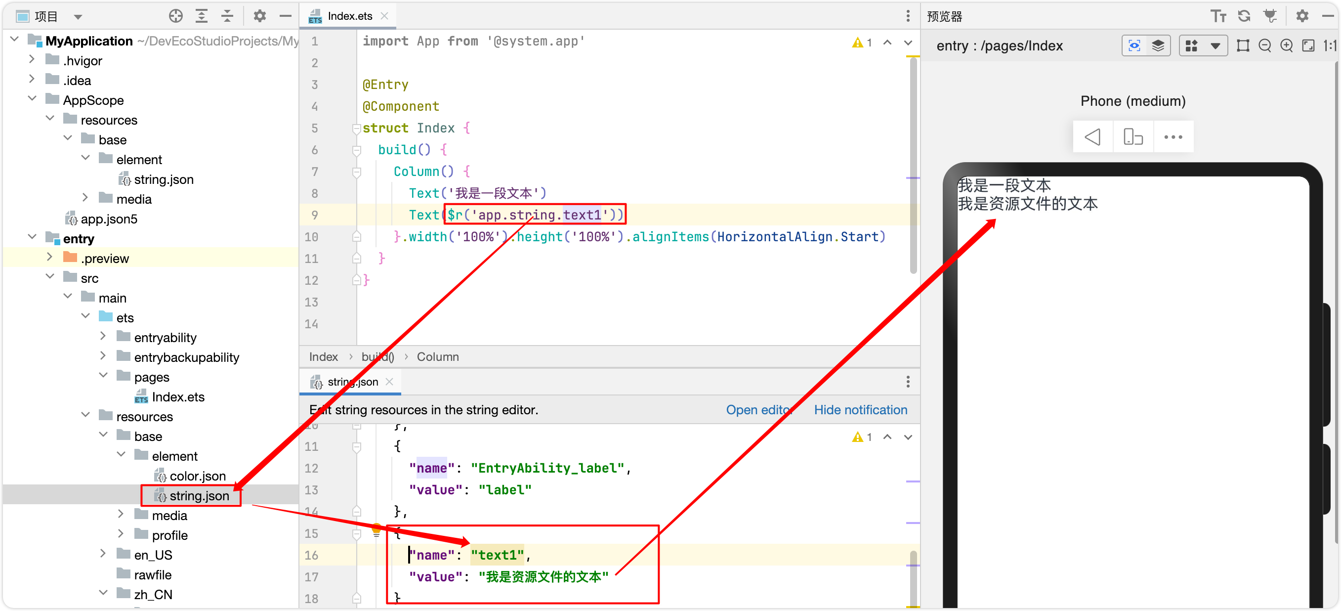
Text(\'我是一段文本\')- 引入资源文件创建
Text($r(\'app.string.text1\'))文件路径是:/resources/base/element/string.json
1.2. 自定义样式
通过Text的属性可以设计出丰富的文本样式。通过下面的“新闻词条案例”来学习文本样式。
以下是Text文本组件常用的样式,我们先过一眼混个眼熟,然后再一个一个去尝试,多试几次根据现实效果反复调试,用不了多久就学会了。
.fontSize设置文字大小,默认为14.fontColor设置文本颜色.fontWeight设置文本粗细 取值:FontWeight.Bold FontWeight.Normal FontWeight.Medium .maxLines最大行数.lineHeight设置行高 .textOverflow设置文本超过限制区域部分的显示方式,要配合 取值:TextOverflow.Nona不做任何处理 TextOverflow.MARQUEE末尾省略号代替 TextOverflow.Ellipsis滚动效果 .decoration设置文本装饰(上划线、下划线、中划线,以及线颜色、线型样式) 取值: { type:TextDecorationType.Underline,下划线 color:Color.Red,红色线条 style:TextDecorationStyle.DASHED虚线 }.textAlign对齐方式 取值:TextAlign.Start起点对齐 TextAlign.End 末尾对齐 TextAlign.Center居中对齐 .border设置边框(边框宽度、边框颜色、边框样式) 取值: { width: 2,边框宽度(粗细) color: Color.Red,边框颜色 style: BorderStyle.Solid,边框样式(实线、虚线、点线) radius: 5设置圆角 }.copyOption是否允许文本复制 代码如下,关键样式已经通过注释说明,结合注释和显示效果,自己试一试。
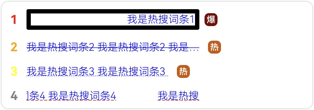
@Entry@Componentstruct Index { build() { Column() { Row() { Text(\'1\') .fontSize(14) .fontColor(Color.Red) .fontWeight(FontWeight.Bold) .margin({ right: 10 }) Text(\'我是热搜词条1\') .fontSize(12) //设置字体大小12,默认为16 .fontColor(Color.Blue) //设置字体颜色蓝色,默认为黑色 .fontWeight(300) //设置字体粗细,取值[100,900]数字越大字体越粗,默认为400 .constraintSize({ maxWidth: 200 }) //限制最大宽度为200 .maxLines(1) //最多一行 .textOverflow({ overflow: TextOverflow.Ellipsis }) //超出限制区域部分以省略号代替 .copyOption(CopyOptions.InApp) //允许复制文本 .border({ width:5, //边框宽度 style:BorderStyle.Solid, //边框样式(实现、虚线、点线) color:Color.Black, //边框颜色 radius:2 //设置边框圆角 }) .width(200) //文本宽度为200,默认包裹字符内容 .textAlign(TextAlign.End) //文本靠右对齐,前提是文本设置的宽度 Text(\'爆\') .margin({ left: 6 })//左边距6 .textAlign(TextAlign.Center)//文本居中 .fontSize(10) .fontColor(Color.White)//字体颜色 .fontWeight(600)//字体加粗 .backgroundColor(0x770100)//背景屎黄 .borderRadius(5)//圆角,最大值为组件宽度的一半(此时为圆形),最小值为0,此时为方形 .width(15)//宽度 .height(15) //高度 }.width(\'100%\').margin(6) Row() { Text(\'2\').fontSize(14).fontColor(Color.Orange).fontWeight(FontWeight.Bold).margin({ right: 10 }) Text(\'我是热搜词条2 我是热搜词条2 我是热搜词条2 我是热搜词条2 我是热搜词条2 我是热搜词条2 \') .fontSize(12) .fontWeight(300) .maxLines(1) .fontColor(Color.Blue) .constraintSize({ maxWidth: 200 }) .textOverflow({ overflow: TextOverflow.Ellipsis }) .decoration({type:TextDecorationType.LineThrough,color:Color.Blue,style:TextDecorationStyle.SOLID}) Text(\'热\') .fontSize(10) .backgroundColor(0xCC5500) .borderRadius(5) .fontColor(Color.White) .width(15) .height(15) .textAlign(TextAlign.Center) .fontWeight(600) .margin({left:10}) }.width(\'100%\').margin(6) Row() { Text(\'3\').fontSize(14).fontColor(Color.Yellow).fontWeight(FontWeight.Bold).margin({ right: 10 }) Text(\'我是热搜词条3 我是热搜词条3 \') .fontSize(12) .fontWeight(300) .maxLines(1) .fontColor(Color.Blue) .constraintSize({ maxWidth: 200 }) .textOverflow({ overflow: TextOverflow.Ellipsis }) .decoration({type:TextDecorationType.Underline,color:Color.Blue,style:TextDecorationStyle.DOTTED}) Text(\'热\') .fontSize(10) .backgroundColor(0xCC5500) .borderRadius(5) .fontColor(Color.White) .width(15) .height(15) .textAlign(TextAlign.Center) .fontWeight(600) .margin({left:10}) }.width(\'100%\').margin(6) Row() { Text(\'4\').fontSize(14).fontColor(Color.Gray).fontWeight(FontWeight.Bold).margin({ right: 10 }) Text(\'我是热搜词条4 我是热搜词条4 我是热搜词条4\') .fontSize(12) .fontWeight(300) .maxLines(1) .fontColor(Color.Blue) .constraintSize({ maxWidth: 200 }) .textOverflow({ overflow: TextOverflow.MARQUEE }) .decoration({type:TextDecorationType.Underline,color:Color.Red,style:TextDecorationStyle.DASHED}) }.width(\'100%\').margin(6) }.width(\'100%\').margin(10) }}1.3. 添加事件
给文本添加点击事件,如下代码,点击后会在控制台打印“我是Text的点击响应事件”。
Text(\'点我\') .onClick(()=>{ console.info(\'我是Text的点击响应事件\'); })2. 按钮组件(Button)
Button是按钮组件,通常用于响应用户的点击操作,其类型包括胶囊按钮、圆形按钮、普通按钮。Button做为容器使用时可以通过添加子组件实现包含文字、图片等元素的按钮。
2.1. 胶囊按钮
普通按钮通过type: ButtonType.Capsule设置,默认是直角矩形;可以通过 .borderRadius(8) 设置圆角,效果要好看一些。
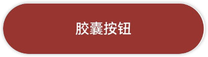
Button(\'胶囊按钮\', { type: ButtonType.Capsule, stateEffect: true }) .fontSize(12) .backgroundColor(Color.Brown) .width(200) .height(50) .onClick(() => { promptAction.showToast({ message: \'胶囊按钮点击了\' }) })2.2. 普通按钮
普通按钮通过type: ButtonType.Normal设置,默认是直角矩形;可以通过 .borderRadius(8) 设置圆角,效果要好看一些。

Button(\'普通按钮\', { type: ButtonType.Normal, stateEffect: true }) .fontSize(12) .borderRadius(8) .width(200) .height(50) .onClick(() => { promptAction.showToast({ message: \'普通按钮点击了\' }) })2.3. 圆形按钮
圆形按钮通过 type: ButtonType.Circle 设置,默认是圆形,一般原型按钮会和图片结合起来使用,这样的按钮带有一定的功能特征。
如下图所示,是一个圆形组件,里面包含一张图片。

Button({ type: ButtonType.Circle, stateEffect: true }) { Image($r(\'sys.media.ohos_ic_public_voice\')).width(30).height(30).fillColor(Color.White) }.width(50).height(50) .onClick(() => { promptAction.showToast({ message: \'图片按钮点击了\' }) })2.4. 自定义按钮
按钮也是一个容器组件,可以包含其他的容器组件或者基础组件。比如下面按钮就包含了一个Row组件,而Row组件中包含图片和文本。
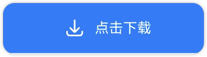
Button({ type: ButtonType.Normal, stateEffect: true }) { Row({ space: 10 }) { Image($r(\'sys.media.ohos_save_button_filled\')).width(20).height(20).fillColor(Color.White) Text(\'点击下载\').fontSize(14).fontColor(Color.White) }.justifyContent(FlexAlign.Start).padding({ left: 8 }).height(50)}.width(200).borderRadius(8) .onClick(() => { promptAction.showToast({ message: \'自定义按钮点击了\' }) })3. 文本输入框(TextInput/TextArea)
3.1. 单行输入框(TextInput)
文本输入框是经常来采集用户信息的组件,比如登录、注册时都需要用到。下面通过一个案例演示一下文本输入框的用法。
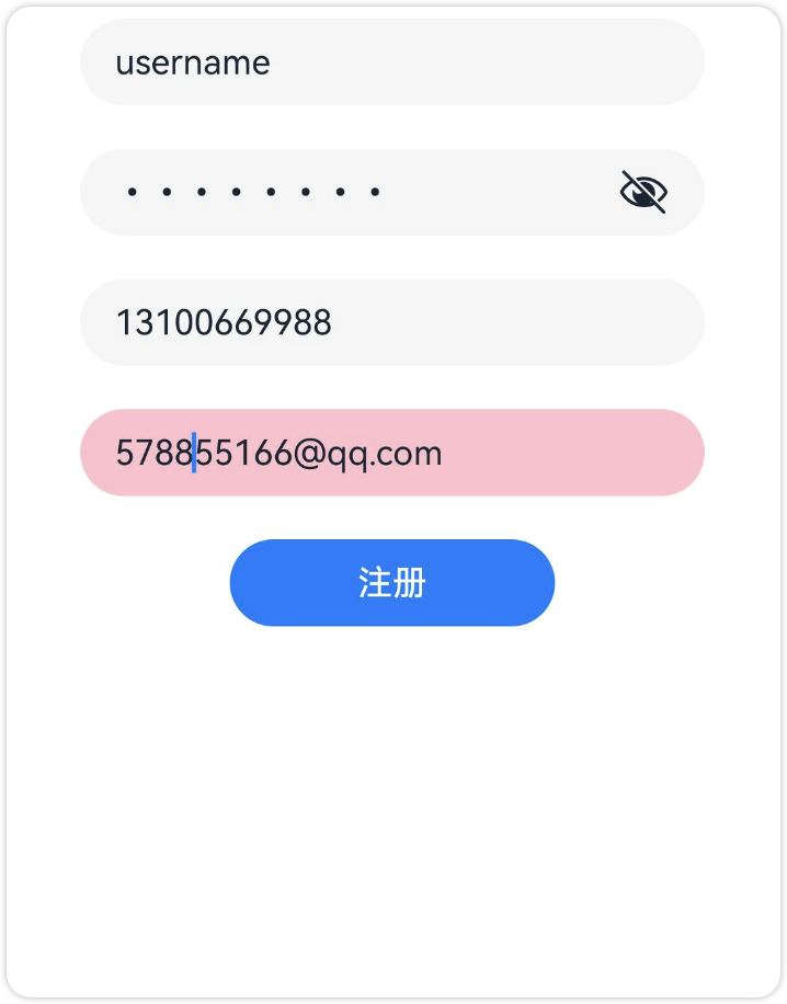
文本输入框有很多种类型,通过.type(InputType.Normal)属性设置,用于输入不同类型的数据,比如:密码、邮箱、电话号码登;
通过 placeholder: \'请输入用户名\'设置文本提示信息,输入时会自动消失。
@Entry@Componentstruct Index { build() { Column({ space: 20 }) { TextInput({ placeholder: \'请输入用户名\'//文本提示信息,输入时小时 }).type(InputType.Normal).width(\'80%\') TextInput({ placeholder: \'请输入密码\' }).type(InputType.Password).width(\'80%\') TextInput({ placeholder: \'请输入手机号码\' }).type(InputType.PhoneNumber).width(\'80%\') TextInput({ placeholder: \'请输入邮箱\' }).type(InputType.Email).width(\'80%\').backgroundColor(Color.Pink) Button(\'注册\').width(150) }.width(\'100%\').margin({ top: 10 }) }}3.2. 多行输入框(TextArea)
当文字比较多时,可以使用多行文本框,比如输入个人简介等待。

TextArea({text:\"我是TextArea我是TextArea\" + \"我是TextArea我是TextArea我是TextArea\"}).width(\'80%\')3.3. $$双向数据同步
使用$$符可以使组件与数据双向同步,也就是说数据改变时UI会更新,UI更新时数据也会同步更新。
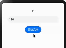
@Entry@Componentstruct TextInputExample { @State text: string = \'110\' build() { Column({ space: 20 }) { Text(this.text).margin({ left: 10 }) TextInput({ text: $$this.text, placeholder: \'请输入...\'}) .placeholderColor(Color.Grey) .placeholderFont({ size: 14, weight: 400 }) .caretColor(Color.Blue) .width(300) .padding({ left: 10 }) Button(\'更改文本\').onClick(()=>{ this.text = \'119\' }) } .width(\'100%\') .height(\'100%\') }}4. 图片组件(Image)
开发者经常需要在应用中显示一些图片,例如:按钮中的icon、网络图片、本地图片等。在应用中显示图片需要使用Image组件实现,Image支持多种图片格式,包括png、jpg、bmp、svg和gif等。
4.1. 加载本地图片
本地图片存储在resources/base/media/目录下,使用$r(\'app.media.文件名\')加载图片。
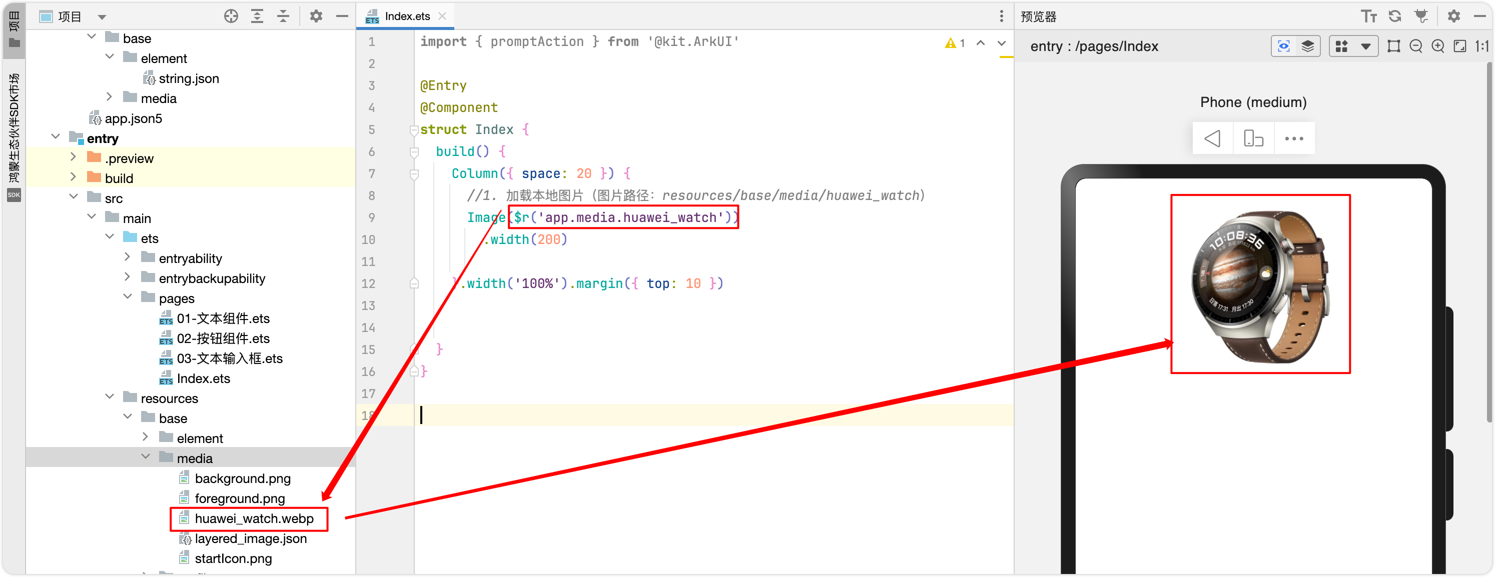
代码如下
//1. 加载本地图片(图片路径:resources/base/media/huawei_watch)Image($r(\'app.media.huawei_watch\')) .width(200)4.2. 加载本地图片
如果是网络图片,直接使用网络地址即可,如: Image(\'https://www.example.com/example.JPG\')
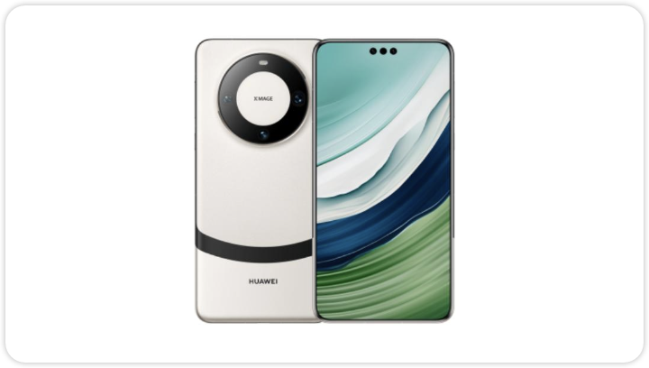
注意:下面的代码只设置了图片的宽度,没有设置高度,会自动等比例缩放。
Image(\'https://res2.vmallres.com/pimages/uomcdn/CN/pms/202403/gbom/6942103109577/428_428_326614F60FB96289584CA7B9E4AE7CB9mp.png\') .width(200)注意:如果运行在手机模拟器上或者真机上,需要网络权限才可以显示图片
\"requestPermissions\":[
{
\"name\": \"ohos.permission.INTERNET\"
}
]
4.3. 显示矢量图
Image组件可显示矢量图(svg格式的图片),支持的svg标签为:svg、rect、circle、ellipse、path、line、polyline、polygon和animate。
svg格式的图片可以使用fillColor属性改变图片的绘制颜色。


Image($r(\'app.media.airplane_fill\'))//默认黑色 .width(200)Image($r(\'app.media.airplane_fill\')) .width(200) .fillColor(Color.Brown)//棕红色5. 切换按钮 (Toggle)
Toggle组件提供状态按钮样式、勾选框样式和开关样式,一般用于两种状态之间的切换。
5.1. 复选框样式
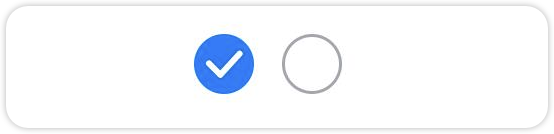
设置Toggle组件属性
{type: ToggleType.Checkbox}属性为复选框样式,从API version 11开始,Checkbox默认样式由圆角方形变为圆形。{isOn: true}表示选中、isOn: false表示未选中;
//1.复选框样式Row() { Toggle({ type: ToggleType.Checkbox, isOn: true }) Toggle({ type: ToggleType.Checkbox, isOn: false })}5.2. 开关样式
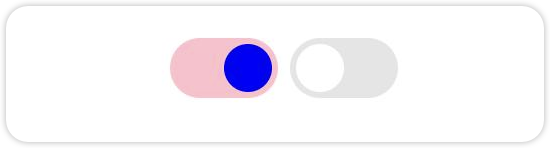
设置Toggle组件属性
{type: ToggleType.Switch}设置Toggle为开关样式;.selectedColor(Color.Pink)用于设置选中的背景颜色;.switchPointColor(Color.Blue)用于设置开关内部小圆点的颜色;
//2.开关样式Row() { Toggle({ type: ToggleType.Switch, isOn: true }) .selectedColor(Color.Pink).switchPointColor(Color.Blue) Toggle({ type: ToggleType.Switch, isOn: false })}5.3. 按钮样式

//3.按钮样式Row() { Toggle({ type: ToggleType.Button, isOn: true }){ Text(\'status button\') .fontColor(\'#182431\') .fontSize(12) }.selectedColor(Color.Pink) Toggle({ type: ToggleType.Button, isOn: false }){ Text(\'status button\') .fontColor(\'#182431\') .fontSize(12) }}5.4. 添加事件
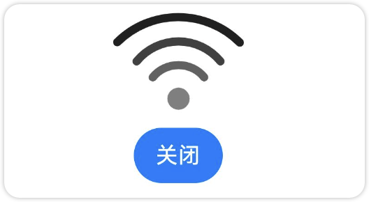
给开关添加点击事件,点击开关时,弹出“选中了”或者“未选中”。如下图所示
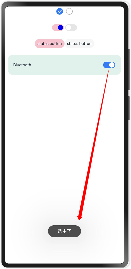
Row() { Text(\'Bluetooth\').fontSize(12) Blank() Toggle({ type: ToggleType.Switch, isOn: false }) .onChange((isOn: boolean) => { if (isOn) { promptAction.showToast({ message: \'选中了\' }) } else { promptAction.showToast({ message: \'未选中\' }) } }) } .width(\'95%\') .padding(16) .backgroundColor(0xdef2ed) .borderRadius(15)6. 进度条组件(Progress)
Progress是进度条显示组件,显示内容通常为目标操作的当前进度。
6.1. 线性样式进度条(默认类型)
如下图所示线性精度条,当宽大于时是水平方向,当高大于宽时是竖直方向;
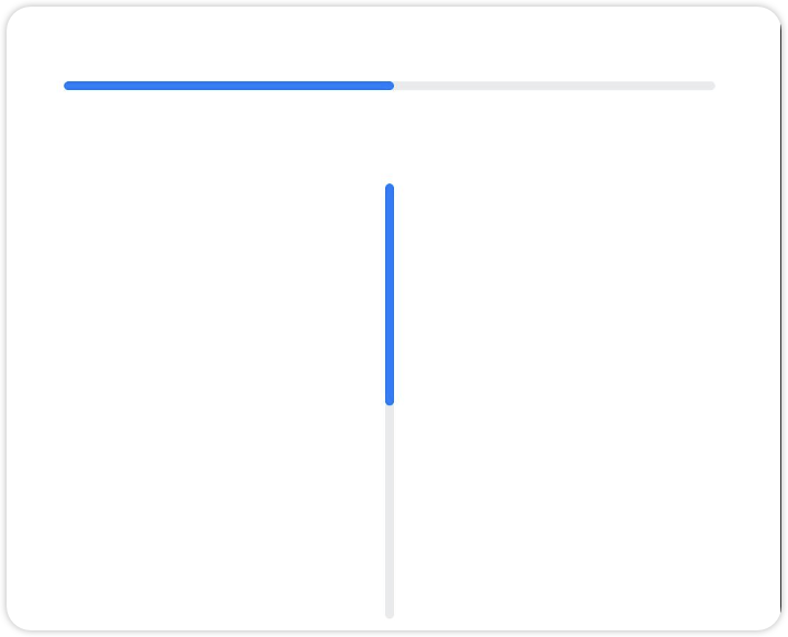
//1.线性进度条(宽大于高,水平)Progress({ type: ProgressType.Linear, total: 100, value: 30 }) .width(300) .height(50)//1.线性进度条(高大于宽,垂直)Progress({ type: ProgressType.Linear, total: 100, value: 50 }) .width(100) .height(200)6.2. 环形进度条
环形进度条的类型为:ProgressType.Ring

//2.环形进度条Row({ space: 20 }) { //2.1 前景色默认蓝色渐变,宽度默认2vp Progress({ type: ProgressType.Ring, total: 100, value: 20 }) .width(50) .height(50) //2.2 设置前景色为灰色 Progress({ type: ProgressType.Ring, total: 100, value: 60 }) .width(50) .height(50) .color(Color.Grey)//设置进度条前景色 .style({ strokeWidth: 8 })}6.3. 环形刻度进度条
环形带刻度进度条类型为:type: ProgressType.ScaleRing 通过 .style 属性可以设置刻度的个数,进度条宽度,刻度的宽度。
//3.环形有刻度样式进度条Row({ space: 20 }) { Progress({ type: ProgressType.ScaleRing, total: 100, value: 80 }) .width(100).height(100) .style({ strokeWidth: 10, //进度条宽度 scaleCount: 20, //刻度个数 scaleWidth: 5 //刻度宽度(刻度的粗细) }) Progress({ type: ProgressType.ScaleRing, total: 100, value: 80 }) .width(100).height(100) .style({ strokeWidth: 15, scaleCount: 20, scaleWidth: 3 }) Progress({ type: ProgressType.ScaleRing, total: 100, value: 30 }) .width(100).height(100) .style({ strokeWidth: 15, scaleCount: 20, scaleWidth: 3 }) .backgroundColor(Color.Black)}6.4. 胶囊进度条
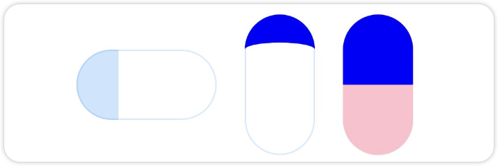
胶囊进度条的类型为:ProgressType.Capsule ,宽度大于高度则水平方向,高度大于宽度则竖直方向。
//4. 胶囊样式进度条Row({ space: 20 }) { Progress({ type: ProgressType.Capsule, total: 100, value: 30 }) .width(100).height(50) Progress({ type: ProgressType.Capsule, total: 100, value: 20 }) .width(50).height(100) .color(Color.Blue) Progress({ type: ProgressType.Capsule, total: 100, value: 50 }) .width(50).height(100) .color(Color.Blue) .backgroundColor(Color.Pink)}6.5. 渐变进度条
进度条渐变色LinearGradient来设置,需要给它传递一个数组,分别表示渐变的起始颜色。

Row({ space: 20 }) { Progress({ value: 80, total: 100, type: ProgressType.Ring }) .width(100).style({ strokeWidth: 20, shadow: false }) .color( new LinearGradient([ { color: Color.Orange, offset: 0.0 }, //橙色 { color: Color.Red, offset: 1.0 }]) //红色 )}6.6. 进度条案例演示
下面我们做一个案例,点击按钮时,进度条的进度+5;我们以胶囊型进度条为例。

@Entry@Componentstruct Index { //定义进度值(默认为0) @State progressValue: number = 0 build() { Column({ space: 20 }) { Column() { Progress({ type: ProgressType.Capsule, total: 100, value: 0 }) .value(this.progressValue) .width(200) Button(\'点击+5\').margin({ top: 10 }) .onClick(() => { this.progressValue += 5 if(this.progressValue>100){ this.progressValue = 0 } }) } }.width(\'100%\').margin({ top: 20 }) }}6.7. 进度条动态效果
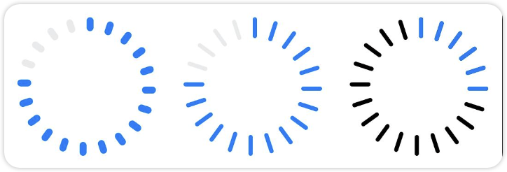
一般在网络加载时,需要用到进度条的动态效果,给用户更好的视觉体验。
比如加载动效:status: ProgressStatus.LOADING,扫描动效:enableScanEffect: true
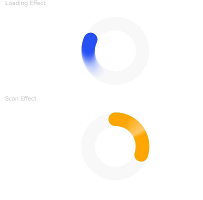
Row({ space: 20 }) { Progress({ value: 0, total: 100, type: ProgressType.Ring }) .width(100).color(Color.Blue) .style({ strokeWidth: 20, status: ProgressStatus.LOADING }) Progress({ value: 30, total: 100, type: ProgressType.Ring }) .width(100).color(Color.Orange) .style({ strokeWidth: 20, enableScanEffect: true }) }7. 单选按钮(Radio)
Radio是单选框组件,通常用于提供相应的用户交互选择项,同一组的Radio中只有一个可以被选中。
7.1. 基本用法

代码如下。其中,value是单选框的名称,group是单选框的所属群组名称。checked属性可以设置单选框的状态,状态分别为false和true,设置为true时表示单选框被选中。
Row(){ Radio({ value: \'Radio1\', group: \'radioGroup\' }) .checked(false) Radio({ value: \'Radio2\', group: \'radioGroup\' }) .checked(true) }注意:多个单选按钮的group名称必须相同,否则会出现多选的情况。
7.2. 应用案例
如下图所示,选中哪个,就弹出哪个选项对应的信息。
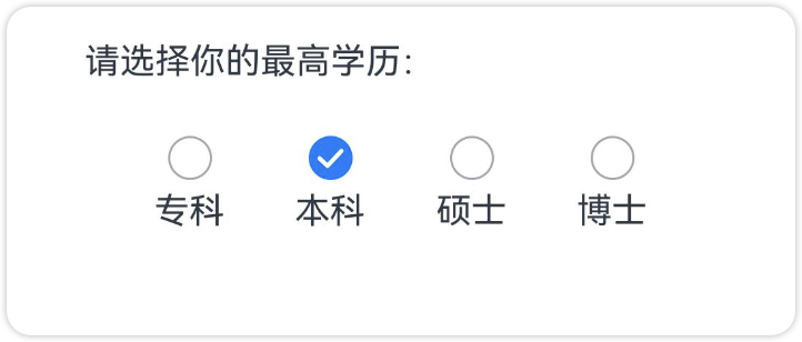
import { promptAction } from \'@kit.ArkUI\'@Entry@Componentstruct Index { private arr = [\'专科\',\'本科\',\'硕士\',\'博士\'] build() { Column({ space: 20 }) { Row(){ Text(\'请选择你的最高学历:\') }.width(\'80%\') Row(){ Column(){ Radio({value:this.arr[0],group:\'radioGroup\'}) .onChange((isChecked)=>{ if(isChecked) { // 如果选中,弹出专科 promptAction.showToast({message:this.arr[0]}) } }) Text(\'专科\') } Column(){ Radio({value:this.arr[1],group:\'radioGroup\'}).checked(true) .onChange((isChecked)=>{ if(isChecked) { // 如果选中,弹出专科 promptAction.showToast({message:this.arr[1]}) } }) Text(\'本科\') } Column(){ Radio({value:this.arr[2],group:\'radioGroup\'}) .onChange((isChecked)=>{ if(isChecked) { // 如果选中,弹出专科 promptAction.showToast({message:this.arr[2]}) } }) Text(\'硕士\') } Column(){ Radio({value:this.arr[3],group:\'radioGroup\'}) .onChange((isChecked)=>{ if(isChecked) { // 如果选中,弹出专科 promptAction.showToast({message:this.arr[3]}) } }) Text(\'博士\') } }.width(\'80%\').justifyContent(FlexAlign.SpaceEvenly) }.width(\'100%\').margin({ top: 20 }) }}8. 属性字符串(MutableStyledString)
8.1. 属性字符串概述
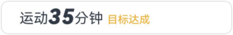
属性字符串可用于字符或段落级别设置文本样式。比如一个字符串前2个字符是黑色的,后两个字符是加粗放大的,再后面又是红色的,如下图所示。这个时候就可以使用属性字符串来完成。
8.2. 创建属性字符串
@Entry@Componentstruct styled_string_demo1 { styledString1: StyledString = new StyledString(\"运动45分钟\"); mutableStyledString1: MutableStyledString = new MutableStyledString(\"运动35分钟\"); controller1: TextController = new TextController(); controller2: TextController = new TextController(); async onPageShow() { this.controller1.setStyledString(this.styledString1); this.controller2.setStyledString(this.mutableStyledString1); } build() { Column() { // 显示属性字符串 Text(undefined, { controller: this.controller1 }) Text(undefined, { controller: this.controller2 }) } .width(\'100%\') }}8.3. 属性字符串案例
我们先分析一下,以上字符串效果怎么实现。
第一个部分:从2开始的2个字符,字体加粗,字体为24vp
第二个部分:从7索引开始的4个字符,字体颜色为橙色,字体为12vp
根据以上的分析完成代码如下,通过new MutableStyledString(\'文本\',文本样式)指定文本及文本样式。
import { LengthMetrics } from \'@ohos.arkui.node\'@Entry@Componentstruct Index { //1.第一步创建一个属性字符串(根据索引的不同,对字符串的每一部分进行样式设定) mutableStyledString: MutableStyledString = new MutableStyledString(\'运动35分钟 目标达成\', [ //第一部分样式:从2开始的2个字符,字体加粗,字体为24vp { start: 2, length: 2, styledKey: StyledStringKey.FONT, styledValue: new TextStyle({ fontColor: Color.Brown, fontSize: LengthMetrics.vp(24), fontWeight: FontWeight.Bold, fontStyle: FontStyle.Italic }) }, //第二部分样式:从7索引开始的4个字符,字体颜色为橙色,字体为12vp { start: 7, length: 4, styledKey: StyledStringKey.FONT, styledValue: new TextStyle({ fontColor: Color.Orange, fontSize: LengthMetrics.vp(12), fontWeight: FontWeight.Normal, fontStyle: FontStyle.Normal }) }, ]) //2.创建恩文本控制器 textController: TextController = new TextController(); //3.在页面加载的时候,把样式字符串设置给文本控制器 onPageShow(): void { this.textController.setStyledString(this.mutableStyledString) } build() { Column() { Text(undefined, { controller: this.textController }).margin({ top: 20 }) }.width(\'100%\') }}9. 图标小符号(SymbolSpan)
SymbolSpan是用于显示图标小符号的组件,它能够向处理文字一样处理图标小符号,如加粗、变色、等等。该组件从API Version 11开始支持。
SymbolSpan 作为Text子组件中使用,SymbolGlyph 可以单独使用。其他用法都是一样的
9.1. SymboSpan 图标粗细
图标可以像文字一样设置粗细

// xxx.ets@Entry@Componentstruct Index { build() { Column() { Row() { //细线图标 Column() { Text(\"Light\") Text() { SymbolSpan($r(\'sys.symbol.ohos_trash\')) .fontWeight(FontWeight.Lighter) .fontSize(96) } } //普通线条图标 Column() { Text(\"Normal\") Text() { SymbolSpan($r(\'sys.symbol.ohos_trash\')) .fontWeight(FontWeight.Normal) .fontSize(96) } } //加粗线条图标 Column() { Text(\"Bold\") Text() { SymbolSpan($r(\'sys.symbol.ohos_trash\')) .fontWeight(FontWeight.Bold) .fontSize(96) } } } } }}9.2. SymboSpan 图标颜色
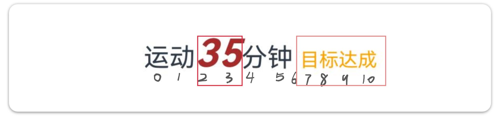
图标颜色分为单色、多色、和分层。如下图所示;
Row(){ Column(){ Text(\'单色\') Text(){ SymbolSpan($r(\'sys.symbol.ohos_folder_badge_plus\')) .fontSize(96) .renderingStrategy(SymbolRenderingStrategy.SINGLE)//单色 .fontColor([Color.Red]) } } Column(){ Text(\'多色\') Text(){ SymbolSpan($r(\'sys.symbol.ohos_folder_badge_plus\')) .fontSize(96) .renderingStrategy(SymbolRenderingStrategy.MULTIPLE_COLOR)//多色 .fontColor([Color.Blue,Color.Brown]) } } Column(){ Text(\'分层\') Text(){ SymbolSpan($r(\'sys.symbol.ohos_folder_badge_plus\')) .fontSize(96) .renderingStrategy(SymbolRenderingStrategy.MULTIPLE_OPACITY)//分层 .fontColor([Color.Orange]) } }}9.3. SymboSpan 图标动效
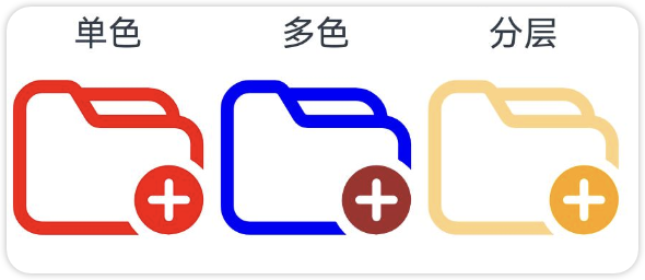
小图标设置动态效果
Row(){ Column(){ Text(\'无动效\') Text(){ SymbolSpan($r(\'sys.symbol.wifi\')) .fontSize(96) .effectStrategy(SymbolEffectStrategy.NONE) //无动效 } } Column(){ Text(\'缩放动效\') Text(){ SymbolSpan($r(\'sys.symbol.wifi\')) .fontSize(96) .effectStrategy(SymbolEffectStrategy.SCALE) //缩放动效 } } Column(){ Text(\'缩放动效\') Text(){ SymbolSpan($r(\'sys.symbol.wifi\')) .fontSize(96) .effectStrategy(SymbolEffectStrategy.HIERARCHICAL) //层级动效 } } }9.4. SymbolGlyph 自定义动效图标
相较于effectStrategy属性启动即触发动效,可以通过以下两种方式控制动效的播放状态以及更多样的动效策略选择。
- 通过symbolEffect属性同时设置SymbolGlyph的动效连续播放,点击关闭按钮时,停止播放。
@State isActive: boolean = true;Column() { Text(\"可变颜色动效\") SymbolGlyph($r(\'sys.symbol.ohos_wifi\')) .fontSize(96) .symbolEffect( new HierarchicalSymbolEffect( EffectFillStyle.ITERATIVE),//动效连续播放 this.isActive//true为播放,false为不播放 ) Button(this.isActive ? \'关闭\' : \'播放\').onClick(() => { this.isActive = !this.isActive; })}10. 评分组件(Rating)

Rating({ rating: 3.5, //当前评分值 indicator: false, //false可改变评分,true不可改变评分}).stars(5) //评分总数 .stepSize(0.5) //评分步长11. 标记组件(Badge)
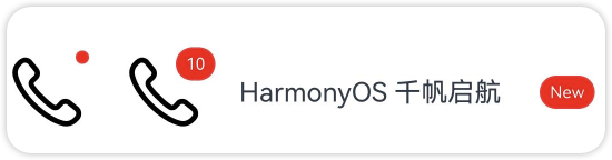
Badge实际上就是一个矩形的容器组件,它可以包裹在任意组件的外面,被它包裹的组件可以设置标记提醒。比如微信来新消息了,就会在图标右上角显示消息数量。
- 小圆点提醒:红色小圆点一般显示在图标的右上角(默认就是右上角),把Badge的宽高设置为内容的宽高。
Badge({ value: \'\', style: { badgeSize: 8, badgeColor: Color.Red },}) { Image($r(\'sys.media.ohos_ic_public_phone\')) .width(50) .height(50)}.width(50).height(50)- 数字提醒:只需要通过
{badgeSize:20}把小圆点尺寸调大,再通过value:\'10\'加一个数字就行。
Badge({ value: \'10\', style: { badgeSize: 20, badgeColor: Color.Red },}) { Image($r(\'sys.media.ohos_ic_public_phone\')) .width(50) .height(50)}.width(50).height(50)- 字符串提醒:字符串提醒一般使用在组件的右边,把Badge的宽度设置为大于被包裹组件的宽度即可。
Badge({ value: \'New\', position: BadgePosition.Right, style: { badgeSize: 20, badgeColor: Color.Red },}){ Text(\'HarmonyOS 千帆启航\').width(\'100%\')}.width(200)
12. 背景属性
很多时候我们都需要给组件设置背景,比如背景图片、背景颜色等,这个时候就需要用到背景属性。
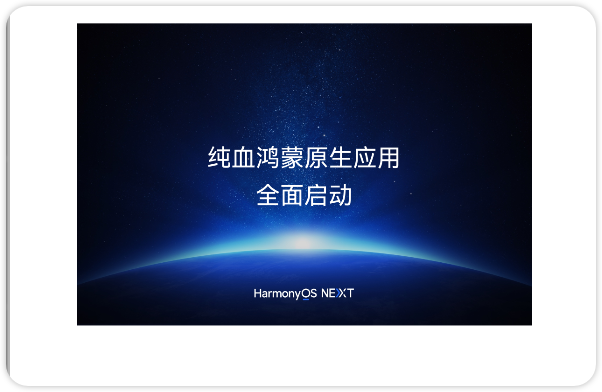
backgroundColor 背景色backgroundImage 背景图片backgroundImagePosition 背景位置 取值: Alignment.Start 靠左对齐 Alignment.End 靠右对齐 Alignment.Top 靠上对齐 Alignment.Bottom 靠下对齐 Alignment.Center 居中对齐backgroundImageSize背景尺寸 取值:ImageSize.Contain保持宽高比缩放,直到任意边与宽或者高相同,可能会有空白 ImageSize.Over保持宽高比缩放,直到撑满整个盒子,居中显示 ImageSize.Auto保持原有大小,居中显示@Entry@Componentstruct Index{ build() { Column(){ Text(\'纯血鸿蒙原生应用\\n全面启动\').textAlign(TextAlign.Center).lineHeight(25) .width(300) .height(200) .fontColor(Color.White) .backgroundColor(Color.Pink) .backgroundImage($r(\'app.media.bannerpc12\')) .backgroundImageSize(ImageSize.Cover) .backgroundImagePosition(Alignment.Center) }.width(\'100%\').margin({top:20}) }}华为开发者学堂

