【Word Press进阶】自定义区块的行为与样式
前两篇
说明白了怎么创建一个简单的静态区块。但实在是太丑了。这里再进行一个优化,让咱们的区块好看又好用。
一个合格的区块应当有着好看的外表,完整的功能,以及一定程度的自定义。我们这次就来完成这些功能
一、配置区块的样式
这应该是最简单的过程了。打开文章的发布界面,F12检查自定义的区块,可以看到它的class:
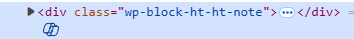
注意到,插件class的名称是以下的规则
wp-block-[插件包名]-[插件名称]也就是我们block.json中配置的name字段:\"name\": \"ht/ht-note\"。
打开插件根目录,能够看到两个scss样式表:editor.scss & style.scss。分别是编辑器展示样式和页面展示样式。另外需要提醒的是,这两个样式表并不是“或”的关系。不管是编辑器还是页面,都使用了style.scss的样式,只是编辑器还额外应用了editor.scss。所以如果没有特殊的需求,只需要修改style.scss即可。
由于修改了name字段,也涉及到class和样式,我们需要修改style.scss、edit.js、rander.php。修改之后的文件将如以下所示:
edit.js
...export default function Edit({ attributes, setAttributes }) {return (<><div { ...useBlockProps() }><RichTexttagName=\'div\'className=\'note-content\' // 新增了classNameonChange={ (value) => setAttributes({ noteContent: value })}value={attributes.noteContent}placeholder=\'输入你的内容...\'></RichText>// 这里新增了class<div class=\'note-button\'>自定义的按钮</div> </div></>);}...rander.php
<?php$content = $attributes[\'noteContent\'] ?? \"默认投票\";?><div <?php echo get_block_wrapper_attributes(); ?>>// 同理新增了class<div class=\"note-content\"><?php echo $content; ?></div><div class=\"note-button\">自定义的按钮</div></div>style.scss
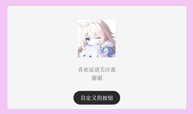
.wp-block-ht-ht-note {margin: 2rem;padding: 1rem;background-color: #f5f5f5;border-radius: 5px;border: 1px solid #ccc;font-size: 1.2rem;display: flex;align-content: center;justify-content: space-around;align-items: center;flex-direction: column;}.wp-block-ht-ht-note .note-content {transition: all 0.5s ease-in-out;width: 75%;text-align: center;margin: 2rem auto;display: flex;flex-direction: column;justify-content: center;align-items: center;}.wp-block-ht-ht-note .note-content:hover {background-color: #c5c5c5;}.wp-block-ht-ht-note .note-button {transition: all 0.5s ease-in-out;background-color: #2a2a2a;color: white;height: 3rem;border-radius: 1.5rem;line-height: 3rem;padding: 0 1.5rem;cursor: pointer;}.wp-block-ht-ht-note .note-button:hover {background-color: #c5c5c5;color: black;}随便写了写样式(为了方便调试,将背景设置成了粉红色),一下子就好看起来了:
二、配置区块的功能
word press支持配置区块的背景、文字颜色等基础样式。除此之外,也能配置区块的对齐方式、间距大小等更复杂的样式。总而言之能够配置很多属性。比较简单,这里不再过多赘述。可看官方文档。
注意:如果你的区块没有被Word Press托管(没有{...useBlockProps()})则配置无效
另外,如果使用了动态区块,部分属性无效。
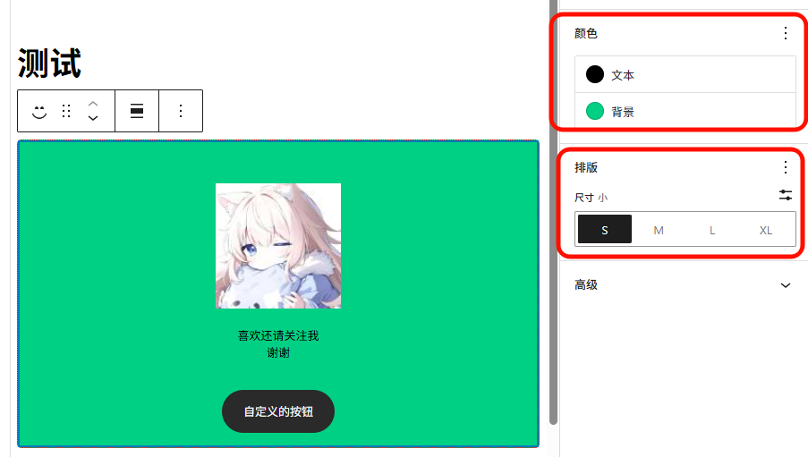
打开block.json,并配置supports字段。这里配置上了字体大小、背景颜色。
block.json
{\"$schema\": \"https://schemas.wp.org/trunk/block.json\",\"apiVersion\": 3,\"name\": \"ht/ht-note\",\"version\": \"v1.0.0\",\"title\": \"自定义投票\",\"category\": \"widgets\",\"icon\": \"smiley\",\"description\": \"创建一个自定义投票区块\",\"example\": {},\"supports\": {\"html\": false,// 允许配置字体大小\"typography\": {\"fontSize\": true},// 允许配置背景和字体颜色\"color\": {\"text\": true,\"background\": true}},\"textdomain\": \"自定义投票区块\",\"editorScript\": \"file:./index.js\",\"editorStyle\": \"file:./index.css\",\"style\": \"file:./style-index.css\",\"render\": \"file:./render.php\",\"viewScript\": \"file:./view.js\",\"attributes\": {\"noteContent\": {\"type\": \"string\"}}}配置好之后,保存刷新,看效果:
非常简单
三、配置区块的自定义功能
除此上面所说的外,Word Press也支持自定义的配置。比如,我们可以实现自定义下方按钮是否启用,以及自定义按钮文本的功能。
实现方法有两种
- 根据状态,渲染不同的div。写两套样式。(简单粗暴,但不够优雅美丽)
- 根据状态,渲染不同的class。额外补充样式。(推荐)
这里使用第二种方式进行说明。
创建变量
参照上一篇博客。创建两个变量分别用于控制是否启用按钮和按钮显示文字。其他内容不过多赘述。
//其他代码//...\"attributes\": {\"noteContent\": {\"type\": \"string\"},// 是否显示按钮,默认显示\"isButton\": {\"type\": \"boolean\",\"default\": true},// 按钮显示文字\"buttonText\": {\"type\": \"string\",\"default\": \"关注\"}}//...//其他代码创建一个Inspector面板
Word Press为自定义的功能呢提供了非常完善的API。我们可以直接使用来实现我们的功能。
什么是?Inspector Controls 会出现在帖子设置侧边栏中。这些控件以 HTML 和可视化编辑模式显示,因此应包含影响整个块的设置。简单来说,这是一个面板,用来告诉Word Press这个标签内的标签显示在区块侧边栏。
打开edit.js,编辑Edit方法:
export default function Edit({ attributes, setAttributes }) {return (<>// 这里新增了一个测试面板<InspectorControls>\"测试面板\"</InspectorControls><div { ...useBlockProps() }><RichTexttagName=\'div\'className=\'note-content\'onChange={ (value) => setAttributes({ noteContent: value })}value={attributes.noteContent}placeholder=\'输入你的内容...\'></RichText><div class=\'note-button\'>自定义的按钮</div></div></>);}保存刷新看效果:
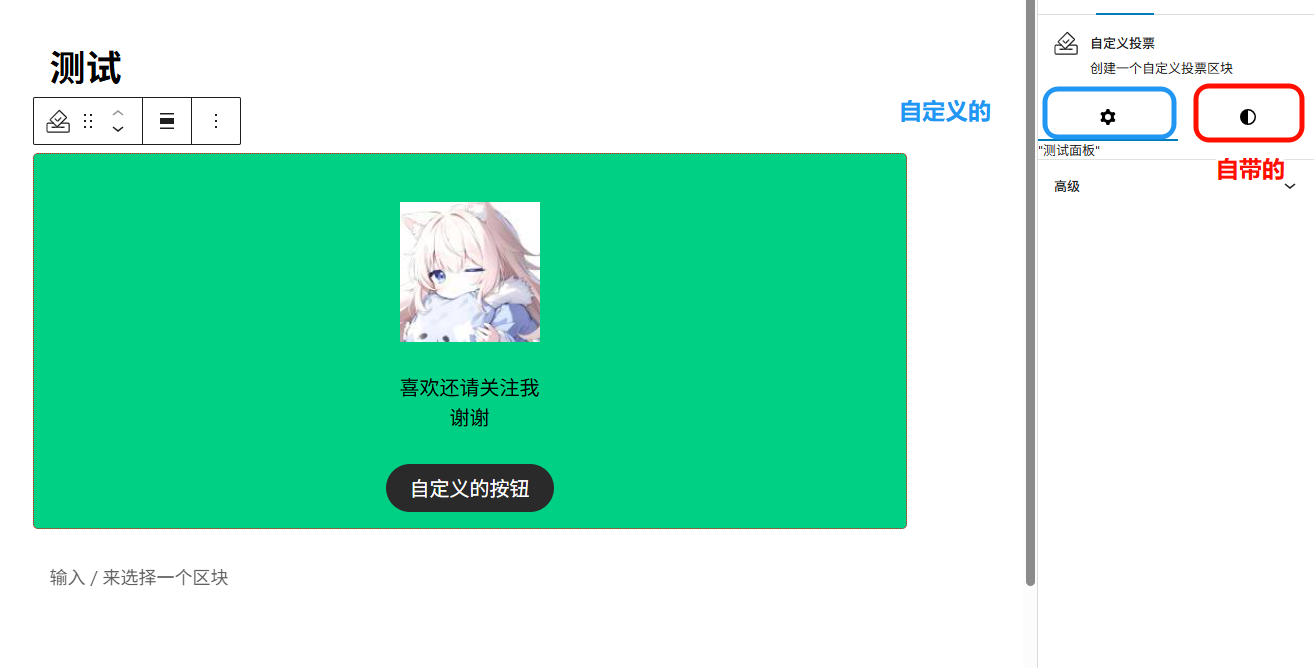
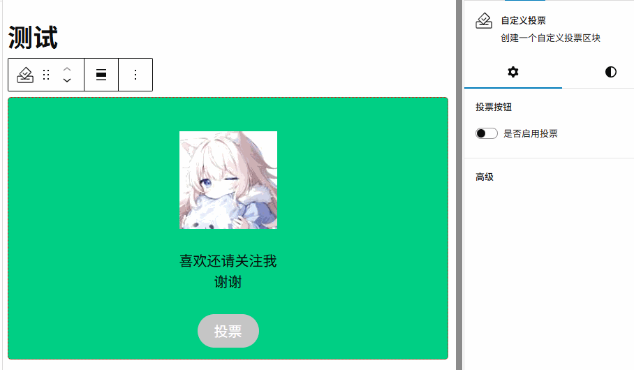
可以看到,上方多出来了一个齿轮。这里就是自定义的面板了。
创建开关、文本控件
标签字段() 可以简单理解成一个标题。用户可以点击标题来展开/收起组中的控件。其他的控件都会放在这个标签下,用来帮助用户进行配置。
开关控件() 顾名思义,提供了一个能够返回一个bool类型的值。
文本控件() 提供了一个文本框,用户能够输入字符。
编辑edit.js,最后的结果如下:
export default function Edit({ attributes, setAttributes }) {// 在这里定义类名let className = \"note-button\";if (!attributes.isButton) className += \" note-button-disabled\";// 在这里定义按钮文本let buttonText = attributes.buttonText;return (<><InspectorControls>// 标题<PanelBody title=\"投票按钮\">// 开关控件<ToggleControl label=\"是否启用投票\"checked={ attributes.isButton}onChange={ ( isButton ) => setAttributes( { isButton } ) }/>{// 如果启用了attributes.isButton && (// 则渲染文本控件<TextControllabel=\"按钮文字\"value={ attributes.buttonText || \'\' }onChange={ ( value ) =>setAttributes( { buttonText: value } )}></TextControl>)}</PanelBody></InspectorControls><div { ...useBlockProps() }><RichTexttagName=\'div\'className=\'note-content\'onChange={ (value) => setAttributes({ noteContent: value })}value={attributes.noteContent}placeholder=\'输入你的内容...\'></RichText><div class={className}>{buttonText}</div></div></>);}不要忘记引入相关依赖。
import { InspectorControls, RichText, useBlockProps} from \'@wordpress/block-editor\';import { PanelBody, TextControl, ToggleControl } from \'@wordpress/components\';最后随便写了写样式,保存刷新,效果如下:
同步到rander.php
最后别忘了,要修改界面上的显示效果需要修改rander.php中的内容。
<?php$content = $attributes[\'noteContent\'] ?? \"默认投票\";$isButton = $attributes[\'isButton\'] ?? true;$buttonText = $attributes[\'buttonText\'] ?? \"关注\";$className = \"note-button\";if (!$isButton) $className .= \" note-button-disabled\";?><div <?php echo get_block_wrapper_attributes(); ?>><div class=\"note-content\"><?php echo $content; ?></div><div class=\"<?php echo $className ?>\"><?php echo $buttonText; ?></div></div>
四、总结
- 通过修改scss文件修改基础样式
- 通过修改block.json来启用一些简单的功能
- 通过修改edit.js来启用自定义的功能
- 同步到rander.php


