Uniapp 自定义 Tabbar 实现教程_uniapp tabbar
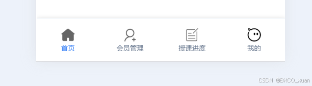
Uniapp 自定义 Tabbar 实现教程
1. 简介
在 Uniapp 开发中,自定义 Tabbar 是一个常见的需求。本教程将详细介绍如何实现一个美观且功能完整的自定义 Tabbar,并分享在实现过程中可能遇到的问题和解决方案。
2. 实现步骤
2.1 创建自定义 Tabbar 组件
首先,我们需要创建一个自定义的 Tabbar 组件。以下是完整的实现代码:
{{ item.text }} // 定义路由映射关系,用于快速查找当前页面对应的索引const TAB_ROUTES = { \'/pages/index/index\': 0, \'/pages/detail/detail\': 1, \'/pages/course/course\': 2, \'/pages/profile/profile\': 3};export default { data() { return { current: 0, // 当前选中的 tab 索引 tabList: [ { pagePath: \'/pages/index/index\', text: \'首页\', icon: \'home-o\', selectedIcon: \'home-o\' }, { pagePath: \'/pages/detail/detail\', text: \'详情\', icon: \'records\', selectedIcon: \'records\' }, { pagePath: \'/pages/course/course\',text: \'课程\', icon: \'clock-o\', selectedIcon: \'clock-o\' }, { pagePath: \'/pages/profile/profile\', text: \'我的\', icon: \'contact\', selectedIcon: \'contact\' } ] } }, methods: { // 切换 tab 的方法 switchTab(url) { uni.switchTab({ url }); } }, watch: { // 监听路由变化,更新当前选中的 tab \'$route.path\': { immediate: true, handler(path) { this.current = TAB_ROUTES[path] || 0; } } }}/* Tabbar 容器样式 */.custom-tabbar { position: fixed; bottom: 0; left: 0; right: 0; height: 110rpx; display: flex; justify-content: space-around; align-items: center; background-color: #fff; border-top: 1rpx solid #e2e8f0; box-shadow: 0 -2px 10px rgba(0, 0, 0, 0.05); z-index: 9999; padding-bottom: env(safe-area-inset-bottom); /* 适配全面屏 */}/* Tabbar 项基础样式 */.tabbar-item { display: flex; flex-direction: column; align-items: center; justify-content: center; font-size: 24rpx; color: #64748b; padding: 10rpx 0; transition: all 0.2s ease; position: relative;}/* 激活状态样式 */.tabbar-item-active { color: #3b82f6; font-weight: 600;}/* 点击效果 */.tabbar-item:active { transform: scale(0.95);}/* 图标样式 */:deep(.tabbar-icon) { font-size: 48rpx !important; margin-bottom: 4rpx;}/* 激活状态图标样式 */:deep(.tabbar-icon-active) { color: #3b82f6 !important;}/* 文字样式 */.tabbar-item text { margin-top: 6rpx; font-weight: 500;}/* 底部指示条 */.tabbar-item-active:before { content: \'\'; position: absolute; bottom: -10rpx; left: 50%; transform: translateX(-50%); width: 16rpx; height: 3px; background: #3b82f6; border-radius: 3px;}2.2 配置 pages.json
在 pages.json 中需要禁用原生 Tabbar,并配置页面路由:
{ \"tabBar\": { \"custom\": true, // 启用自定义 Tabbar \"list\": [ { \"pagePath\": \"pages/index/index\", \"text\": \"首页\" }, { \"pagePath\": \"pages/detail/detail\", \"text\": \"详情\" }, { \"pagePath\": \"pages/course/course\", \"text\": \"课程\" }, { \"pagePath\": \"pages/profile/profile\", \"text\": \"我的\" } ] }}3.1 路由映射
使用 TAB_ROUTES 对象来映射路由路径和对应的索引值,这样可以方便地管理当前选中的 tab:
const TAB_ROUTES = { \'/pages/index/index\': 0, \'/pages/detail/detail\': 1, \'/pages/course/course\': 2, \'/pages/profile/profile\': 3};3.2 样式设计
- 使用
position: fixed确保 Tabbar 固定在底部 - 添加
env(safe-area-inset-bottom)适配全面屏手机 - 使用
box-shadow添加阴影效果 - 实现点击缩放动画效果
- 添加底部指示条
3.3 图标处理
使用 van-icon 组件(来自 Vant UI)来显示图标,通过 :class 动态切换选中状态。
4. 常见问题及解决方案
4.1 页面跳转问题
问题:使用 uni.switchTab 跳转时可能出现页面不更新的情况。
解决方案:
- 确保在
pages.json中正确配置了 tabBar - 使用
uni.switchTab而不是uni.navigateTo - 在
watch中监听路由变化,及时更新选中状态
4.2 样式适配问题
问题:在不同机型上可能出现底部遮挡或样式错乱。
解决方案:
- 使用
env(safe-area-inset-bottom)适配全面屏 - 设置合适的
z-index确保层级正确 - 使用
rpx单位确保在不同设备上显示一致
4.3 性能优化
问题:频繁切换可能导致性能问题。
解决方案:
- 使用
v-for时添加:key - 合理使用
watch监听路由变化 - 避免在 Tabbar 中加载过多资源
5. 扩展功能
5.1 添加徽标
可以在 Tabbar 项上添加徽标,显示未读消息数量等:
{{ text }} {{ badge }}5.2 添加动画效果
可以添加更丰富的动画效果,如:
.tabbar-item { transition: all 0.3s cubic-bezier(0.4, 0, 0.2, 1);}.tabbar-item:hover { transform: translateY(-5rpx);}6. 总结
通过以上步骤,我们实现了一个功能完整、样式美观的自定义 Tabbar。这个实现方案具有以下特点:
- 支持路由跳转
- 适配不同机型
- 提供良好的视觉反馈
- 性能优化
- 易于扩展
作者:xuan
个人博客:https://blog.ybyq.wang
欢迎访问我的博客,获取更多技术文章和教程。


