鸿蒙ArkTS如何实现数据可视化:饼状图/柱状图/折线图_mccharts
鸿蒙数据可视化系列
在我们鸿蒙APP开发中,经常需要使用到一些图表的开发,本文主要介绍使用 McCharts 框架绘制柱状图的方法
配套指导视频地址:鸿蒙数据可视化系列-McCharts使用介绍_哔哩哔哩_bilibili
1. 第三方库介绍
1.1. McCharts
McCharts(莓创图表)是McUI提供的一款开箱即用的图表工具库,专为Harmony OS的所有类型的开发人员而设计。该组件库目前支持折线图、柱状图、饼图、散点图。
McCharts是一个基于ArkTS语法封装的图表组件,你可以运行在ArkTS 3+版本(DevEco Studio 3.1.1+)以上的任意版本当中。
1.2. 我们选择McCharts
-
McCharts是一款自研开发的公共组件,基于ArkTS最新版本。意味着HarmonyOS的新特性我们都支持,并拥有一个庞大的社区,您将拥有所有创建和制作项目的帮助和文档。
-
每个组件都是独立化的,更好地避免导入不必要的代码。
-
所有开发者拥有创建、改进和纠正任何组件或功能的开源社区。
-
提供了配套的设计资源,充分满足可定制化的需求。
1.3. 官网地址
http://meichuang.org.cn(目前好像不能访问了)
可以访问这个试试:React App
2. 安装
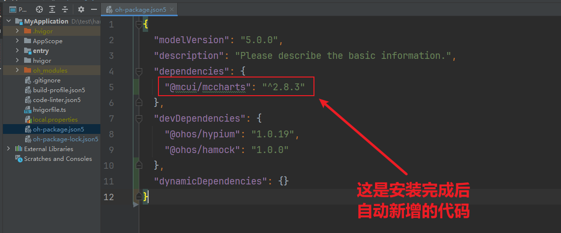
McCharts已经使用OpenHarmony三方库进行托管,你可以使用OpenHarmony提供的ohpm工具安装McCharts。在DevEco Studio中,您可以在Terminal(命令行窗口)输入如下的指令进行安装。
ohpm install @mcui/mccharts安装完毕之后,可以检查oh-package.json5文件中是否已经添加了mccharts的依赖。如下图所示:
3. 绘制折线图
3.1. 新建空白页面:
@Entry@Componentstruct LineCharts { build() { Column() { } .height(\'100%\') .width(\'100%\') }}3.2. 创建Options类
在Options类中,我们可以通过属性来设置折线图的样式,如设置图例的相关样式与功能,设置提示层的相关样式与功能,设置X轴的相关样式与功能,设置Y轴的相关样式与功能,设置折线区的相关样式与功能。具体代码如下所示:
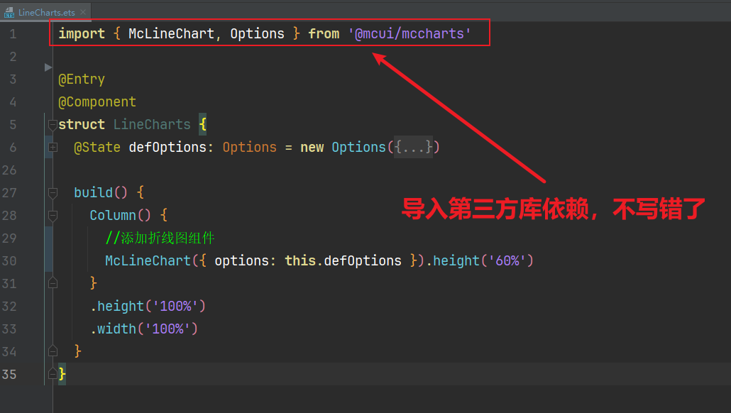
import { McLineChart, Options } from \'@mcui/mccharts\'//注意不要导入错误的包了,这个是正确的引入代码@State defOptions: Options = new Options({ xAxis: { //设置X轴的相关样式与功能 data: [\'周一\', \'周二\', \'周三\', \'周四\', \'周五\', \'周六\', \'周日\'] }, yAxis: { //设置Y轴的相关样式与功能 name: \'温度\' }, series: [//设置折线区的相关样式与功能 { name: \'周最高气温\', data: [11, 5, 9, 13, 12, 12, 5] }, { name: \'周最低气温\', data: [3, 0, 3, 5, 4, 2, 2] } ] })3.3. 添加折线组件
//添加折线图组件McLineChart({ options: this.defOptions }).height(\'60%\')3.4. 页面效果
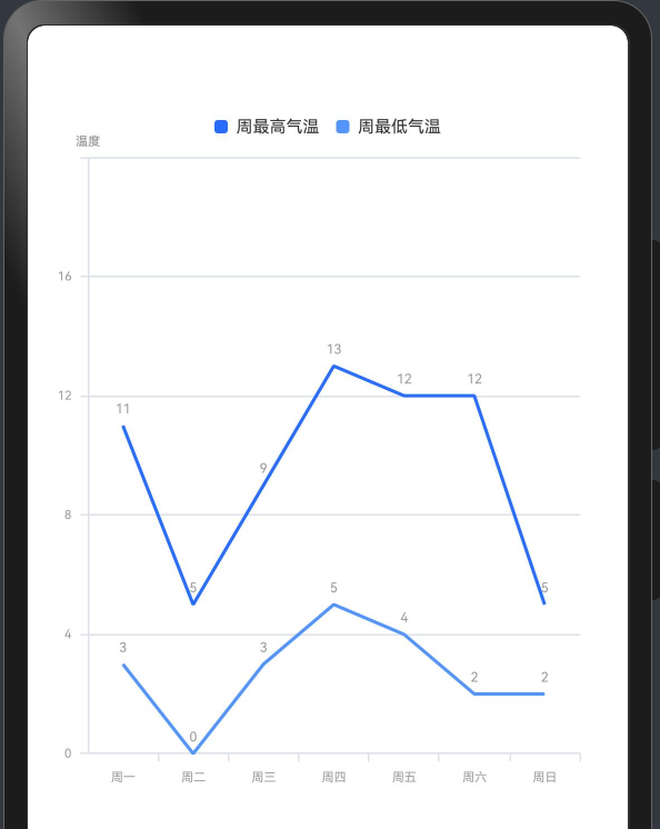
代码截图如下:
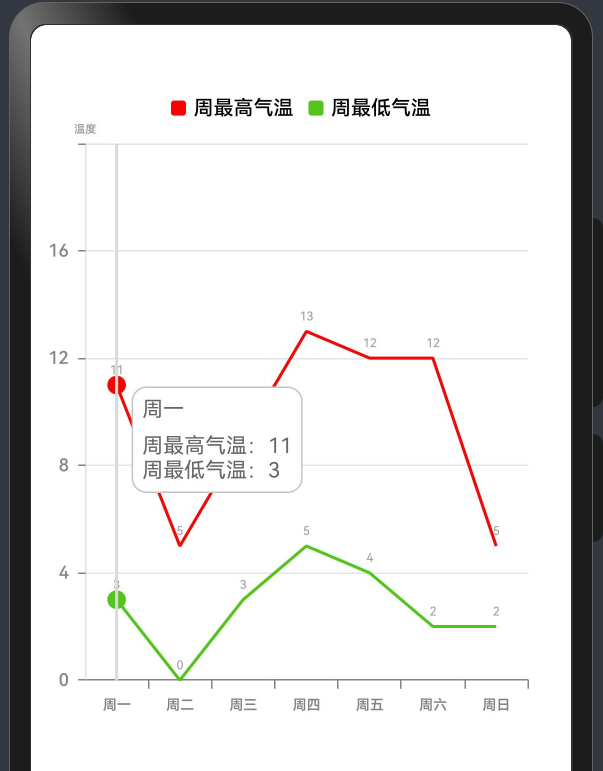
3.5. 美化
上面是一个最简单的版本,我们还可以参考官网,对X轴和Y轴及其他地方,做一些美化设置,设置完毕后,折线图最终页面如下图所示:
最终完整代码如下:
import { McLineChart, Options } from \'@mcui/mccharts\'/** * Author: 波波老师(weixin:javabobo0513) * Desc: 折线图-案例页面 */@Entry@Componentstruct LineCharts { @State message: string = \'Hello World\'; @State defOptions: Options = new Options({ //设置图例的相关样式与功能 legend: { top: \'5%\', //图例距离顶部侧位置 itemWidth: 10, //图形的宽度 itemHeight: 10, //图形的高度 textStyle: { //文本样式配置 color: \'#ff000000\', //字体颜色 fontSize: 40, //字体大小 fontWeight: \'500\' //字体粗细 } }, //设置X轴的相关样式与功能 xAxis: { axisLabel: { color: \'#ff838383\', //X轴字体颜色 fontSize: 28, //X轴字体大小 fontWeight: \'600\' //X轴字体粗线 }, axisTick: { //刻度线配置 show: true, //控制刻度线显示与隐藏 length: 6, // 刻度线的长度 interval: 4, //刻度线与文本的间隔 lineStyle: { color: \'#ff838383\', //X轴刻度线颜色 width: 1 //X轴线刻度线宽度 } }, axisLine: { //x轴线配置 show: true, //控制轴线显示与隐藏 可选值-true显示 false-隐藏 lineStyle: { color: \'#ff838383\', //X轴线条颜色 width: 1, //X轴线宽度 type: \'solid\' //X轴线类型 } }, data: [\'周一\', \'周二\', \'周三\', \'周四\', \'周五\', \'周六\', \'周日\'] }, //设置Y轴的相关样式与功能 yAxis: { name: \'温度\', axisTick: { //刻度线配置 length: 6, //刻度的长度 lineStyle: { //刻度线样式 color: \'#ff838383\', //线颜色 width: 1 //线宽度 } }, axisLine: { //y轴线配置 show: true //隐藏y轴线 }, splitLine: { // Y轴分割线配置。 show: true, //显示分割线 lineStyle: { //轴线样式 color: \'#ffe5e5e5\', //线颜色 width: 1 //线宽度 } }, axisLabel: { //y轴文本标签样式配置 color: \'#ff838383\', //字体颜色 fontSize: 35, //字体大小 fontWeight: \'500\' //字体粗细 }, }, //设置折线区的相关样式与功能 series: [ { name: \"周最高气温\", //图例文字 color: \'#ffff0002\', //图例颜色 lineStyle: { //折线样式配置 width: 2, //折线宽度 color: \'#ffff0002\' //折线显色 }, itemStyle: { //折线拐点配置 symbol: \'solidCircle\', //拐点类型 symbolSize: 4 //拐点大小 }, data: [11, 5, 9, 13, 12, 12, 5] //数据 }, { name: \"周最低气温\", //图例文字 color: \'#52C41A\', //图例颜色 lineStyle: { width: 2, //折线宽度 color: \'#52C41A\' //折线显色 }, itemStyle: { //折线拐点配置 symbol: \'solidCircle\', //拐点类型 symbolSize: 4 //拐点大小 }, data: [3, 0, 3, 5, 4, 2, 2] //数据 } ], tooltip: { //设置提示层的相关样式与功能 axisPointer: { //指示器配置项 type: \'line\', //指示器类型 lineStyle: { //提示线样式 color: \'#D9D9D9\', //线颜色 width: 2, //线宽度 type: \'solid\' //线类型 } }, backgroundColor: \'#FFFFFF\', //提示框背景颜色 borderColor: \'#C4C4C4\', //提示框边框颜色 borderWidth: 1, //提示框边框宽度 padding: 6, //提示框内边距 textStyle: { //文本样式配置 color: \'#666666\', //字体颜色 fontSize: 14 //字体大小 } }, }) build() { Column() { //折线图组件 McLineChart({ options: this.defOptions }) .height(\'60%\') //设置图表区域的高度 } .height(\'100%\') .width(\'100%\') }}3.6. 单折线图
效果如下图所示:
代码:
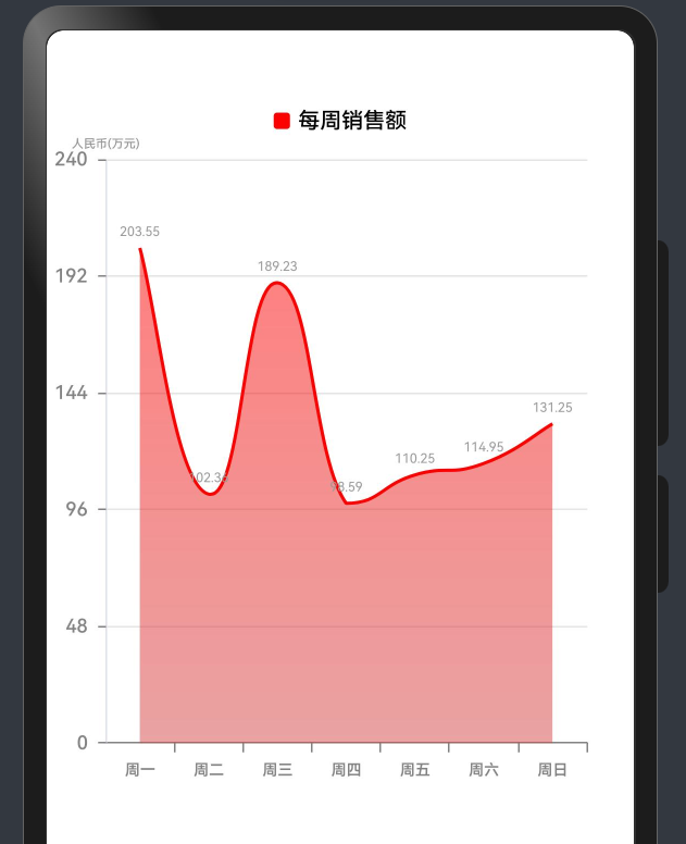
import { McLineChart, Options } from \'@mcui/mccharts\'/** * Author: 波波老师(weixin:javabobo0513) * Desc: 单折线图-案例页面 */@Entry@Componentstruct SingleLineCharts { @State defOptions: Options = new Options({ //设置图例的相关样式与功能 legend: { top: \'5%\', //图例距离顶部侧位置 itemWidth: 10, //图形的宽度 itemHeight: 10, //图形的高度 textStyle: { //文本样式配置 color: \'#ff000000\', //字体颜色 fontSize: 40, //字体大小 fontWeight: \'500\' //字体粗细 } }, //设置X轴的相关样式与功能 xAxis: { axisLabel: { color: \'#ff838383\', //X轴字体颜色 fontSize: 28, //X轴字体大小 fontWeight: \'600\' //X轴字体粗线 }, axisTick: { //刻度线配置 show: true, //控制刻度线显示与隐藏 length: 6, // 刻度线的长度 interval: 4, //刻度线与文本的间隔 lineStyle: { color: \'#ff838383\', //X轴刻度线颜色 width: 1 //X轴线刻度线宽度 } }, axisLine: { //x轴线配置 show: true, //控制轴线显示与隐藏 可选值-true显示 false-隐藏 lineStyle: { color: \'#ff838383\', //X轴线条颜色 width: 1, //X轴线宽度 type: \'solid\' //X轴线类型 } }, data: [\'周一\', \'周二\', \'周三\', \'周四\', \'周五\', \'周六\', \'周日\'] }, //设置Y轴的相关样式与功能 yAxis: { name: \'人民币(万元)\', axisTick: { //刻度线配置 length: 6, //刻度的长度 lineStyle: { //刻度线样式 color: \'#ff838383\', //线颜色 width: 1 //线宽度 } }, axisLine: { //y轴线配置 show: true //隐藏y轴线 }, splitLine: { // Y轴分割线配置。 show: true, //显示分割线 lineStyle: { //轴线样式 color: \'#ffe5e5e5\', //线颜色 width: 1 //线宽度 } }, axisLabel: { //y轴文本标签样式配置 color: \'#ff838383\', //字体颜色 fontSize: 35, //字体大小 fontWeight: \'500\' //字体粗细 }, }, //设置折线区的相关样式与功能 series: [ { name: \"每周销售额\", //图例文字 color: \'#ffff0000\', //图例颜色 lineStyle: { width: 2, //折线宽度 color: \'#ffff0000\' //折线显色 }, itemStyle: { //折线拐点配置 symbol: \'ffff0000\', //拐点类型 symbolSize: 4 //拐点大小 }, // 平滑曲线 smooth: true, // 区域颜色,线性渐变 areaStyle: { show: true, gradient: [\'#ffff0000\', \'#ffd44646\'] }, data: [203.55, 102.36, 189.23, 98.59, 110.25, 114.95, 131.25] //数据 } ], tooltip: { //设置提示层的相关样式与功能 axisPointer: { //指示器配置项 type: \'line\', //指示器类型 lineStyle: { //提示线样式 color: \'#D9D9D9\', //线颜色 width: 2, //线宽度 type: \'solid\' //线类型 } }, backgroundColor: \'#FFFFFF\', //提示框背景颜色 borderColor: \'#C4C4C4\', //提示框边框颜色 borderWidth: 1, //提示框边框宽度 padding: 6, //提示框内边距 textStyle: { //文本样式配置 color: \'#666666\', //字体颜色 fontSize: 14 //字体大小 } }, }) build() { Column() { //折线图组件 McLineChart({ options: this.defOptions }) .height(\'60%\') //设置图表区域的高度 } .height(\'100%\') .width(\'100%\') }}4. 绘制饼状图
4.1. 实心饼状图
效果图:
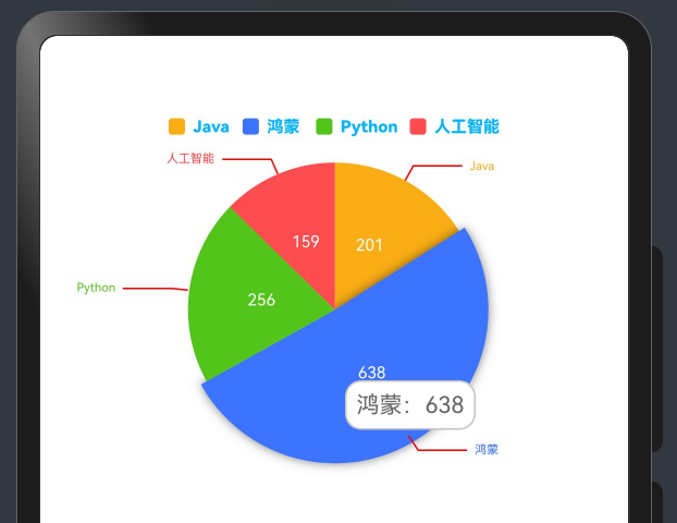
代码如下:
import { McPieChart, Options } from \'@mcui/mccharts\'/** * Author: 波波老师(weixin:javabobo0513) * Desc: 饼状图-案例页面 */@Entry@Componentstruct PieCharts { @State message: string = \'Hello World\'; @State defOptions: Options = new Options({ //调色盘颜色列表 color: [\'#FAAD14\', \'#3C73FF\', \'#52C41A\', \'#FF4D4F\'], //设置图例的相关样式与功能 legend: { top: \'5%\', //图例距离顶部侧位置 itemWidth: 10, //图形的宽度 itemHeight: 10, //图形的高度 textStyle: { //文本样式配置 color: \'#ff00b4ff\', //字体颜色 fontSize: 30, //字体大小 fontWeight: \'800\' //字体粗细 } }, // title: { // show: true, // text: \'最受欢迎语言\', // 主标题文本 // subtext: \'占比\', // 副标题文本 // top: \'30%\', // }, series: [ { // radius: [\'45%\', \'30%\'], // 饼图外半径、内半径 center: [\'50%\', \'30%\'], // 饼图中心位置 data: [ { name: \'Java\', value: 201 }, { name: \'鸿蒙\', value: 638 }, { name: \'Python\', value: 256 }, { name: \'人工智能\', value: 159 }, ], labelLine: { //文本连接线样式配置 length: 10, //连接线1的长度 length2: 30, //连接线2的长度 lineStyle: { //提示线样式 width: 1, //线宽度 color: \'#ffff0000\' //线颜色 } }, label: { //系列文本标签样式配置 show: true, //是否显示文本标签 fontWeight: \'800\', //字体粗细 fontFamily: \'sans-serif\', color: \'#ffffffff\', //字体颜色 position: \'outside\', //文本显示位置 fontSize: 30, //字体大小 distanceToLabelLine: 6 //字体与饼状间距 }, } ], tooltip: { //设置提示层的相关样式与功能 axisPointer: { //指示器配置项 type: \'line\', //指示器类型 lineStyle: { //提示线样式 color: \'#D9D9D9\', //线颜色 width: 2, //线宽度 type: \'solid\' //线类型 } }, backgroundColor: \'#FFFFFF\', //提示框背景颜色 borderColor: \'#C4C4C4\', //提示框边框颜色 borderWidth: 1, //提示框边框宽度 padding: 6, //提示框内边距 textStyle: { //文本样式配置 color: \'#666666\', //字体颜色 fontSize: 14 //字体大小 } }, }) build() { Column() { //饼状图组件 McPieChart({ options: this.defOptions }) .height(\'60%\') //设置图表区域的高度 } .height(\'100%\') .width(\'100%\') }}4.2. 空心饼状图
效果图:
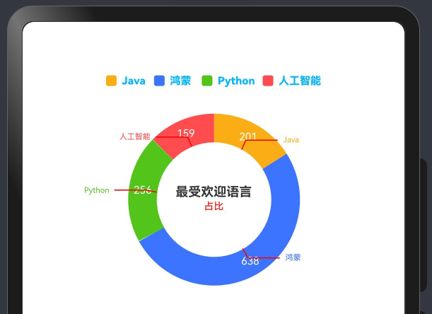
代码如下:
import { McPieChart, Options } from \'@mcui/mccharts\'/** * Author: 波波老师(weixin:javabobo0513) * Desc: 饼状图-案例页面 */@Entry@Componentstruct PieCharts { @State message: string = \'Hello World\'; @State defOptions: Options = new Options({ //调色盘颜色列表 color: [\'#FAAD14\', \'#3C73FF\', \'#52C41A\', \'#FF4D4F\'], //设置图例的相关样式与功能 legend: { top: \'5%\', //图例距离顶部侧位置 itemWidth: 10, //图形的宽度 itemHeight: 10, //图形的高度 textStyle: { //文本样式配置 color: \'#ff00b4ff\', //字体颜色 fontSize: 30, //字体大小 fontWeight: \'800\' //字体粗细 } }, title: { show: true, text: \'最受欢迎语言\', // 主标题文本 subtext: \'占比\', // 副标题文本 top: \'30%\', }, series: [ { radius: [\'45%\', \'30%\'], // 饼图外半径、内半径 center: [\'50%\', \'30%\'], // 饼图中心位置 data: [ { name: \'Java\', value: 201 }, { name: \'鸿蒙\', value: 638 }, { name: \'Python\', value: 256 }, { name: \'人工智能\', value: 159 }, ], labelLine: { //文本连接线样式配置 length: 10, //连接线1的长度 length2: 30, //连接线2的长度 lineStyle: { //提示线样式 width: 1, //线宽度 color: \'#ffff0000\' //线颜色 } }, label: { //系列文本标签样式配置 show: true, //是否显示文本标签 fontWeight: \'800\', //字体粗细 fontFamily: \'sans-serif\', color: \'#ffffffff\', //字体颜色 position: \'outside\', //文本显示位置 fontSize: 30, //字体大小 distanceToLabelLine: 6 //字体与饼状间距 }, } ] }) build() { Column() { //饼状图组件 McPieChart({ options: this.defOptions }) .height(\'60%\') //设置图表区域的高度 } .height(\'100%\') .width(\'100%\') }}5. 绘制柱状图
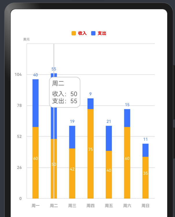
5.1. 双柱
效果图如下所示:
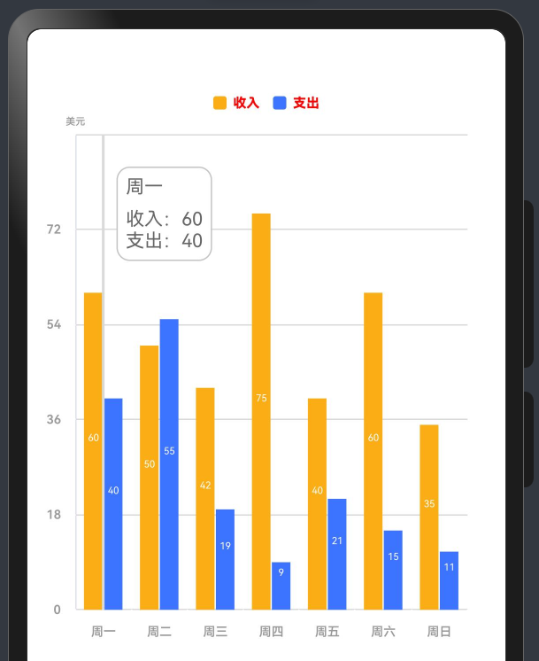
代码如下:
import { McBarChart, McPieChart, Options } from \'@mcui/mccharts\'/** * Author: 波波老师(weixin:javabobo0513) * Desc: 柱状图-案例页面 */@Entry@Componentstruct BarCharts { @State message: string = \'Hello World\'; @State defOptions: Options = new Options({ legend: { //设置图例的相关样式与功能 top: \'5%\', //图例距离顶部侧位置 itemWidth: 10, //图形的宽度 itemHeight: 10, //图形的高度 textStyle: { //文本样式配置 color: \'#ffff0000\', //字体颜色 fontSize: 30, //字体大小 fontWeight: \'800\' //字体粗细 } }, yAxis: { //设置y轴的相关样式与功能 name: \'美元\', axisTick: { //刻度线配置 length: 6, //刻度的长度 lineStyle: { //刻度线样式 color: \'#FFFFFF\', //线颜色 width: 1 //线宽度 } }, axisLine: { //y轴线配置 show: true //隐藏y轴线 }, splitLine: { // Y轴分割线配置。 show: true, //显示分割线 lineStyle: { //轴线样式 color: \'#D9D9D9\', //线颜色 width: 1 //线宽度 } }, axisLabel: { //y轴文本标签样式配置 color: \'#999999\', //字体颜色 fontSize: 28, //字体大小 fontWeight: \'600\' //字体粗细 }, }, xAxis: { axisLabel: { //X轴文本标签样式配置 color: \'#999999\', //字体颜色 fontSize: 28, //字体大小 fontWeight: \'600\' //字体粗线 }, axisTick: { //刻度线配置 show: true, //控制刻度线显示与隐藏 length: 6, // 刻度线的长度 interval: 4, //刻度线与文本的间隔 lineStyle: { //刻度线样式 color: \'#FFFFFF\', //线颜色 width: 1 //线宽度 } }, axisLine: { //x轴线配置 show: true, //控制轴线显示与隐藏 可选值-true显示 false-隐藏 lineStyle: { //轴线样式 color: \'#D9D9D9\', //线颜色 width: 1, //线宽度 type: \'solid\' //线类型 } }, //设置x轴的相关样式与功能 data: [\'周一\', \'周二\', \'周三\', \'周四\', \'周五\', \'周六\', \'周日\'] }, series: [//设置柱状区的相关样式与功能 { label: { //系列文本标签样式配置 show: true, //显示文本标签样 color: \'#FFFFFF\', //字体颜色 fontWeight: \'600\', //字体粗细 fontFamily: \'sans-serif\', //字体样式 position: \'center\', //文本显示位置 fontSize: 22, //字体大小 distanceToLabelLine: 5 //字体与柱状间距 }, name: \"收入\", //图例文字 color: \'#FAAD14\', //图例颜色 stack: \'\', //是否显示堆叠柱子 barStyle: { //柱状样式配置 width: 14, //柱子宽度 color: \'#FAAD14\', //柱子颜色 barGap: 1 //同系列之间的柱子间隙 }, data: [60, 50, 42, 75, 40, 60, 35] //数据 }, { label: { //系列文本标签样式配置 show: true, //显示文本标签样 color: \'#FFFFFF\', //字体颜色 fontWeight: \'600\', //字体粗细 fontFamily: \'sans-serif\', //字体样式 position: \'center\', //文本显示位置 fontSize: 22, //字体大小 distanceToLabelLine: 5 //字体与柱状间距 }, name: \"支出\", //图例文字 color: \'#3C73FF\', //图例颜色 stack: \'\', //是否显示堆叠柱子 barStyle: { //柱状样式配置 width: 14, //柱子宽度 color: \'#3C73FF\', //柱子颜色 barGap: 1 //同系列之间的柱子间隙 }, data: [40, 55, 19, 9, 21, 15, 11] //数据 } ], tooltip: { //设置提示层的相关样式与功能 axisPointer: { //指示器配置项 type: \'line\', //指示器类型 lineStyle: { //提示线样式 color: \'#D9D9D9\', //线颜色 width: 2, //线宽度 type: \'solid\' //线类型 } }, backgroundColor: \'#FFFFFF\', //提示框背景颜色 borderColor: \'#C4C4C4\', //提示框边框颜色 borderWidth: 1, //提示框边框宽度 padding: 6, //提示框内边距 textStyle: { //文本样式配置 color: \'#666666\', //字体颜色 fontSize: 14 //字体大小 } }, }) build() { Column() { //柱状图组件 McBarChart({ options: this.defOptions }) .height(\'60%\') //设置图表区域的高度 } .height(\'100%\') .width(\'100%\') }}5.2. 单柱
效果图如下所示:
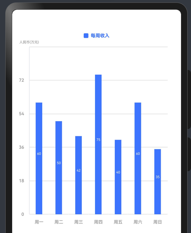
代码如下:
import { McBarChart, McPieChart, Options } from \'@mcui/mccharts\'/** * Author: 波波老师(weixin:javabobo0513) * Desc: 单柱状图-案例页面 */@Entry@Componentstruct SingleBarCharts { @State defOptions: Options = new Options({ legend: { //设置图例的相关样式与功能 top: \'5%\', //图例距离顶部侧位置 itemWidth: 10, //图形的宽度 itemHeight: 10, //图形的高度 textStyle: { //文本样式配置 color: \'#3C73FF\', //字体颜色 fontSize: 30, //字体大小 fontWeight: \'800\' //字体粗细 } }, yAxis: { //设置y轴的相关样式与功能 name: \'人民币(万元)\', axisTick: { //刻度线配置 length: 6, //刻度的长度 lineStyle: { //刻度线样式 color: \'#FFFFFF\', //线颜色 width: 1 //线宽度 } }, axisLine: { //y轴线配置 show: true //隐藏y轴线 }, splitLine: { // Y轴分割线配置。 show: true, //显示分割线 lineStyle: { //轴线样式 color: \'#D9D9D9\', //线颜色 width: 1 //线宽度 } }, axisLabel: { //y轴文本标签样式配置 color: \'#999999\', //字体颜色 fontSize: 28, //字体大小 fontWeight: \'600\' //字体粗细 }, }, xAxis: { axisLabel: { //X轴文本标签样式配置 color: \'#999999\', //字体颜色 fontSize: 28, //字体大小 fontWeight: \'600\' //字体粗线 }, axisTick: { //刻度线配置 show: true, //控制刻度线显示与隐藏 length: 6, // 刻度线的长度 interval: 4, //刻度线与文本的间隔 lineStyle: { //刻度线样式 color: \'#FFFFFF\', //线颜色 width: 1 //线宽度 } }, axisLine: { //x轴线配置 show: true, //控制轴线显示与隐藏 可选值-true显示 false-隐藏 lineStyle: { //轴线样式 color: \'#D9D9D9\', //线颜色 width: 1, //线宽度 type: \'solid\' //线类型 } }, //设置x轴的相关样式与功能 data: [\'周一\', \'周二\', \'周三\', \'周四\', \'周五\', \'周六\', \'周日\'] }, series: [//设置柱状区的相关样式与功能 { label: { //系列文本标签样式配置 show: true, //显示文本标签样 color: \'#FFFFFF\', //字体颜色 fontWeight: \'600\', //字体粗细 fontFamily: \'sans-serif\', //字体样式 position: \'center\', //文本显示位置 fontSize: 22, //字体大小 distanceToLabelLine: 5 //字体与柱状间距 }, name: \"每周收入\", //图例文字 color: \'#3C73FF\', //图例颜色 stack: \'\', //是否显示堆叠柱子 barStyle: { //柱状样式配置 width: 14, //柱子宽度 color: \'#3C73FF\', //柱子颜色 barGap: 1 //同系列之间的柱子间隙 }, data: [60, 50, 42, 75, 40, 60, 35] //数据 }, ], tooltip: { //设置提示层的相关样式与功能 axisPointer: { //指示器配置项 type: \'line\', //指示器类型 lineStyle: { //提示线样式 color: \'#D9D9D9\', //线颜色 width: 2, //线宽度 type: \'solid\' //线类型 } }, backgroundColor: \'#FFFFFF\', //提示框背景颜色 borderColor: \'#C4C4C4\', //提示框边框颜色 borderWidth: 1, //提示框边框宽度 padding: 6, //提示框内边距 textStyle: { //文本样式配置 color: \'#666666\', //字体颜色 fontSize: 14 //字体大小 } }, }) build() { Column() { //柱状图组件 McBarChart({ options: this.defOptions }) .height(\'60%\') //设置图表区域的高度 } .height(\'100%\') .width(\'100%\') }}5.1. 层叠柱
效果图如下所示:
代码如下:
import { McBarChart, McPieChart, Options } from \'@mcui/mccharts\'/** * Author: 波波老师(weixin:javabobo0513) * Desc: 层叠柱状图-案例页面 */@Entry@Componentstruct CengDieBarCharts { @State defOptions: Options = new Options({ legend: { //设置图例的相关样式与功能 top: \'5%\', //图例距离顶部侧位置 itemWidth: 10, //图形的宽度 itemHeight: 10, //图形的高度 textStyle: { //文本样式配置 color: \'#ffff0000\', //字体颜色 fontSize: 30, //字体大小 fontWeight: \'800\' //字体粗细 } }, yAxis: { //设置y轴的相关样式与功能 name: \'美元\', axisTick: { //刻度线配置 length: 6, //刻度的长度 lineStyle: { //刻度线样式 color: \'#FFFFFF\', //线颜色 width: 1 //线宽度 } }, axisLine: { //y轴线配置 show: true //隐藏y轴线 }, splitLine: { // Y轴分割线配置。 show: true, //显示分割线 lineStyle: { //轴线样式 color: \'#D9D9D9\', //线颜色 width: 1 //线宽度 } }, axisLabel: { //y轴文本标签样式配置 color: \'#999999\', //字体颜色 fontSize: 28, //字体大小 fontWeight: \'600\' //字体粗细 }, }, xAxis: { axisLabel: { //X轴文本标签样式配置 color: \'#999999\', //字体颜色 fontSize: 28, //字体大小 fontWeight: \'600\' //字体粗线 }, axisTick: { //刻度线配置 show: true, //控制刻度线显示与隐藏 length: 6, // 刻度线的长度 interval: 4, //刻度线与文本的间隔 lineStyle: { //刻度线样式 color: \'#FFFFFF\', //线颜色 width: 1 //线宽度 } }, axisLine: { //x轴线配置 show: true, //控制轴线显示与隐藏 可选值-true显示 false-隐藏 lineStyle: { //轴线样式 color: \'#D9D9D9\', //线颜色 width: 1, //线宽度 type: \'solid\' //线类型 } }, //设置x轴的相关样式与功能 data: [\'周一\', \'周二\', \'周三\', \'周四\', \'周五\', \'周六\', \'周日\'] }, series: [//设置柱状区的相关样式与功能 { label: { //系列文本标签样式配置 show: true, //显示文本标签样 color: \'#FFFFFF\', //字体颜色 fontWeight: \'800\', //字体粗细 fontFamily: \'sans-serif\', //字体样式 position: \'center\', //文本显示位置 fontSize: 28, //字体大小 distanceToLabelLine: 5 //字体与柱状间距 }, name: \"收入\", //图例文字 color: \'#FAAD14\', //图例颜色 stack: \'total\', //是否显示堆叠柱子 barStyle: { //柱状样式配置 width: 14, //柱子宽度 color: \'#FAAD14\', //柱子颜色 barGap: 1 //同系列之间的柱子间隙 }, data: [60, 50, 42, 75, 40, 60, 35] //数据 }, { label: { //系列文本标签样式配置 show: true, //显示文本标签样 color: \'#3C73FF\', //字体颜色 fontWeight: \'800\', //字体粗细 fontFamily: \'sans-serif\', //字体样式 position: \'top\', //文本显示位置 fontSize: 28, //字体大小 distanceToLabelLine: 3 //字体与柱状间距 }, name: \"支出\", //图例文字 color: \'#3C73FF\', //图例颜色 stack: \'total\', //是否显示堆叠柱子 barStyle: { //柱状样式配置 width: 14, //柱子宽度 color: \'#3C73FF\', //柱子颜色 barGap: 1 //同系列之间的柱子间隙 }, data: [40, 55, 19, 9, 21, 15, 11] //数据 } ], tooltip: { //设置提示层的相关样式与功能 axisPointer: { //指示器配置项 type: \'line\', //指示器类型 lineStyle: { //提示线样式 color: \'#D9D9D9\', //线颜色 width: 2, //线宽度 type: \'solid\' //线类型 } }, backgroundColor: \'#FFFFFF\', //提示框背景颜色 borderColor: \'#C4C4C4\', //提示框边框颜色 borderWidth: 1, //提示框边框宽度 padding: 6, //提示框内边距 textStyle: { //文本样式配置 color: \'#666666\', //字体颜色 fontSize: 14 //字体大小 } }, }) build() { Column() { //柱状图组件 McBarChart({ options: this.defOptions }) .height(\'60%\') //设置图表区域的高度 } .height(\'100%\') .width(\'100%\') }}6. 动态修改图表数据
McCharts 组件整体使用@Observed装饰器和@ObjectLink装饰器来监控数据的变化,所以修改数据需要使用Option实例对象的【setVal】方法来实现
案例代码如下:
import { McLineChart, Options } from \'@mcui/mccharts\'@Entry@Componentstruct Index { @State defOption: Options = new Options({ title: { show: true, text: \'更新数据\', right: 20, top: 30 }, xAxis:{ data:[\'周一\',\'周二\',\'周三\',\'周四\',\'周五\',\'周六\',\'周日\'] }, yAxis:{ name:\'温度\' }, series:[ { name:\'最高气温\', data:[11, 11, 15, 13, 12, 130, 10] } ] }) aboutToAppear() { setTimeout(() => { // 使用Option实例对象的setVal方法来实现,修改什么属性就传什么 this.defOption.setVal({ series: [ { name:\'最高气温\', data:[110, 110, 150, 130, 102, 130, 210] } ] }) }, 2000) } build() { Row() { McLineChart({ options: this.defOption }) } .height(\'50%\') }}
